Android L vs Windows Phone 8.1: Guess who's catching up
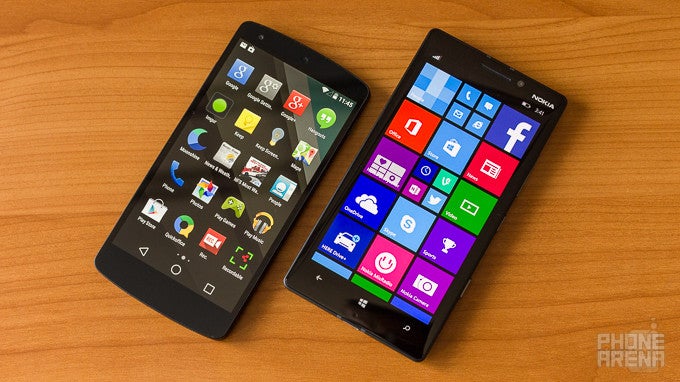
Over the past few weeks, Android L has been one of the hottest topics that we've been covering – not a surprise given the fact that it is an update of epic proportions. The platform's latest version brings along a fresh new design, performance and battery life improvements, and a richer set of developer tools, among tons of other goodies. Windows Phone 8.1 has also been enjoying quite some attention as it is a major boost for Microsoft's mobile OS. The new software introduces welcome features like the Action Center and Cortana, all the while improving the web browsing experience and adding more personalization options. The result is a mature operating system worthy of being stacked up against the dominating forces.
But how do Android L and Windows Phone 8.1 compare? What makes one better than the other? Is there anything they can learn from each other? To provide the answers to these questions, we've decided to put the two platforms side by side for a preliminary comparison. Yes, it a preliminary one because Android L, which is running on our Nexus 5, is still in beta, while Windows Phone 8.1 on our Nokia Lumia is just a trimmed down version. And we can't draw any final conclusions based on experience with non-final software, can we? Alright, now let's get to business.
User interface
Android and Windows Phone are kind of like a convertible and an SUV – they're both made to do the same thing, but they do it differently. Same goes for their visual presentation and user interface layout. In Android L, we have a home screen with app shortcuts, folders, and widgets while Windows Phone 8.1 relies on a home screen populated with the so-called Live Tiles. Picking a favorite depends on one's preferences, but in general, Android L should appeal to those who are into customizing their phone and those who like the feeling of having control over it, while Windows Phone is more suitable for folks who prefer things clean, simple, and easy to organize.
Widgets are Android's solution to making the most of the available screen space. They come in all shapes and sizes and serve a vast array of functions – some tell the time, display weather conditions, or list our recent emails, others let us control music playback, or tweet on the fly. Windows Phone's alternative are the aforementioned Live Tiles. They're a blend between an app shortcut and a widget – if an app has a notification for us, its tile will let us know. Live Tiles aren't as functional as Android's widgets, however. On the upside, a Windows Phone 8.1 home screen looks very presentable and well laid out, with almost no space left unused.
Android L and Windows Phone 8.1 have a similar approach to notifications. Both list them in a panel that is accessible with a swipe down from the top of the screen. Both let us dismiss a notification with a swipe to the side, while a tap triggers the respective application.
Android, however, takes matters a few steps further. First of all, it pushes non-important notifications down to the bottom to the list, while high priority ones are placed at the top. Also, some notifications expand and give us extra interaction options – for example, we may archive or reply to an email at the push of a button. And it is cool how if you have an app running and you get a call, the notification pops up from the top of the screen without hiding whatever app you're in. What's not so cool, however, is that in Android L we don't have a way to clear all notifications at once (although this option might return with L's final release). In Windows Phone 8.1, we may dismiss all notifications at once, or just those from a specific app.
The Android L lock screen makes it hard to miss a notification as it lists them right in the middle of the screen. Again, you may swipe or tap if you want to dismiss a notification or to launch the respective app. Unlike Windows Phone, Android L presents us with handy shortcuts to the Phone and Camera applications.
Windows Phone 8.1 sticks with a simpler, cleaner lock screen – an approach that's neither better nor worse; it is more elegant, but a tad less functional. At the bottom we have counters for missed calls, new texts, and unread IMs, which is a small touch that we quite like. It is also nice that you may let Windows Phone change your lock screen wallpaper daily with one selected by the Bing team. To access the camera app from the WP lock screen, you either hold down the phone's physical camera button, if one's available, or swipe down to get to the notification panel – a shortcut is placed there.
Speaking of the Windows Phone 8.1 notification panel, also referred to as the Action Center, it hosts toggle buttons for turning Wi-Fi and Bluetooth on or off and for controlling screen brightness. While only four of these can be displayed at a time, you may remove those that you don't need and add other toggles, such as one for internet sharing, GPS, orientation lock, or Airplane Mode. Still, Android L's solution is more versatile. In addition to Wi-Fi and Bluetooth toggle buttons, the Quick Controls present us with a brightness slider, Location and Airplane Mode toggles, as well as with a button for locking the screen orientation, all in the same menu.
Customization
Now, as we mentioned above, Android is a lot more flexible when it comes to personalization. Android L is no exception – one can pick between static or live wallpapers, move widgets and shortcuts around to their liking, or apply a third-party theme or icon pack with the help of third-party software. Those who are feeling extra adventurous may also pick among a plethora of launchers, which are available for download from the Play Store. These give the user interface a totally new look and layout.
In Windows Phone 8.1, the user may pick between a handful of theme colors and apply one of them against a white or a black background. Alternatively, there's the option to set a home screen wallpaper of sorts – some tiles are rendered transparent and an image is layered behind them, which creates a unique and quite nice window effect. One more thing that can be modified is the arrangement of the Live Tiles on the home screen – we can place each right where we want it. Plus, with Windows Phone 8.1, we can enable an extra column of space for Live Tiles from the Settings menu.
Phone, Contacts, Messaging, Keyboard
In Android L, the Phone application is unified with the contacts list so all our calling needs are met by a single app. Opening it up displays our call log, our last contacted number, our favorites, and a neatly organized list of contacts with a profile picture at the side. The search bar lists results from our contacts, but can also search Google's directory for nearby businesses, which is pretty neat.
In contrast, Windows Phone 8.1 has the Phone and contacts apps (the latter is called People) separated. The Phone app is pretty simple, with our call log, favorites, and contacts listed alphabetically. Using the search bar we can find contacts by entering either of their names. The People app is separate since it is more than just a manager for our contacts. It also serves as a hub listing our friends' activity on social networks and lets us interact with their posts. It is a different approach and definitely not a bad one.
Hangouts is Android L's default SMS application. It handles both plain ol' text messages and IMs sent through Google's service, as well as audio and video calls over the internet. With the risk of repeating ourselves, Windows Phone 8.1 is keeping things simple with its no-hassle texting application. It is made for texting and that's pretty much it. In both platforms we may attach our location to the outgoing message.
The on-screen keyboard on Android L now has a simpler layout and has retained its great accuracy. It speeds up our typing with its word predictions, and fans of alternative input methods may use the keyboard's swipe mode. The keyboard in Windows Phone has always been a very accurate one, and it is about to get even better in Windows Phone 8.1. The platform's latest version adds Word Flow, which works just like the swipe method in Android. It isn't available on our demo unit, however, so we can't give it a try at this time.
Google Now vs Cortana
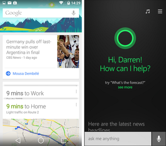
Also, Google Now responds to natural language queries and commands. You may ask it to dial or send a message to a contact, to give you a weather forecast, or to set a reminder or to take down a note, to give a few examples. What's more, Google Now can be accessed from any screen thanks to an always-on voice command. As long as the phone is not on stand-by, that is.
With Windows Phone 8.1, Microsoft is introducing us to Cortana – a personal virtual assistant made to respond to natural language commands, much like Google Now. Similarly, she is able to look into the user's contacts, emails, calendar and other personal information in order to perform whatever action she's been instructed to do. For example, you may ask Cortana to initiate a call, to set an alarm, or to read your last email. But she's been also designed to integrate with third-party apps and services, such as Skype, Hulu Plus, or Facebook.
Chrome vs Internet Explorer 11
Google's Chrome mobile web browser has established itself as one of the best of its kind. It isn't only fast, but also highly functional and pretty easy to use. What's more, it can sync with other devices on which the same user is running Chrome – you may have access to your tabs and bookmarks on multiple devices, basically. And if you need to save up those megabytes, the browser comes with the option to have pages compressed before they are downloaded. But Internet Explorer 11 on Windows Phone 8.1 is a browser that shouldn't be underestimated. The latest version of Microsoft's mobile browser features unlimited tabs, optional data compression (which works pretty much like Chrome's), and a reader mode, which hides all pictures and leaves only the body of articles for easy reading. The latter is a handy feature – definitely one that Chrome can learn from its counterpart. Alas, unlike Chrome, Internet Explorer 11 won't inflate text for easier reading without having to zoom in.
Camera and gallery
The stock camera in Windows Phone 8.1 seems to be a pretty basic one and it is easy pretty to use. At the side of the screen we have quick buttons for taking a photo, a video, or a burst sequence of images. There are some settings that you can adjust manually, but these are found in a menu that takes a few taps too many to get to. Additional modes can be downloaded separately from the Marketplace, if you're feeling brave enough to experiment. However, if you're an owner of a Nokia Lumia phone, you'll find the Nokia Camera app pre-installed. It is a welcome upgrade over the stock camera application, adding quick access to true manual controls – focus, exposure, ISO, shutter speed, and color temperature – for those who know how to use them. Those who don't can simply leave them in their default auto setting.
Google Camera, which is the default camera app in Android L, offers little in terms of manual controls. But it is easy to get the hang of and features a handful of cool modes, including panorama, Photo Sphere, HDR+, and Lens Blur. We gave it a review not long ago, so check it out if you're curious to learn more.
Once in the Android photo gallery, you're presented with a thumbnail view of all your photos. If there's anything that you've stored in Google's cloud, it will be listed for you as well. Now would be a good time to mention that photos can be backed up automatically for safety's sake. Photos can be shared straight from the gallery app or edited using the rich selection of image processing tools.
The Windows Phone 8.1 gallery is similar to Android's. Images are grouped by date taken and uploaded up to OneDrive where they're safe from being lost. You may easily share images on your favorite social networks with a few taps. The only thing we wish the app had more of are image editing tools beyond cropping, rotating, and an automatic fix.
Expectations
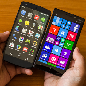
Yet while Windows Phone 8.1 brings the feature gap between itself and its nemeses to a minimum, it can't be considered superior to Android L. We'd rather call it... different. It isn't as customizable as Android, but it has a unique, modern look. It isn't as functional as Android, but all that it does, it does it well. Ultimately, we don't see why anyone who's grown up with Android would prefer WP 8.1 to Android L, unless they are just eager to try something new. Those who are less picky about which OS their smartphone is powered by, however, would probably not be disappointed with Windows Phone 8.1 and its smooth, hassle-free user experience.
Follow us on Google News


Things that are NOT allowed:
To help keep our community safe and free from spam, we apply temporary limits to newly created accounts: