Android L Preview: there's a lot to be excited about

To say that the past couple of days have been exciting for Android enthusiasts would be an understatement. After all, there's a fresh, new flavor of Android on the horizon, as Google confirmed at the I/O conference opening keynote. It is being referred to as "the L release", which seemingly breaks Google's tradition of naming its major Android versions after sweets, and it brings both visual and functional changes to the platform, as well as tons of improvements under the hood. At the same time, developers will benefit from the tons of newly-added APIs, which will enable them to create apps more powerful than ever.
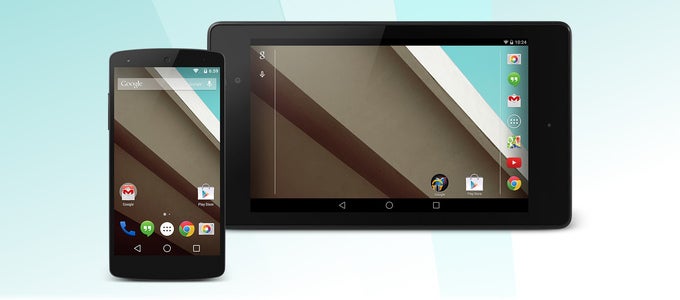
Now, there's one thing that must be highlighted before we dwell any further. The Android L release is not quite ready for prime time, and ordinary folks won't be getting it over the air until later this year. What we do have access to, on the other hand, is an early preview version of Android's latest flavor. As a matter of fact, we've been test-driving it on our Google Nexus 5 smartphone, and the following preview is based on our experience and impressions that have accumulated while using it. Keep in mind that the platform's design and the way its features work might change by the time its final release is out. Some of the screenshots below have a KitKat feel to them, yet the look of the respective screens might end up being quite different. With that out of the way, allow us to demonstrate what Google has crafted.
Introducing "Material Design"
We feel obliged to begin with a comment on the overhauled visual presentation of Google's platform – the adoption of the so-called Material Design. As before, the UI design in Android L is governed by the principles of flatness and minimalism. But now, there's also a sense of depth that can be felt throughout the user interface – while switching between apps, while interacting with notifications, while scrolling through the contacts list, for example. This effect has been achieved through clever uses of shadows under objects and by "layering" elements, as if they're stacked on top of each other. At the same time, the interface isn't distracting. It lets one focus on whatever it is they're doing instead of drawing their attention with shiny buttons and sparkly transition animations. All in all, the L release does bring a huge number of visual changes, some more radical than others, all the while building and improving upon what Google has already established with KitKat.
Speaking of minimalism, it is about to become omnipresent with Android L. Take the on-screen buttons, for example. They are now represented by basic shapes – a triangle, a circle, and a square. Simple as that. Toggle switches, radio buttons, and sliders have been redesigned as well. Menus, dialog windows, even the on-screen keyboard have a simpler layout. Over time, Google's suite of applications and services will also be treated to a fitting redesign.
Functionality boost
But of course, the changes brought by Android L aren't merely superficial. Functionality has been given a boost as well. One of the first changes that we noticed was the overhauled notification panel. Swiping down shows all pending notifications, but not in chronological order, as it was in previous Android versions. The L release brings the most important notifications to the top of the list, while the least important are pushed to the bottom. For example, email notifications have a higher priority than those letting you know that a new app has been installed. On the lock screen, notifications are now displayed at a glance – a much appreciated improvement – and a tap on one is how you interact with it.
While the notification list is displayed, a second swipe down brings forth the redesigned quick settings menu. Note that the two-finger slide-down gesture for instant access to this menu is now gone. As before, you're given toggles for Wi-Fi, Bluetooth, and GPS. What's new, however, is the added control over the screen's orientation, which lets us lock it in portrait mode, or let the system control that automatically.
The overhauled multitasking menu is one of the things that you'll either like or hate. Recent apps are listed as cards stacked on top of each other, and you scroll through with a swipe up or down. On one hand, the design looks great, but on the other, the old solution could fit more apps into the screen, while the new presents us with no more than three at a time. If we want to switch to the fourth app, for example, we need to get to its card first and then tap, while the old interface would have been able to fit its snapshot as well. Nevertheless, we don't find this too annoying, and let's not forget that the design of the recent apps list might change by the time Android L is released.
While digging through the Settings menu, we came across the newly-added Do Not Disturb mode. When enabled, it blocks whatever interruptions you specify, be it phone calls, messages, or both. You may still allow your starred contacts to bother you at any time, however, and alarms will not be muted even when DND is on. Do Not Disturb can be toggled on manually, or scheduled to be in effect over a specified time window.
Google has also built a battery saver into Android L. It works by dimming the screen, limiting cellular data connectivity, and reducing the performance of the device in order to reduce its power consumption. The battery saver mode can be set to enable itself automatically when the battery level drops below a certain point, or you may turn it on manually when that's needed.
To make Android more enterprise-friendly, Google has built data separation features in L. In plain words, one Android phone will be able to run both the user's own apps and their corporate ones without that posing any privacy or security threats. This will also allow Samsung Knox Independent Software Vendors (ISVs) and developers to reach a wider audience outside of Samsung branded devices.
As for the minor tweaks that we appreciate having in Android L, a shortcut to the Phone app has been added on the lock screen. It is located in the lower left-hand corner and triggered with a swipe to the right. It is also nice to see that a search option has been built into the Settings menu, letting one easily find whatever it is they're looking for. Last but not least, Android L's call notification now hovers above the UI, which means that your running app won't get minimized if someone is calling.
Under the hood
So far we've been commenting solely on Android L features that we can see and experience. But the fact of the matter is that the OS' new version has also undergone some serious changes under the hood. We won't be going over each and every tweak as the list is a lengthy one. We will, however, highlight the most notable ones among them.
Project Volta is what Google calls its new set of tools and APIs made to enable apps to run efficiently, thus using less battery power. Among these APIs is the Job Scheduler which allows a developer to optimize the power use of their apps while running in the background. And with Battery Historian, devs can get a visual representation of when and how their software is using energy.
Android L is the release that makes ART (Android RunTime) the system's default, thus replacing Dalvik. Note that the latter has been available in KitKat all along, but in an experimental state. ART takes advantage of ahead-of-time (AOT) compilation, effective garbage collection, and improved development and debugging features. Switching to ART should result in improved device performance without that requiring any app modifications.
Another improvement in L that is projected to boost performance is the added 64-bit support. Java apps will run immediately on 64-bit architectures with no need for developers to modify them. In addition, the extra address space will allow RAM capacity in Android to reach the 4GB milestone.
And game developers can benefit from the added support for OpenGL ES 3.1. This would give them the option to use new shader and texture tools while making their games' visuals. Plus, there's the new Android Extension Pack (AEP), which is a new set of extensions to OpenGL ES that promise to bring desktop-class graphics to Android. Games will be able to take advantage of tessellation and geometry shaders, and use ASTC texture compression across multiple GPU technologies.
Expectations
We're pretty sure that the impact which Android L will cause upon launching will be felt by users and developers alike. Google's new Material Design philosophy improves in key areas where room for improvement was available, while most of whatever wasn't broken hasn't been touched. Functionally, Android users will benefit from much appreciated battery life improvements, enhanced notifications, and a whole bunch of minor, yet notable additions to the system's feature set, such as the Do Not Disturb mode and the built-in battery saver. And developers will be able to take advantage of a bunch of new APIs, which will enable them to make apps more capable than before.
So as you can surely see, there's a lot to look forward to in the upcoming Android L release. Yet sadly, details as to when the new flavor of Google's OS might come are scarce to non-existent. Chances are that the final version of Android L will be launched this fall, (along with some new Nexus hardware, we hope). In the meantime, we'll keep on exploring the depths of Android L and we'll inform you of any new discoveries that we come across.


Things that are NOT allowed: