Android 6.0 Marshmallow vs iOS 9 visual interface comparison: vote for the better one here
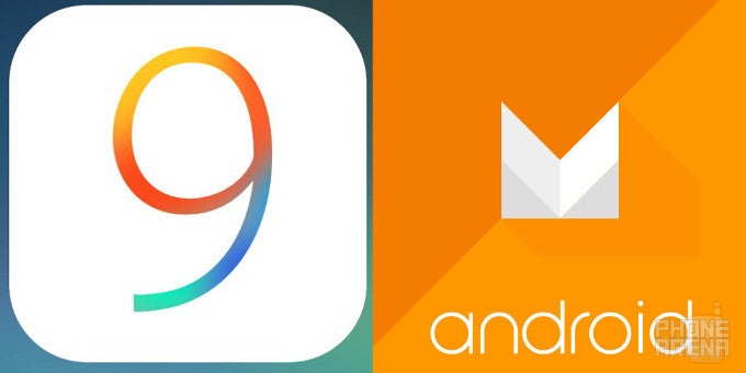
Apple and Google are pretty much done for this year in terms of operating systems. With iOS 9 and Android 6.0 Marshmallow officially out, we don't expect either of the giants to unveil anything exciting anytime soon as far as operating systems are regarded.
To be completely honest, both Android Marshmallow and iOS 9 are certainly not oriented at visually overhauling the platforms; on the contrary, both are centered around under-the-hood improvements that aim to enhance the user experience on a more basic, fundamental level by focusing on things like performance, battery management, and general feature polishment.
We've reviewed both, and guess what, there's little not to like about either of the platforms we mentioned. But which one do you like more? That's a question that has been lingering in our HQ for some time now. Hoping to put it to an end, we decided to devise a visual comparison between the two venerable mobile platforms and allow you to vote for your favorite one in a series of different polls. These will be open until October 19; we will reveal the winner afterwards.
Scroll down below and cast a vote wherever you feel appropriate!
Lock screen and home screen
In this section, you're going to evaluate each the lock screen solutions that Marshmallow and iOS 9 flaunt out of the box. The two haven't changed much in comparison with their previous iterations. However, in line with the under-the-hood proactive functionalities both platforms scored, the lock screens got tweaked, one more than the other. iOS 9 provides users with a shortcut to a frequent app in its lower left corner, while Marshmallow has ditched the dialer shortcut for a Google Now voice search one.
Well, the latter is not a very pro-active solution, but at least it now allows you to jump straight into Google Now in a jiffy. We also miss the dialer shortcut a bit, but hey, that's our opinion! We are interested in your opinions, though - vote and let us know which one looks better to you.
Quick Settings & folders
In this category, you will have to vote for the OS that implements quick settings and folders in a better way and more more eye-pleasing way. As you're certainly aware, Android Marshmallow comes with the very same quick settings pane that debuted with Lollipop. There are a couple of differences though - the new quick settings pane comes with a new Do Not Disturb toggle, as well as the ability to add, remove, or rearrange the items thanks to the hidden System UI Tuner menu. In Apple's camp, we are also greeted by a well-known friend of old, Control Center. It provides you with a couple of more important settings toggles, audio controls, as well as shortcuts for a couple of staple apps.
When it comes to folders, both platforms don't differ much. With a third-party launcher, Android users can change the appearance and styling of their folders, but the stock version of the OS doesn't allow for such intricate tweaks. Nor does iOS, mind you. In fact, both only allow you to rearrange the icons inside and change the names of the folders themselves.
Siri vs Google Now
In this category, both platforms have new weapons in their arsenals. For starters, Siri now has pro-active abilities and suggest regularly-used apps and contacts in the returned Spotlight Search page on the leftmost home screen. Android Marshmallow also provides app suggestions, but it does so inside the launcher. Additionally, Now on Tap is on board Marshmallow. You can read more about it in our review, but here is the "TL;DR" version: it's a proactive and contextually-aware functionality for Google Now.
Stock wallpapers
True, getting a custom wallpaper for your device is easy as abs regardless of the platform, but the on-board wallies are an integral part of the OS. That's why we decided that it's worth comparing them. So, give us your best shot at which platform supplies the better looking background pics.
We have not included the iOS 9 Live wallpapers that make use of the new 3D Touch feature. You can view and download them here, though.
App switchers
The app switcher of iOS scored a major overhaul with iOS 9 - apps get displayed in a more fashionable way now and browsing them creates an effect that reminds us of flicking a book's pages back and forth. On the other hand, Marshmallow's carousel app switcher, for the most part, has remained largely unchanged in comparison with what Android Lollipop brought to the mix last year. It still doesn't come with "clear all" button of sorts, but neither does iOS. That's one of our rather minor nuisances with both platforms.
It's also worth mentioning that if you're running Marshmallow and use Google Chrome as your go-to browser, by default your tabs will appear as separate cards in the app switcher. This feature can't leave people indifferent - you either hate it in the guts or can't live without it. The former type are probably glad it can be easily turned off.
So, without further ado, what do you think about the app switchers of iOS 9 and Marshmallow?
Settings menu
We can't help but love the search functionalities both platforms scored. No more aimlessly digging through the different menus, you can now search for anything and it will be promptly displayed. We're quite glad both platforms now employ such a time-saving feature. Another similarity is the light background both employ. Sadly, the stock dark theme of Marshmallow is nowhere to be found in the official release, so we are stuck with the default one. Same can be said for iOS 9, with the difference being we never saw evidence it might come with a dark mode of sorts.
It might be a minor feature, but undoubtedly allowing users to choose between white and dark UI theme will have a small, but beneficial effect on the overall user experience. Here's to hoping that iOS 10 and Android N will provide us with such a small but nifty functionality in 2016.
Keyboard
One of the not-so-major, but still beneficial improvements that iOS scored was the new uppercase keyboard. It beats us why it took Apple so long to implement such a feature, but anyway, it's here now and shows what case you're typing in. Hallelujah! In stark contrast, the stock Android keyboard is no stranger to such a feature as it has had it for some time now.
In contrast, the stock Marshmallow keyboard is not vastly different from the Lollipop one - save for a couple of under-the-hood API improvements, it doesn't offer any groundbreaking new feature, but we feel it's just as good the way it is at the moment.
Camera interface
Say what you want, but this is an aspect we are inclined to like the iOS solution more than the Android one. In case you're an avid fan of minimalism or other artsy movements that are ruled by the "less is more" approach, then Marshmallow's stock camera interface will feel just right. While this is not bad, the one of iOS 9 is much more functional. Most of the latter's features are displayed at all times, making it quite easy to turn on or off a given feature easily.
In terms of features, things have not changed much - apart from regular photos, the iOS camera app allows you to shoot Time Lapse, Slo-Mo, Panorama, and regular video as well. Oh, and let's not forget the new Live Photos feature.
The stock Marshmallow camera app is not different from its predecessor - Photo Sphere, Panorama, Lens Blur, and video recording are some of its defining features. The Nexus 6P and 5X's arrival will bring forth some other new features, namely camera burst and slo-mo.












Things that are NOT allowed: