Android 5.0 concept video has some good ideas

There haven't been a huge amount of Android concept videos, especially considering how many iOS concept videos we see (although the number is certainly higher than the number of Windows Phone concept videos around). But, designer Craig Tuttle has decided to put together a concept video with a couple very good ideas for changes that we may see in Android 5.0.
The basic idea is one that is very plausible: the expansion of the card UI that Google is so fond of. Most of that in Tuttle's view will come from an expansion of Google Now. We definitely like the idea of having Google Now cards embedded within apps, but having Google Now being part of the notification tray is highly unlikely. Remember Google can't integrate its services that deeply into the Android system, because that bottom layer is open-source. Google has to run its services as a closed-source middle layer between the open-source Android and the closed manufacturer UI.
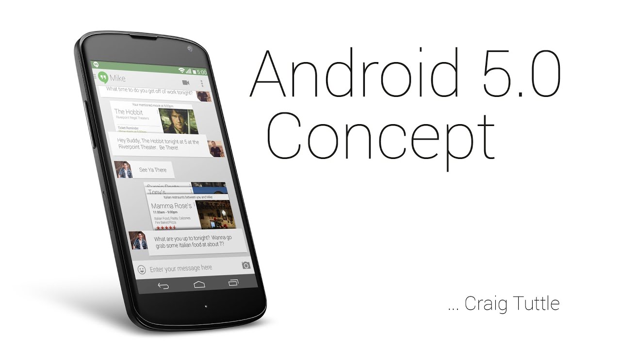
Tuttle's concept also has the idea to change the multitasking menu from the side-by-side card layout used now with a stacked card UI similar to the tab switcher menu inside the Chrome Android app. The only other change is the move to more white colors in the system, although once again that is unlikely because Google wants to get better battery life on AMOLED displays.

source: Craig Tuttle via Droid Life






Things that are NOT allowed: