Still doubt Android Q's upcoming dark mode? Google Assistant blacks out...

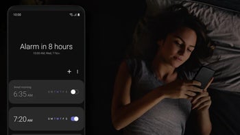
Samsung has a Dark Mode in its latest One UI interface, and Google is following suit with stock Android
In just the latest installment of a default Android app blackout, Google's Assistant gets a Dark Mode option in its newest beta edition, complete with white text on a black background.
Google is a bit behind in the dark mode game compared to manufacturer overlays, but it is steadily darkening the core Android apps to be gentler on your eyes at night and on the battery life of OLED display phones at any time. The next Android 10 Q version is heavily rumored to sport system-wide Dark Mode.
The feature has been "approved" for development by Google's software team and could very well be baked in when Android 10 Q lands. No surprise, as that is one of the most requested features that Android users have been clamoring for since time immemorial, to the extent that major phone makers started implementing it in their own interface overlays due to popular demand.
The latest Google Assistant beta is Google's latest experiment in dark-moding, and as such has some teething problems like inconsistent coloring and glaring contrasts. The cards, queries list and results are all blacked out, while the rest of the interface is glaringly white. It's a step in the right direction, though.
Darkening in the latest Google Assistant beta can be enabled by switching "Night mode" in Android Pie’s developer options menu to "Always on," or it will turn on automatically when the phone kicks into battery saving mode.


Things that are NOT allowed: