Android 10 with One UI 2.0 on the Samsung Galaxy S10+: Hands-on with all the new features
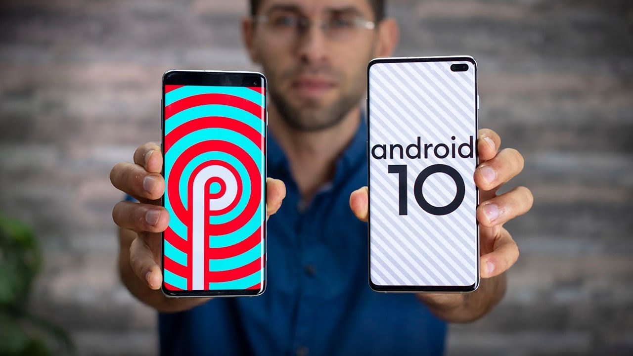
Update: The software update is now rolling out to all eligible Galaxy S10, S10+, S10e, Galaxy Note 10 and Note 10+ devices across multiple regions right now.
What's new?
Let's summarize the changelog real quick:
- Full screen gestures
- Enhanced one-handed mode
- New Media & Devices
- Enhanced Biometrics
- New Battery usage graph
- Improved Digital Wellbeing
- Enhanced Samsung Internet, Contacts, Calendar, Reminder, My Files, Calculator
- Android Auto is now preloaded
- Removed Android Beam
- Redesigned camera UI, AR Doodle included
- Screen recording with selfie recording feature
With that out of the way, let's dive a bit deeper into Android 10 on the Galaxy S10!
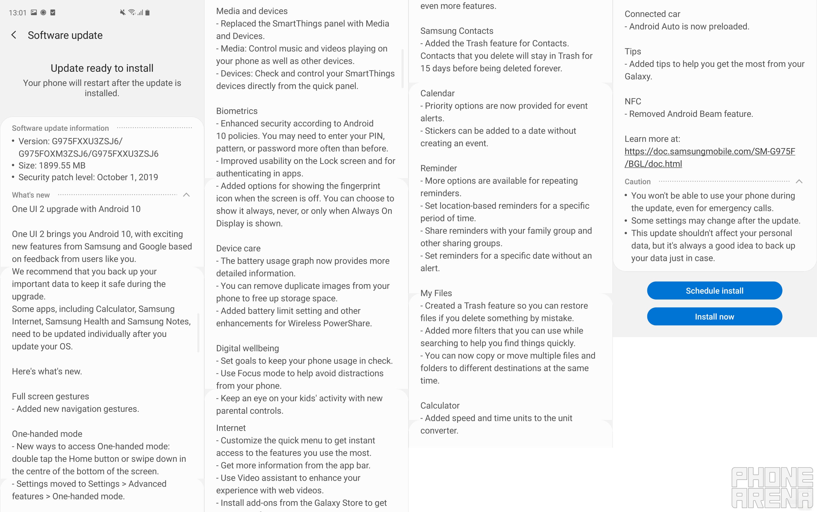
Full Android 10 changelog for the Galaxy S10+
Galaxy S10 Android 10 software update release date
Overall feel and impressions
To sum it all up, Android 10 with One UI 2.0 doesn't feel very different that Android 9 with One UI 1.1. Actually, you'll be hard-pressed to notice any striking differences at first, second, or even third glance. After all, One UI made its official debut earlier this year, and we never expected Samsung to come up with yet another groundbreaking redesign in such a short manner of time. We got just what we expected we'd get: an interface that looks virtually unchanged from a visual standpoint. Of course, some subtle changes can be seen here and there, but overall, the changes are not visual ones.
It may come across as a large cliche, but the vast majority of changes are under the hood ones that improve or enhance the functionality of the device. Things like Google's new gesture navigation, improved device care stats, and Digital Wellbeing are now part of One UI, but if you don't ever look for them you may hardly stumble upon them.
Welcome, Google gestures!
Initially, Samsung's gesture-based navigation was a rather half-baked implementation - users had to stretch their finger all the way to the bottom of the display and swipe up to go back, go home, or access their recent apps. Just like the navigation button layout of old, Samsung's original navigation gestures were merely an afterthought that was arguably inferior when compared to the gesture-based interfaces of most other manufacturers.
With Android 10, One UI 2.0 gives users vast options for navigation. By default, it uses Google's interface, which utilizes swipes from the sides and the bottom and is akin to iOS' gestures. There's still the old option to swipe up from the bottom of the display to navigate the interface, and if you really, really insist, you can still use the good ol' navigation buttons. Google's gestures are superior to the other options, so we ended up using them full-time.
A very useful new feature is the back gesture sensitivity, which lets you fine-tune the back gesture when you're using a larger case that makes touching the edge of the screen a bit harder than usual. You can also allow the back gesture on the keyboard, but you need to explicitly enable this feature in the settings.
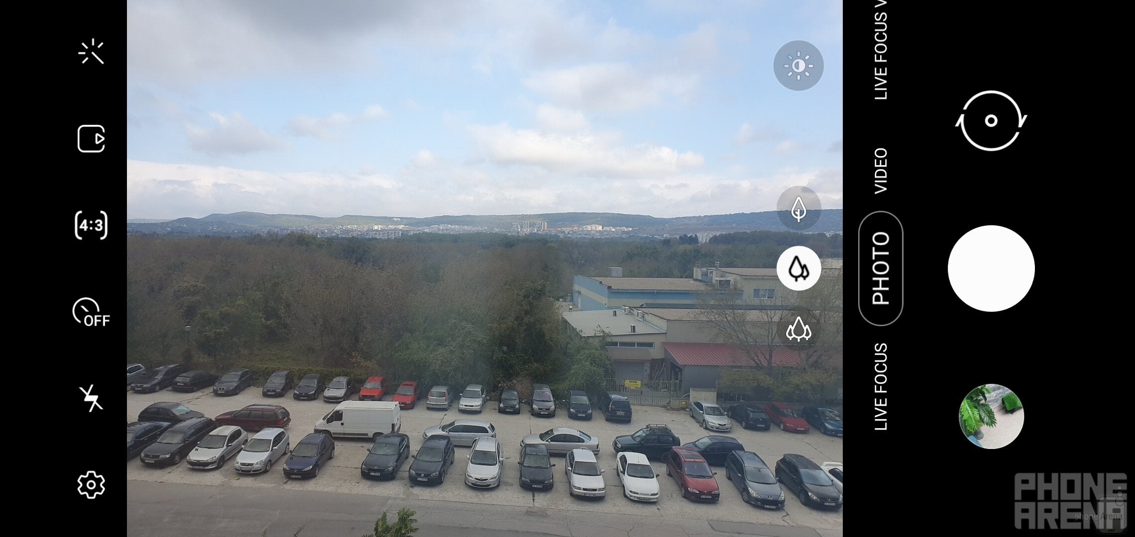
New camera UI
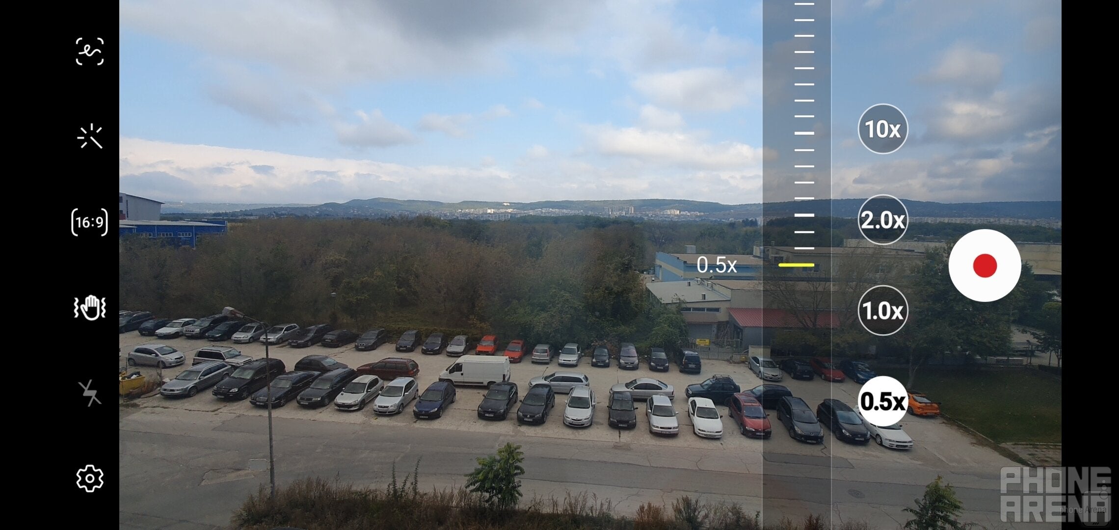
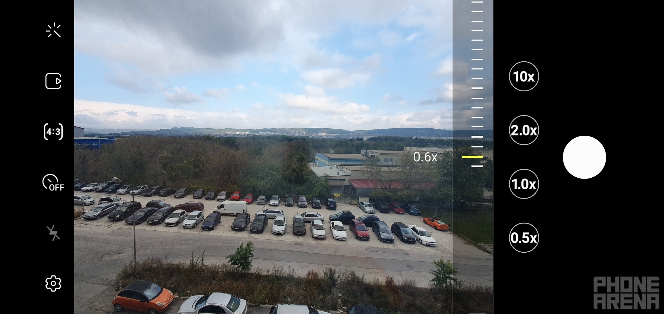
The interface of the camera app has also been changed... and is now a bit different. Not sure if I like this change in the interface, but it's definitely something worth mentioning. There are a couple of stopgap zoom levels when switching between the different cameras, and there's the new AR doodle present in the selfie camera as well.
Built-in screen recording
Samsung has also thrown in a very useful screen recording feature that lets you record your screen in 480, 720, or 1080p, and even record yourself with the selfie camera in a livestream fashion. Very useful when it comes to gameplay recording, but have in mind that the interface stutters a bit while you're recording, so heavy 3D games will probably be a bit more taxing on the overall performance.
Suggested notification actions
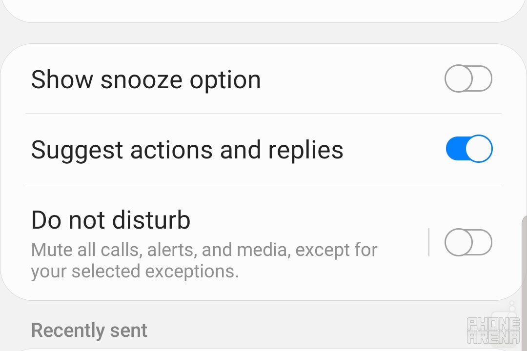
Android's smart notifications have also been invited to the One UI 2.0 party. They are now smarter and work with almost all messaging apps you might think of. The smart replies now suggest contextually-aware replies and even emoji straight in your notifications, which makes replying quickly and adequately a very easy process. Additionally, Smart Reply can suggest relevant actions: if someone sends you an address, a button will pop up, allowing you to directly launch Google Maps with the address in the forefront. It's nothing groundbreaking but can be still perceived as a useful small feature that will save you some time here and there.
Volume sliders, redesigned
One feature that was implemented by no other phone manufacturer aside from Google itself were the redesigned volume sliders. It seems that every phone maker has decided to use its own rendition of the essential functionality and opt out of Google's recommended looks for the volume sliders. Samsung is no different - the new volume sliders with One UI 2.0 are sleeker and more compact, taking up less screen real estate. The animation is different as well.
Enhanced Device Care & battery stats
The battery section in the Device Care submenu in Settings have been redesigned and now display all the information in a more concise and visually-cleaner matter. The battery usage stats are now a bit easier to read and screen-on time is way easier to see in case you want to brag about your battery's endurance online.
Wireless Powershare battery limit
You can now set a specific battery percentage at which the Wireless Powershare option will disable itself. Previously, the feature wouldn't work below 30%, but you can now select any battery level between 30 and 90% to automatically turn off the reverse wireless charging functionality.
One-handed mode
One-handed mode has also seen some changes, mainly in the way you access it. To do that, you need to swipe straight down from the very bottom of the screen, which is not the most intuitive way to do this... until you get the hang of it.
Lockscreen and Always-on display changes
There is now a very smooth transition animation between the always-on display and the lockscreen, which is enhancing the visual cohesiveness of the interface as a whole. Additionally, you can have the in-display fingerprint scanner icon to be always on, to show only when always-on display is on, or never show. This will come in handy when you need to unlock your phone quickly but don't want to unnecessarily fidget around in search of the correct spot on the display.
Digital Wellbeing
It's now easier than ever to set screen time goals and keep them in check with the new Digital Wellbeing menu in Settings. Parents can also keep tabs on their kids device usage and screen time as well.
Stock apps updated
Many stock apps have also been updated. For one, Contacts scores a Trash option that will keep any deleted items for up to 15 days. The Calendar app scores sticker support and priority options for event alerts. You can set location-based reminders for a certain amount of time, and more options will be available for repeating reminders. By the way, there's anew Trash feature in the My Files option as well. If you fancy Samsung's unit converter, you'd be happy to know it now supports speed and time units as well.
In with the new, out with the old
Android Auto now comes preloaded with One UI 2.0, while a core Android feature - NFC Beam - has been depreciated in the new software update.






Things that are NOT allowed: