In a world of iPads and Honeycombtablets, one operating system stands truly unique – you guessed itright, it's webOS. As we're approaching the “summer” release dateof the
HP TouchPad, folks over at PreCentral have gotten hold of fiveprecious screenshots of webOS 3.0, the tablet-optimized version ofthe platform.
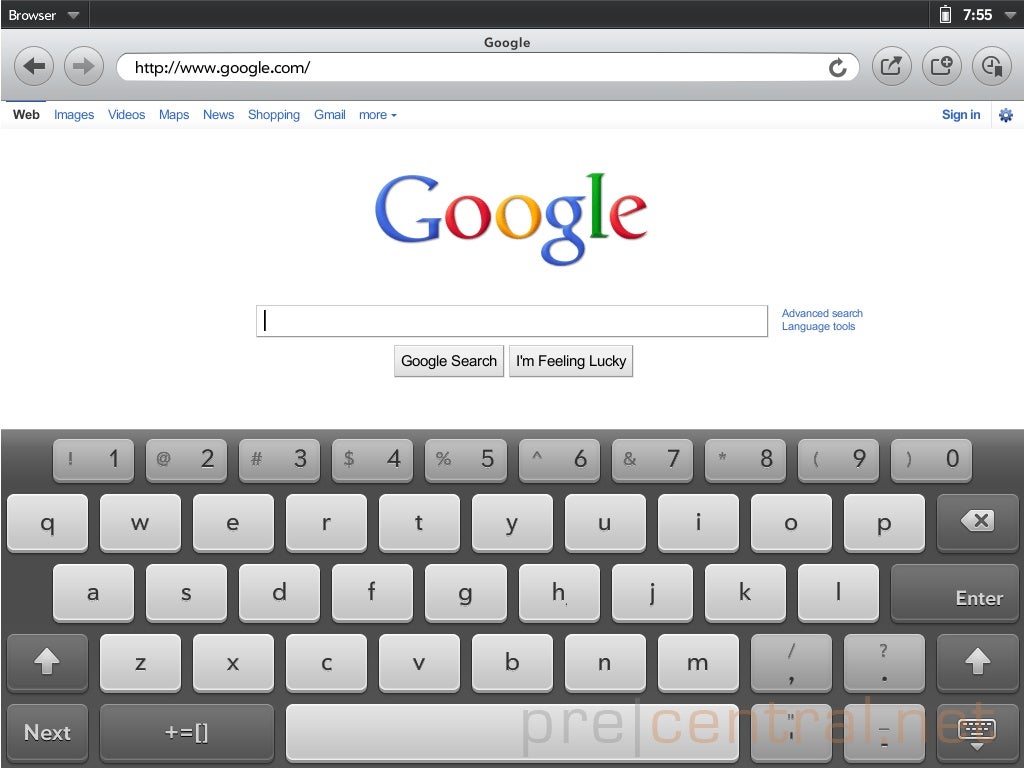
First and foremost is the wittilycalled "
Browser." You should be already familiar with theon-screen keyboard on webOS 3.0, but nothing is better than a realscreenshot confirming a five-row layout, with a separate row fornumbers and symbols. The default seems to be for lowercase letters,at least until you switch using the Shift button, just like on aregular keyboard. Everything keeps the signature webOS looks with thefamiliar Prelude font, rounded shapes and minimalistic styling. Thetop holds navigational keys, as well as three buttons on the rightfor sharing, opening a tab and bookmarks.
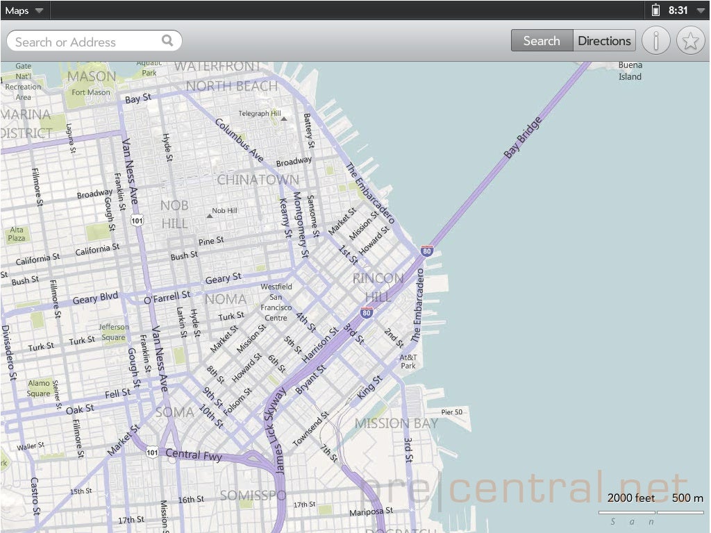
In the Maps department, settings lookaustere as well, freeing up space on the 9.7-inch screen. You have a searchbox, as well as separate buttons for switching between "Search" and "Directions." Finally, the top right holds the additionalinformation and bookmarks keys. By the looks of it, we're treatedwith
Bing maps. While it definitely has its pluses such as the scalebar in the bottom right, we would prefer to see the data-rich GoogleMaps.
Messaging is equally simplified, withtwo panes allowing you to view your contacts (on the left), while youchat with a particular person (on the right.) Next on the list is thecontextual menu, brought up by hitting the upper right cornerclock/battery bar. It grants you quick access to the date, batterystatus and brightness controls among others. You'll also see the VPNtoggle switch, particularly useful for corporate folks.
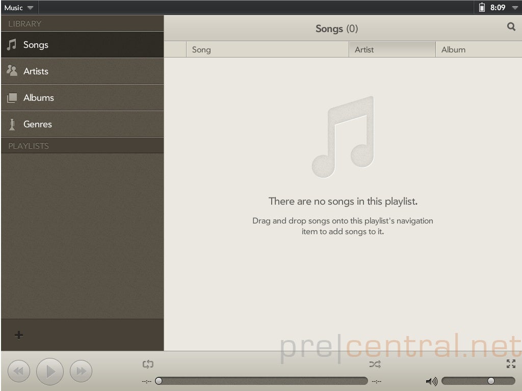
Finally, the
Music application carries strong resemblance to iTunes,both in color and styling. We can't say much except for the obvious –it supports filtering your media by songs, artists, albums andgenres. Finally, we still have months until summer, soeverything is subject to change, but it's very likely for the basic appsto stay this way. So what are your thoughts - webOS 3.0 has the looks, but will it match otheroperating systems in content? Sound off in the comments below.
source: PreCentral
Thanks, Philip!
Read the latest from Victor Hristov





Things that are NOT allowed: