A look back at the evolution of HTC's smartphone designs
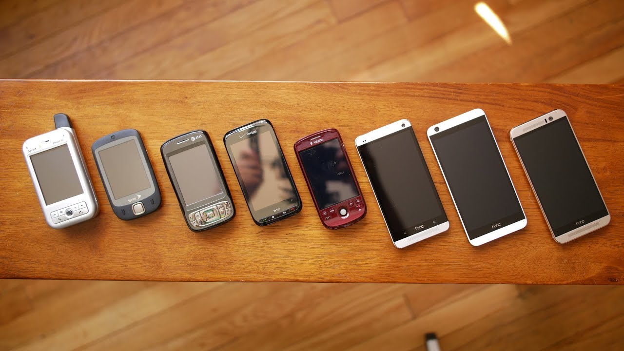
Before anything else, most people initially judge a smartphone based on its design. So, just like in real life, something appealing to the eyes tend to evoke favorable opinions about it from a cursory look. If it's terrible, or just simply cheap looking, opinions would reflect that. First impressions are without question extremely important, so that's why having a good design is the foundation that can help a phone achieve recognition right from the onset.
The beginning with Windows Mobile
We all know that HTC's humble beginning began with Microsoft's Window Mobile platform, one of the dominant smartphone operating systems in contention during the 2000s. Back during the early 2000s, many of HTC's smartphone were white-labeled products, often being rebranded after the respective carriers that were selling its phones. Take the HTC Apache for example, which was rebranded as the Sprint PPC6700 over on Sprint – while Verizon received the Verizon XV6700.
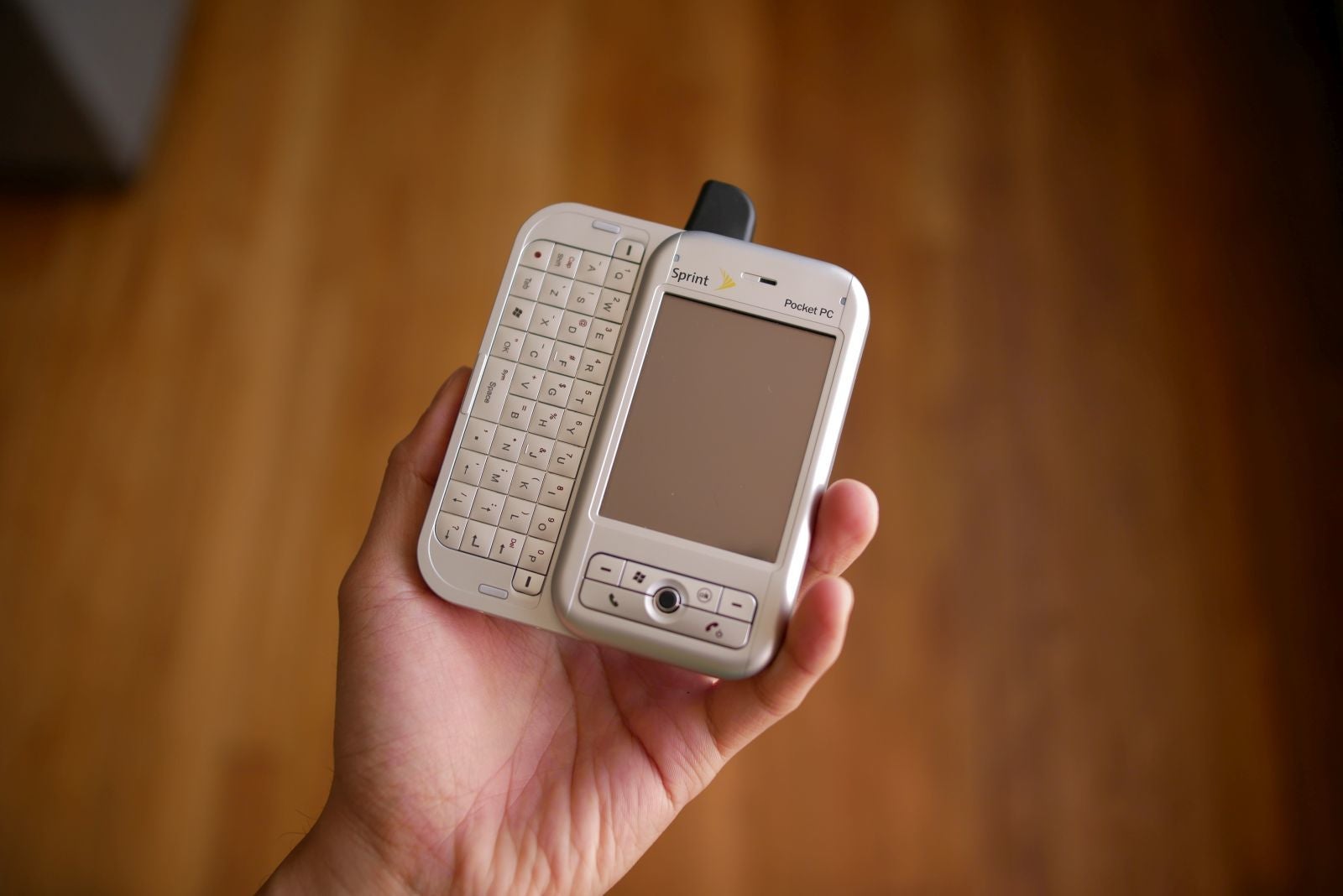
The Sprint PPC6700, one of the many white labeled variants of the HTC Apache.
The designs of these early Windows Mobile smartphones were uninspiring to say the least. Not only were they fashioned after PDA designs, accompanied with nubs for their antennas, but their silver plastic bodies seemed like a throwback to the antiquated boxy designs of PCs throughout the 1990s. Through the mid-2000s, smartphones like the HTC Wizard, Tytn, and P3600 Trinity, featured designs that followed after this practice. During an era dominated mostly by flip phones, the only reason why HTC's designs stood out from the pack was because of their brick-like sizes and large touchscreens.
From left to right, the HTC Wizard, HTC Tytn, and HTC P3600 Trinity.
Enter the touch and cleaner designs
Things really began to change with HTC's design language with the release of the HTC Touch in 2007. Who knows if Apple's unveiling of the original iPhone had anything to do with this redirection, but the HTC Touch offered a totally new design language that made consumers take notice. With the early HTC phones, you could say that they were trying to emulate the laptop design, evident in those physical keyboard and vast buttons littered throughout its phones. However, the HTC Touch simplified things with fewer buttons and going after that all-touch implementation.
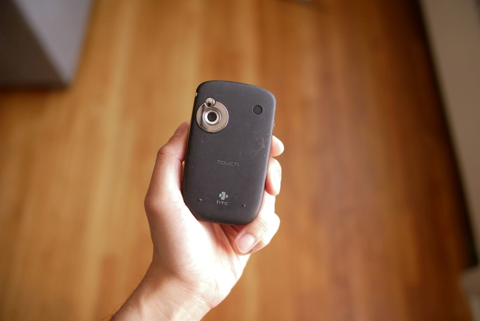
The HTC Touch introduced a brand new design language starting in 2007.
On top of that, this is also when we began to see shift. Gone was the ghastly silver plastic that dominated many of HTC's early smartphones, replaced with other materials that were more inviting – like the soft touch matte finish of the HTC Touch. Not only that, but now its phones were slimmer, more compact in size. This new design language flourished throughout 2007, when subsequent phones like the HTC Touch Dual, HTC Touch Cruise, and HTC Phoebus (aka T-Mobile Shadow) all followed suit.
From left to right, the HTC Touch Dual, HTC Touch Cruise, and HTC Phoebus (aka T-Mobile Shadow), which all leveraged the new design language established by the HTC Touch.
The birth of solid industrial designs
HTC's brand recognition was climbing steadily by the time 2008 came around, because this was arguably the turning point for when we all began to regard HTC as a premier designer. The term industrial design entered out vocabulary thanks in part to a couple of new HTC smartphones introduced in 2008 – the HTC Touch Diamond and HTC Touch Pro.
The HTC Touch Diamond and Touch Pro ushered us into the industrial design age with their superb designs back in 2008.
These were still running Windows Mobile, but their designs were unbelievable because they were original and unlike anything else seen during the time. These industrial designs featured reflective finishes, gunmetal frames, and angular cutouts that simply made them stunning – exuding a new benchmark of premium design that was largely absent in other phones. The transformation here was akin to how the Motorola RAZR upended the traditional flip phone design, as it was cool, sleek, and sexy. To HTC's credit, they delivered the same level of meticulousness and craftmanship with its phones.
The early days with the open handset alliance
Interestingly enough, HTC's progress in design didn't necessarily carry over when they joined the open handset alliance. Even though the T-Mobile G1 (aka HTC Dream) and subsequently the HTC Magic helped to establish HTC's presence in Google's brand-new Android platform during 2008 to 2009, it could be argued that the designs were rather dull – in comparison to the stuff they were putting out with its last line of Windows Mobile powered smartphones.
The industrial designs that HTC was known for didn't necessarily translate over to its first Android offerings, the T-Mobile G1 and the HTC Magic.
Saving the best for last with Microsoft
While those Android smartphones were a stark departure, the Windows Mobile smartphones that HTC released under its umbrella during 2008 and 2009 continued to push the boundaries. Successive devices, like the HTC Touch Diamond2 and HTC Touch Pro2, showed iterative growth within its industrial design philosophy. Even more impressive, HTC perfected its craft of keyboard designs – evident in the Touch Pro2's superb landscape layout and tilting function. Conversely, they also showed us that they could whip up an equally compelling looking portrait QWERTY smartphone, just like what we saw with the HTC Snap.
The HTC Touch Diamond2, Touch Pro2, and Snap, all exhibited HTC's great designs during its Windows Mobile days.
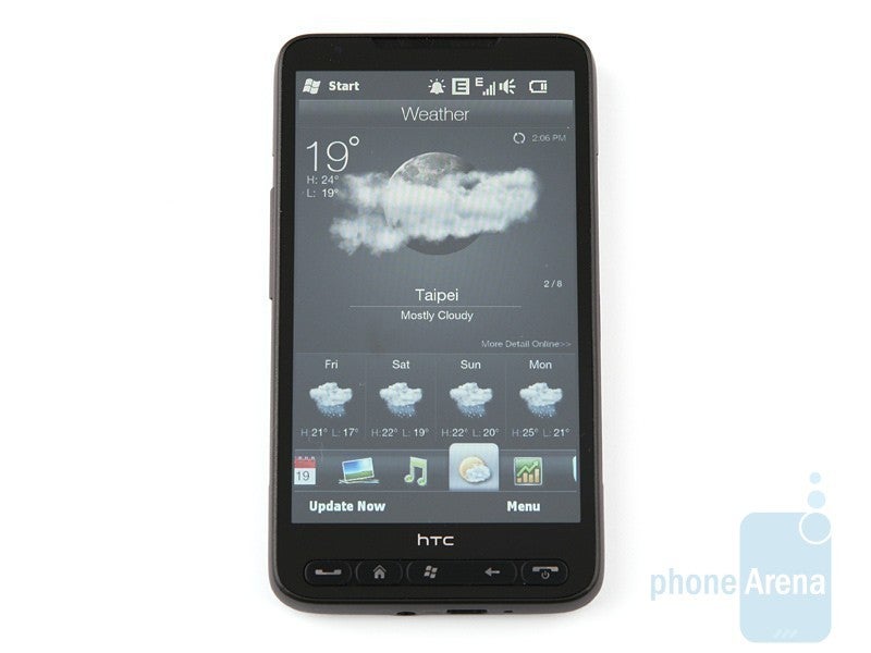
Many would agree that the HTC HD2 was the pinnacle of industrial designs for Windows Mobile smartphones.
And here comes the hero
HTC's first two Android powered phones didn't necessarily convey the company's signature design philosophies we saw with its last few Windows Mobile smartphones, but that all changed with the introduction of its third Android effort. Coming in at just the right time, the summer 2009 released HTC Hero brought on some of the familiar industrial design characteristics that the company had been known for. And you know what? It was every bit of a hero device, distinguishable and unique for its industrial design, Teflon coating, and protruding chin.
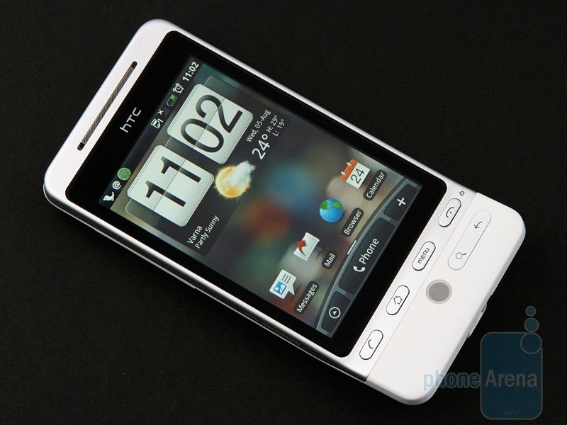
It took them a few tries, but HTC finally delivered a beautifully designed Android smartphone with the HTC Hero.
The following year, we saw yet another milestone with HTC's designs thanks to the 2010 released Google Nexus One – sold exclusively through Google. HTC's expertise was again on showcase with the Nexus One! Although it ditched the angular cutouts of its previous offerings, the curvier looking chassis was comprised out of a metallic frame and two large rubbery plastic surfaces. The way that these two materials meshed with one another really added to the phone's distinctiveness and premium construction.
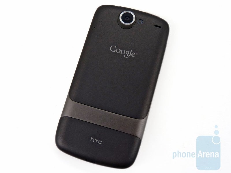
Another design milestone came with the arrival of the Google Nexus One in 2010.
The HTC Desire, EVO 4G, and Droid Incredible all featured iterative designs that came from the Nexus One.
The period of the ones
The next major design evolution we saw from HTC came in 2012, when polycarbonate became the material of choice for its flagship smartphone in the HTC One X. While it felt incredibly solid for a phone employing plastic, it was a stark roundabout from the metal cladded bodies that the company previously leveraged. Then again, the minimalism of the design is exactly what made it stood out from the crop. Naturally, this new design language became the standard for HTC's other smartphones in 2012 – including the HTC EVO 4G LTE, Desire V, Desire X, One X+, and One VX
The HTC One X (left) introduced a polycarbonate frame, which eventually made its way to the HTC EVO 4G LTE (middle) and Desire V (right).
HTC might've stuck with the "One" moniker for some time, but there was really one that caused the biggest stir with its design. That happened the following year, as the One X's successor, the 2013 released HTC One (M7) came to light – showing off an unprecedented design that many consider to be one of the best designed phones of all-time. Highly regarded as a landmark moment in design, the HTC One M7 featured a symmetrical design with its aluminum plates, chamfered edges, and slightly curved back. Everything about the design was astounding, which was yet another testament to the ingenuity of HTC's designers!
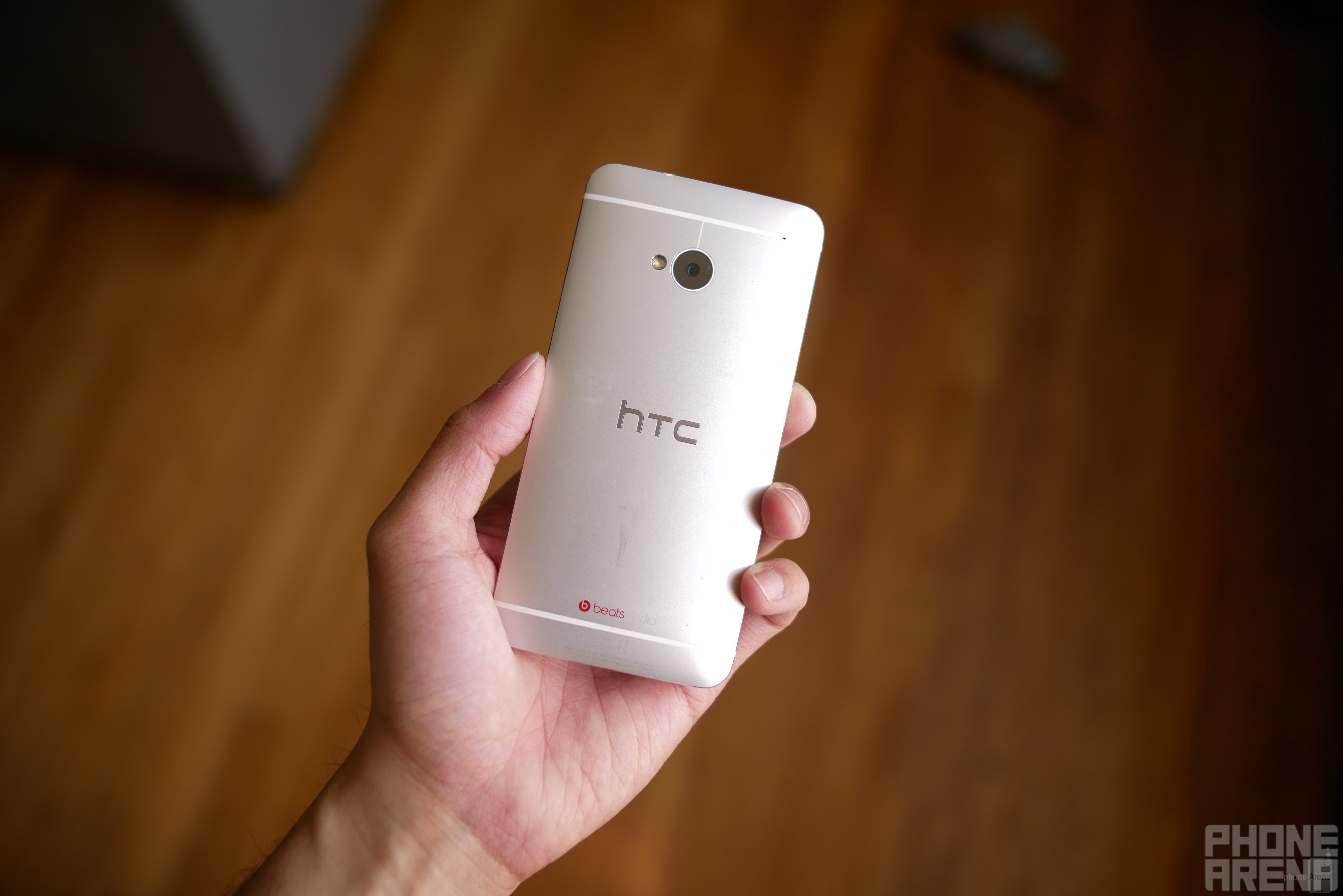
The HTC One M7 is highly regarded as one of the all-time, best designed phones.
The fun and desirable
Just because HTC was going after premium qualities with its flagships, that didn't prevent them from experimenting with other materials in its other line of smartphones. The Desire line, in fact, saw a radical change during 2013, starting with devices like the Desire 600, which featured an all-plastic construction. Additional phones in the line, like the Desire 700, 816, and 820, followed this new implementation. Even though they weren't as premium with their designs, there was a charming quality to them that allow them to attract a younger audience. In particular, the bright colors used with its design really allowed them to pop!
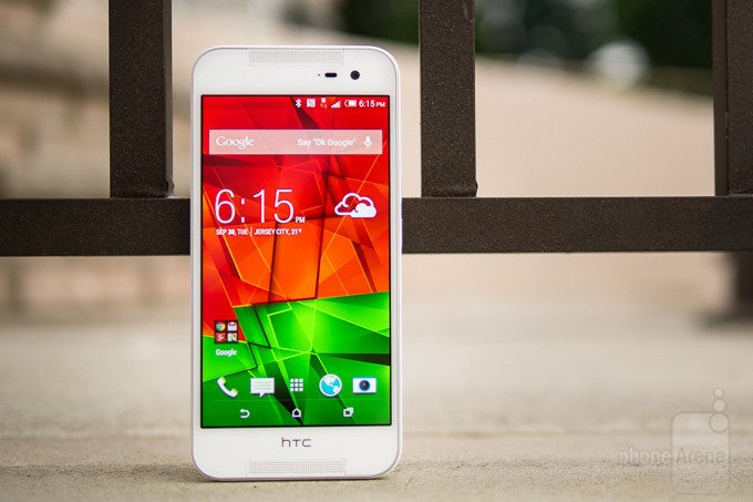
A water resistant construction finally arrived with the HTC Butterfly 2.
A last hoorah with metal
The increase in competition leading up to arrival of the so-called tenth major flagship device in HTC's history, the HTC 10, placed the Taiwanese company into a bind. Dropping the "one" from the name, the shortened HTC 10 didn't disappoint to deliver yet another outstanding and superb design – one that was largely underappreciated, due to HTC's position in the space. As it turned out, it was going to be the last flagship in its stable to don the all-metal construction. Going with what made its One series so popular, the HTC 10 followed suit with an aluminum body, accompanied with chamfered edges on the back.
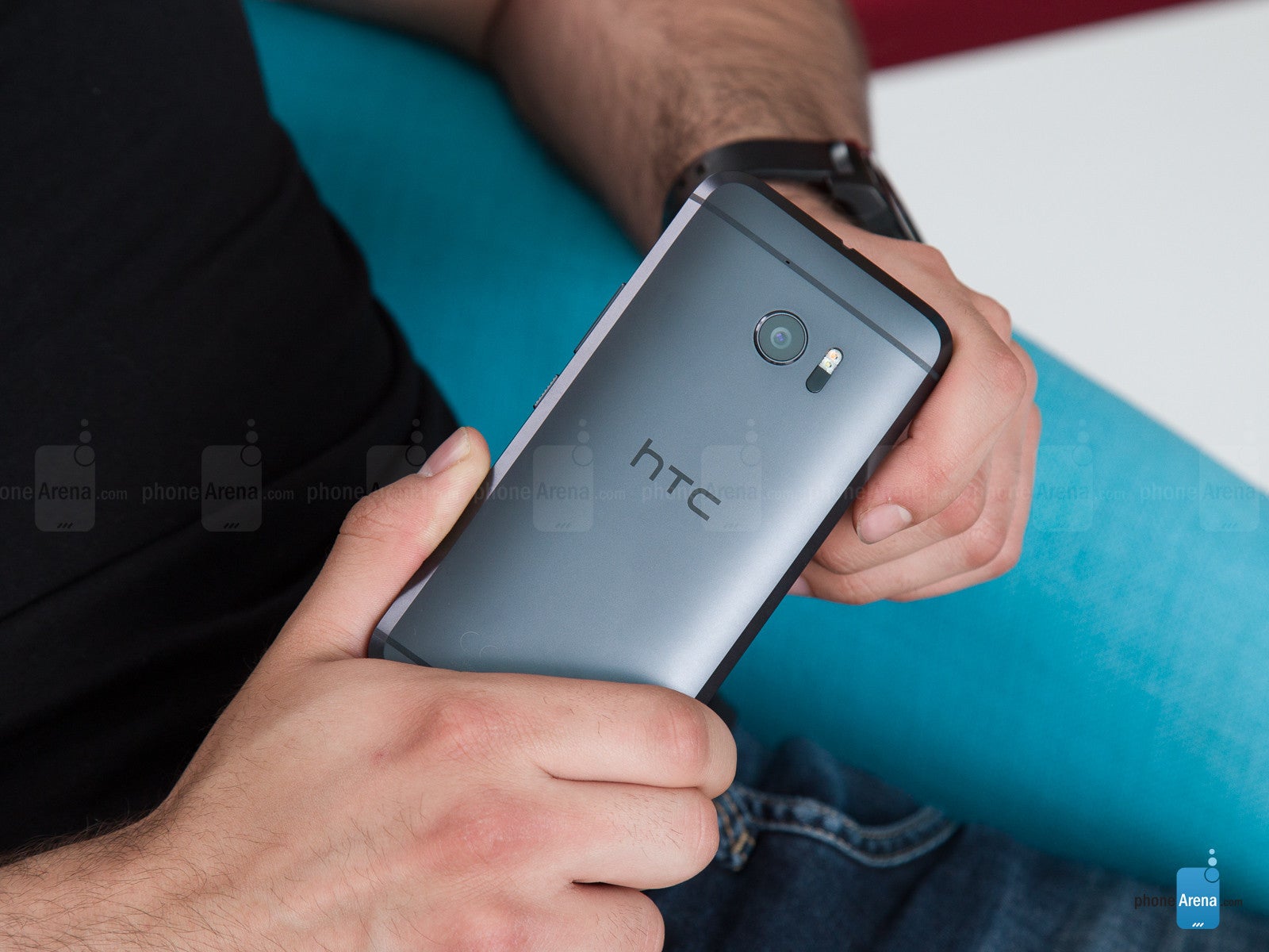
The HTC 10 was the last flagship from HTC to feature an all-metal design.
When you look at where HTC started with its Android smartphones, like the HTC Hero back in 2009, to what they delivered in 2016 with the HTC 10, two common themes kept on reoccurring with its major phones. One was the decision to go with metal, giving its phones the premium quality to stand out. Secondly, they all featured meticulous industrial designs that were never replicated by the competition – making them ever so unique! And that's probably why HTC's designs were frequently acclaimed!
Following the trends
In 2017, smartphone designs shifted to a glass meets metal construction – something that was adopted by many of the big players in the space. HTC jumped on the trend as well with the arrival of the HTC U Ultra, an obnoxiously large phone featuring a brand-new glass and metal design. While the flashy and piercing color made the phone radiate at certain angles, it was largely lamented for its wasted space. For something so large and spacious, it lacked a headphone jack and packed a skimpy 3000 mAh battery.
Releasing the HTC U11 and U11+, the designs weren't as original than what we've gotten in the past from the company, seeing that they looked very much like its contemporaries. Covered in the front and back with glass, with a metal frame sandwiched in between, the U11 and U11+ just kept on going with the trend that was running its course during that time. For the time being, it appears as though this is the format that HTC will be utilizing, but you never know, they might surprise us with something different.
HTC opted to go with a metal meets glass design with its most recent phones, the HTC U Ultra, U11, and U11+.
A look back at the evolution of HTC's smartphone designs
Follow us on Google News




Things that are NOT allowed:
To help keep our community safe and free from spam, we apply temporary limits to newly created accounts: