A first look at Android O's new features: Here's what arrived along with Developer Preview 2

Google's developer summit, I/O 2017, kicked off yesterday with an official two-hour keynote that had Sundar Pichai and other head honchos unveil tons of new features and functionalities that will grace Google's ecosystem later this year. Among the more important ones was the newest Android O beta, which was released shortly after the keynote and is now available for adventurous folk willing to experience the latest improvements head-first.
Before we head on, make sure to check out our main overview of Android O, as well as the official summary of all the new features:
Being adventurous ourselves, we did just that. Here's the latest beta, with most of the novel features dissected:
Picture in Picture & Dots
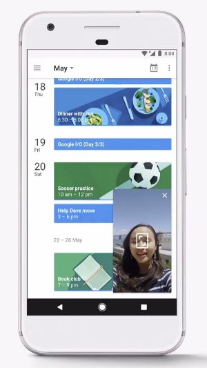
Picture-in-Picture mode in action
Just as we explained yesterday, Fluid experiences envision Google's goal of creating a non-interrupted user experience.
In case you're watching a YouTube video or in a video call with your mom, you might want to use the new Picture in Picture mode and send the video to a floating window while you continue doing what you were doing before. That's quite useful, given that certain apps like Google Duo are incompatible with Android's existing split-screen mode.
If you think Picture-in-Picture tops the cake, think again - Dots is another intuitive new functionality that lets you quickly explore each app's pending notifications on the fly.
Upon receiving one of these, a small dot will appear on the top right corner of the app; if you press and hold the app icon for over a second, a redesigned long-press menu will pop up.
Aside from showing you the notifications, it also provides access to some specific quick actions for most apps. You can then interact with the notification or simply dismiss it by swiping.
Easy access to widgets
While it's not a major feature, the quick access to an app's widget is a welcome and mostly intuitive addition to Android O. Long-press an app's icon and tap the checker icon at the top to access the available widgets of the app and add any of them to the home screen. It's never been more intuitive to see what apps come with widgets on deck.
The "i" icon immediately to the right of the checker icon does just what you suspect - opens up the corresponding app's info panel, where you can micro-manage its various aspects.
Quick Settings redesigned, again
The new Android O beta introduces a new color scheme for Android's Quick Settings shade. Previously employing a dark gray/teal color combo, Android O's newest shade is now fashionably grayscale, with dark icons plastered over a predominantly white background. How are you liking it?
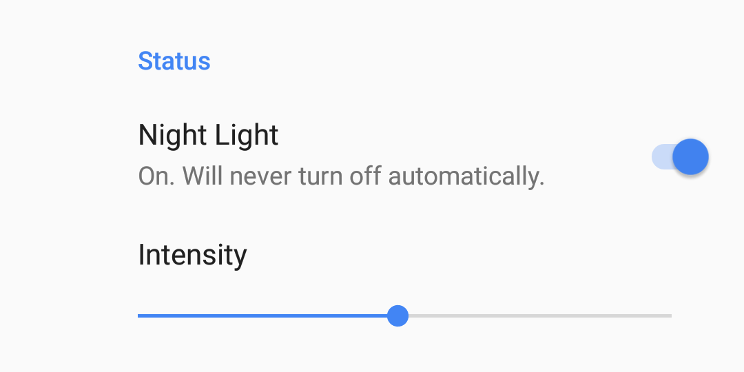
Night Light now employs a slider
The nifty feature that turns your screen amber in order to help you fall asleep faster, Night Light, now comes with a slider that lets you fine-tune how much blue-light reduction you want to have.
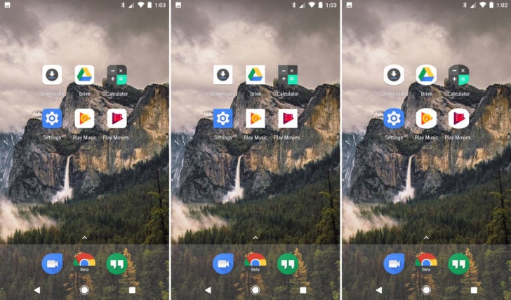
Icon shape selection
Squircle, cylinder, or square - you can now select stock icons' shape. Mind you, it's strictly a Pixel Launcher feature as of now, and who knows if it will make it to the final build at all.
New emoji!
Let's face it, Google's stock emoji have always looked a bit weird, but luckily for all millennials that practically live in Instagram, Facebook Messenger, and whatnot, Google's aiming to redefine their emoji game. And what's a better way of doing that than overhauling the emojis themselves? Good riddance, blobs, you're succeeded by a much more expressive and non-ambiguous bunch of emojis that are rounder and way more colorful than before. Overall, a good visual change that gets a seal of approval!
Gboard live transliteration
Google is definitely not forgetting its Gboard keyboard and is supercharging it with new live transliteration feature. Currently with a host of languages, it lets you key in text in Latin and it will be automatically transliterated to Sanskrit, Bengali, Manipuri, Malayalam, Mathili, and so on.




Things that are NOT allowed: