6 things iPhone does better and Android should steal (and a few the iPhone should copy)
This article may contain personal views and opinion from the author.
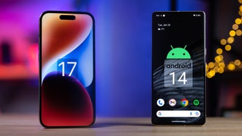
The iPhone 15 series is now reality and iOS 17 has been pushed out to all compatible iPhones out there. Thus, we are about to enjoy new features, and polished old apps, coming to Apple’s ecosystem. Did you update already? There's little reason not to.
But you know how it is — ideas have a tough time sitting in one place. Sometimes, iOS might appropriate an idea that was introduced with an Android update, sometimes there’s an iOS feature that magically makes its way to the land of green bubbles and borgs.
After years and years of such exchanges, is there anything left? Well, here are six features we wish Android would take from the iPhone and iOS.
But you know how it is — ideas have a tough time sitting in one place. Sometimes, iOS might appropriate an idea that was introduced with an Android update, sometimes there’s an iOS feature that magically makes its way to the land of green bubbles and borgs.
Conversely, we have a few features that could make any upcoming iOS update a major news for iPhone fans, provided that Apple considers borrowing these features.
Come on, this is easy. The only Android smartphone manufacturer that has incorporated a mute switch is OnePlus, and they are excellent. Well, maybe it’s a bit more confusing, because OnePlus phones have a triple slider — sound, vibrate, full mute — which is a bit redundant.
But it’s still convenient and fun to widget with — there’s nothing like the good old iPhone mute switch to quickly go into vibrate mode. It’s such a simple concept that we are kind of shocked nobody else has experimented with it yet. Also, we can’t say we won’t miss it now that Apple has begun replacing it with an Action Button on the iPhone 15 Pro. Boo!
Apple was late to the widgets party, as it finally gave us the ability to place widgets on an iPhone’s homescreen with iOS 14 — about 11 years after Android Cupcake experimented with the widget idea.
But, as Apple does, it did put its own spin on widgets with the new Widget Stacks. Basically, you can store multiple widgets in one spot — like a folder — and access whichever one you need by scrolling through them in-place. Or, activate Smart Stack to have the iPhone display relevant information based on your daily habits.
This feature is neat, useful, and fun, and Samsung quickly added it to One UI. And, indeed, some launchers you can find on the Play Store will also grant you access to widget stacking or widget grouping. However, it hasn’t made it to core Android as a baked-in feature yet.
I’m sorry, but the Android quick toggles section inside the notifications shade is simply not as useful or intuitive. Especially since Google decided to create these big unifying tiles for the quick toggles — why is my Wi-Fi toggle hidden in a big puck that also holds my Mobile Data settings?
Brightness adjustment is also a bit of a chore, since it’s a tiny horizontal slider, that may or may not appear when you swipe down once — some phones require you to fully open the notification shade before you get access to a simple brightness setting.
Granted, quick toggles on Android can hold way more buttons, and allows you to edit and arrange them as you will. Meanwhile, the Control Center in iOS is more limited, and some sections can’t be moved, as per the “Apple knows best” rule.
But you know what? Control Center is still able to give me quick access to the most important controls of the phone, that’s easy to navigate with just a glance. Some Android phones realise this — we’ve seen Control Center-type menus on Xiaomi and Huawei phones, maybe on some versions of Oppo’s Color OS.
But any other Android phone, out of the box, has a quick toggles menu that’s a chore to study and arrange.
You often hear people talk about “the Apple Ecosystem”, and we often assume this is iMessage. But, in reality, Apple devices simply “talk” to each other. For example — I can press Cmd+C on a text highlight on a MacBook, and instantly go to my iPhone and press “paste” over a text field to instantly get whatever was in the clipboard.
This also works vice-versa and includes any iPad or Mac you may have logged in your iCloud account and currently being close to each other.
But that’s just the tip of the iceberg, as Continuity and Handoff let you start one webpage on one device and continue reading it on another, begin composing an email and continue on another machine, et cetera.
Samsung definitely saw the value in this and has some of these features — shared clipboard works seamlessly between Samsung tablets, phones, and laptops. However, Android developer Google hasn’t really reached a point where its own devices talk to each other so effectively. It basically relies on the Windows Phone Link feature, which isn’t really a smooth operator currently.
What Android should borrow from iOS
Support
Getting an iPhone entitles you to years of prolonged software support, upwards of five years in recent years. Just the other day, for example, Apple released iOS 17, which supports the iPhone XR, iPhone Xs, and iPhone Xs Max, all of which were released in 2018.
With Android, it's up to each manufacturer to determine just how long it will support its Android phones. Google, interestingly, isn't exactly a poster child in this regard. While the most recent Pixel phones get five years of security patches, they are entitled to just three major Android software updates.
In comparison, Samsung recently committed to four years of major software updates and five years of security updates, definitely a step better than Google's Pixel phones. The same applies to OnePlus' flagships, which also matches Samsung pound for pound and has surpassed Google in support.
The Mute Switch/Action Button
Come on, this is easy. The only Android smartphone manufacturer that has incorporated a mute switch is OnePlus, and they are excellent. Well, maybe it’s a bit more confusing, because OnePlus phones have a triple slider — sound, vibrate, full mute — which is a bit redundant.
But it’s still convenient and fun to widget with — there’s nothing like the good old iPhone mute switch to quickly go into vibrate mode. It’s such a simple concept that we are kind of shocked nobody else has experimented with it yet. Also, we can’t say we won’t miss it now that Apple has begun replacing it with an Action Button on the iPhone 15 Pro. Boo!
Widget Stacking
Apple was late to the widgets party, as it finally gave us the ability to place widgets on an iPhone’s homescreen with iOS 14 — about 11 years after Android Cupcake experimented with the widget idea.
The Control Center
I’m sorry, but the Android quick toggles section inside the notifications shade is simply not as useful or intuitive. Especially since Google decided to create these big unifying tiles for the quick toggles — why is my Wi-Fi toggle hidden in a big puck that also holds my Mobile Data settings?
Brightness adjustment is also a bit of a chore, since it’s a tiny horizontal slider, that may or may not appear when you swipe down once — some phones require you to fully open the notification shade before you get access to a simple brightness setting.
Granted, quick toggles on Android can hold way more buttons, and allows you to edit and arrange them as you will. Meanwhile, the Control Center in iOS is more limited, and some sections can’t be moved, as per the “Apple knows best” rule.
But you know what? Control Center is still able to give me quick access to the most important controls of the phone, that’s easy to navigate with just a glance. Some Android phones realise this — we’ve seen Control Center-type menus on Xiaomi and Huawei phones, maybe on some versions of Oppo’s Color OS.
But any other Android phone, out of the box, has a quick toggles menu that’s a chore to study and arrange.
Continuity, handoff, shared clipboard
You often hear people talk about “the Apple Ecosystem”, and we often assume this is iMessage. But, in reality, Apple devices simply “talk” to each other. For example — I can press Cmd+C on a text highlight on a MacBook, and instantly go to my iPhone and press “paste” over a text field to instantly get whatever was in the clipboard.
But that’s just the tip of the iceberg, as Continuity and Handoff let you start one webpage on one device and continue reading it on another, begin composing an email and continue on another machine, et cetera.
Samsung definitely saw the value in this and has some of these features — shared clipboard works seamlessly between Samsung tablets, phones, and laptops. However, Android developer Google hasn’t really reached a point where its own devices talk to each other so effectively. It basically relies on the Windows Phone Link feature, which isn’t really a smooth operator currently.
The tightly-knit ecosystem
Yes, we know, we are almost in 2024, and just about any other phone manufacturer out there has their own ecosystem that interconnects their hardware and software together. Yet, rarely one does it better than Apple.
Not only does Cupertino have an extremely wide selection of devices that work in concert together, but these complement each other in subtle ways that become indispensable once you get used to them. The continuity and handoff features we discussed in the previous are included in the mix, but hardware-wise, it's hard to deny that the AirPods work best in a combination with an iPhone, and iPad, and a MacBook, not to mention that pairing them on one device automatically shares it among all other devices.
Sidecar, the ability to unlock your iPhone, iPad, or Mac with your Apple Watch, taking calls and messages on any Apple device with your iCloud logged in, SharePlay, AirDrop, Wi-FI password sharing, and the ability to use your phone as a webcam for your laptop during video calls surely sound like minor features in the grand scheme of things, but they definitely make for an experience that's far greater than the sum of its parts. Once you get used to them , it's hard to experience the same ecosystem experience with the fragmented Android landscape.
What iOS sorely needs to borrow from Android
A more powerful smart assistant
Let's face it, the Google Assistant is ahead of Siri when it comes to overall capabilities. We've been dealing with these smart assistant for nearly a decade now, and Siri is yet to catch up to the full capabilities of the Google Assistant, which is getting smarter and more capable every year thanks to AI.
Don't get us wrong, Siri is good enough in most cases, but the general consensus is that the Google Assistant is the more capable among the two, being capable of accessing more hardware features of the phone and providing rich answers fueled by Google Search. In the meantime, similarly complex questions are answered as web links by Siri, which isn't ideal.
With the recent galactic rise of AI, it would make sense to expect from Apple to reinvent Siri in an upcoming iOS update, and sooner rather than later. According to rumors, that's exactly what's coming with iOS 18 as soon as next year.
Universal long screenshot (only on webpages)
With iOS, you can take a long screenshot, but this function is only limited to websites in Safari. The ability to take a long, uninterrupted screenshot in any app is not a default iOS feature. Surely, third-party apps exists that may emulate the feature to some extent, but our point still stands.
Better notification handling
Notifications are one of the most frequently overhauled aspects of iOS, but if you go online and ask strangers what they mostly miss when switching from Android to iOS, there's a high chance that most of the people will dearly miss the way notifications are handled on Android.
Imagine you pick up your iPhone and you have a bunch of notifications waiting for you. You tap one and you're taken to the respective app, and the rest of the apps that you didn't interact with would no longer clog up your lock screen space. Instead, they now reside in the notification shade, but without any visual cue, you might easily forget about them.
On Android, notification icons remain in the shade until you interact with the notification (tap on it or swipe it away), so you're always reminded of the pending notifications. Moreover, Android notifications offer richer and more varied experience in terms of possible options when replying to that notification.




Things that are NOT allowed: