5 cool new Android launchers and interface tools (November)
If you put enough time and effort, they say, you can tailor every Android phone to serve your unique interests and interface layout, and third-party launchers like Nova, Apex and the like, have proved it time and again.
Every once in a while, a new launcher appears that promises a paradigm shift in interacting with our mobile devices, utilizing innovative gesture-based or side-sliding launch tech, and some of them are even donning amazing graphics and extra functionality.
We took a glimpse at what's new and cool or updated fine at the Play Store in the interface draping department for the fortnight, and noticed a few launchers and interface tools that you might find useful, or at least funky to try out. Check them out below.

Every once in a while, a new launcher appears that promises a paradigm shift in interacting with our mobile devices, utilizing innovative gesture-based or side-sliding launch tech, and some of them are even donning amazing graphics and extra functionality.
Oh, Arrow, you finally jumped out of beta, and hopped into the Play Store! The newest creation of Microsoft's Garage band is one clean, small, and well thought-out launcher that features soothing graphics that are a far cry from the me-too flat trend that got introduced with Google's Material Design shenanigans. Moreover, it is not brimming with unneeded functionality, yet automatically puts your most used apps and contacts front and center for easier access.
The launcher gives you a home page with one row on top for your recently used apps, and three rows for apps that you use the most frequently. The apps displayed on the dock are determined by the user, and normally might include those used very often. A swipe to the right takes you to the Notes & Reminders page where you can type in a list of things to do and check a box once the task is completed. A swipe in the other direction brings you to a list of people from your contacts list that you recently got in touch with via phone, email or text. It also provides you with a list of frequently used contacts, as well. You can also swipe up to see more options including additional dock shortcuts. The app drawer is posted alphabetically, and you can use your finger to slide down a list of letters to reach an app faster.
Launch by Quixey Launcher
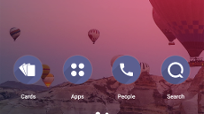
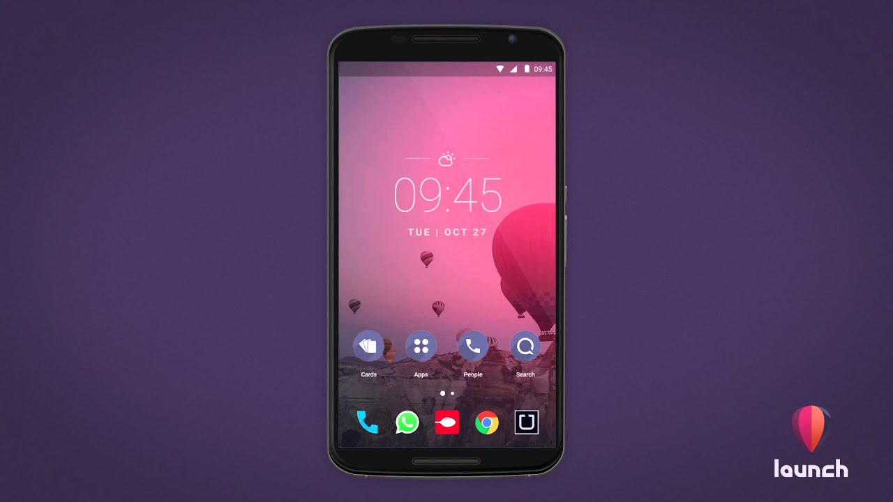
Still in public beta, Launch by Quixey offers rapid access to the internal contents of your most used apps, accessible with one tap. Swiping down on the homescreen gets you the powerful search box, where you can look for apps, contacts, text messages, music, calendar, and even your phone's settings options, for instance. The so-called Deep View Cards, accessible with a right swipe from the edge give you at-a-glance feed of stuff around you from many popular apps, without actually having to enter those apps one by one. The launcher will automatically categorize your apps, and the People Hub gives you access to your most frequent contacts, based on your pattern of communication with them.

Backdrops
A new wallpaper app, Backdrop strives to be a different, aiming to provide you only with high-quality content that is handcrafted in-house, and some are tailored exclusively for your device, provided that it is one of the more popular Android handsets on the market, of course. The app's design is clean, flat and colorful, just what the Material Design doctors ordered, and Backdrops lets you get all social with it, uploading your own designs or photography work in the various categories. There is a wallpaper of the day, and premium packs unlock different features and categories, more of which will be added over time by the devs.
Material Cards icons (Beta)
The Material Cards app offers an icon pack with, you guessed it, Material Design that resemble Google Now cards. There are 500+ high quality icons and svelte wallpapers that are compatible with most popular launchers out there.
Stark Launcher (Beta)
Another public beta, Stark Launcher organizes your apps by categories, has a card-based system for things like events, places, and so on, plus predictive apps widget. You can access your most recent contacts quickly by swiping up from the dock, and there are gesture shortcuts for quicker navigation.






Things that are NOT allowed: