2 years after Apple, Android phones still cannot get gesture navigation right
This article may contain personal views and opinion from the author.
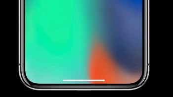
The very mention of the Apple brand seems to trigger an emotional response in pretty much every tech enthusiast out there: some swear in loyalty to the brand, while others hate it with a passion.
With so much emotions, it's often hard to look objectively at the Apple side of the industry, and every strong claim - be it positive or negative - is bound to get a strong reaction. Fully understanding that, I am still convinced: in the nearly two years since the iPhone X launched with its brand new gesture navigation system, Android phone makers have rushed to catch up with Apple and despite the many efforts, no one has managed to do it just right.
But in order to criticize Android phone makers approach to gesture-based navigation, we have to take a close look at what makes the iPhone X with its gesture navigation so different and special.
What makes iPhone gesture navigation better?
It feels different, but how do you describe a feeling?
Let's make one thing clear: the iPhone was undisputably first to introduce a gesture navigation system. Unlike some other Internet controversies, there is really no other Android phone that used gesture navigation throughout the system when the iPhone X launched. This would not matter all that much: being first just for the sake of it is after all not something one should be proud of, but what it does clearly show is that Apple was clearly innovating. The fact that multiple other Android phone makers quickly started introducing gesture navigation shortly after the iPhone X strongly suggests that they were rushing to catch up and reacting to Apple setting a trend.
Understanding the way the iPhone X used gestures is really easy: you swipe up to go back to the home screen, swipe and pause shortly to get to the recents cards, and swipe from the edge of the screen to go back a step.
Such a superficial description of the works of the gesture navigation system, however, risks convincing the unaware user that any other company that implements the same directional gestures could just call it a day and say it has properly implemented gesture nav.
The devil is as always in the detail and that detail is brilliantly explained in a WWDC 2018 presentation called "Designing Fluid Interfaces" where Apple designers explain the little things that they had to spend long hours working to get just right.
- You can watch the full presentation right here
There are a few key details, a few things that happen behind the scenes to make the iPhone gesture navigation feel so light, smooth and enjoyable. We will shortly go through them and then quickly see what's going on in Android land.
Latency
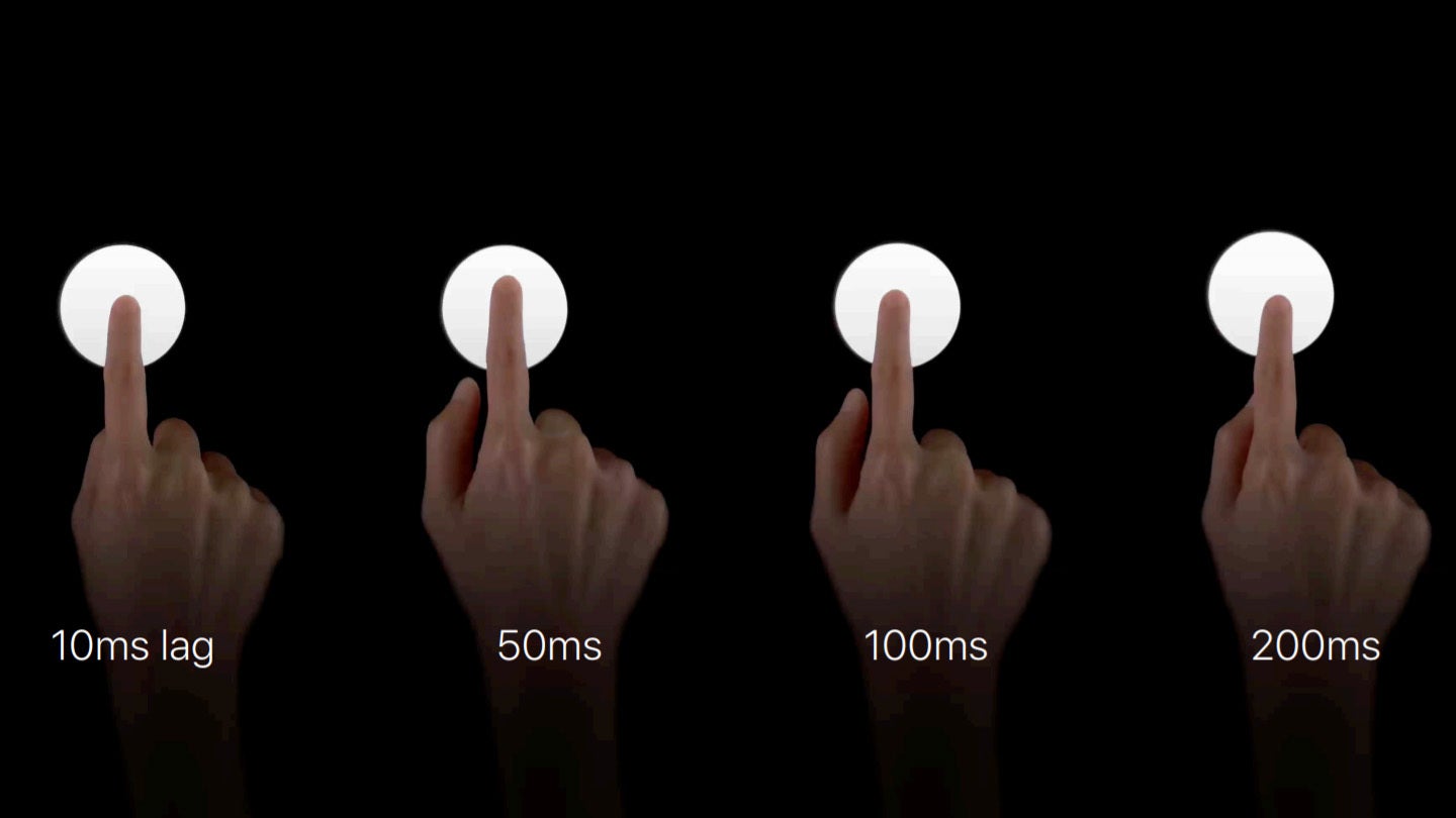
The first things that you will notice is off on many Android gesture implementatons is latency. Things are either just a bit jittery, or don't quite happen instantly. And latency is an extremely hard thing to get right: it's a simple definition, get everything to run at 60 fps always, and you are done, but... how do you do it?
Apple explains the importance of getting the latency of gestures right with a few analogies and says it has worked the extra hours to get it to that 60fps level:
You know, our tools depend on the latency. Think about how hard it would be to use any tool, or play an instrument, or do anything in the physical world, if there was a delay to using it? And, we found that people are really, really sensitive to latency. You know? If you introduce any amount of lag, things all of a sudden just kind of fall off a cliff in terms of how they respond to you.
There's all this additional mental burden. It feels super disconnected.
It doesn't feel like an extension of you anymore. So, we work so hard to reduce latency. Where, we actually engineered the latest iPhone to respond quicker to your finger, so we can detect all the nuances of your gestures as instantly as possible. So, we really care about this stuff, and we think you should too. And, that means look for delays everywhere.
Redirectable interface
What does that even mean? Well, redirecting is the ability to change your mind, tap to open an app and decide right in the middle of it that you first need to go back home, and then open multitasking, and then on and on. The "redirecting" part is our ability to change our mind constantly in midst of doing something. Some of the best Android implementations simply lack this feature (for example, Huawei's gesture system basically copies the Apple gesture directions, but does not support redirection of gestures).
Here is how Apple explains its redirectable interface:
So, our bodies and minds are constantly in a state of redirecting in response to change in thought, like we talked about. So, if I was walking to the end of this stage here, and I realize I forgot something back there, I could just turn back immediately. And, I wouldn't have to wait for my body to reach the end before I did that, right? So, it's important for our interfaces to be able to reflect that ability of constantly redirecting. And, it makes it feel connected to you. That's why for iPhone 10, we built a fully redirectable interface. So, what's that? So, the iPhone 10's an actually-- it's pretty simple two-axis gesture. You go horizontally between apps. And, you go vertically to go home.
But you can also mix the two axes, so you can be on your way home, and peek at multitasking and decide whether or not to go there. Or, you can go to multitasking and decide, actually, no, I want to go home.
But you can also mix the two axes, so you can be on your way home, and peek at multitasking and decide whether or not to go there. Or, you can go to multitasking and decide, actually, no, I want to go home.
One gesture
Having redirection and perfect latency, means that gestures are not viewed as separate, but kind of as one motion, just in different directions. Here is why this matters:
What if the only gestures you could do was this horizontal gesture between apps, and then a vertical gesture to go home, and that's it. You couldn't do any of that in-between stuff I just mentioned. ... So, you'd have to think, do I want to go home? Do I want to go to multitasking? Then you make your decision, then you perform the gesture, and then you release. But, the cool thing is when it's redirectable, the thought and gesture happen in parallel. And, you sort of think it with the gesture, and it turns out this is way faster than thinking before doing. You know? Because it's a multi-axis gestural space. It's not separate gestures. It's one gesture that does all this stuff. Home, multitasking, quick app switching, so you don't have to think about it as a separate gesture. ...
And, it allows you to layer gestures at the speed of thought.
And, it allows you to layer gestures at the speed of thought.
The lightness of multitouch
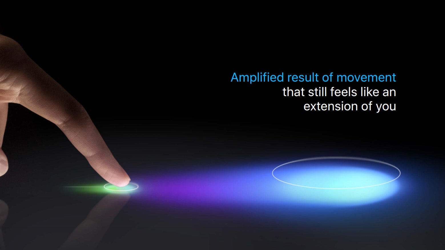
The other secret aspect of Apple's iPhone gestures is something called lightness or the way a tiny gesture is amplified into a bigger animation and action, but still feels light, so you don't need to swipe from one end of the screen to the other just to get an app to close.
You know the lightness of multitouch is one of the most underrated aspects of it, I think. It enables the airy swipes and scrolls, and all the taps and stuff that we're all used to. It's all super lightweight. But, we also want to amplify their motion. You want to take a small input and make a big output, to give that satisfying feeling of moving or throwing something and having a magnified result.
So, how does this apply to our interfaces? Well, it starts with a short interaction. A short, lightweight interaction. And, we use all our sensors, all our technology, to understand as much about it. To, sort of, generate a profile of energy and momentum contained within the gesture. Using everything we know, including position, velocity, speed, force, everything we know about it to generate a kind of, inertial profile of this gesture.
And then we take that, and generate an amplified extension of your movement.
Android Gesture Struggles
Android phone makers have been trying to create a gesture interface with some phone makers copying the Apple way of doing gestures (Huawei, Xiaomi, most recently Google), while others have their own take (Samsung, Apple).
The struggles of Google itself are quite revealing: the company introduced a weird mixture of gestures and buttons for navigation with Android 9 Pie, but it was just a strange concoction that never felt fluid and was blasted by even loyal Android blogs. Eventually, Google gave in and it is working on a iPhone-esque navigation system with Android 10 Q, but first betas shows that it lacks the refinement, the aforementioned lightness, latency and one gesture feel that Apple has worked hard on achieving.
Others like Samsung, for example, have gone with their own take on gestures, but they can feel cluttered, all starting from the bottom of the phone and none utilizing the sides (probably because they would conflict with Samsung's Edge panel functionality). The animations are nowhere nearly as smooth and the experience is just not as fluid.
We have already mentioned that Huawei and Xiaomi have basically copied the iPhone gesture system, but Huawei does not support redirection and the latency is just not there on even their top phones, let alone the more affordable devices.
OnePlus is the only one that gets latency close to what Apple achieves, but it's not quite there and its own take on navigation also includes a ton of swipes from the bottom which often interfere with in-app buttons.
Overall, we have everyone doing gestures their own way and no one quite doing them right, which shows that all these companies were reacting and often rushing to get a solution after Apple, but none so far have the refinement of the iPhone gestures. Let's hope that this changes in the near future.




Things that are NOT allowed: