10 phones with terribly designed physical keyboards
Rarely spotted in the wild nowadays, there was a time when the majority of smartphones featured physical keyboards. In the early 2000s, we saw a barrage of these so-called "smartphones" attempting to bridge the gap between the phone and mobile computing experiences – with the aid of physical keyboards, of course. They definitely helped to emulate the desktop experience on a mobile scale!
LG DoublePlay
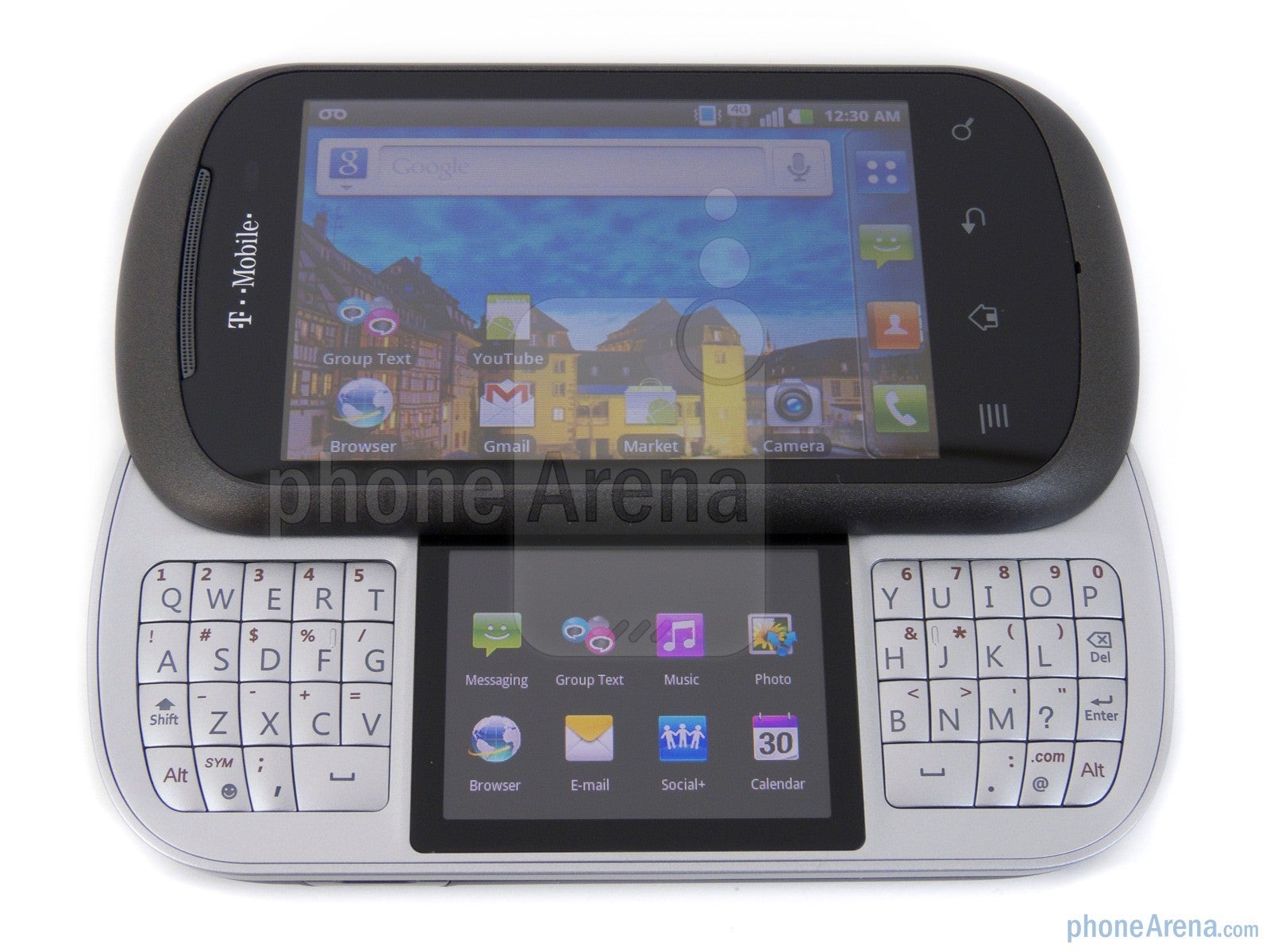
Talk about experimenting with not just one form-factor, but with several unorthodox ones! As its name isn't evidence enough in what to expect from it, the LG DoublePlay guaranteed itself onto this list because of its unconventional style and terrible physical keyboard. For starters, this landscape QWERTY clam shell styled smartphone offered two displays, which that by itself was a novel thing to begin with. However, they went the extra distance by breaking up its landscape QWERTY keyboard into two halves.
In some instance, a split-style keyboard can make for a better overall typing experience, but that was hardly the case using the LG DoubePlay. Placing the secondary display right in between the keyboards meant that buttons on the keyboard were tinier in size versus what it could've potentially achieved by having full access to the entire area to begin with. When your layout is compromised, such as the case here, you're often double checking the positioning of each letter you want to type. Additionally, it didn't help that the buttons were stiff – often requiring firm presses in order to respond.
Palm Centro
Palm's first entrance onto this list begins with the Centro, which was released back in the fall of 2007 – just a little after the original iPhone arrived on the scene. Palm was one of the notable PDA and smartphone makers during the early 2000s, but the Centro signaled a design change philosophy for the company. Naturally, owning a Palm device meant that you were getting a keyboard. However, unlike the previous Palm devices released by the company, the Centro was geared for the "tweener" crowd.
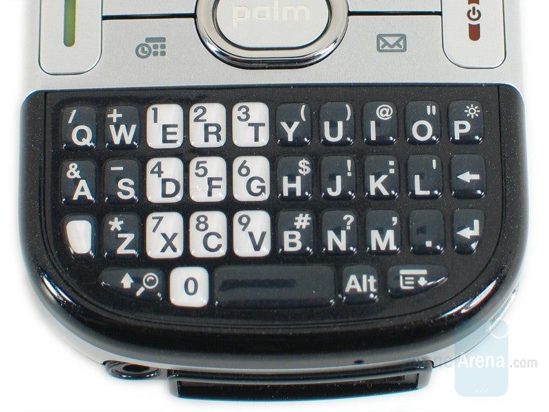
While the keyboard itself featured the distinctive layout that most Palm owners were accustomed to using, it's the shrunken size of the buttons, close placement of them, and their marginally distinct feel that made it just more difficult to use. For those with larger sized hands, it definitely proved to be a bit more challenging. But given that this was targeting a younger demographic, leveraging a smaller keyboard did seem to be an appropriate decision. Nevertheless, it was just tougher to use than previous Palm devices.
At least there was auto-correct with the platform, so even if you did manage to make a few mistakes along the way as you carefully press on each minuscule key, it'd correct it automatically for you.
HTC Snap CDMA
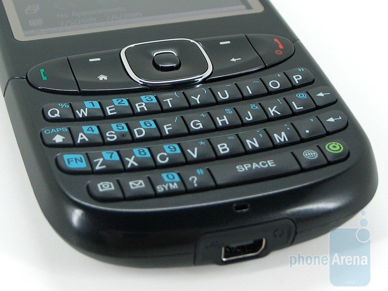
Windows Mobile saw all sorts of form-factors. From landscape QWERTY sliders, to portrait styled ones, the platform was home to an assortment of phones that helped to spur the modern age of the smartphones. The HTC Snap was released in the summer of 2009, which offered one of the best portrait styled keyboards in a Windows Mobile phone. However, that wasn't the case with the CDMA version of the handset – released just a little bit later on after the original.
Gone were the springy, rather spacious keyboard found with the international GSM variant, replaced instead by keys that were positioned very close to one another – offering no distinction whatsoever as you were typing. It didn't help either that the overall build quality of the phone came off chintzy, wherein the keys were stiff to the touch and they didn't offer the same springy response as the GSM version. Seriously, it felt like work having to type on this keyboard, because if you didn't hit the buttons hard enough, the phone might not even register them. When it comes to Windows Phones with portrait QWERTY keyboards, this had to have been one of the worst!
Verizon Wireless Razzle
Nowadays, we have one single major classification when it comes to phones; the smartphone. Sure, there are still some basic flip phones in circulation sold by retailers, but the vast majority of people in this day and age own smartphones. Still, there was a time when these so-called dumb phones ruled the market – with all sorts of classifications. From feature phones to messaging phones, there were an abundance of these kinds of phones that sported physical keyboards.
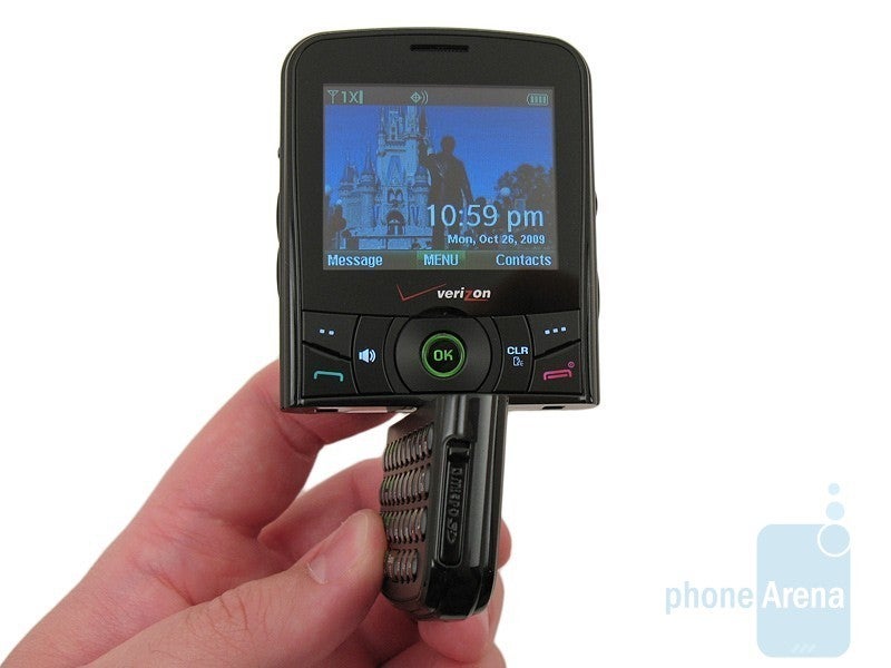
Released in the fall of 2008, the Verizon Wireless Razzle was one of them. Classified as a quick messaging device that capitalized on the text messaging trend that dominated most of the mid and late 2000s, the Razzle did quite the opposite when it came to being a messaging phone. First of all, it sported this unorthodox swiveling portrait style keyboard that allowed users to switch from messaging to all-out media playback. Making matters worse, the keyboard was tilted on an odd angle – making it tough to see the display straight on unless you tilt the phone away from you.
Motorola Backflip
Motorola has been in the business for a long time! And during that time, they've managed to deliver some fantastic devices with equally suitable physical keyboards to accompany them. From the stunning Windows Mobile powered Moto Q, to the premium look of the Photon Q's keyboard, the company was known to produce solid keyboards that allowed users to effortless type with ease. There was a time during the early days of its Android endeavor when we began to started questioning some of the company's decisions. Devices like the Motorola Charm, Flipside, and Flipout all showed us some interesting keyboard designs, but the Motorola Backflip failed to execute where it mattered the most – the typing experience!
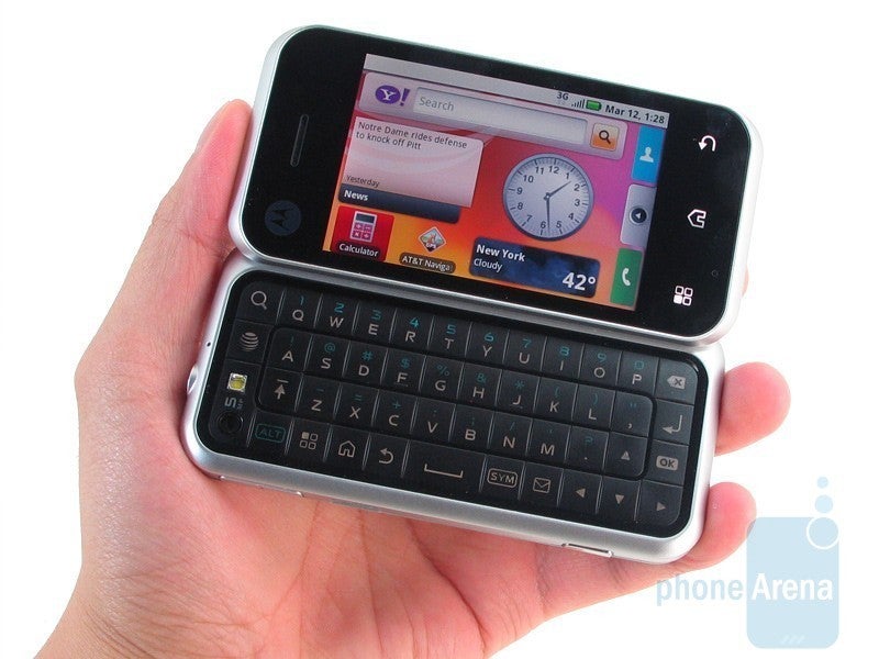
Motorola was rapidly becoming a force to be reckoned with in the Android landscape by the time 2010 came around, especially after releasing the Motorola DROID. One of the first phones to be released after that was the AT&T exclusive Motorola Backflip, which to this day, is arguably one of the strangest designed landscape QWERTYs around. The name says it all, as the keyboard itself was the back of the phone, but when it was flipped over, it was positioned traditionally right below the display. The keyboard was in fact constructed from a single plastic-like material, which meant that there were no cutouts that would distinguish each button. This material, too, didn't offer any sort of tactility when typing – so it hindered the user's speed.
KIN ONE and TWO
Remember when Microsoft made phones? It was just recently when Microsoft announced that it would be pulling the plug from its Windows Phone mobile platform, due to the lack of market penetration. Microsoft as a hardware maker delivered several Lumia branded smartphones during the late stages of the platform's history, but we can't forget about Microsoft's endeavor with a pair of "smarter" messaging phones prior to the release of its Windows Phone platform.
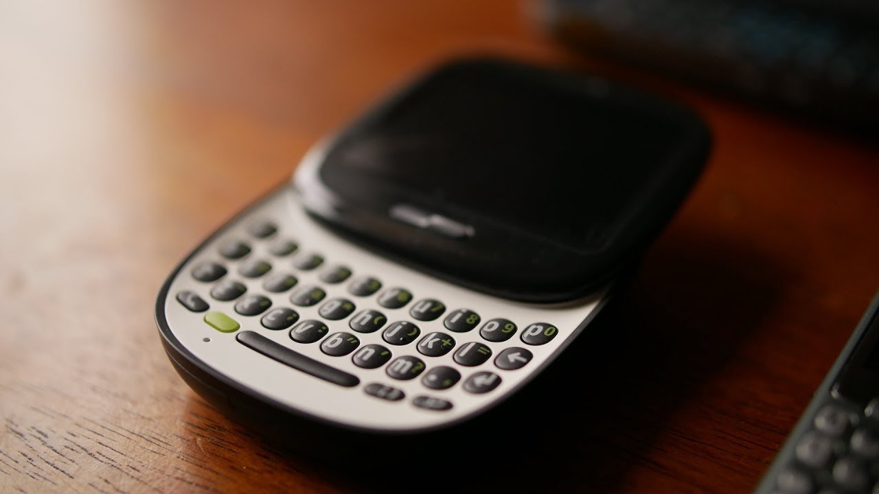
Enter the Microsoft KIN ONE and TWO, a pair of quick messaging phones released in early 2010 that gave us an early tease of what to expect with full blown Windows Phone. These weren't technically regarded as smartphones, but rather, quick messaging phones that were meant to be very similar to the messaging centric features seen with the Sidekick line. The KIN ONE was a puck shaped portrait QWERTY slider, while the KIN TWO was your traditional landscape QWERTY slider. They were undeniably unique at the time, but they didn't offer practical keyboards for the occasion.
With the KIN ONE, its tinier sized keys, minimal travel, and plastic feel didn't help at all with the experience. Trying to type on a cramped keyboard is tough enough on its own, but it's exemplified when you can't get a proper grip on the phone itself because it's so compact. Things didn't fare any better for the KIN TWO, which resorted to a 3-row layout. Combining the keyboard's stiff response and an extra wide looking space button that didn't respond well when pressed directly in the middle, it didn't do anything to make it a convincing messaging phone. To be frank, it's shocking looking back now to think that these were meant to follow in the same footsteps as the Sidekick line with their messaging first approach!
LG Neon
There was a time when LG invested its efforts into nothing but feature phones, specifically the quick messaging variety. Throughout the 2000s, the Korean company churned out several messaging phones. Out of the four major wireless carriers, you could argue that LG seemed to have an affinity for Verizon Wireless the most – evident in memorable device series such as the Voyager and enV. They did manage to produce other quick messaging phone for the other carriers, but one in particular for AT&T just did not live up to what we saw over with Verizon.
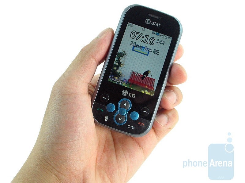
The LG Neon became a part of AT&T's lineup in the summer of 2009, a period where quick messaging phone were quickly becoming phased out in favor of smartphones. Having success over on Verizon, you'd think that LG would've hit it out of the park with the Neon for AT&T. While it did sport that rare semi-hybrid touchscreen and QWERTY phone, the keyboard itself failed to deliver the same rich and practical experience seen with the enV series over at Verizon.
BlackBerry Passport
When it comes to keyboards, BlackBerry rarely disappoints with its offerings! That's made more prevalent when they created some of the best keyboards around, like the ones found in the BlackBerry Bold series, BlackBerry Priv, and Curve series. Indeed, the company wasn't afraid to go outside of the box and change things up every now and then, like what we got with the BlackBerry Pearl series, but they still managed to deliver the goods when it came to its keyboards. Even with all of its heralded successes, there were a few occurrences when they missed the mark.
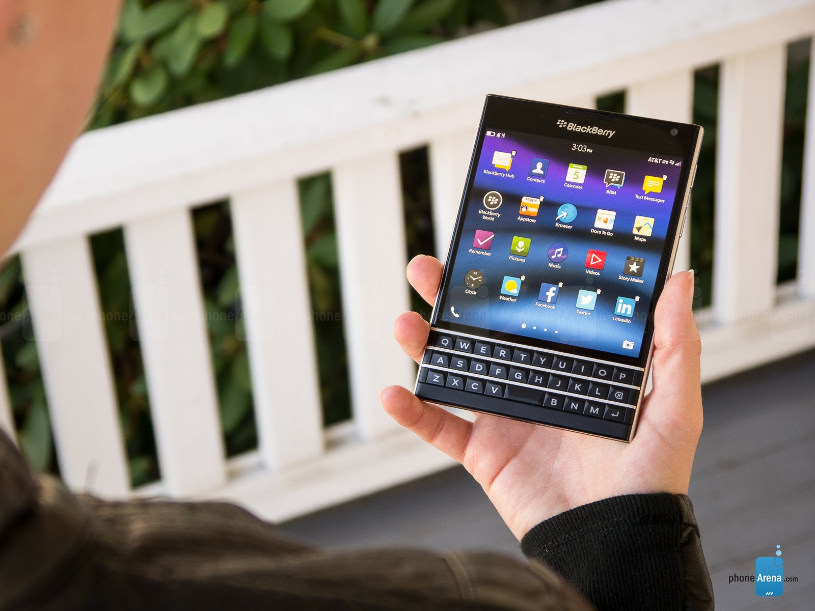
The oddly proportioned BlackBerry Passport was one of them, which was released well after the company's glory days in the fall of 2014. It's what we'd consider a recent BlackBerry smartphone, after the switch to the BlackBerry 10 OS. Similar in shape to an actual passport, the BlackBerry Passport is undeniably one of the few odd designs from the company. Because of how its touchscreen dominates most of the phone's façade, it meant that there was little room leftover for the physical keyboard.
We weren't particularly forgiving about the keyboard, going on to say that it's "disorganized, cramped, and some other weird quirks make the keyboard almost impossible to use effectively." First of all, the cramped confines meant only having a 3-row configuration. Other quirks include the lack of a dedicated area for numbers or symbols, the backspace button action as a delete function instead, and there being no shift key! Yes, numbers, symbols, and the shift function were all accessible through the touchscreen, but the transition between touch input and using the keyboard just made for an odd combination – it just doesn't have the same flow as just sticking to one method.
Samsung Alias U740
Making its first appearance on this list, Samsung is no stranger when it comes to phones with physical keyboards. Rarely do we see a Samsung phone today that incorporates a keyboard with its design, but they've been known to experiment with various types over the years. From your standard portrait and landscape styles we've all come to expect, they did go after a strange format with one of its quick messaging phones for Verizon Wireless.
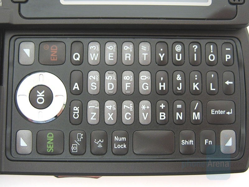
Back in 2007, the Samsung Alias U740 was one of those odd designed phones for its time. In particular, it utilized this dual hinged design that allowed this typical looking flip phone to "flip" its display around to turn it into a clamshell with a physical keyboard at your disposal. What's really notable about this keyboard is that it adapted to either orientations with its combination numeric/QWERTY keypad. The problem with this design is that when the phone is used as a flip phone, there are just simply way too many buttons to deal with – while alternatively in clam shell mode, buttons were too tiny to get into a good rhythm with typing.
Worst yet, the keyboard's layout was such a strain to the eyes because letters and numbers were facing different directions. For example, if you were composing a text message and wanted to type in numbers, the arrangement made it difficult to discern those numbers because they were oriented in a different direction than the usual letters and symbols. While the Samsung Alias U740 proved to be challenging to use, its successor managed to improve the experience with its e-ink keyboard.
Palm Pre
We mentioned the Palm Centro earlier, which was a radical departure from previous Palm keyboards that users were acquainted to using. Palm's history was a rocky one, having dominated the scene early on in the 2000s, only to relinquish its grab as BlackBerry and Microsoft's mobile smartphone platforms became increasingly popular amongst consumers. And then came the Apple iPhone, which redefined the smartphone experience in ways that were unimaginable at the time – forcing Palm to quickly adapt to the rapid changes in the industry, or face extinction.
And that brings us to the final device on our list, the webOS champion in the Palm Pre, which was released in the summer of 2009. Consumers were no doubt enthralled by Palm's webOS platform, proving itself as a strong competitor against the newly released Android and iOS platforms. While the Palm Pre will go down in phone history as one of the most remarkable to ever be released, its keyboard wasn't necessarily a bright spot in its otherwise rich portfolio. And no, it wasn't the keyboard that brought Palm's eventual demise later on.
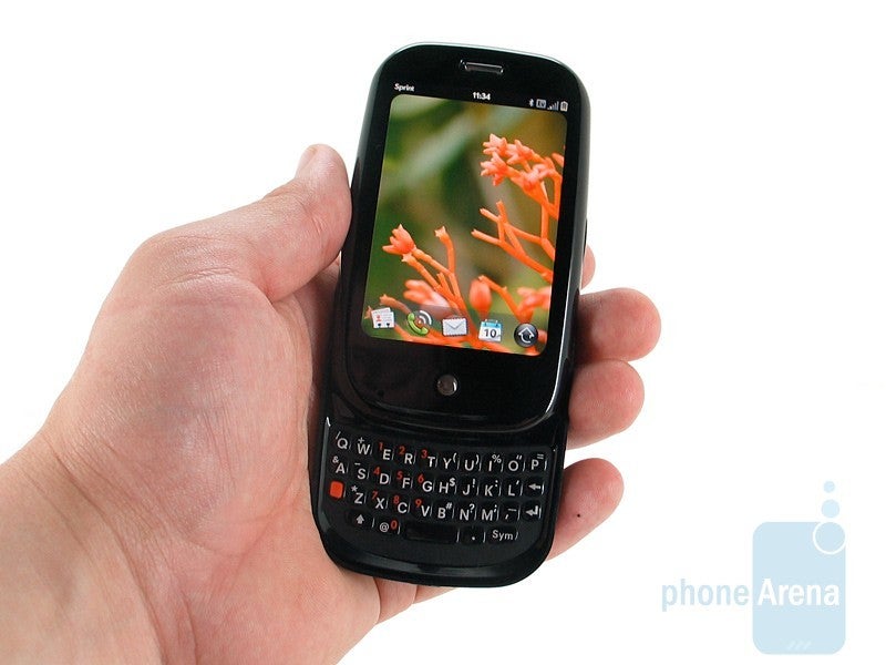
The keyboard was a chore to operate, especially if you happened to have larger sized fingers. Very similar to the Palm Centro's keyboard, the keyboard here with the Palm Pre was just a little bit cramped to smoothly operate. In fact, the keys here with the Pre were shallower than those on the Centro – offering only a smidgen of distinction when you ran your fingers over them. The gel-like plastic keys, too, didn't offer as much tactility when pressed, so at times, it was difficult to gauge if you actually pressed down on them. While an on-screen keyboard would eventually be available to the platform later, at the beginning though, all input was done through the keyboard.
When we look at the totality of what the Palm Pre eventually became, it's disappointing to realize that there wasn't more thought put into the keyboard's design. Considering how the platform was forward-thinking for the time, it really would've elevated the Pre's stature amongst the other top-tiered phones at the time by delivering on a solid keyboard. But in reality, it was far from it.
Follow us on Google News




Things that are NOT allowed:
To help keep our community safe and free from spam, we apply temporary limits to newly created accounts: