Sony Xperia E1 Review
Introduction
The Sony Xperia E1 is a device for music lovers on a budget. A phone with a dedicated Walkman button and a rich music app, its music capabilities make it stand out in a fiercely competitive market of affordable Android smartphones. It also has time on its side, as it’s one of the first devices to ship with a new and faster Snapdragon 200 system chip. In addition to all this, the Xperia E1 is also a very compact and lightweight phone, a virtue that becomes less and less common nowadays.
There is a fly in the ointment, though - the phone only has a 3-megapixel camera with no flash. Is that a deal-breaker, and are there any other hidden caveats? Stay with us as we answer these questions right below.
In the box:
- USB Cable
- Wall Charger
- In-ear headphones
- User manual
Design
Forget about design intricacies - the Xperia E1 looks like a device sold in Dollar Tree with its extremely cheap feeling plastic. At the same time, though, it’s also compact, and lightweight.
The first thing you notice about the Sony Xperia E1 is that it’s built out of such low quality plastic that it makes the phone feel like a cheap toy from the Dollar Tree store. This very cheap feel is a bit of a shock even for an affordable device, as nowadays we have similarly low-priced devices like Nokia’s Lumia 52x series or the Moto G that push the envelope with sleeker look and wide color options. Despite its negligence for looks and build materials, it’s also true that the phone is fairly tightly put together and does not screak under pressure.
In terms of pure size, the Xperia E1 is a very compact and pocketable phone (it measures just 62.4mm, or 2.46 inches, wide). As such, it is nearly perfect for single-handed use, as your thumb can practically reach its every corner. In addition, the E1 is also of very light weight, tipping the scales at just 120g (4.23oz). And while in terms of thickness, it is a fairly chubby little phone with a body girth measure of 12mm (0.47”), its compressed overall size makes this less of an issue than it would have been for a larger phone.
Up front, you have just the Sony logo on top, the screen, and no physical buttons - instead, the device uses on-screen buttons for navigation around Android. All the physical keys are located on the left: a tiny lock key, and a volume rocker above it, and while both are clicky and responsive, they are made of that same extremely low-grade plastic, which is disappointing.
We ought to separately mention the unique Walkman key located on the top of the phone. Since the phone is so compact, it’s not hard to reach for it, and it’s also clicky enough. This key is specifically tailored to control the music listening and it integrates tightly with Sony’s Walkman music app. You can customize it to your liking, but by default, long pressing it starts the Walkman app, pushing it once pauses or resumes the current song, and double-pressing it switches to the next song. It’s a neat touch for music lovers, who can control their music without firing up the phone.
Display
The 4-inch WVGA display is of underwhelming quality, with washed out colors and poor viewing angles.
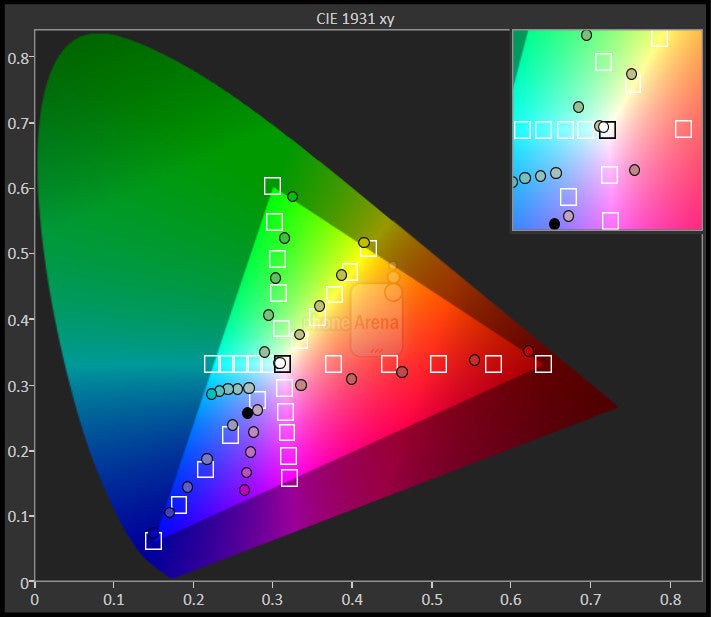
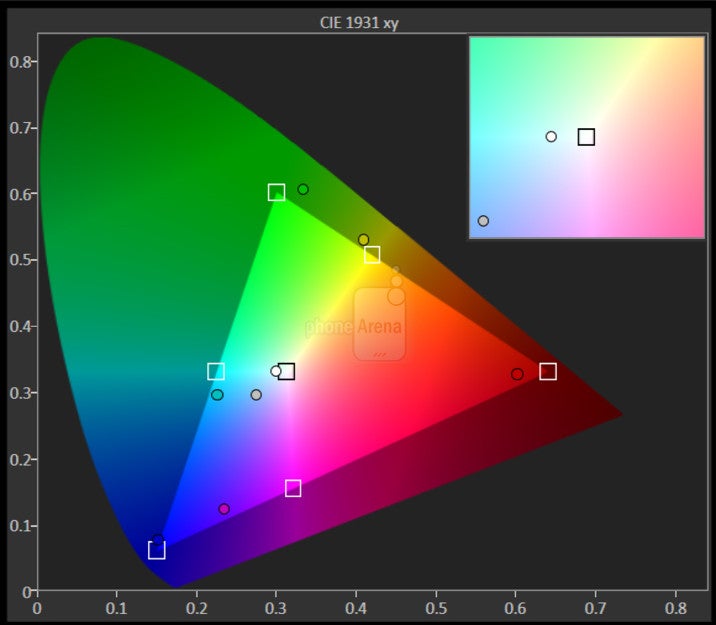
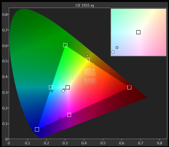
The Xperia E1 features a 4-inch display with a resolution of 480 x 800 pixels (WVGA). Quite frankly, the display is one of this phone’s weakest points - it looks very washed out, with a distinct bluish cast, poor contrast, and inaccurate colors. Viewing angles are just terrible (and we’re not being picky) - tilt the phone just slightly and you witness huge loss in contrast and color saturation. With all these serious flaws, the middling 480 x 800-pixel resolution, and the 233ppi pixel density, looks like a mild inconvenience that we could excuse given the cheap price of the phone.
On a more positive note, the phone supports automatic brightness adjustments, a setting that is often times missing on low-end devices. It’s also fairly bright, but outdoors its visibility is not great because of the high reflectivity of the display.
Interface and Functionality
[Android 4.3 Jelly Bean is adorned with the Xperia UI here, and Sony’s skin looks and feels great.]
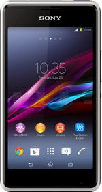
It is Android at version 4.3 Jelly Bean, adorned with the Xperia user interface, that welcomes users of the E1. It’s not the latest 4.4 KitKat, and that’s a shame since KitKat adds optimizations for devices with 512MB of RAM, just the type of phone the Xperia E1 is.
Sony’s skin runs smoothly and is one of the most likable custom Android UIs with sleek looks, appropriate swift animations that add some nice dynamics, and a few custom apps that add to the stock experience. Such apps are the custom album, movie, Track ID, Back Up, and Smart Connect apps.
Sony’s custom Walkman app deserves a special mention here since its optimized to work with the dedicated Walkman button on the phone. It offers a rich music experience with traditional capabilities like the ability to categorize all your music, but it also offers a dedicated equalizer allowing deeper controls for music output.
Sony also offers you to try its Music Unlimited music streaming service with unlimited skips, no ads, offline listening and availability across various devices, but it’s free only as a 1-month trial, and you’d have to pay to use its full capabilities in the long term.
The on-screen keyboard is sufficiently large, with well spaced buttons for convenient, relatively fast typing. As we’ve already said, the phone is compact enough for single-handed use, and you can also type with just one hand without performing excruciating hand gymnastics and phone juggling.
In its bag of tricks, Sony has a fun LED light (positioned right below the display) that acts like a disco ball of sorts as it adapts its color reflects the dominant color of what’s displayed on the screen. A photograph with a red motif triggers a red LED response, for instance, and that is a subtle, but still - fun touch.
Processor and Memory
A new, 28nm Snapdragon 200 chip ups the game in terms of performance on affordable smartphones, but the Xperia E1’s 512MB of RAM are limiting.
Sony’s Xperia E1 is a member of the new, 2014 wave of affordable devices and as such its comes with a faster version of the Snapdragon 200 system chip. Before diving in the fine processor details, let’s just say that the E1 is a surprisingly snappy device for its class, offering a very smooth daily performance throughout, and while it has some slight niggles, it’s a step up for affordable devices in terms of performance.
The chip that makes it all possible is the Qualcomm Snapdragon 200 MSM8210. While most of 2013’s affordable devices in this class shipped with a Snapdragon 200 chip, they used different variations of it, most of them, manufactured using a 45nm process. The MSM8210 stands out with being made on the more advanced 28nm LP node. We’re looking at 1.2GHz dual-core Cortex-A7-based processor and Adreno 302 graphics.
This results in some huge gains that are very obvious in benchmarks. The Xperia E1 scores nearly double results when compared to its 2013 peers. The GPU is also fairly capable for its class, and you can play most games with smooth framerates.
The biggest throwback to the past in the Xperia E1 is its meager 512MB of LPDDR2 RAM. This, combined with the fact that the E1 ships with Android 4.3 Jelly Bean (and not the latest 4.4 KitKat, specifically optimized for devices with 512MB of RAM), causes some trouble in terms of performance. The low amount of RAM affects most multitasking, as the system terminates apps very quickly, and the most common nuisance is if you are playing a game and someone interrupts you with a call (or you decide to check your mail). The phone would quickly terminate the game, and when you go back to it, the game needs to reload all over again.
Internal storage on the Xperia E1 is 4GB, of which only around 2GB are available to the end user. Luckily, you can expand on the scarce storage allowance with microSD cards of up to 64GB.
Internet and Connectivity
With Chrome on board and 4G HSPA, the Xperia E1 delivers a fairly good web browsing experience.
Sony has chosen to use pre-load just one browser on its devices, and it’s mobile Chrome. Google’s Chrome browser is an excellent browser with nicely optimized for touch card-based interface, and plentiful options. It loads and renders pages fairly fast, and we were happy to see that scrolling around and zooming in and out happens swiftly.
In terms of connectivity, the phone supports download speeds of up to 21Mbps on HSPA networks (that’s considered 4G, but there is no LTE support).
Other traditional connectivity options include Wi-Fi b/g/n, Bluetooth 4.0, and GPS, but there is no NFC on board.
Camera
The camera is a weak spot for the Xperia E1. It’s a barebones 3-megapixel shooter that lacks sorely in details and captures choppy video.
To make an extremely affordable device, a company just has to cut some corners and, unfortunately for some, with Xperia E1, Sony decided to cut in one of the most oft used features - the camera. The handset comes with a barebones 3-megapixel auto-focus camera with no flash, and there is no front-facing camera.
The camera app itself is well made (it’s the same as on other recent Sony devices), but it takes quite a while to start, and on some isolated occasions, it just crashed on us. Once it loads, you have the Superior Auto Mode that picks the right camera settings for you (and it works good most of the times), plus there is the Manual mode for those who want to manually set things like ISO, white balance, and so on.
The actual images, however, are somewhere between average (in perfect conditions) and disappointing (in low light). Wherever you shoot, though, the captured pictures lack detail sorely, and that’s the biggest issue with the camera on the E1. Still, in well-lit conditions the camera gets the colors mostly right (overblowing them slightly in some situations), so we can imagine that for sharing on social networks with no pretense of photographic excellence, the images are usable. Indoors, though, pictures border with unusable, as the camera misses the colors completely, and often times images look as if there was a blue filter on top of them.
Video capture is also way below average, even for an affordable phone. By default, the Xperia E1 shoots at 480p (640 x 480 pixels), but the frame rate is very low at 19fps, and the footage comes with lots of skipped frames, making it look choppy. You can also shoot at the somewhat non-standard 800 x 600-pixel resolution, but the frame-rate drops even further down in this mode.

Multimedia
The Xperia E1 is music-oriented, and it ships with a very rich in options Walkman app. For videos, though, it disappoints with poor codec support.
The 4-inch screen on the Xperia E1 is big enough for many to use it to watch short videos, either on YouTube, or via the built-in media player. Strangely enough, Sony has overlooked video codec support, and we could not get to play any Xvid/DivX files. The built-in video player manages 720p MPEG-4 and MKV files, but for fancier encodings you should turn to something like the free MX Player on the Google Play store.
The real highlight of the Xperia E1 is its Music affinity, with a built-in Walkman app and dedicated physical Walkman key. The Walkman music app won’t disappoint music lovers - it is rich in options, features an equalize, and neatly categorizes your music. Sound via the loudspeaker is loud enough, but does not impress in any way - it’s definitely on the tinny side. The included plug-in headphones are not exceptional, but while they don't pump that super bass, they produce very clean audio that's a pleasure to listen to, and are definitely above your average set of headphones that phone makers usually include in the box.
Call Quality
Call quality on the Xperia E1 is satisfactory, but not great. On our side of the line, voices in the earpiece sound loud enough and clear, in their natural tonality. On the other end, however, our callers report hearing very distorted voices so that often times it’s hard to discern what the caller says. This is especially true if the person on the other end of the line has volume up to the maximum. Luckily, when you tone down volume a few levels, you can get rid of most of the distortions, and while clarity is not perfect, at those quieter volume levels, you can at least understand what the person says. Side noise seems to get filtered slightly, and while it’s audible, it does not get in the way of conversation.
Battery life
The E1 ships with a 1750mAh user-removable battery. Quoted talk time stands at 8.2 hours (8.7 hours on 3G), which is below the average. In our daily experience with it, the phone lasted around a day, requiring an overnight charge in most cases.
Conclusion
All in all, the Sony Xperia E1 turns out to be a device that is affordable, yet offering an above average performance for its class. It will appeal to music lovers with its dedicated key for controlling music playback, but it does not offer much in terms of loudspeaker sound quality. It has a dark side too, though, as two of its most important components are compromised: the display is of underwhelming quality, and the camera captures mostly disappointing shots.
The Xperia E1 price depends on market, varying from around $150 and up to €140 ($190). At this price, there are plenty of alternatives. One of the most popular devices around this class (it actually costs nearly 30% less) remains the Windows Phone 8-based Nokia Lumia 520. The Lumia 520 features a great 5-megapixel camera, an equally sized (but of better quality) 4-inch WVGA display and it’s very potent in terms of silicon power. Another option, this time running on Android, is the popular Motorola Moto G, a 4.5” device sold at a slight premium, but in exchange for that, offering a 720p display, the latest Android 4.4, much faster performance, and a good camera.
All in all, the Xperia E1 seems like an affordable device that does little to stand out in the fiercely competitive low-end segment. The sub-par display and camera seem like too great of a compromise, especially given the fact that there are other phones at around the same price offering much more.







Things that are NOT allowed: