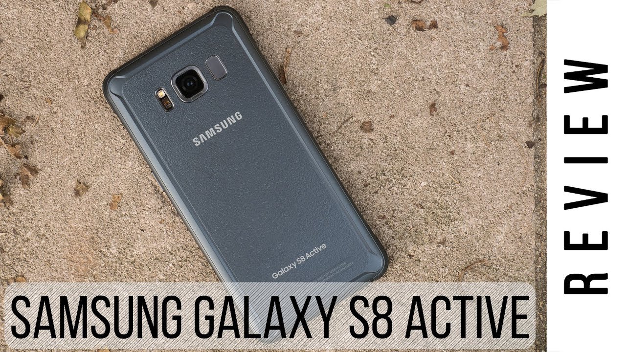
Samsung Galaxy S8 Active Review
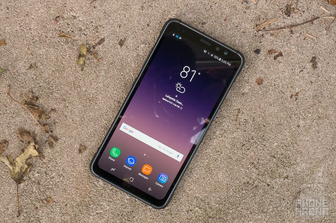
Introduction
In the box:
- Galaxy S8 Active
- USB-A to USB-C adapter (female to male)
- Micro-USB to USB-C adapter (female to male)
- USB-C to USB-A charging cable
- Adaptive fast-charging wall plug
- Warranty and Getting Started guide
Design
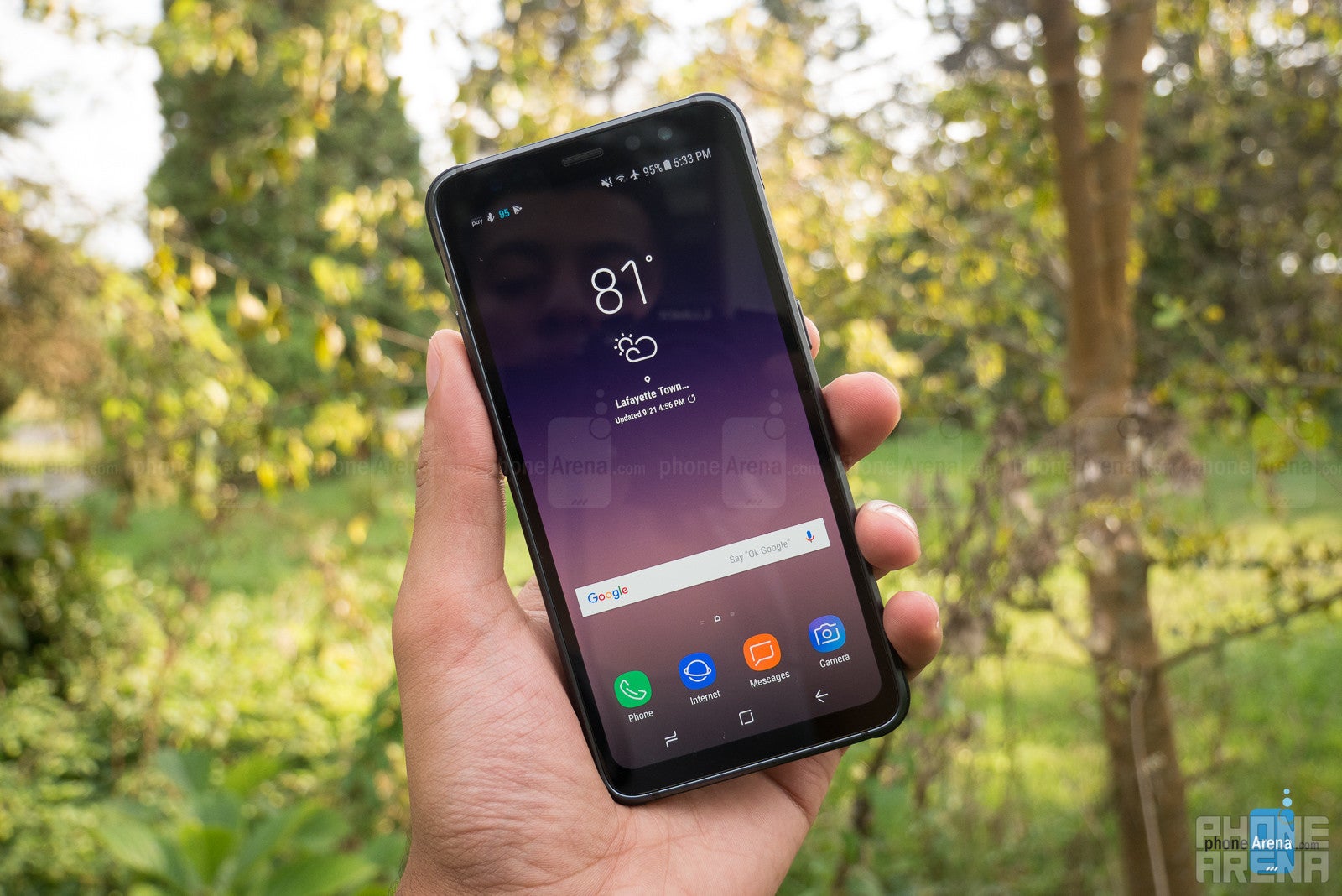
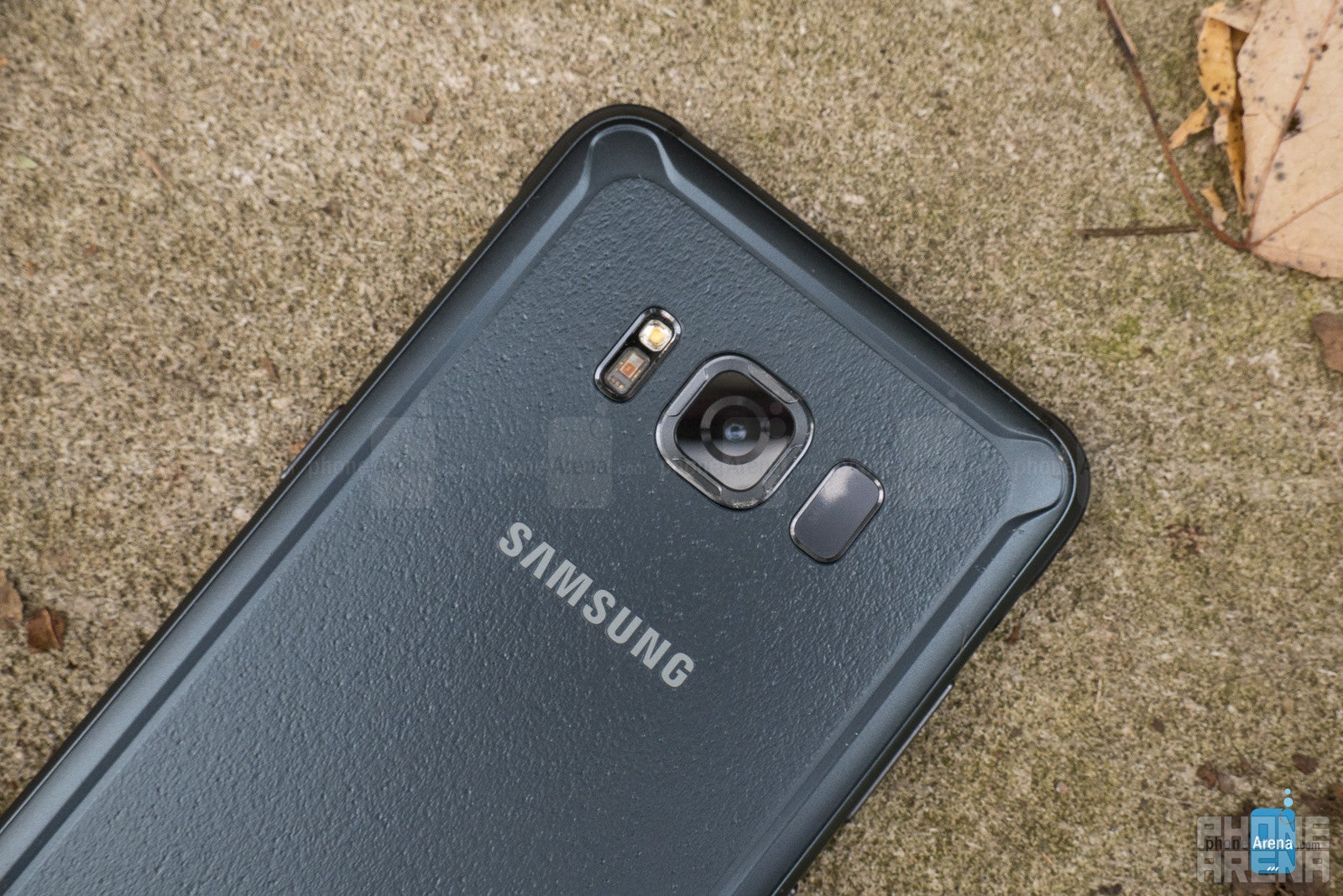
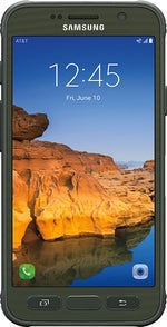
Meeting military specification’s (MIL-STD-810G) for enduring drops, extreme temperatures, and much more, as well as IP68 water and dust proofing, the S8 Active is a phone of solid constitution. The thicker edges of the device not only add durability, but also space for a 1000-milliamp increase in battery capacity. Altogether, the added thickness and weight still leave the device with a good feel in-hand. While of course not as light as the svelte S8 (50 grams heavier to be exact) the S8 Active is only about 20 grams heavier than the S7 Active, with the same thickness and width, while only being about a tenth of an inch taller. Once again, Samsung achieves a sturdy design that leaves no worries in the most fearless outdoor warriors heart, while still making a pocketable device that feels substantial, but not like a brick in the hand (or pocket).
Display
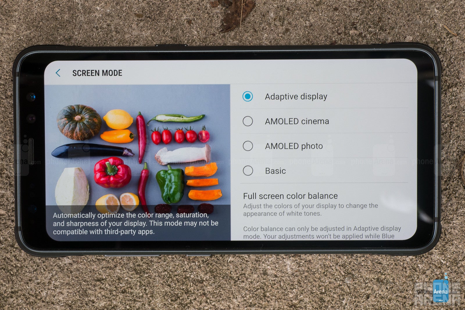
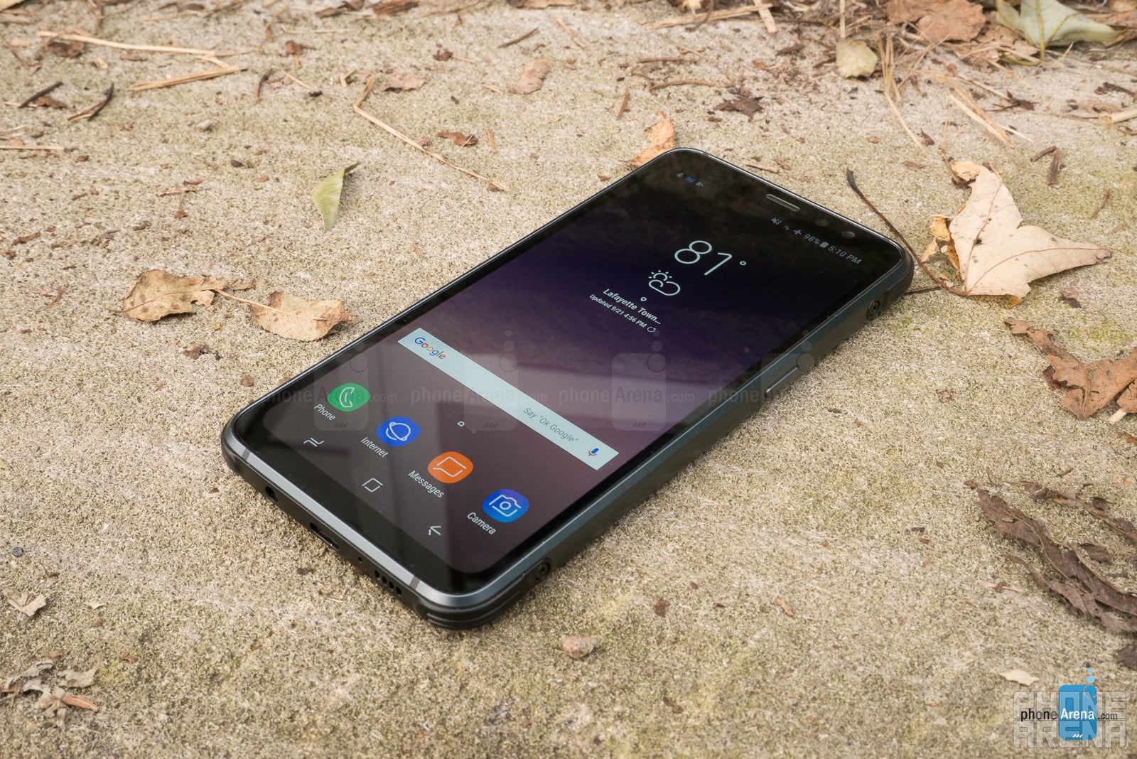
Though the infinity display isn’t in full effect here, with its typically curved design and near-bezel-less edges, you’ll still find the rounded corners and high screen-to-body ratio (75%) which buyers so loved on the regular S8. Though the 5.8-inch screen size is the same for the two, the metal/plastic casing that comprises the Active’s protective bulk brings that ratio down some from the original S8’s 84% ratio.
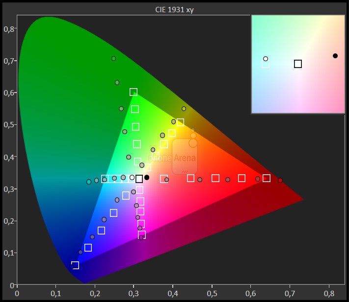
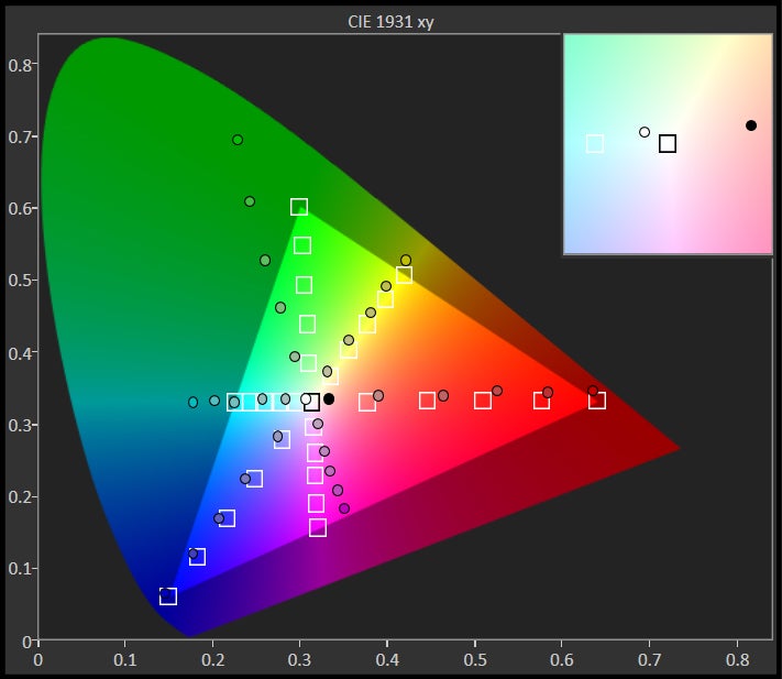
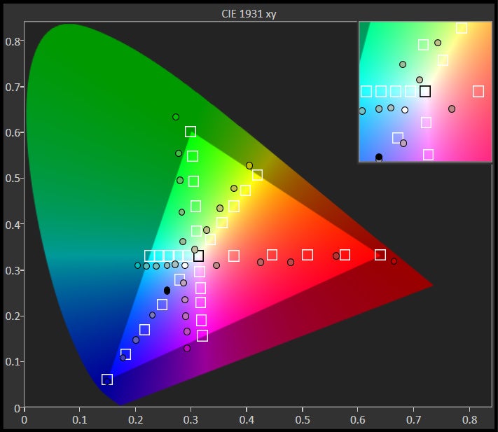
Samsung’s trademark Super AMOLED technology looks just as good on the Active as on the S8 before it, even without the curved edges. Capable of brightness that can stare back undaunted at the sun’s rays, but also lower far enough for comfortable night reading, we have little to complain about here, although it’s still susceptible to the ills of any AMOLED display. Colors are pleasing to look at, albeit super saturated with less-than-perfect viewing angles which produce a bluish hue as the phone is tilted. Color accuracy can be tweaked to an extent by utilizing various color modes and sliders found in the display settings, though we found most tweaks to affect red balances more than anything, never quite giving us proper color representation. Although somewhat bluish, we found the default Adaptive Display mode to be the most pleasing to look at.
Meeting the same resolution as the S8 and S7 Active, the S8 Active produces 1440 x 2960 pixels. It’s a quite pleasing screen to view pictures and video, or consume content of any kind. But of course, its 18.5:9 ratio still lends itself to cropping or letterboxing in most video-watching scenarios. So, as always, pick your poison.
Interface and Functionality
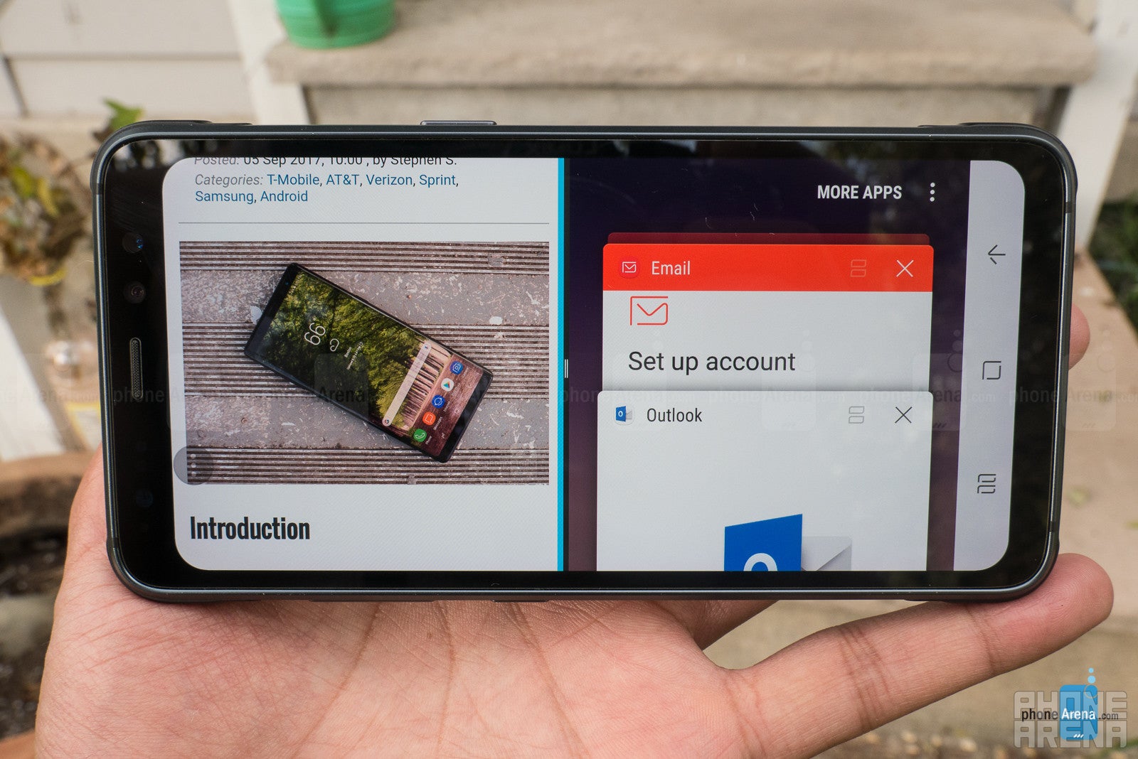
Samsung’s come a long way with its UX since the days of TouchWiz. The Samsung Experience, as it’s now called, first debuted on the Galaxy S8 six months ago upon its release, and since then we’ve settled in with the creature comforts that this affords. We like the overall aesthetic, iconography, and smoothness in the UI; things look good, and they move well.
Samsung apps, which include mail, messages, and the browser, among others, are generally useful and well-thought out, though not always as feature-rich or well-integrated as their stock Android counterparts. Samsung’s browser, for instance, is in some ways more intuitive and perhaps better laid out than Google Chrome, but existing Chrome users will need to download an extension for Chrome on their desktop in order to sync bookmarks with Samsung’s browser. This detracts from the overall seamlessness, and can deter some from using it altogether, especially when Chrome has these features built-in and saved to your Google Account.
Samsung’s email app, on the other hand, is missing key features like the ability to delete emails in-line from the notification center, though it too has an otherwise useful app layout with functions to match. In the end, you’ll likely end up using either stock Android, or other third-party apps for at least a couple of these, as Samsung’s execution doesn’t exceed the alternatives enough to warrant a switch from one ecosystem to another. Though its execution isn’t poor enough that a good portion of users won’t simply use what’s given to them by default. It seems a bit of a net-zero for Samsung overall.
While we admit the UI looks good, and zips along nicely, we tend to appreciate one particular feature the most: an effective and intuitive settings search. We know, just reading those words gets us all jazzed up too. It may not be the sexiest feature, but it may well be the biggest improvement Samsung offers over its competition and its own previous UIs. Unlike most other Android flavors, The Samsung Experience’s settings search can actually find all the settings related to the query you’ve entered. A search for “screen” returns any setting, or description of a setting, with the word “screen” in it. Results include the Always On Display, lockscreen settings, general display settings, and even a section for related settings, which are often times quite useful to jump to when you’re on a particular subject. We know this sounds small, but it’s not.
While we admit the UI looks good, and zips along nicely, we tend to appreciate one particular feature the most: an effective and intuitive settings search. We know, just reading those words gets us all jazzed up too. It may not be the sexiest feature, but it may well be the biggest improvement Samsung offers over its competition and its own previous UIs. Unlike most other Android flavors, The Samsung Experience’s settings search can actually find all the settings related to the query you’ve entered. A search for “screen” returns any setting, or description of a setting, with the word “screen” in it. Results include the Always On Display, lockscreen settings, general display settings, and even a section for related settings, which are often times quite useful to jump to when you’re on a particular subject. We know this sounds small, but it’s not.
Android has long struggled with offering myriad features and deep customization while still keeping these options organized and accessible. Samsung has improved, and evolved in both. Not only does the settings layout look better, but the capable and intuitive search will bring you what you desire in a matter of taps. Unfortunately, this is a level of functionality lost on most other Android platforms, and is immeasurably useful to those who know what they’d like to change, but don’t want to search through every menu and sub-menu to change it. Want to tweak the Always On Display but don’t know if it’s in “Display” settings or “Lockscreen and Security”? Just type “Always” in the search bar and get right to where you need to go. No more hunting or menu memorization required.
Bixby and Activity Zone
Bixby’s also made some strides since its debut, which was also on the Galaxy S8. We’re now finally able to speak to Bixby via the dedicated button, doing so in a walkie-talkie-esque hold-the-button fashion, as opposed to other assistants which only require a single long-press (but then again, no other assistant has its own dedicated button.) You can also call up Bixby with the hot phrase “Hi Bixby” and use it to manipulate most any aspect of your device. We’re glad to finally have a more complete Bixby on the S8 Active since we (and everyone else) missed it at launch for the S8.
All works pretty well with Samsung’s assistant – sorry, butler – at last providing us with useful and mostly accurate control over the phone, just using our voice, as Samsung promised. You can of course tell Bixby to set an alarm or reminder, turn off Wi-Fi or another setting, or ask general information questions. Such commands have become status quo with voice assistants. But this button-beckoned-butler uses its tailored integration to the fullest, endeavoring to make using your phone as close to a hands-free experience as possible. While not perfect – in need of a bit of maturation and fine-tuning, especially with word recognition – Bixby gets pretty darn close, ultimately besting Google Assistant and Siri in the level of engagement between the assistant and the device running it.
For instance, you can say “Hi Bixby, open the voice recorder and start recording” or “Take a slo-mo video” and your phone will do exactly those things. The same goes for a number of third-party applications, as well. “Hi Bixby, search Yelp for a Mexican restaurant” is a great example of a useful query which is completed so quickly that you may never type another Yelp search again. You can also pretty much navigate the entire phone by just telling Bixby what to do. If you start by saying “Hi Bixby, turn on Wi-Fi calling” the butler will fetch the setup screen for Wi-Fi calling, which in this instance produces a disclaimer from AT&T with a “Next” arrow at the bottom. You can then simply say to Bixby, “Next” and it will proceed as though you tapped the Next arrow. We found this to be the case even if “next” wasn’t an option, but there was a screen to progress to. Otherwise, Bixby is accurately reading all clickable options on the screen, and will recognize your selection by voice, even if many options exist – an impressively well-integrated feature which can have a number of use-cases.
The biggest issue you’ll face with Bixby is it’s hearing problems. Speech recognition is probably the most inconsistent we’ve seen among voice assistants, which is a shame considering the potential it has. Teaching Bixby when it gets something wrong is easy and well executed, but it doesn’t learn right way. Unfortunately, it seems to be sending these corrections off to the labs for further processing. Better on-board learning and speech recognition is a must here in order for Bixby to thrive.
Something we missed from our S8 Active was the ability to make complex quick commands like those we saw on the Note 8. Quick commands bring another level of automation to your experience by triggering multiple actions based on a phrase of your choice. We looked forward to telling Bixby “Good Night” and watching Do Not Disturb and the Blue Light Filter enable, as an alarm is set at our pre-specified time – all in matter of seconds, with no further input from us beyond our initial quick command phrase. But, inexplicably, we could only create quick commands for one action per phrase on our S8 Active. As far as we could tell all software was up to date on our unit, unfortunately leading us to believe that Bixby’s experience will vary by model, even aside from model-specific features, like the S-Pen’s Bixby translate feature, for instance.
As many voice assistants are, Bixby is constantly improving and gaining new functionality, so we expect voice recognition to improve and third-party app integration to expand, hopefully sooner than later.
Bixby on the S8 Active also adds a card named Activity Zone to the assistant’s dashboard. Here you can get instant readings from a barometer and compass, as well as quick toggles for the flashlight and stop watch. Tapping the card opens Activity Zone’s full screen, which adds weather and Samsung Health to the suite of activity-oriented apps. Though the flashlight is somewhat unnecessary, since a quick toggle for this already exists in the notification center, we found the compass to be a useful addition. In general, we suppose it’s not a bad idea to have all these apps accessible from a single Bixby card, especially since it would appear that Bixby has stolen the hardware shortcut for Activity Zone which existed on the S7 Active, known simply as the Activity Button. Though reports of an update to disable the Bixby button on certain devices have been circulating, there’s no indication on the S8 Active that this button can be re-mapped to bring back the beloved Activity Button.
Processor and Memory
Being an AT&T exclusive (for now) the Active runs solely off the Snapdragon 835, whereas global variants of the regular S8 use Samsung’s Exynos chips. There’s usually very little difference in performance of the two anyway, but especially with the SD 835, you’re quite unlikely to long for more power. Add four gigs of RAM to the equation and you’re in for a treat. Just like the regular S8, navigation is smooth and prompt. Apps launch quickly and without issue, no matter how many tasks are open. We only sometimes encountered stutters or force closes when setting up Bixby initially, but as the day wore on, Bixby began to conform to the rest of the phone's blazing performance norms. No surprises here, as the same hardware setup in the original S8 delivers just the same kind of fluid, swift performance we originally witnessed in March.
Connectivity
As mentioned, this is an AT&T exclusive as of the time of this writing, so don’t expect full compatibility on any other network, but you do have LTE-A Pro Cat 16, which means that S8 Active is properly equipped to utilize gigabit LTE in the coming years. Otherwise, the Active has all the same standards as the regular S8, including Bluetooth 5.1, NFC/MST for mobile payments, and wireless charging.
Camera
Regular pictures taken on the front-facing camera come out generally well-exposed, with good detail. Selective focus works well here too, though the sensors strength in properly exposing and focusing an entire shot is also readily apparent.
The rear-facing camera is an excellent low-light performer, catching details equal to the best in the biz, and exceeding them in pulling out accurate, vibrant colors from the shadows. While not the absolute best in toning down hotspots within scenes containing light and dark areas – the iPhone 7 seems to beat it there – the S8 Active may take the crown (or rather share it with its Galaxy brethren) for capturing color in low-light and maintaining sharp details with little noise throughout. For our money, we’d rather have a couple slight hotspots than an entire area of color-less darkness.
This proclivity with low-light color capture seems to be linked to the sensor's tendency to shoot warmer (yellower) colors, just as the iPhones shortcomings in low-light appear tied to its strengths in shooting more accurate colors. Preferences on this are subjective, of course, and nothing quite compares to the capability of the human eye (yet) but as it stands right now, it seems the S8/S8 Active will afford you better overall low-light performance, while the iPhone 7 has the edge in overall color accuracy.
Macro shots on the Active produce great sharpness in the foreground and pleasing bokeh in the background – not to mention the amazing quickness with which the S8 Active focuses a subject, thanks to dual-pixel technology.
Video Quality
Dual-pixel produces the same exquisite results in focusing real-time video. If you’ve never seen it in action, please make sure to check the sample video to see its great capability, as it focuses objects instantaneously. Optical image stabilization also makes it mark here, keeping videos smooth and balanced, , though it does suffer from a bit of shutter-roll, as well as a peculiar image wobble at the end of pans. Video quality, much like image quality, is also quite good here. Details are crisp, movement looks good, and colors are generally well-represented.
Multimedia
By now we’re all aware of the growing pains encountered with the proliferation of extra-tall “bezel-less” displays. To recap, these taller displays present an issue for video formatting due to their awkward aspect ratios. This leads to situations where videos are cropped, stretched, or letterboxed to accommodate these displays. In the instance of the Galaxy S8 Active, the aspect ratio is 18.5x9 – the same as the original S8 – and all of the above methods are incorporated to remedy this. Videos produced in a 2:1 ratio are your best friend here, but even those will leave you with black bars on the top and bottom, though not on the sides. This is simply the price to pay for such tall screens. YouTube, at least, has begun auto-fitting compatible 2:1 videos to your screen, but content in this format is still very sparse.
Listening to music on the Active will be a better experience than on most phones. The loudspeaker is not only loud, but also fuller and less tinny than comparable flagships. Samsung’s typically excel in this area, and thankfully the S8 Active continues in this tradition.
Call Quality
Calls on the S8 Active are unremarkable. No glaring complaints came about from our callers, nor was it hard for us to hear them on the other end. The earpiece is a little quieter than we’d like, but the speakerphone is plenty loud.
Battery Life
With 1000 milliamps more battery capacity than the regular S8 and the same capacity as the S7 Active, the S8 Active’s 4000-mAh battery is rated at 32 hours of talk time, as oppose to the original S8’s 30. This translates well in day-to-day use; moderate usage should see you through about a day and a half of battery life – even with the Always-On Display enabled. Samsung rates the S8’s standby time as 3.4 days with AOD enabled, while the S8 Active is rated at about 5. This seems to hold true in real life, as well, lasting almost 11 hours in our custom test – about 2.5 hours longer than the original S8, and almost exactly the same time as the S7 Active. Recharge times for this “fast-charger” were two hours, on the dot.
Conclusion
The Galaxy S8 Active endeavors to do something really no smartphone does today. Taking top-of-the-line technology and melding it with externals that come as close to indestructible as any pocket-device feasibly can is no small feat, but it’s easy to see how this can be taken for granted. The S8 Active doesn’t appear to have a very hard job. Thicken the metal, add some rubber corners, and a shatter-resistant shield and voilà, right? Well, although Samsung certainly won’t see it like that, it kind of does appear that way. The Galaxy S8 was already IP68 dust and waterproof, so now let’s make it withstand drops and extreme temperatures then call it a day. Sure. But smartphone construction can be a delicate balance, figuratively and literally. Just take for instance the critical mistakes made in trying to pack too much into the ill-fated Note7.
Smartphones need to be light, and pocketable – not too substantial, or carrying and using them becomes a burden. While the S8 Active doesn’t exactly improve its footprint over its predecessor, it still has a palatable size and weight. For all that it adds in the inherent upgrades from the S7 to S8 (and the ruggedized construction) we doubt anyone will be longing for a sleeker device. Users know it will be a heavier phone than the S8, and with an additional 1000 milliamps more power on board, Samsung achieves this variant with little compromise, ultimately creating the phone of many people’s dreams. As notoriously fragile “bezel-less” designs continue to overtake the industry, it’s good to know that (as far as we can tell) Samsung will always take the time to make their best phone better – relatively speaking, that is.







Things that are NOT allowed: