Samsung Galaxy Note 7 Review
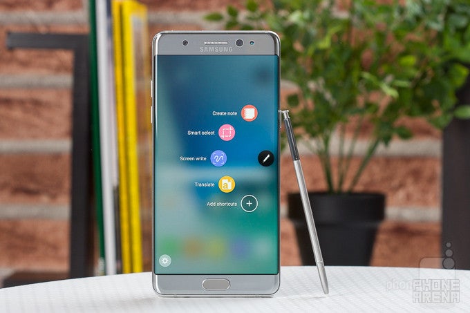
The Samsung Galaxy Note 7 has been discontinued following numerous reports of units catching fire or exploding. In the interest of safety, users who still have a Note 7 in their possession must return the unit to Samsung.
Update: Read our Galaxy Note 8 review!
Introduction
I don't know how hard it is to build a great smartphone, but market intelligence shows that most companies are failing, so it's got to be pretty hard out there. Samsung, however, is among the very few that have found great success in this business. The company's approach is an elaborate mix of high-powered, in-house produced hardware, multi-layered software that is constantly being rethought and reworked, and resilient marketing efforts, all coming together in progressively likeable products.
After an unusually lousy 2015, Samsung has returned stronger than ever, it seems, with the successful launch of the Galaxy S7 and S7 edge smartphones earlier this year. Now, still riding on that momentum, Samsung is eager to also unleash its new Note 7 – granting it an early start against Apple's upcoming Plus model...
Design
Samsung's design language translates very well to the phablet from-factor
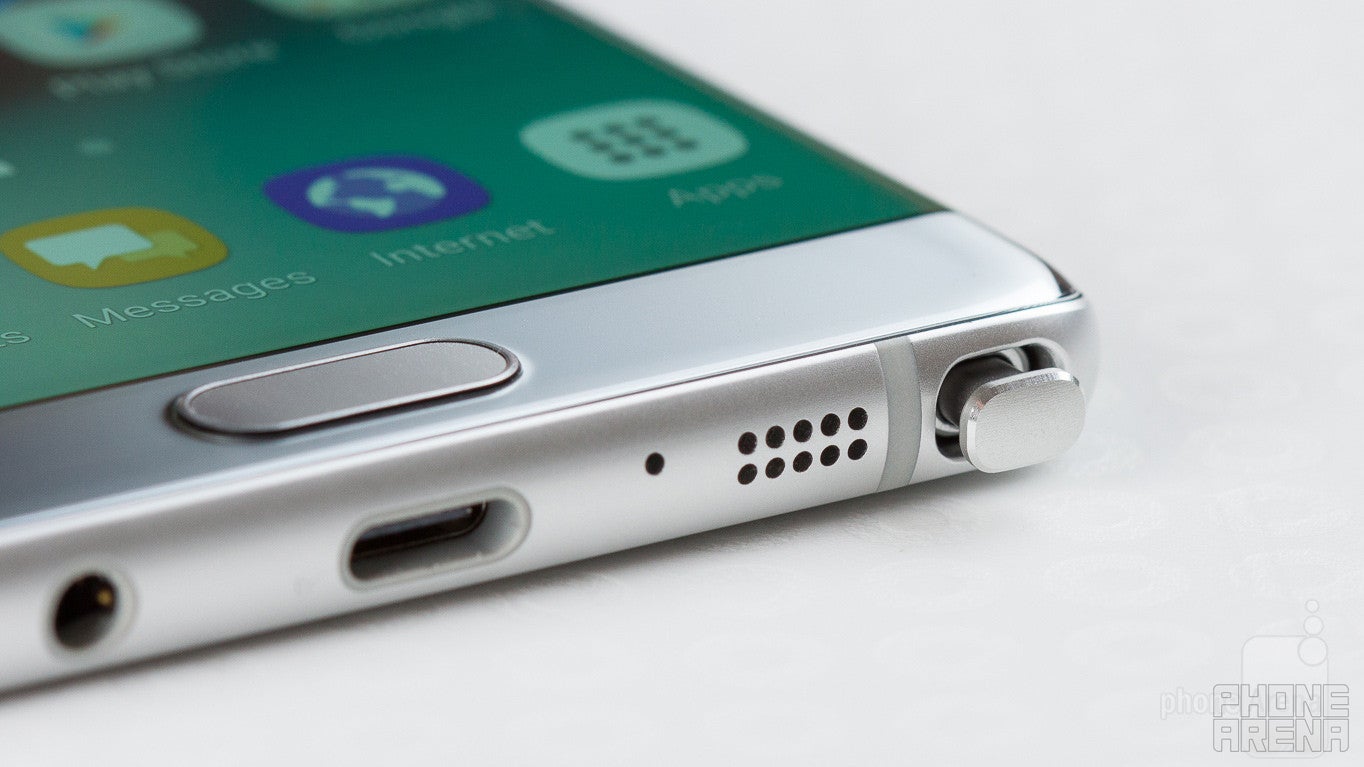
Samsung is moving fast these days. After it showcased its new glass design language for the first time last year with the S6, it has continued to refine it. First, by introducing gentle curves to the rear glass with the Note 5, and now, by making it more symmetrical all-around with the Note 7.
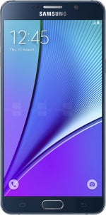
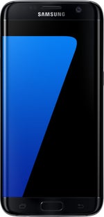
Viewed from the side, the Note 7 has the same exact curves and shapes towards the front and the rear, which is very aesthetically pleasing. Unfortunately, Samsung's promise for a balanced, symmetrical design isn't completely fulfilled, as the handset's top bezel is ever so slightly taller than the bottom one. Maybe this will be perfected in the next generation, maybe not. And not to avoid the obvious comparisons with the Galaxy S7 edge, here are the differences: the Note 7 is slightly (but noticeably) wider and taller, with a less pronounced screen curve, which we actually prefer.
That said, I find the Samsung Galaxy Note 7 to be a very attractive phone overall. Available in 4 shiny colors – light gray, black, gold, and the brand new blue/orange – there's hardly a variant of it that doesn't look fancy. That's especially true for the new two-tone one, called Blue Coral, which combines front and rear glass in light blue with a metal frame in soft orange. Samsung is willing to have a little fun and experiment with color schemes that happen to be out of the norm, and that's a great thing.
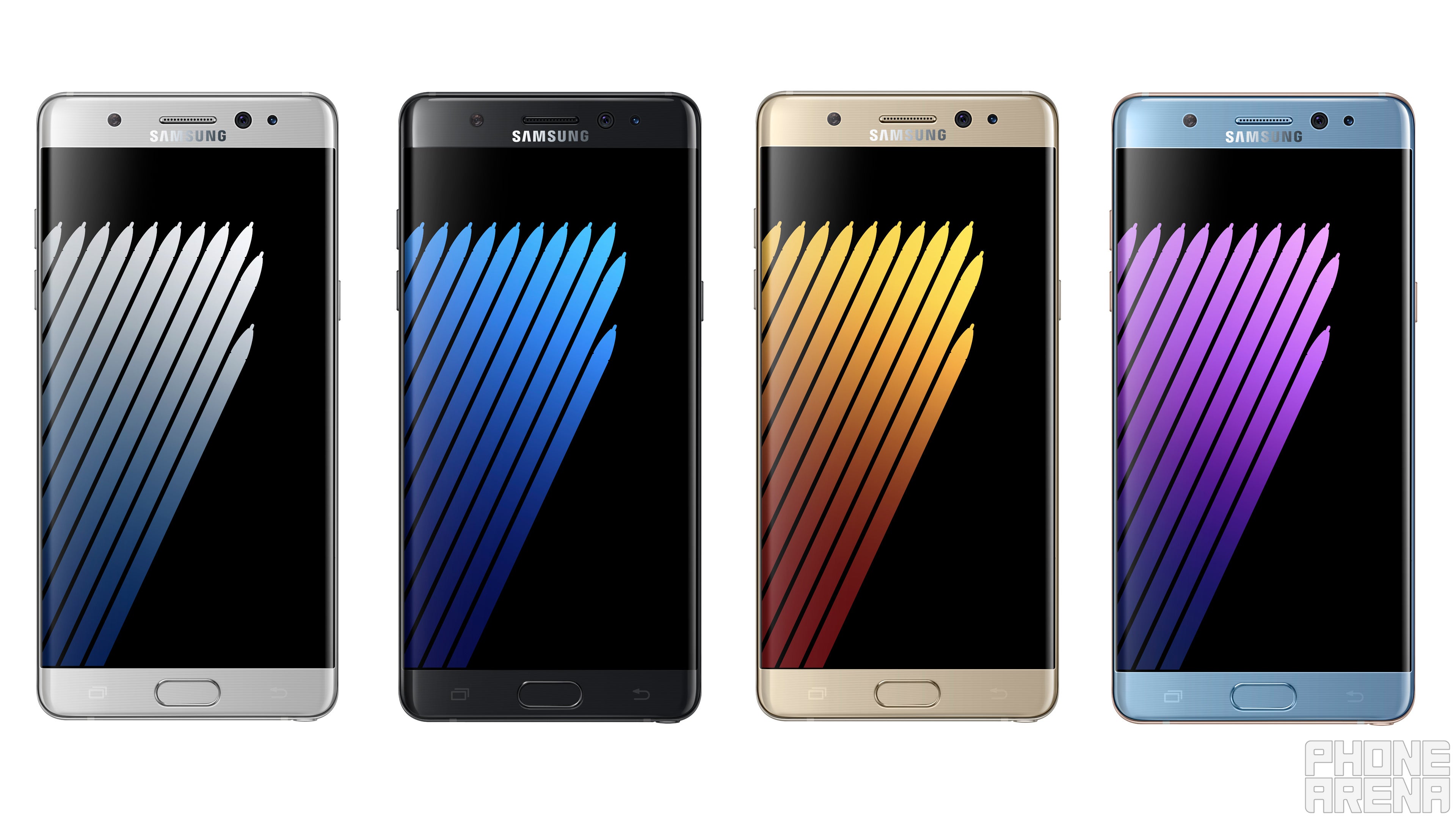
Just as its predecessor, the Galaxy Note 7 has the same highly reflective, mirror glass finish that is all nice and shiny, but can quickly get messy due to fingerprints sticking like crazy. To me, that's not a big problem, because I like the unslippery nature of glossy surfaces – it makes the Note 7 easy to handle.
In terms of overall quality of execution, the Note 7 inspires confidence. It's not obsessive, in a way that would see different buttons, speaker grilles, mics and other holes and elements around the metal frame aligned perfectly, but it does feel nice and solid. The volume and power keys are a tad soft when pressed, but not to an annoying extent. The "hidden" capacitive multitasking and back keys surrounding the home button can cause some annoyance at times upon being accidentally pressed, but I do prefer this solution to on-screen navigation keys, as it doesn’t needlessly take up screen space.
Display
Big, bright, and colorful, the Note 7's AMOLED screen is great for media and reading
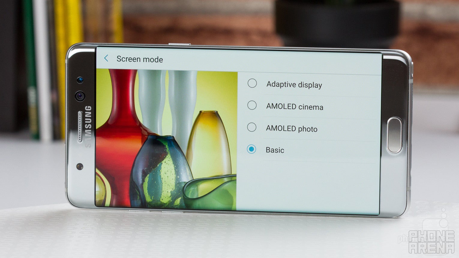
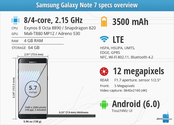
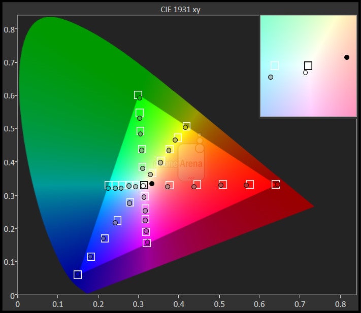
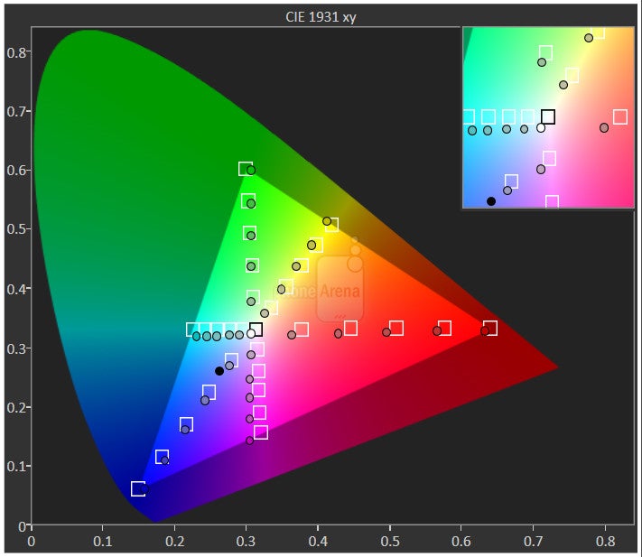
The situation is complex when it comes to color quality with the Note 7’s AMOLED display. Numbers-wise, all is top-notch: the screen is 5.7 inches big (albeit slightly curved towards both edges), the resolution is incredibly high at 1440 x 2560 pixels, so things are pretty much perfect in terms of clarity, but there are some important issues to consider.
As always, there’s a number of color modes to choose from, here’s a breakdown:
1. Adaptive: Attempts to optimize screen characteristics depending on the content that you’re viewing. Typically, colors are way too saturated in this mode, so we wouldn’t recommend using it.
3. AMOLED Photo: Sets the Note 7 to the Adobe RGB color space.
4. Basic: Sets the Note 7’s display to the standard sRGB color space, which should be used in, like, 99% of the time.
Aside from the color balance inconsistencies we mentioned above, it’s also worth noting that the gamma for both the US and the international phones is measured at close to 2.0, causing the screen to appear slightly washed out. To summarize, should you get the US model, color balance and overall authenticity (if you use Basic screen mode) will be top-notch. The international model, however, leaves something to be desired.
Iris Scanner
An undoubtedly useful technology that is served half-baked with the Note 7
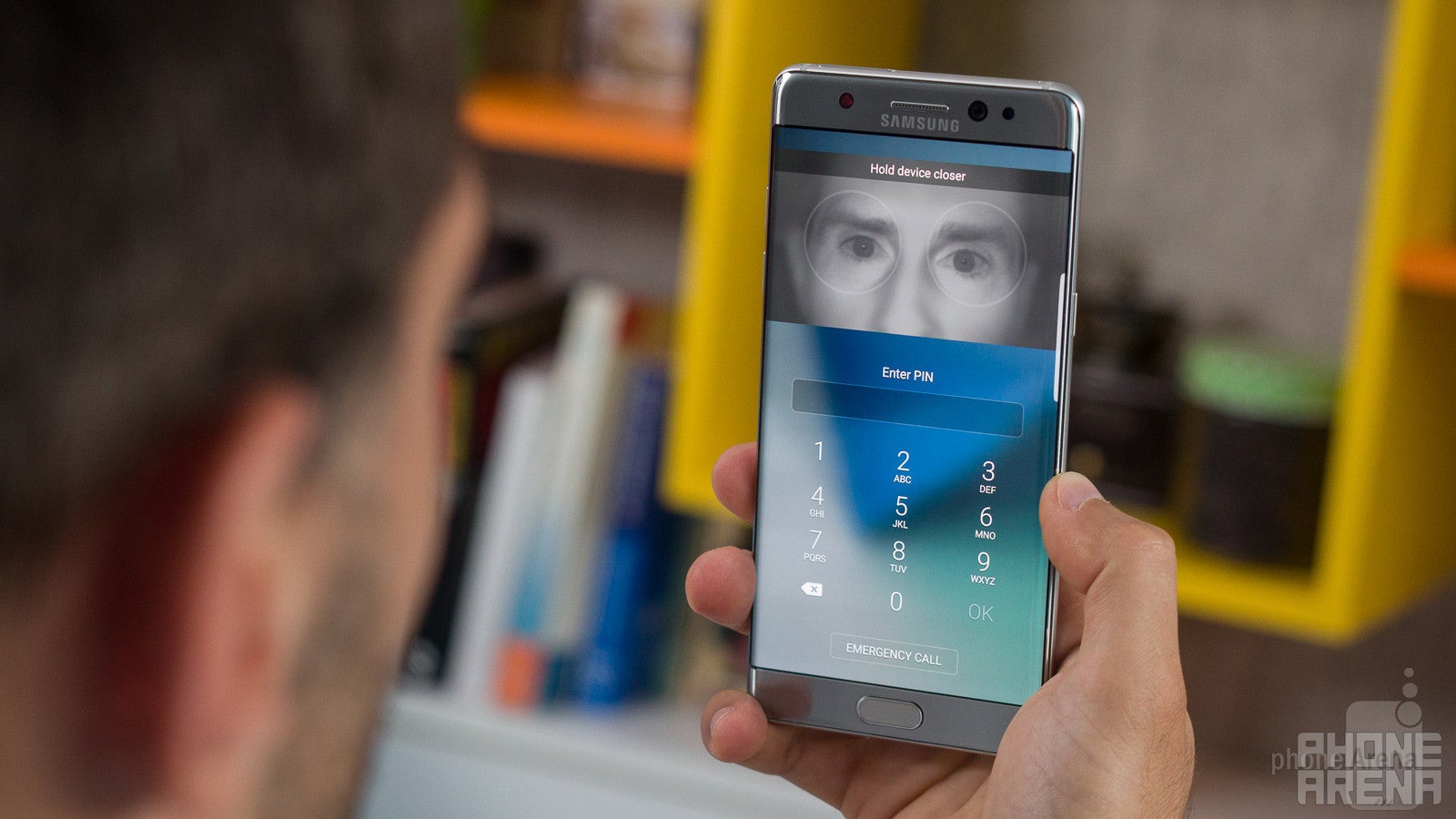
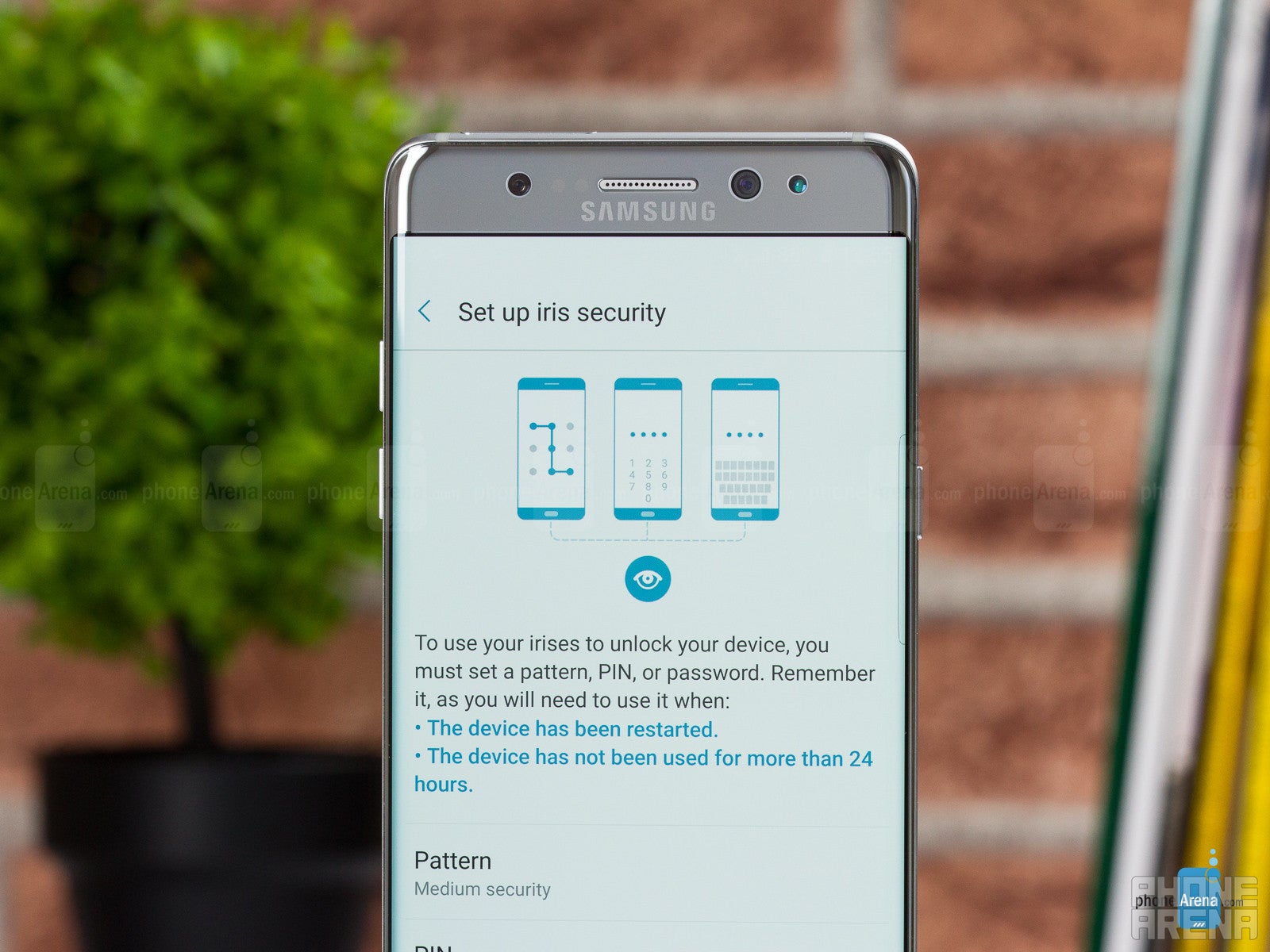
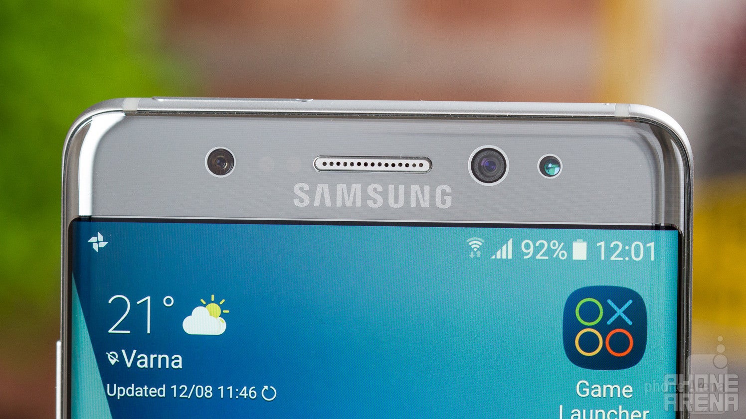
The Samsung Galaxy Note 7 introduces a new security feature called Iris scanner. In what is probably the only occasion where Windows phone owners could say “ha, we’ve had this since…”, this new piece of biometric security allows you to unlock your phone or access private stuff with just a glance. How does it work? It simply scans your iris using some dedicated hardware that’s mounted next to the front-facing camera. You can learn more about the technicalities here, but the bottom line is this: just as it was on the Lumia 950 and 950 XL, the iris scanner is just not a very good feature at this point. It’s inconvenient, and it’s unreliable. To demonstrate all the disadvantages of this current generation of iris scanning technology against the already great fingerprint scanners, let’s play a quick Q&A game:
Iris scanner: No | Fingerprint scanner: Yes
Can you use it without staring at it?
Iris scanner: No | Fingerprint scanner: Yes
Can you use it to unlock the phone in any position, like when it’s lying on a table?
Iris scanner: No | Fingerprint scanner: Yes
Can you use it with (sun)glasses?
Iris scanner: Most of the time, no | Fingerprint scanner: Yes
Which one is more reliable?
While not perfect, the fingerprint scanner in the Galaxy Note 7 works far more consistently than the iris scanner. Success rates in my experience stand at about 75% for the fingerprint scanner and 50% for the iris scanner.
Which one is faster?
The fingerprint scanner, by far. First, in order to initiate an iris scan, the Note 7 requires you to do an additional swipe across the lockscreen, which isn’t required for the fingerprint scanner. Then, if you get everything perfect, yes, the iris scanner is very fast, but more often than not, it doesn’t work instantly, so you need to adjust the position of the phone, move your head around some, etc., etc., ultimately taking more time than doing a fingerprint reading. With the fingerprint scanner, you can take your phone out of your pocket, and by the time you’ve raised your hand, the handset can already be unlocked, while with the iris scanner – this simply cannot happen.
New Interface
The Note 7 introduces an improved, more coherent version of Samsung's Galaxy UI
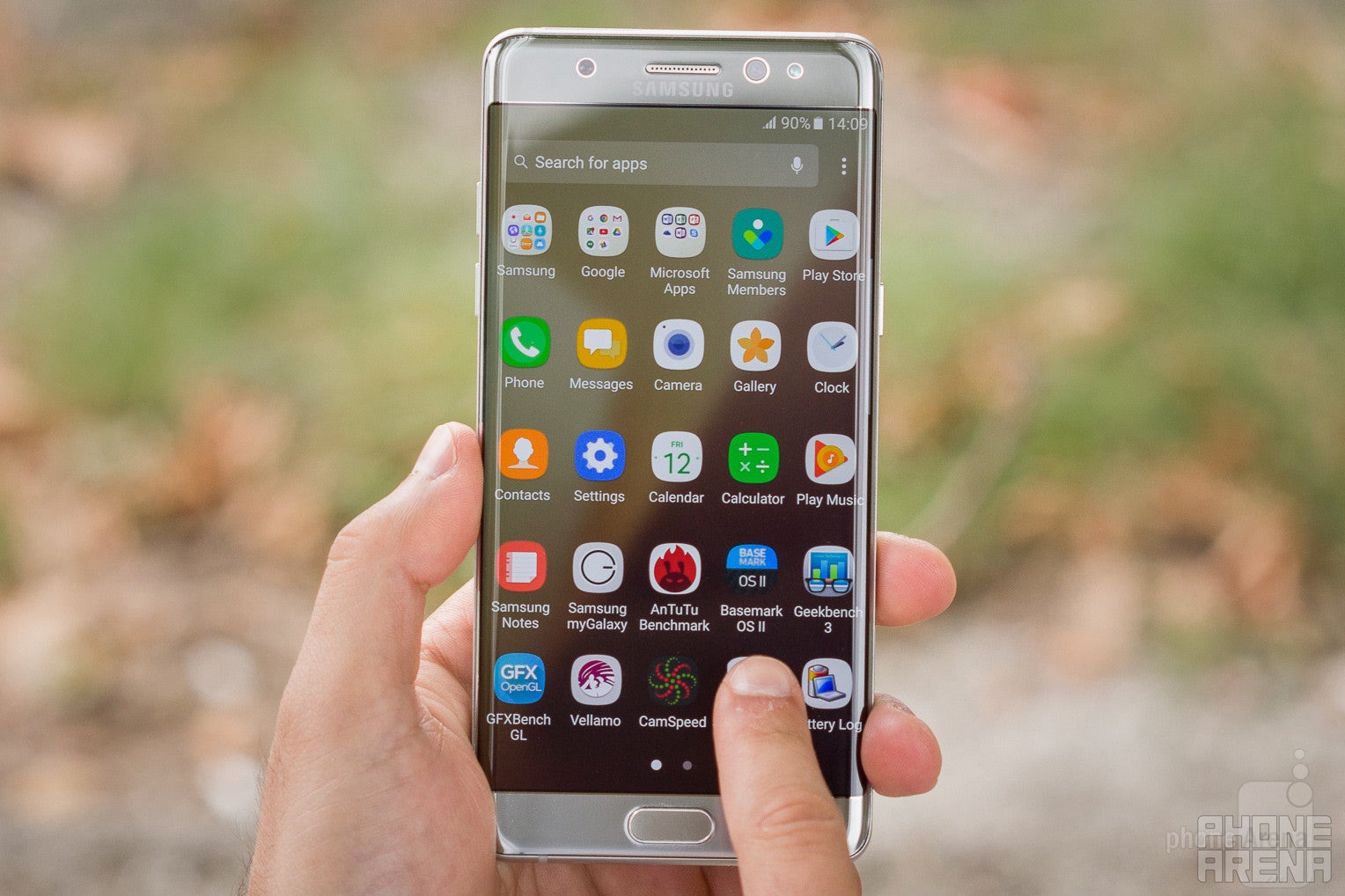
As mentioned in the beginning, the Samsung software layer, which we're used to calling TouchWiz, is constantly being reworked and updated. This remains true with the Galaxy Note 7, which comes with not only a bunch of new features, but refreshed visuals as well.
Powered by Android 6.0.1, the Note 7 brings a new visual style where everything is much cleaner and more simplified than in any other previous Galaxy. It also attempts to standardize icon shapes, by putting them in white icon frames. Many Android makers have tried to do that in the past, and all have failed. Samsung’s latest attempt, however, works rather well for the most part, with only occasional unsuccessful instances, like the Hearthstone icon, for example, which looks weird with its edges cut off. If you’re not into standardized icon shapes, you can always disable this feature from the settings.
Secure Folder
Another really cool new feature is the Secure Folder, where you can store separate instances of entire apps, with their own content and all. For example, you can have a separate Gallery within the Secure Folder, and that gallery can house all the memories you happen to be ashamed of – like that time when you drank soda and at the same moment something really funny happened that made you laugh, and all the soda came out through your nose... Doesn't sound familiar? Well, I can tell you it's not the best feeling in the world! Anyway, you can also have a separate Contacts app with private entries, or private files, etc. As I said, this is a very cool feature, made even cooler by the fact that it can use all available security tools, including the fingerprint sensor and the iris scanner.
Phonebook, Messages, Email, Calendar
The new Phone application is pretty neat. Nice and simplified, it has just two prominent tabs: Log and Contacts. The log is pretty much what you expect it to be, plus it’s searchable. The Contacts tab is relatively efficient, yet it doesn’t miss on the eyecandy, as it displays a picture of decent size next to each entry. Following the iOS approach, almost everything is now designed in the neutral colors of white and gray, and thankfully, the ridiculous dummy portraits next to people for which you hadn’t assigned a photo are no more. No matter if you’re in Log or Contacts, the Dialer is accessible with a single tap on the respective icon in the lower-right corner, and we’re happy to see the familiar T9-style contact searching in tact.
The built-in Email application is pretty decent. It’s quite powerful and doesn’t require a lot of tinkering to get set up properly. It managed to set-up a custom IMAP email address correctly, choosing the right server folders and all. It’s smart enough to inflate text sizes so they are convenient to read, though I did run into an issue where the older messages from a long email thread weren’t displayed properly and were almost impossible to read. But, more often than not, the stock Email app gets the job done quite well.
I didn’t quite like the default Calendar application: if you have a good number of appointments, the week view starts to lag unpleasantly. Day view isn’t much better, because it tends to be somewhat inefficient – it displays too little content on the otherwise abundant screen space. The process of creating new events could also use some streamlining.
Edge Screen
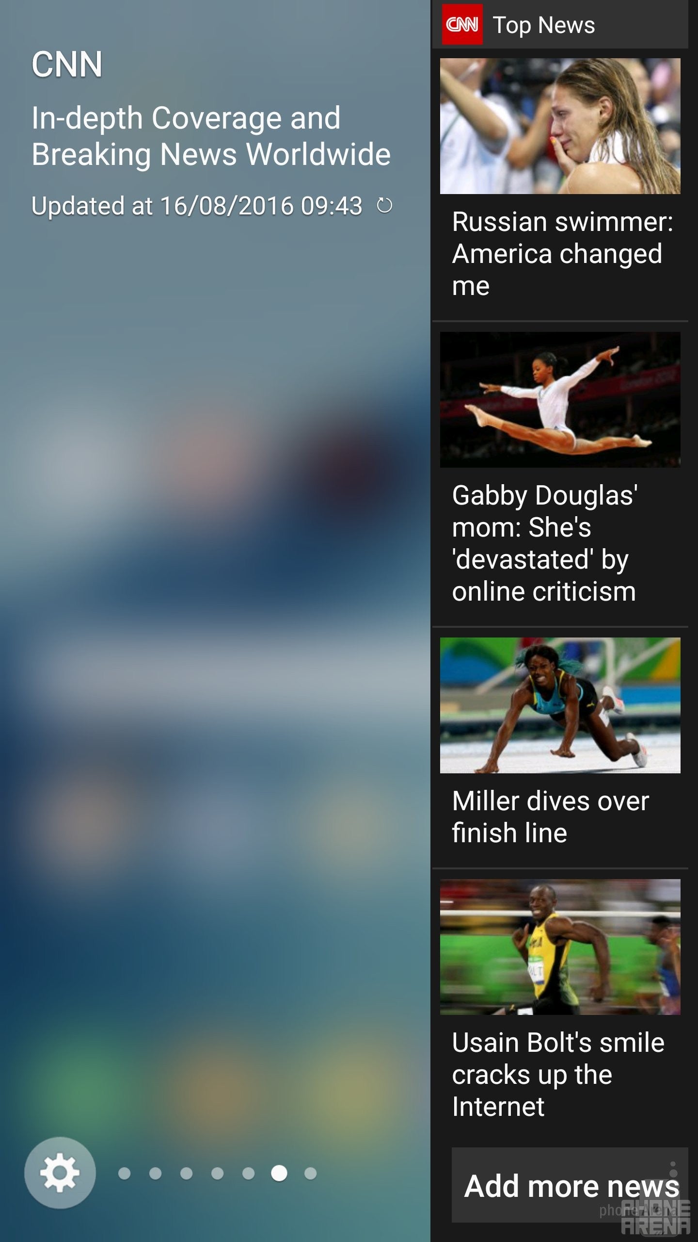
Edge Screen
So, what could you use the edge screen for? Basically, it’s a shortcut to whatever “edge” pane you set it to. There’s a good number of informative panes to choose from (internet bookmarks, favorite contacts, most used apps, tools, etc.), though having too many active at the same time can be counterproductive, as it takes some time to cycle through all of them. Then, there’s the ‘Edge feeds’, which is supposed to display quick updates about notifications, your S Health data, or maybe even CNN news. It’s activated using an unintuitive and inconvenient slide left-right gesture across the edge of the screen, but it’s so clumsy and useless, it makes me wonder why it’s here at all.
Finally, there’s Edge lightning, which seem to be designed for people who prefer placing their phones face-down on surfaces. It illuminates the edges of the Galaxy Note 7’s screen in predetermined colors when someone’s calling you – giving you a hint of who they might be. If you happen to be of the minority who prefer keeping their phones this way, running the risk of scratching their displays, this may be a useful feature to an extent.
S Pen Features
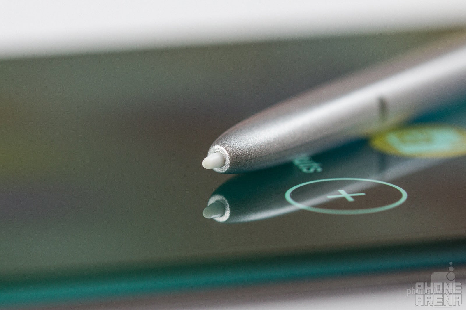
Unlike the Edge screen features, the S Pen has actually evolved into a rather neat tool.
First things first, the spring-loaded mechanism, first introduced with the Note 5, is both a good and a bad thing. In a way, it's better than the old solution, where you could just pull the stylus out of its compartment, because it looks and feels more refined. However, all of this pushing-in and then pulling-out business required by the spring mechanism makes the whole process of taking the S Pen out a bit slower and more finicky.
The new S Pen can also magnify on-screen stuff for you, or translate text by hovering over each word. That’s right: you need to hover over each and every word – it translates just one word at a time, making it a surprisingly tedious solution. You’d be better of using the Google Translate app for the purpose, as it will allow you to select the whole passages that you want translated.
But, if we get back to the essentials of the S Pen, which are writing and drawing, I think it works pretty well these days, with good sensitivity levels and input response. Writing with it isn't like writing on a piece of paper, but it doesn't feel weird; I'd say it's pretty close to where it needs to be. And of course, it's neat that it doesn't require charging.
Additionally, there's a pretty cool new feature here called Screen-off memo. With it, even when the Galaxy Note 7's screen is off (actually, only then), you can take out the stylus and immediately start writing a note. Then, once you're done and the S Pen has been reinserted into its compartment, the phone automatically saves your hand-written note.
Performance and Memory
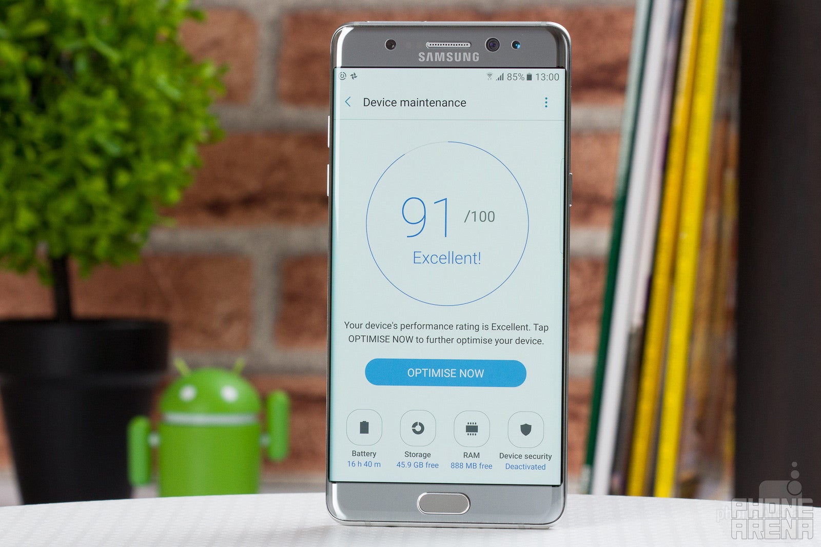
Samsung has put itself in a unique position to offer smartphones that are technologically superior to most of the competition. It develops its own memory chips and batteries, it is the leader in AMOLED display production, and it builds its own processors. The Note 7 comes in two variations: in the US, it sports the Qualcomm Snapdragon 820 (quad-core, up to 2.1 GHz), while in most other markets, it comes with Samsung's in-house produced Exynos 8890 (octa-core, up to 2.1 GHz). Both of these silicon marvels are extremely powerful. Together with the 4 gigs of RAM, they have more or less equal processing potential. And in this case, this means overall very snappy system performance, while most games and apps tend to run quite well. In some very rare occasions, I noticed some frame rate drops in some games, but those instances were mostly few and far between.
The Galaxy Note 7 comes with the generous 64 GB of internal memory. Not only does this allow you to store tons upon tons of content, but you can also expand it with a good old microSD card for even more storage potential.
Camera
Same great shooter as on the S7 series; post processing is a bit out of hand
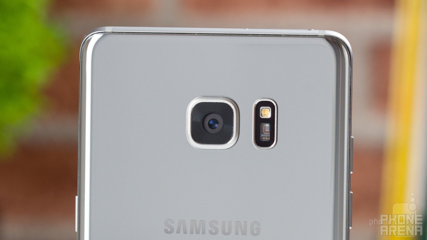
What is a Galaxy smartphone without a superb camera? That’s exactly what we get with the Note 7 – the same 12 MP shooter that has already made the Galaxy S7 the wonderful cameraphone that it is.
The camera application is mostly easy to deal with. Most camera modes are accessed with a swipe to the right, while filters – with a slide to the left. It's quite efficient, once you get the hang of it.
The 12 MP images the Note 7 takes are gorgeous. They offer mostly correct, if slightly warm, color tones. At the same time, everything looks nice and vibrant, perhaps overly so. Details are abundant, although there's quite a bit of oversharpening going on, which gives the photos a slightly more aggressive look than needed. With the added warmth, saturation, and sharpening, it feels like Samsung is pushing things a bit too far with the post processing. Still, pics from the Note 7 do look great, so we guess there’s not much cause for concern.
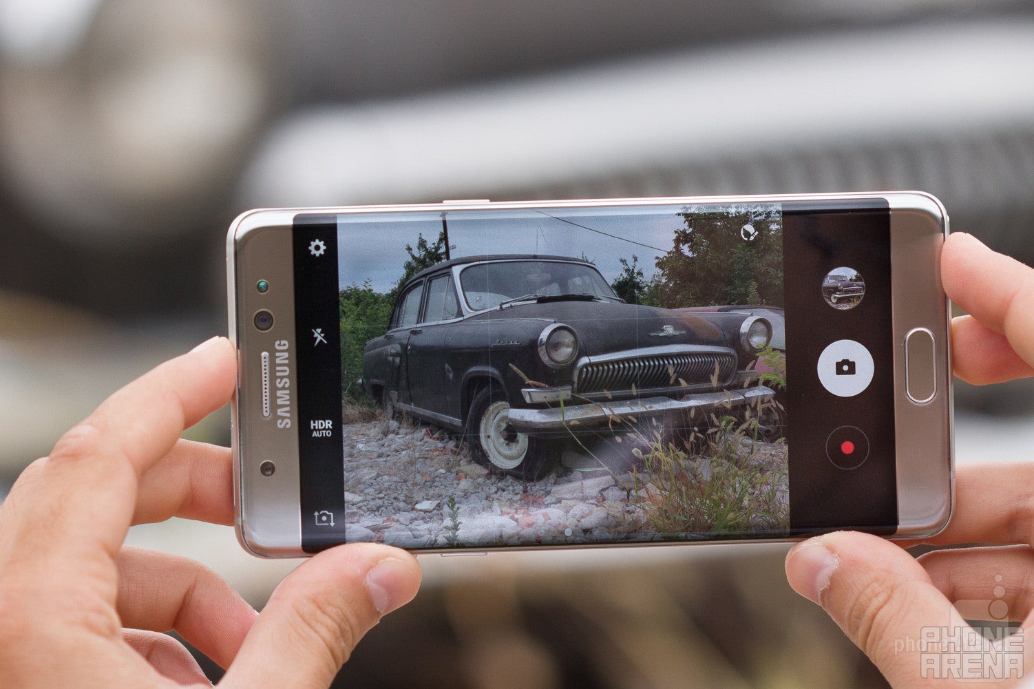
Camera interface
Probably the best part about this camera is how good it is when shooting in dark conditions. The wide, F1.7 aperture really helps draw in as much light as possible, and the results are inspiring, although sometimes things can easily get a bit blurry, so you need to keep the phone extra steady. Still, night pictures and portraits taken with the Galaxy Note 7 seem to be at least a step ahead of most rivals, including the iPhone.
Not everything is so jolly when it comes to the 5 MP front camera, however. The field of view is so wide, one can hardly take a normal selfie shot without their head appearing stretched like a banana. For group selfies – yes, it’s going to work pretty well, but if it’s just you that you want to get in the shot – not so much. There’s also a fairly intense beautify effect by default, and if you’re into this sort of things, there are also some other effects like ‘big eyes’ or ‘spotlight’, or ‘slim face’, which, if utilized correctly, can really make you look like the superstar or diva that you’re not.
Samsung Galaxy Note 7 Sample Images
Video recording with the Note 7 happens in 4K at 30 fps, or 1080p at 30 or 60 fps, and most of the things we said about photo quality apply here as well. An overall solid picture, with some noticeable oversharpening and added vibrancy. As far as night video footage goes, it’s mostly good, though I think the noise reduction is a bit too aggressive here.
Samsung Galaxy Note 7 Sample Videos
Multimedia
First phone to play HDR10 video content
There’s a bottom-mounted loudspeaker on the Note 7. Volume-wise, things are pretty decent – nothing to make you jump out of your seat, but strong enough. In terms of clarity, there’s something left to be desired: it’s not too bad, but it could use some brilliance in the highs and depth in the lows.
Call Quality
There’s nothing out of the ordinary with the Note 7 as far as call quality goes. The earpiece is of average quality, with volume being decent. This is something which would depend on a number of factors, of course, but the general case is just that – OK, but not great experience. The same goes for the outgoing side.
Battery Life
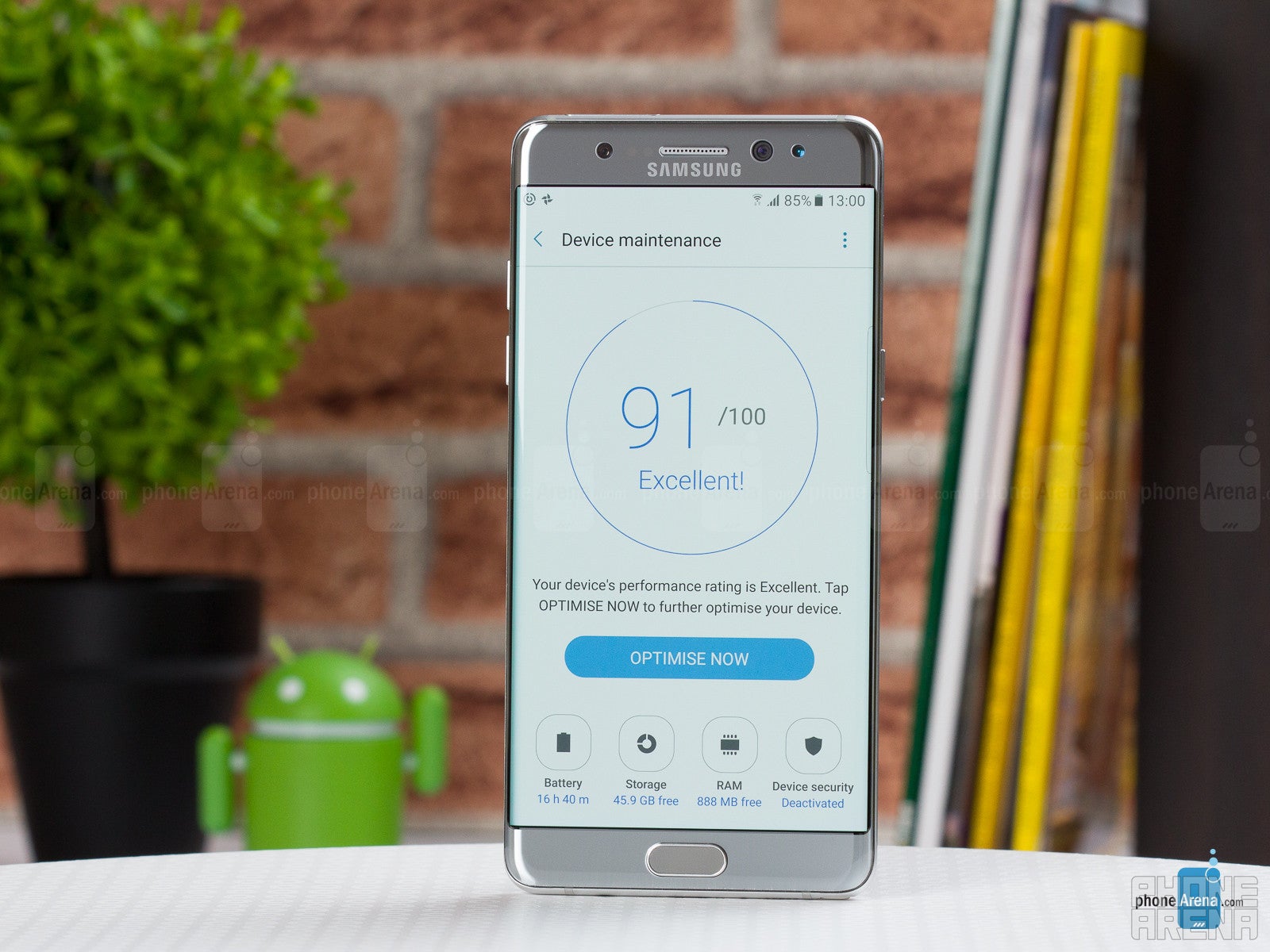
If one day of battery doesn’t sound particularly promising, there’s a couple of power-saving modes you can try. The MID power saver is interesting because it allows you to simply lower the resolution of the phone (among other measures): to either 1080 x 1920 or 720 x 1280 px. There’s a teeny tiny bit of visual clarity lost, but in return you’ll be getting longer battery life and increased performance. And there’s also the MAX power saver, which seriously limits functionality on the phone and enables a simple black theme in order to significantly extend longevity.
Conclusion
The Galaxy Note 7 is an almost incomprehensibly versatile smartphone. It can do so much right out of the box! However, the large screen, the seemingly endless functionality, and all of that S Pen goodness are obviously… not for everybody. So who is it for?
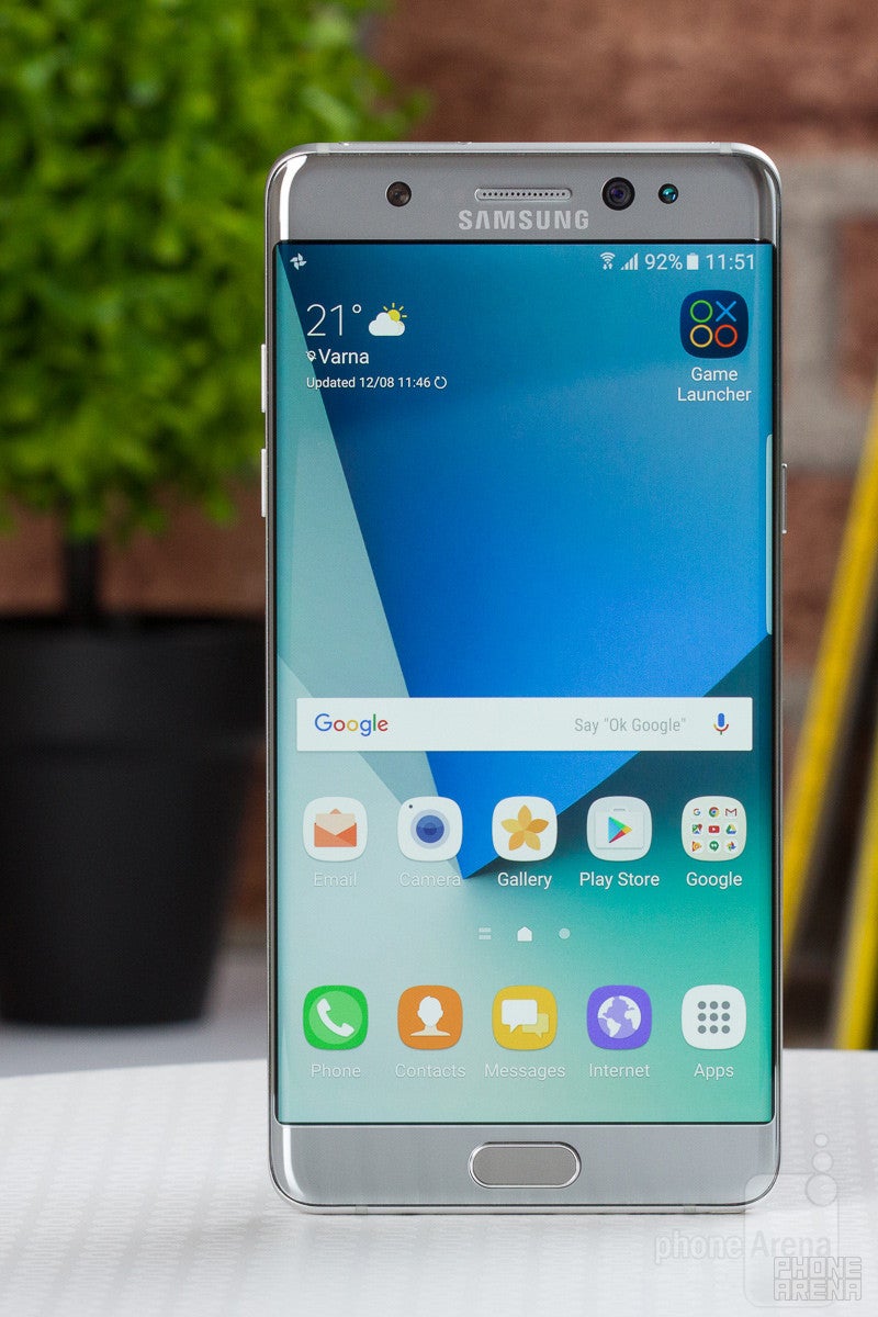
But, if you, instead, see yourself as a more of a mainstream consumer, not necessarily a phablet junkie, there’s an extremely similar, but slightly scaled down experience available out there, and it’s called Galaxy S7 edge. Which, I think, will be a much better fit for most consumers.
Update: Read our Galaxy Note 8 review!
Follow us on Google News






Things that are NOT allowed:
To help keep our community safe and free from spam, we apply temporary limits to newly created accounts: