Nokia XL Review
Introduction
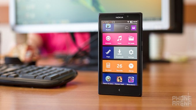
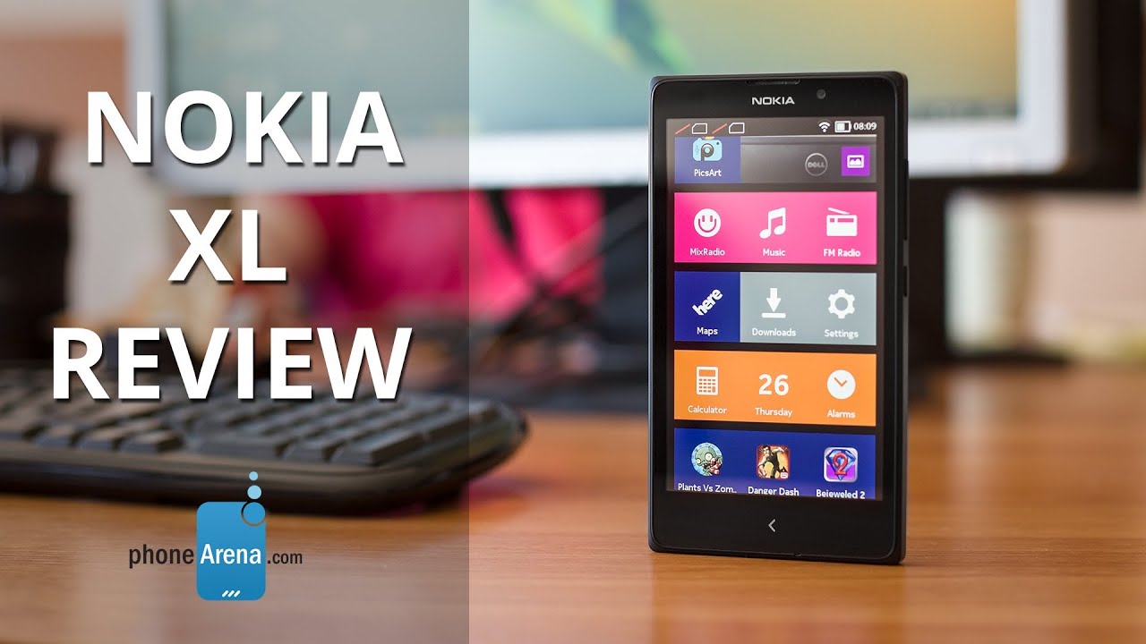
The 5-inch Nokia XL is the largest in Nokia’s family of affordable Android-running phones, but just like all the rest in the X series, you’d find it hard to recognize it as an Android phone. This is because of Android Nokia X - the company’s own custom version of the platform that brings a Windows Phone-inspired interface and comes without all core Google apps. The Nokia XL does not even have the Google Play Store - instead it comes with Nokia’s own app catalog that lacks even very popular apps like Spotify and Netflix.
The Nokia XL also got quite a few things going on - the large and vivid display, a fairly well-optimized performance, dual-SIM connectivity, and it’s got both a 5-megapixel main camera and a secondary, front cam.
Can all these pros outweigh the cons of a weird Android experience and limited number of apps? Let’s find out.
In the box:
- User Manual
- Wall Charger with non-detachable USB cable
- Headset
Design
The Nokia XL deserves its name - it’s big and unwieldy, larger than most other 5-inch phones.
You can tell just by its name that the Nokia XL is a large device. Knowing that it’s a 5-inch phone actually does not tell too much about the phone - it does not reveal the fact the bezels on it are huge (especially the side ones), and that it all comes in a pretty thick and bulky package. It is the 0.43” (10.9mm) thickness, however, that really contributes to a feeling of a rather unwieldy phone. Not only is it thick, it's also very heavy, measuring 6.7 ounces (190g), more than even most phablets. It is solidly put together, though, and does not screak when you hold it tightly.
Design-wise, the XL follows Nokia’s signature design language with a plastic wrap-around shell. The back is made of matte plastic that feels very similar to the material used in the Moto G, maybe a bit softer, but also very prone to attract oily fingerprints. Up front, there is just one capacitive ‘back’ key, right below the display - an element that reminds of Asha feature phones.
All physical keys are on the right side - the power/lock key in the middle, and the volume rocker above it, and while both are decidedly plastic, they are comfortably within reach of your thumb, and very clicky and easy to press.
Display
The 5-inch screen is not sharp, but it more than makes up for this with its great and vivid colors. Outdoors, though, it’s hard to read the screen.
The big highlight of the Nokia XL and the reason it carries its (not so flattering in apparel design) name is the spacious 5-inch display. It’s not truly XL by today’s standards, but it’s still big for this class of affordable devices.
The screen comes with a resolution of 480 x 800 pixels (WVGA), which works out to a pixel density of the very low 189ppi. This drawback is most obvious when you look at text, which looks pixelated, forcing you to zoom in to be able to read it.
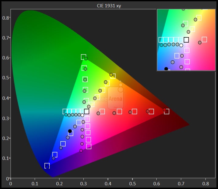
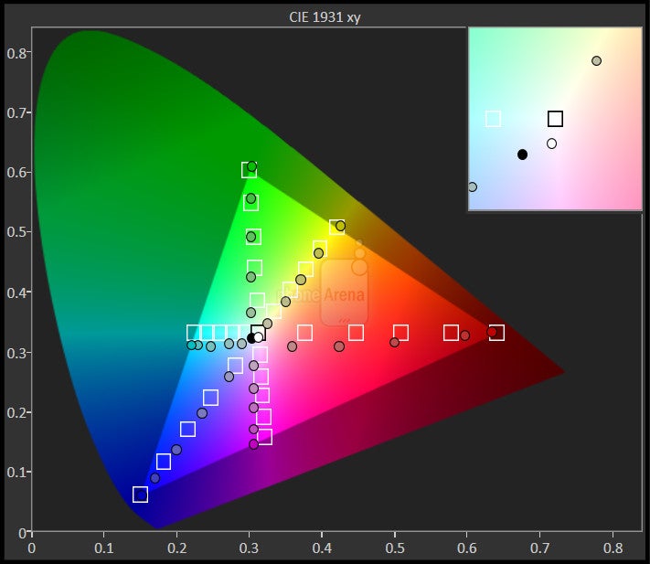
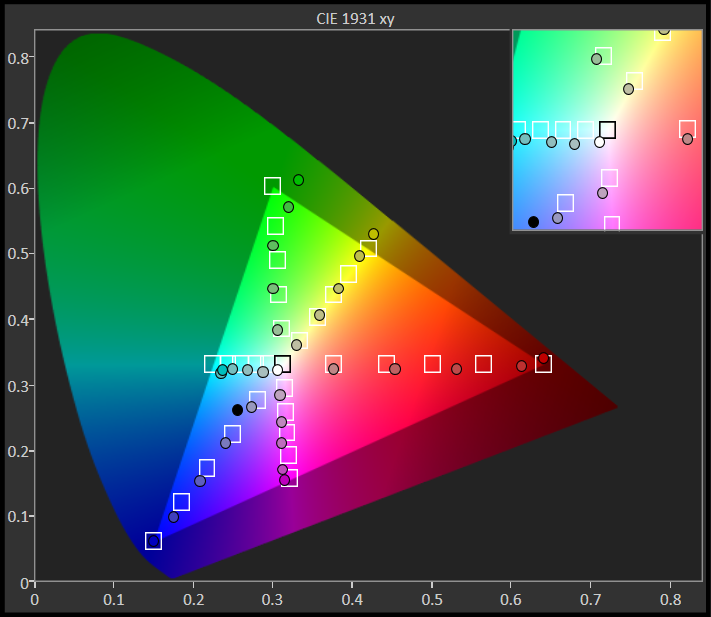
If you don’t obsess over pixels, though, the 5” display of the Nokia XL will definitely make you happy with its lively, vivid colors. It’s among the best screens on an affordable phone we’ve seen so far - it’s not too cold, it’s got deep blacks, and while it’s just a bit off in terms of color, it looks great.
Using the display under the direct sunlight outdoors, however, is a bit problematic - the peak brightness of 358 nits is on the low side, and the high reflectivity of the screen will force you stare and shield the screen to make out what’s on it. Finally, while viewing angles are not terrible, they are not good either and color and luminance decrease noticeably when you tilt the screen a bit.
Interface and Functionality
The Android-based Nokia X platform feels crippled - it lacks the most basic applications and the Windows Phone-inspired looks lack the dynamics and good iconography work.
The Nokia XL comes with Android Nokia X 1.0 UI, a platform we called Frankenstein of a software when we first saw it in the Nokia X, and we can only confirm this observation with the XL. To build its own fork of Android, Nokia went the way of Amazon - it used the open part of Android, the AOSP, and built on top of it, making a Windows Phone-inspired Tile-based interface immersed in the Microsoft ecosystem.
The Nokia Android X platform is in fact built from the ground up to be a window to the world of Microsoft services, and a wall to the world of Google. None of Google’s traditional apps are here: instead of Google Maps, you get Nokia’s map app; rather than having Gmail, you have a different client that feels more limited; then the YouTube stock app is simply missing; and finally, the massive Google Play Store is replaced with the sketchy Nokia solution. While we have our reservations for Nokia’s Android X looks, it is the horrific app situation that truly could be the real deal-breaker here. Yes, you can sideload apps, and yes, you can also sideload the Amazon Appstore and get apps from there, but with no Google Play Store on board, the Nokia XL is crippled. Having to look for a way to sideload the most basic of apps like Spotify and Netflix is not our understanding of a good user experience. Trying to sweeten the sour taste from those missing apps, Nokia offers 1 month of free international Skype calls, and 10 gigs of free OneDrive cloud storage. While we have no particular problem with windows and walls on their own, the big issue with the XL is that its particular window is both limited and not a pretty one.
Unlike the dynamic Live Tiles that give Windows Phone its character, the tiles in the Nokia Android X platform home screen are static, the icons are too simplistic and don’t look good. In the end, it all looks like a mash-up of colors and pixelated icons drawn by a kid in MS Paint. The notification dropdown is also different than on Android, with just four quick toggles, and no options to customize its appearance.
Swipe to the left of the home screen, and you arrive in Nokia’s Fastlane, a view of all your recent apps and actions. Fastlane replaces Android’s multitasking, but it differs in that it registers actions separately, so instead of seeing a list of the most-recent apps, you rather see a list with your most recent activities (this way you can see two images from the gallery in the list, while in Android's standard multitasking, you'd have just one entry from the gallery). You can even manage which apps to appear in your Fastlane and push notifications to it. Overall, while different in functionality than stock Android, Fastlane gets the job done differently and does not look like a huge downgrade.
It’s also worth mentioning Nokia’s in-house features - Glance screen and Double tap to wake up. Double tap is something we've seen on other devices (most notably, from LG), but the other one - Glance Screen – is fairly unique, allowing you to see the time without even unlocking your phone, and it’s neat.
One thing that’s missing on the Nokia X platform is a dedicated home key. Having only the ‘back’ button below the display, it takes a bit to learn that you have to actually hold it to go straight to your home screen (it certainly took us a few tries to figure it out).
We usually don’t pay too much attention to system sounds, but in the case of the Nokia XL we should, just to say that we wish there were none at all. From the annoying click-clack of the screen unlock, to the terror-inducing camera shutter, we were flabbergasted with the poor taste in sound in the XL. Luckily, you can disable most of those sounds in Settings -> Sounds and vibration (and inside the camera app for the shutter sound).
Processor and Memory
Nokia has optimized the interface well, so that even the ancient chip inside the XL can run it fairly smoothly. For more intense apps and games, though, it goes out of breath.
In terms of speed, the Nokia XL rarely lags, and generally feels very zippy nearly all throughout. It’s powered by a fairly quaint chip - the dual-core 1GHz Snapdragon S4 MSM8225 (part of Qualcomm’s S4 entry-level Play series). It’s a piece of silicon based on the Cortex A5 core and manufactured on the 45nm process, definitely out of the league of even most other Android low-end phones. At least the amount of RAM on the XL stands at the fairly decent 768MB, an amount that helps with fairly smooth multitasking. The large screen might lure in some gamers on a budget, but fact is that the quaint processor is just not a good fit for the mobile gamer.
Another downside of the Nokia XL is that it only comes with 4GB of internal storage, of which only around 1.2GB are available to the end user. Luckily, you can expand on that limited allowance via microSD cards of up to 32GB.
Internet and Connectivity
There is only 3G at fairly low speeds, and the stock browser is slow to load and render pages.
Since everything Google-made is missing, you should not be surprised that the Android-based Nokia XL does not have the Chrome browser on board. Instead, it uses a Nokia-built browser that uses Bing as the default option for searches.
The dated processor, however, seems to be a bottleneck when it comes to browsing as pages load slower than we’d like, and rendering different parts of them, as well as just scrolling around is definitely on the slow side.
The Nokia XL lacks 4G LTE connectivity, but that’s expected for such an affordable phone. It has 3G that is not too fast, though, reaching speeds of up to 7.2Mbps on the downlink. Other connectivity options include single-channel Wi-Fi, Bluetooth 3.0, GPS, and there is no NFC on board.
Camera
The 5-megapixel main camera captures mostly above average images with pleasing colors, but it’s on the slow side.
The Nokia XL comes with a 5-megapixel auto-focus main camera with a single LED flash, plus it also packs a basic front-facing shooter.
There is no shortcut to quickly start the camera - you have to unlock the phone and tap on the app icon to launch it. Once inside, you’re welcomed by a familiar interface that looks somewhat similar to Google’s own Camera app, with a large shutter key and a few settings. Unlike the Google app, though, here you have more manual settings and you can control even settings like ISO, white balance, and so on. Still, the interface is a bit confusing - try finding the button to switch to the front-facing camera (you have to first tap on what looks like the video recording button to see it)!
The actual quality of captured photographs is above average: good, but not spectacular. Images have nice and vivid colors in most conditions, and this makes them perfectly fit for social sharing. There are, however, two notable issues with this camera: first one is that it is very slow and thus not well-fit for impromptu shots, and the second one is the weird, unnatural oversharpening visible in almost all images. The sharpening effect is so aggressive that you can even see some white halo-like artifacts in images.
Indoors, images turn out okay: dynamics could have been a little bit better, but overall, you're getting a usable picture with fairly pleasing colors. Our studio shots, however,show that the handset sometimes has trouble with color in those lower-lit conditions - it swings towards green-ish colors that probably only Kermit would like. The LED flash is strong enough to light up scenes, but it is the colors again that seem like the big issue here.
Having a front cam in an affordable phone is still considered an advantage, and Nokia's front shooter captures decent photos in good light.
The main camera is capable of recording up to 480p video at 30 frames per second that does not look good at all. Its biggest problem is the sore lack of detail, and the playful, loose auto-focus. Sound recording quality is also not something to brag about - it lacks clarity, picks up lots of side noise, and it’s hard to make out voices in recordings.
Multimedia
The vivid 5” display makes video watching a great experience, and with MixRadio on board you have music streaming covered.
The 5-inch display is large and vivid, which is a great asset for enjoying media. We managed to play up to 720p videos in most popular codecs.
For music, you have both Nokia’s MixRadio player and streamer on board, as well as the custom Nokia Music app (that has no streaming option, but adds settings like an equalizer), and both get the job done playing your tunes. MixRadio, on the other hand, is a great application with that allows you to stream songs for free (it’s got an ad-free premium version as well), but it’s not available in all markets. Speaking of music, we should once again mention the sore lack of many popular streaming services like Spotify and Pandora in the Nokia app catalog - you’d need to sideload those apps, if you’re using them.
Sound via the loudspeaker is very loud, and fairly clear, and while it cannot match the depth and clarity of top performers like say the HTC One (M8), it is still great.
Call Quality
Call quality is a bit of a mixed bag on the Nokia XL. On one hand, voices in the earpiece sound very clear and natural (though, a bit quiet), while on the other end of the line, sound is muffled and not all that clear, plus it is also on the quiet side.
Battery life
The Nokia XL comes with a 2000mAh battery with an above-average talk time of some 16 hours (13 hours on 3G), and stand-by time of 30 days. In real-life use, you can expect it to last a bit more than a full day, and that’s not a bad achievement at all.
You can also easily remove the wrap-around back cover and change the battery, an option that would be useful for, say, travelers that don’t have access to a charger for longer periods of time.
Conclusion
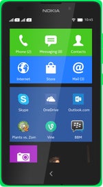
With an off-contract price of around $165 (€140 in Europe), the Nokia XL is an affordable device that stands out with a display larger than most of its competitors in this price range. Needless to say, this large and also gorgeous display is its biggest advantage. The 5-megapixel camera is also a good one for the class, and while it runs on a dated processor, the XL is well optimized and does not lag, at least for most basic tasks.
And while these are important advantages, the limitations of the Nokia X platform are no less important. The poorly stocked Nokia app catalog would force users to try and sideload apps, while most non-tech-savvy users would simply be left with greatly crippled app choice. On top of this, the interface of the Nokia XL is not appealing.
Those are compromises that budget-limited consumers might be willing to deal with as the Nokia XL is not a bad value for its money. It is a crippled experience at the end of the day, though, so our recommendation at the moment is to look at slightly pricier device that deliver a full and satisfying Android experience.
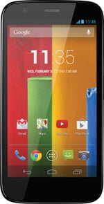
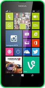
Luckily, there’s no shortage of such phones: the Motorola Moto G is the most talked about affordable phone and for a good reason - it’s got a great 4.5” screen, zippy chip, the full Google Play Store and decent camera, all enough to make it our top recommendation in the affordable phone class. The Huawei Honor 3C is a bit more expensive, but it gets even closer to that flagship experience with a 5” display, a fast chip and a good camera (it’s also a dual-SIM phone). The Nokia Lumia 630 also seems like a great alternative - even though it’s running on the app-constrained Windows Phone, it still feels better equipped with applications than the app-crippled Nokia XL.







Things that are NOT allowed: