Nokia Lumia Icon Review
Introduction
As the good saying goes, it’s better late than never. The timeless adage rings deeply for Verizon when it comes to Nokia smartphones, seeing that the carrier is constantly receiving second servings in comparison to its rival in AT&T. It was especially made apparent last year with the arrival of the highly anticipated Lumia smartphone for Big Red, the Nokia Lumia 928, which was a none other than a slightly modified version of the Lumia 920 before it – yet again, a phone launched with AT&T first.
More recently, AT&T continued to reap all of Nokia’s fruitful labors with the Lumia 1520, a game changing Windows Phone in respect to its specs and size. Following in tradition, from what it seems, Verizon is laying claim to a modified version – the non-number branded Nokia Lumia Icon. Taking almost everything we love about the mighty Lumia 1520, the Icon’s package is slightly smaller, due to the 5-inch display it’s packing along for the ride. Aside from that, it looks like there aren’t any compromises with this over AT&T’s pride and joy. Well, let’s cross our fingers about that one!
The package contains:
- Wall charger
- microUSB cable
- Warranty information
- Get started guide
Design
Its design is not as iconic as those of some other Nokia phones
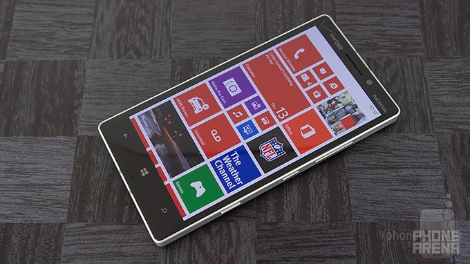
Depending on how you look at it, the Lumia Icon is either a larger version of the Lumia 928 before it – or a slightly shrunken down size of the Lumia 1520. Compared to other recent Lumias, we can’t say that we’re totally in love with the design here. First and foremost, it has a flatter/boxier characteristic to it, seeing that it’s sporting tapered cuts in the rear casing that are more subdued than ever before.
Although we appreciate the sturdy metallic bezel outlining the handset, which sprinkles on a hint of premium to the overall design, it makes the handset sharp to the touch. In fact, it’s not as comfortable to hold in the hand due to the edges of the bezel digging into our hand. In comparison to the Lumia 1520, the Icon is obviously easier to hold with a single hand due to its smaller size, but then again, those sharp edges combined with its flatter design, doesn’t make it the most ergonomic thing.
Finally, there are only two colors available with this model, matte black and white, which employ the same polycarbonate materials we’ve seen endlessly by now. Frankly speaking, it’s not an iconic design – nor is it daring or cutting edge.
Keeping true to the design language that’s been well established by now, it features the same set of ports and buttons around its trim – these consist of its microUSB port, two-level shutter key, power button, volume controls, 3.5mm headset jack, and SIM slot. A changeup to say the least, unlike previous Lumias that required a SIM removal tool to access the SIM, the Icon’s tray is easily accessed by simply prying the compartment with our fingernail.
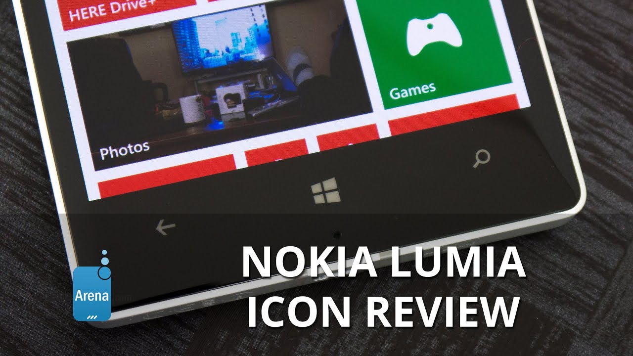
Below and above the display, we find the usual trio of capacitive Windows Phone buttons, earpiece, light & proximity sensors, and a 2-megapixel front-facing camera. Sorry folks, this one doesn’t feature a microSD card slot.
Both the Lumia 1020 and 1520 are known to be serious camera centric devices, so it doesn’t surprise us that the Icon is in the club as well. Rather, there’s an evolutionary improvement seen with the handset’s 20-megapixel PureView camera, which features ZEISS optics, a wide angle f2.4 aperture lens, optical image stabilization, and dual-LED flash. Whereas the cameras on the aforementioned smartphones jutted out tremendously, the Icon’s entire camera package is flush to the surface – resulting in a uniform back casing.
Display
Sharp, 441 ppi AMOLED screen that is rather difficult to view in the sun
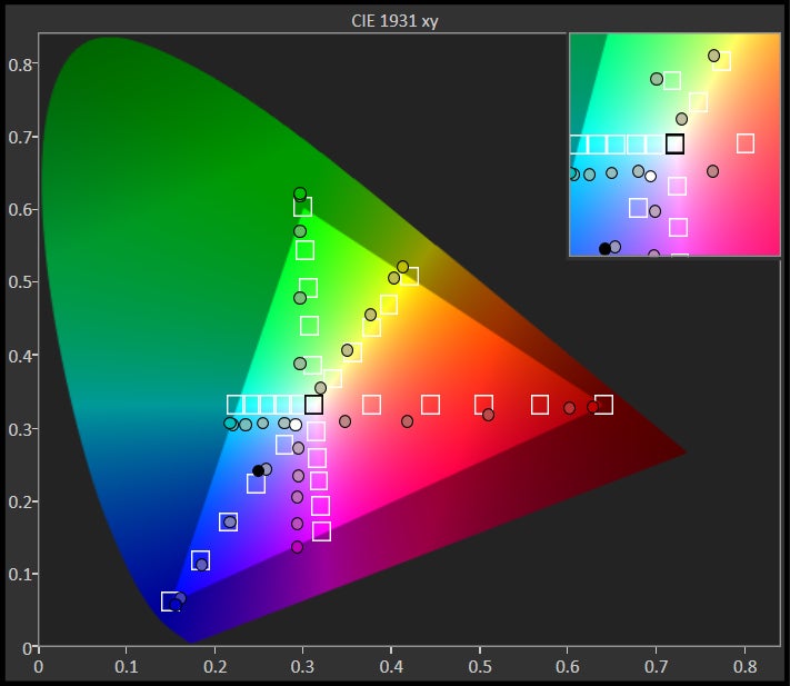
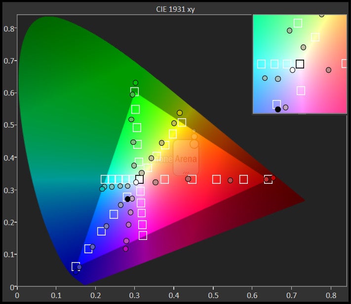
So long Lumia 1520. There’s a new king in the Windows Phone arena that’s taking the crown for having the most detailed display. Flaunting a 5-inch 1080p HD OLED display with Nokia’s ClearBlack technology, it results in having a pixel density count of 441 ppi – easily besting the 368 ppi tally of the Lumia 1520. It’s undoubtedly detailed, giving every little morsel plenty of sharpness and clarity.
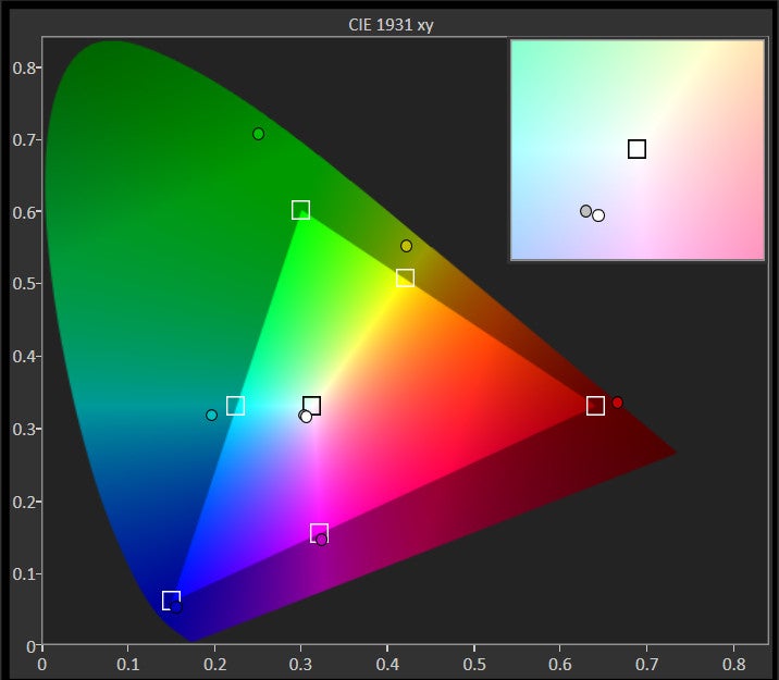
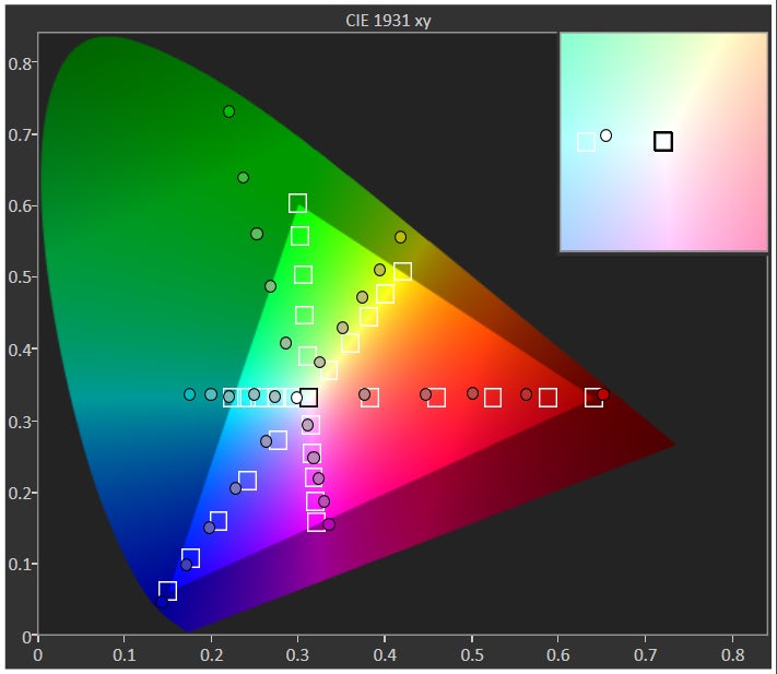
Nokia has been known to switch up the displays they employ with their phones, which is especially apparent here with the Icon. Instead of following in the same path of the Lumia 1520, which sported an LCD display, the Icon’s display favors AMOLED technology. The result, of course, is having oversaturated colors that instantly catch our attention – more so when the color black is actually black, not a shade of grey. Additionally, its viewing angles are stupendous, since it maintains its clarity at all angles.
Under the settings menu, we can adjust the color profile of the display. Therefore, we can modify both the color temperature and saturation, giving colors a cooler or warmer glow. Also a frequent feature amongst Nokia’s Lumia smartphones, we can interact with the display while wearing gloves. It’s a pleasant thing to know when it’s frigid outside, and at the same time, its sensitivity can also be adjusted for better accuracy.
However, it’s not the brightest display we’ve come across. Just a smidgen shy of 300 nits, the display is difficult to view outdoors with the sun present – requiring us to shield it most of the time. Layered on top of it all is Gorilla Glass 3, which should do nicely to protect it against minor scuffs and scratches. Overall, it’s still a head turner in a dark room, as the iridescent glow of the display makes it a prime target.
Interface and Functionality
It has the same experience as any other Nokia Lumia
Playing around with the Nokia Lumia Icon, it’s made clear from the get-go that it’s running the same software experience as the Lumia 1520 before it – Windows Phone 8 with the GDR 3 update. Save for a few Verizon branded apps, the package remains similar for the most part, so there aren’t any new additions or surprises here folks. As with all other Windows Phones running the GDR 3 update, the Lumia Icon benefits by accommodating even more live tiles on the Start screen, a smoother multitasking experience, screen orientation lock, driving mode, and much more. We won’t expand on them a whole lot, seeing that you can read about them in our Lumia 1520 review.
Beyond the usual set of apps we’re accustomed to seeing on any Windows Phones, we’re naturally greeted by the array of apps from Nokia’s portfolio. The goodies in the mix include such things like the splendid Nokia Here app with free turn-by-turn navigation and offline maps, Nokia Mix streaming radio service, Nokia Cinemagraph for making animated GIFs, and Nokia Beamer for sharing your phone's screen through a web browser.
By now, we’re familiar with the routine here. Knowing that, we’re kind of ready for a change of scenery – though technically, Windows Phones with the GDR 3 update are still few and far in between. It gets the job done, more so than other non-Lumia Windows Phones, but at the end of the day, it’s just the same recycled experience we’ve relished first with the Lumia 1520.
Messaging
Certainly easier to maneuver than the Lumia 1520’s keyboard, the smaller sized screen of the Icon allows us to better encompass the layout – while its responsiveness and accuracy continue to be impeccable.
Even with the GDR 3 update, there’s nothing dramatically new the email experience here that we get on other Windows Phones. Despite that, we can’t complain because it gets the job done by giving us a good balance between organization and productivity.
Organizer
We like the selection of first-party apps on Windows Phone. Having mobile Office right out of the box is a huge plus. Since this is a Nokia phone, you also get some very neat applications that other Windows Phone handsets do not have. Nokia Drive with free offline turn-by-turn navigation and Nokia Music with its great free music streaming option are on board.
Basic functionality is also well covered with a phone app that integrates your social news circles (Facebook and Twitter) and contacts. Although its set of core organizer apps are more than usable, the platform is seriously lacking a contender in the digital personal assistance service category. Relying on its Bing service, it’s able to do basic things like making phone calls, sending text, opening apps, and much more. However, it lacks the smarter features of its rivals – like being able to perform calculations, conversions, and even answering who is the president of the US.
Processor and Memory
Powered by the excellent Snapdragon 800 SoC, with 2GB of RAM
Matching its close sibling, the Icon is powered by the same piece of silicon inside of the Lumia 1520 – a quad-core 2.2GHz Qualcomm Snapdragon 800 SoC coupled with the Adreno 330 GPU and 2GB of RAM. Its performance is quite telling, considering that this processor is used by many of today’s high-end smartphones, so we’re thankful to know it’s responsive with pretty much every operation. Some apps might load a bit slower than its contemporaries on other platforms, but that’s mainly attributed to the platform – not the phone’s hardware per se.
More and more companies are raising the bar when it comes to storage capacity for $200 on-contract phones, so it’s refreshing to know that the Icon is blessed with an ample 32GB. That’ll go a long for some people, especially when there’s no expandable memory with this.
Internet and Connectivity
Accessing the web on a Windows Phone device happens exclusively via Internet Explorer, and the Lumia Icon is no exception. We don’t like the lack of choice, but luckily mobile IE is a good browser on its own, and with 4G LTE on board, surfing the web is a pleasure. Best of all, its even more detailed 1080p screen adds icing to an otherwise typical looking experience for Windows Phone.
Being touted as the premier Lumia smartphone for Verizon, the Icon is stuffed with all the connectivity features of its contemporaries. The listing includes 4G LTE, aGPS with Glonass, Bluetooth 4.0 LE, dual-band 802.11 ac Wi-Fi, and NFC.
Camera
The 20-megapixel camera is great, but could be better in low-light scenarios... and faster, too!
Turning our attention to the camera app, it’s exactly like the one we’ve already seen with the Lumia 1020 and 1520 – so it’s the Nokia Pro Cam app by default. The layout, mimics that of most digital cameras nowadays, where we have a healthy selection of options and manual controls to choose from. With the latter, we can adjust the white balance, focus, ISO, shutter speed, and exposure to achieve the best composition. There’s a smart mode too that compiles various images post shot, like the best shot, action shot, or motion focus, but the majority of fun shooting modes are uncovered through the various “lenses” that are attached to the camera app – or just use any of the Nokia branded photos apps that are preinstalled.
As for the camera gear, it’s the same set that we saw already on the Lumia 1520 – albeit, the Lumia Icon doesn’t have any serious bulges or protrusions in the rear. Packing along a 20-megapixel PureView camera with ZEISS optics, optical image stabilization, wide angle f2.4 aperture lens, and dual-LED flash, it’s no doubt a serious contender in the camera arena. Just like its sibling, it captures two set of images – a 5-megapixel oversampled one that’s best for sharing via social networking, and the higher resolution 19-megapixel one that can be reframed later on to our liking. Having such a high megapixel count, it means that snapping images and saving them take a lengthy amount of time. In our case, roughly 8.5 seconds before we’re able to snap the next shot.
This is indeed a snapper to behold, as it’s able to compose sharp looking images outdoors when lighting is aplenty. Out of everything, it’s the sharp visuals captured by the higher resolution 19-megapixel samples that show its detail superiority over other smartphone cameras. Whereas fine details would be hard to distinguish with the 5-megapixel oversampled shots, they’re more than visible to the eye with the high-res ones. Both the exposure and color reproduction look pretty convincing, which perfectly complements the sheer amount of detail it captures.
However, we’re still baffled by the underwhelming performance of the camera under low lighting – the same issue we had with the Lumia 1520. Yes, we’ll say that images are noticeably brighter in tone, to help draw out details, but they’re softer and less pronounced. Its dual-LED flash casts an effective amount of lighting to give our shots a proportioned color reproduction.When it comes to its 1080p video recording quality,the entire package is absolutely likable in many fronts, especially when details are sharp, audio recording is clear, and artifacting is held to a minimum. Best of all, we have the choice of recording video at 30, 25, or 24 FPS. However, it’s not without its flaws. First, its exposure seems just a tiny bit jumpy when transitioning from dark to light areas – so the result with that is some overexposure. Secondly, even though we appreciate the 3x lossless zoom, it’s more rigid with its movements. Meaning, we wish it were smoother looking.
Shutterbugs will be generally pleased with the results put out by the handset’s camera. Undeniably, its quality is better than average even for a high-end phone, though, the low lighting performance could’ve been improved to make it more usable for the occasion.

Multimedia
Of course, the Windows Phone Store is home to several other Nokia branded photo apps that help to enhance the smartphone’s experience. For example, the Nokia Refocus app is an interesting shooter that allows us to select what elements in the shot are to remain in focus. Essentially, we hold the handset still as it takes a series of photos, and once that’s done, we can touch the screen to select where we want to emphasis focus in the shot. It’s pretty neat actually!
With listening to music, we have two options to choose from – the standard Windows Phone music player or the Nokia Music one. With the latter, not only are we able to play local content, but it also provides us with streaming and buying option as well. Conversely, the stock Windows Phone music player continues to entice us with its dynamic interface, which heavily relies on that stylish looking Modern UI.
Whether it’s the internal speaker or the 3.5mm headset jack, there’s no shortage of lovable sounds that are rich with clarity and robustness. With the internal speaker, it nearly pumps out 80 dB of audio at the loudest setting – and there’s no evidence of strain or crackling!
Who knows why, but AMOLED screens make videos come to life more so than its LCD counterparts. Casting those dreamy looking colors, we’re instantly mesmerized and in awe by the Icon’s screen while playing high definition videos. As expect, it supports all the popular video codecs – while also maintaining a consistent playback rate.
Call Quality
Whoa, the call quality performance of the Nokia Lumia Icon is almost perfect! Through the earpiece, voices are clear and audible to comprehend – with all background noise silenced. And it helps too that the volume output is strong, enabling us to even hear our callers with the middle volume setting. On the other end of the line, our callers mention being greeted to voices that filled with plenty of clarity to decipher even the faintest of voices. And the good fortunes extend to the speakerphone as well!
Battery
Having a smaller figure than the Lumia 1520, we see the Icon’s battery chopped down as well. To be exact, there’s a 2420 mAh stuffed on the inside, which isn’t anything to gloat about. Setting its brightness to the medium setting and using our battery benchmark test, the Lumia Icon pulled out 4 hours, 50 minutes of battery life. That’s actually average, even more when our real world usage results in a solid one-day of juice from a full charge.
Also, it’s worth noting that it features wireless charging without the need of a case – it’s built right on, without adding any additional thickness to its already streamlined 0.39” body.
Conclusion
Verizon customers who are envious of those Nokia Lumia 1520 owners over on AT&T have nothing to be jealous about anymore now that the Nokia Lumia Icon is inbound. Although it’s not necessarily a game changing device, the Icon has all of the goodies to make it prized offering on Big Red’s lineup – even more when it’s without a doubt the best Windows Phone in the carrier’s lineup. Topping things off, it features the same beefy specs as its admired sibling, but in a smaller package.
One perplexing choice that really baffles us is Verizon’s on-contract pricing for the smartphone. When the Lumia 1520 launched with AT&T all those months ago, it came out of the gate with an aggressive $100 on-contract price – giving it a lot of attention for its value. In comparison, Big Red’s Nokia Lumia Icon is going for $200 with a 2-year agreement. Without a doubt, the Icon is the best Windows Phone smartphone on Verizon’s lineup right now, but at the same time, we can’t help to think that next-generation Nokia Windows Phones are on the horizon. For what it is right now, the Icon is an admirable offering in face of other flagship smartphones. For all the heartache we have over its on-contract price, its off contract price of $550 is actually pretty good taking into consideration everything it boasts.
Software version of the review unit: Windows Phone 8.0






Things that are NOT allowed: