Nokia Lumia 1520 vs Samsung Galaxy Note 3
Introduction
More than ever before, this year we saw an unprecedented amount of larger than life smartphones entering the space – commonly known to many of us as “phablets.” They’re gargantuan devices that might overpower those with small appetites, but they serve their purpose in their own sort of unique way. Even with all of the hoopla surrounding “flagship” smartphones, these phablets of sorts have become an indelible part of the industry, as they really do super-size things.
For Android, there’s no arguing that the Samsung Galaxy Note 3 has been the most prized device, not only because it’s armed with today’s most cutting-edge hardware, but because Sammy is able to refine the experience by throwing in several useful features that increase its functionality. Meanwhile, Windows Phone is now finally in the mix, thanks to the recent introduction of the mighty Nokia Lumia 1520. Obviously, these two aren’t afraid to expose their sizes, but it’s a battle between the best from each respective platforms – so let’s see who can come out on top!
Design
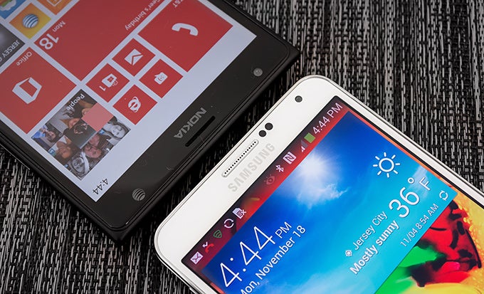
When it comes down to beauty, we really have to go with the Lumia 1520 on this one, mainly because of its stylish attitude. Throw in its tapered design and the fact that it’s available in various color options, it undoubtedly all helps to catch our attention from a first glance. Although it’s not as stylish, the Note 3 has more of a sophisticated appearance thanks to its faux-pas leather casing that’s further accented by the stitching around its rear. For all of its worth, it just can’t quite match the attractive star power of the Lumia 1520.
It might be beaten in the looks department, but the Note 3 is more comfortable to hold in the hand – a lot easier too because it’s not as wide as its rival. Indeed, it’s still a beefy sized thing, but it’s much more forgiving when we factor in the heavier weight and pointed corners of the Lumia 1520. On the surface, they’re both constructed out of plastic, but the unibody construction of the Lumia 1520 tends to feel a bit sturdier – with less creaking around the edges too.
Looking around the edges of both devices, they have several things in common – like their power buttons, volume controls, 3.5mm headset jacks, and various microphones. However, the Note 3 dishes up a few extra goodies with its package. Specifically, they include a faster microUSB 3.0 port, S-Pen, and an IR blaster that turns the phone into a universal remote. Yes, we appreciate that they both have microSD slots, but it’s easier to access with the Note 3, since it’s right there when we remove its rear casing – whereas with the Lumia 1520, we have to use a SIM removal tool to access it.
Grandeur is something that they prize highly, so it doesn’t surprise us that it extends into their cameras as well. Much like Nokia’s other recent offering, the Lumia 1520 is able to raise a few eyebrows due to its number crunching 20-megapixel PureView cameraThe Note 3’s 13-megapixel auto-focus camera is still a head turner on its own.
Display
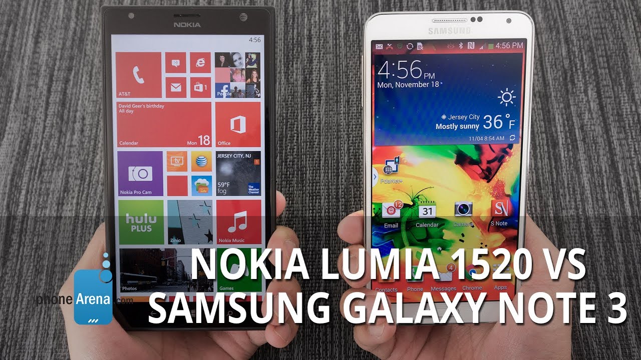
Massive is one of the many words that can best describe their displays, but we can also say that they’re simply marvelous as well. Honestly, we like the two displays equally, as they have their own unique assets that make them so darn lovable. For the Lumia 1520 and its larger 6-inch 1080p IPS LCD display, we’re wowed by its immense size no doubt, but it dishes up the stronger brightness output and superior outdoor visibility. On paper, its 368 ppi pixel density count might be lower than the Note 3’s tally of 386 ppi, but seriously folks, it’s really hard to distinguish who really has the upper hand – even with a close inspection with our eyes.
On the other hand, the Note 3’s 5.7-inch 1080p Super AMOLED screen comes to life thanks in part to the overly saturated colors it produces – giving it that subtle glow to reel us in from afar. Viewing angles are actually better with it, since it maintains its clarity at all angles better than the Lumia 1520, but it tends to wash out under outdoor settings. However, there’s a bit more geek tech involved with it, seeing that the screen itself is able to track either our finger, or the S-Pen stylus, as we hover them over the display.
Nokia Lumia 1520 360-Degrees View
Samsung Galaxy Note 3 360-Degrees View
Interface and Functionality
Ah yes, it’s now onward to their respective platforms: Window Phone 8 with the GDR3 update versus Sammy’s TouchWiz Nature UX experience on top of Android 4.3 Jelly Bean. Let’s cut to the chase folks, power users will no doubt get more value out of the Note 3, simply for the fact that its customized Android experience is deeper and more diverse. It’s not to say that the Windows Phone 8 experience of the Lumia 1520 can’t dish up the same thing, but as we’ve seen, it’s still playing catchup in several areas.
When it comes to having an animated approach, there’s plenty of that happening with Windows Phone 8, as its start screen really comes to life with the various live tiles on there. Personalization has been enhanced, like how we’re given different sizing options for those live tiles, but it still pales in comparison to the extensive personalization aspect seen over with the Note 3. Particularly, it’s how we’re able to rearrange all of the homescreens with various and useful widgets.
With those live tiles with Windows Phone 8, they also populate various notifications, which can become a messy process because they can be spread out in different areas of the start screen. In comparison, the Note 3’s notifications panel can be accessed at any time with the swipe of our finger – giving us a unified area where everything is aggregated. Not only that, but we’re given some useful secondary functions as well.
To tell you the truth, multi-tasking is handled in a similar way between the two phones, as we’re able to quick move in-and-out of apps by relying on their respective multi-tasking views. However, the Note 3 really ups the ante with its multi-windows feature, which allows for real multi-tasking as two apps can be used simultaneously.
Mainly due to Android’s longer development, it benefits by having a richer ecosystem of apps and a smarter digital personal assistance service. With the former, we tend to see apps come out first with Android – whereas it comes later on with Windows Phone. And when it comes to their respective voice assistance services, there’s no questioning that Google Now for Android is light years ahead of what the Bing experience has to offer over on Windows Phone. Not only does it offer more features, but it’s self-aware and provides us with relevant information.
On the productivity side, we really appreciate we have Microsoft Office is on board with the Lumia 1520. Despite lacking an Office-like app out of the box, we can obviously download something similar for the Note 3. Additionally, Sammy’s offering has a host of useful productivity apps, like S-Note and Action Memo, which both rely on the S-Pen stylus, to extend its functionality well beyond what the Lumia 1520 can offer.
At the end of the day folks, the customized Android experience with the Note 3 is more suitable for those power users. Certainly, Windows Phone has come far from its humble beginnings, but the gap between these two experiences is still wide. We appreciate that the Lumia 1520 is preloaded with several Nokia-branded apps that help extend its worth over other Windows Phones, but it’s still nowhere as all-encompassing to what we can get out of the Note 3.
Processor and Memory
For a good while there, the hardware inside of Windows Phones in general seemed to pale in comparison to what its Android counterparts offered. Well, that certainly changed with the introduction with the Lumia 1520, as it too sports the same processor running inside of the mighty Galaxy Note 3 – a 2.2GHz Qualcomm Snapdragon 800 SoC coupled with the Adreno 330 GPU. However, it’s worth mentioning that the Note 3 is armed with 3GB of RAM – as opposed to the 2GB in the Lumia 1520. Frankly, they’re both snappy and fast with their performances, but the Lumia 1520’s is just more consistent. It’s not a pervasive issue, but sometimes we experience some choppiness when navigating around the Note 3’s homescreen.
In matching their hefty statures, these two big boys are packing along 32GB of internal storage, a tally that we consider as befitting. Better yet, we’re able to supplement their capacities, seeing that they both offer microSD slots for added expandability. As we’ve mentioned earlier, it’s just easier to access with the Note 3.
Internet and Connectivity
Okay, did we expect anything but perfection with these two in the web browsing department? As expected, they deliver all the quality elements that make it such a joy to surf the web, but the Note 3 dishes up quite a few tricks that makes its experience deeper. For example, the S-Pen’s usefulness comes into play by providing us with a precise tool that mimics the operations of a mouse cursor – while its Smart Scroll feature lends its help in allowing us to scroll vertically with our eyes and some tilt action.
When they’re aimed for a mass market audience, it shouldn’t be a shocker to people that they’re boasting nearly the same set of connectivity features – such as 4G LTE connectivity, aGPS, Bluetooth 4.0, dual-band 802.11 a/b/g/n Wi-Fi, and NFC. Going beyond the usual armament, the Note 3 packs along some additional conveniences such as an IR blaster and video-out functionality with the aid of an MHL adapter.
Camera
Much like Nokia’s other recent offering, the Lumia 1520 is able to raise a few eyebrows due to its number crunching 20-megapixel PureView camera, which features a Zeiss lens, an aperture of f2.4, dual-LED flash, optical image stabilization, and 1080p video recording. Although it’s not as high, the Note 3’s 13-megapixel auto-focus camera is still a head turner on its own. In tow, it features an LED flash, an f2.2 aperture lens, and option to shoot videos in 4K resolution.
Nokia is aiming to capture serious photographers with its camera app, since it features quite a few different manual controls that are at our disposal. Still, we can’t count out the Note 3, even more when it offers similar options, but the Lumia 1520’s camera interface closely mimics that of a traditional point and shoot. Best of all, we’re able to adjust the focus manually – whereas it’s not an option with the Note 3. Despite that, when it comes to shooting modes, it’s actually Sammy’s pride and joy that coughs up an extensive tally – all of which are accessible through the camera app. Conversely, the Lumia 1520’s camera app doesn’t incorporate those cool shooting modes. Rather, we have to rely on the Nokia Creative Studio app for all of our post photo effects.
This is where things get a bit interesting, as we pit the 20-megapixel PureView camera of the Lumia 1520 against the 13-megapixel snapper of the Note 3. In general, they take some astounding outdoor shots that are filled with a lot of detail, lively colors, and proper exposure. Impressively, the 5-megapixel samples from the Lumia 1520 rivals the quality put out by its rival’s 13-megapixel samples, but its high-resolution 19-megapixel samples absolutely draws out more fine details. Then again, we do notice that the Note 3’s results tend to exhibit some over-sharpening elements that actually help to accentuate its shots.
It might be a close race with their qualities when lighting is plentiful, but under low lighting situations, the Lumia 1520 drives its point home as being the superior performer. The reasoning behind it is partly attributed to its built-in optical image stabilization module allowing longer exposure time, which as a result, produces shots that are noticeably brighter and sharper than that of the Note 3.
Strangely though, the Lumia 1520 falls flat against the Note 3 when it comes to shooting 1080p videos. Instead of putting out the same sharp visuals we see from its still image quality, the visuals are toned down considerably on the Lumia 1520 – to the point where it looks unbelievably softer with its details. Meanwhile, our eyes become more affixed to the results put forth by the Note 3’s video capture. Hey, the Note 3 even has the ability to shoot video in 4K resolution too!
Multimedia
Out of the box, the Note 3 has two different music players to choose from – the TouchWiz one and the Google Play Music app. Even with the tandem in tow, they don’t have the same presentation value we see out of the XBOX Music player that’s used by the Lumia 1520. Even at the highest volume setting, these two giants match one another with their commanding tones.
Video playback is wonderful as well, not only because they offer support for a wide array of video codecs out of the box, but for the obvious reasons that videos come to life while watching them on their massive sized screens. Yet again, the Note 3 shows off its prowess by including its Pop-up-play feature, which allows us to better multi-task by layering the ongoing video on top of whatever we’re doing.
Call Quality
Even with all of their high-end specs, extensive software, and solid performances, their calling qualities are nothing more than average. Sure, the Lumia 1520’s earpiece is rather weak with its output, while the Note 3 emits some crackling at the loudest setting through its earpiece, but in the end, we’re still somehow able to handle phone calls with few infuriating occurrences.
Battery
When phablets first rolled onto the scene, some people were afraid that their giant sized screens would be a total drain on battery life. Of course, that’s certainly not the case, especially when these two deliver amazing results that are long lasting. Even with heavy usage, their batteries are able to churn out a solid one-day of juice – more than enough to appease even the hungriest of power users. Still, we notice that the Lumia 1520 has more gas in the tank at the end of the day.
Conclusion
Let’s cut to the chase, these two are no doubt the best phablet performers in their respective platforms. However, as we’ve compared the two, it’s very apparent that the Note 3 has several advantages over the newcomer in the space. Sure, they’re blessed with almost the same set of hardware under the hood, but it’s just the enhancements we see in the customized Android experience of the Note 3 that takes it up a notch over the Lumia 1520. Don’t get us wrong, Windows Phone 8 is constantly growing and developing, but as a whole, it still has yet to reach the milestones we’ve seen out of Android. On top of that, the Note 3 further complements the experience by including several neat/redundant features to its package.
Even though the Note 3 is arguably the preferred choice for power users, we can’t help but stress the fact that it’s attached with a premium price point – one that’s still viewed as being hefty in this day and age. Well, considering the enhancements we see from its customized experience, combined with its inclusion of an IR blaster and S-Pen, its $300 on-contract price is more than justified. Knowing that, we’re just amazed to see that the Lumia 1520 is sporting an impressive on-contract price of $100. Heck, that price alone undercuts many flagship devices in the space, giving it a whole lot of value.
If you’re looking to save a whole lot of money, while still being given a device that doesn’t make compromises in the specs and performance departments, the Lumia 1520 is going to be the device for you. Sure, Windows Phone 8 might not be on the same level as its rival, but as we’ve seen, each iterative update brings forth enhancements and features that diversify its functionality. On the other end of the spectrum, if money isn’t a concern, we’d recommend the Note 3 for its deeper functionality, excellent performance, and all around performer.





Things that are NOT allowed: