Huawei Mate S Review
Update: You can now read our Huawei Mate 8 review!
Introduction
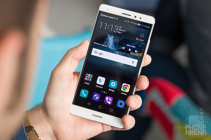
From the point of view of Huawei's product portfolio, the Mate S is a weird addition to its high-end roster. A mixture between the P and Mate lines, the S strikes a balance between thinness and size, all the while hitting the right notes when it comes to looks. No, it doesn't look 'cool'. It looks beautiful.
In the box:
- Huawei Mate S
- Earphones with metal accents
- 2A wall charger
- USB to microUSB cable
- SIM ejector tool
- Flip case with 'smart' front window
Design
You'll go 'my precioussss' all over it in no time whatsoever!
Whether you like large devices or not is besides the point. The Huawei Mate S is a beautifully crafted piece of telephony goodness, and one that's sure to attract eyeballs.
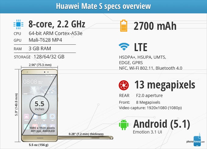
More specifically, we start off with an aluminum body with nary a disagreeing element to clash with the uniform looks of the phone. Clear-cut lines, rounded corners, chamfered edges, and display glass that seeps into the frame masterfully. Add to that a thin, 0.28 inch (7.2 mm) profile, and you've got yourself one of the most striking phablets currently on the market. Just handling the Mate S is consistently rewarding, and so we loved fondling it. And that says a lot when you go through literally hundreds of devices a year.
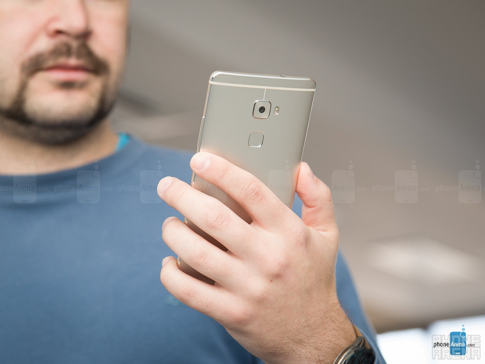
Finally, we ought to mention the rear-mounted fingerprint scanner. Obviously, this particular setup has grown in popularity lately, though it's definitely true that there's a notable — but acceptable — learning curve to go through before you feel right at home. Even then, however, you'll find that unlocking the phone when it's laying flat on a surface is kind of a hassle — we ended up using the pass code quite often whenever that happened.
Display
Shades of orange look red. And that's a problem that you can only partially solve.
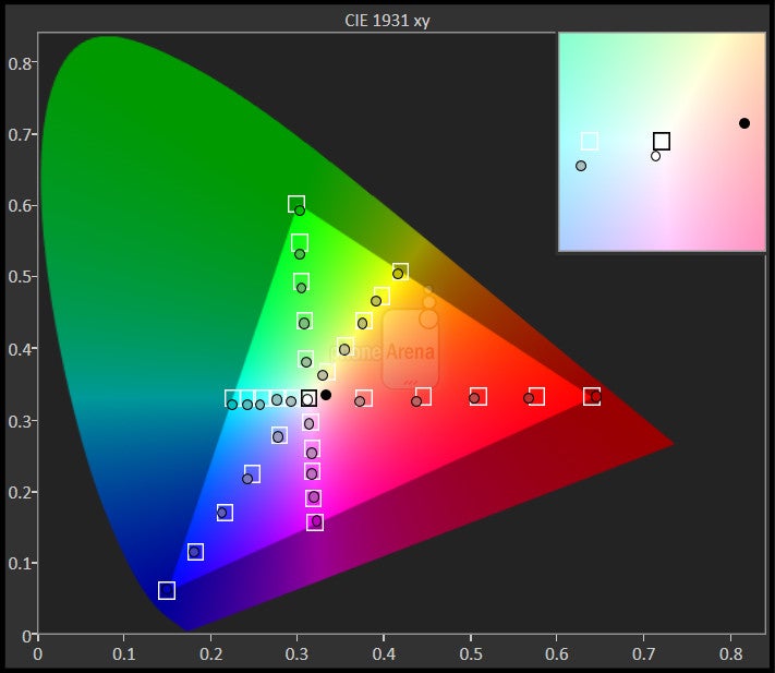
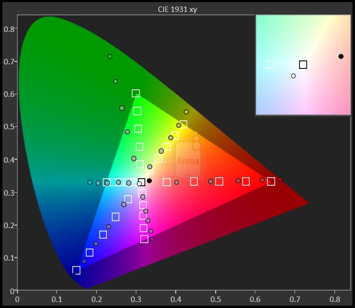
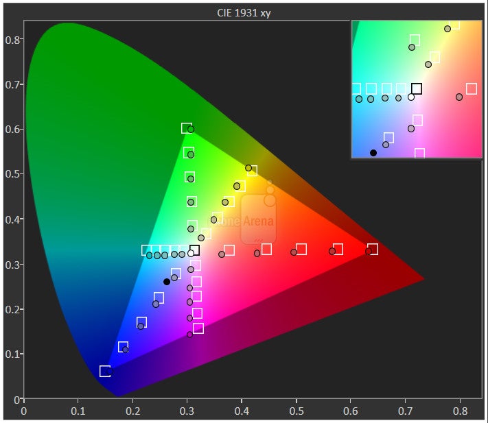
AMOLED panels have recently grown into a significant trend within the industry, and while we've seen Samsung make some great progress in terms of color accuracy and brightness potency, the unit on the Mate S misses both these targets.
In short, the 5.5-incher of the Huawei Mate S, while pleasant to look at, is actually fairly disappointing for a high-end device. And no, it's not because Huawei has decided to skip over Quad HD and instead stick to a standard (and perfectly sufficient) resolution of 1080 x 1920 (401 ppi). More worrying are the non-trivial disparities between target and actual color reproduction.
Finally, on brightness. We measured a peak of just under 350 nits, which is on the lower end overall. Still, it being winter-y around here, we ran into absolutely no trouble — even on the odd day when the sun was up and shining — but you may feel otherwise once summer gets here. Unfortunately for Huawei, the minimum brightness of the panel (6 nits) is just too high for comfortable usage at night, and we can't say we were impressed by the performance of the ambient light sensor. It consistently let us down and forced us to manually adjust how much light goes through the pixel matrix, which is extremely annoying.
Interface and functionality
EMUI 3.1 is like Samsung's, LG's, and Sony's interfaces baked into a single mega-UI.
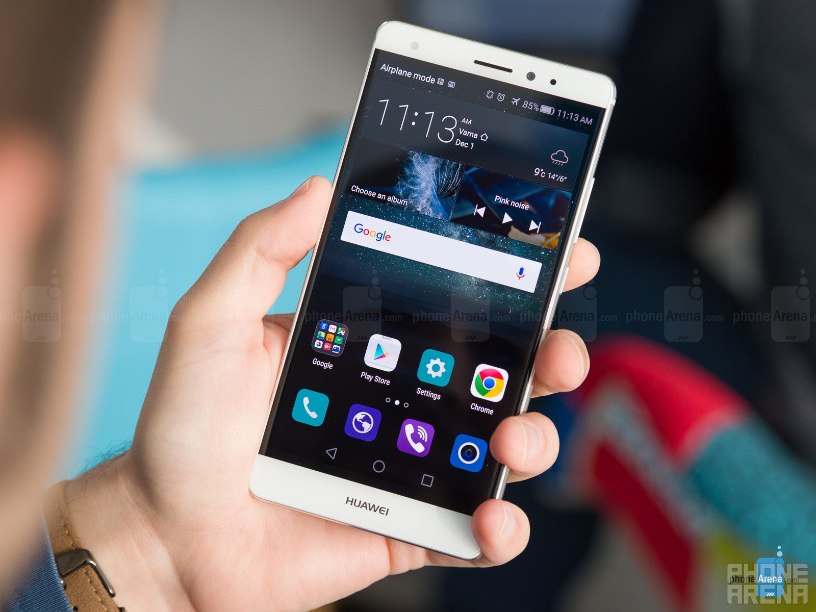
Based on Android 5.1.1 Lollipop, the Huawei Mate S is rocking the company's proprietary EMUI 3.1 skin. It's hard comparing EMUI with anything else on the market, simply because there is no equivalent — the thing is packing more features than Samsung's, LG's, and Sony's overlays taken together. And so while there's a host of perks, quite a few are rather niche, and some key elements of the user experience haven't received the critical attention they require.
Before we get into the nitty-gritty, though, here are the basics. Like most Chinese UIs, Huawei's is an app drawer-less, colorful interface. Essential apps such as the Dialer and Messenger have been skinned, and as mentioned — offer a number of extras. Finally, you'll find that the standard, two-level Lollipop notification drawer is actually monolithic on the Mate S and offers a vast array of customization features — like re-arranging toggles and actioning notifications from the panel. And as for the fingerprint scanner, it's top notch — omnidirectional, quick, and reliable.
For discerning users, these will quickly add up and amount — at the very least — to an off-putting user experience. At worst, it'll make you want to disassemble every last line of code behind the aforementioned battery manager with a virtual hammer. If ALL apps are draining too much juice, then no app is draining too much juice, Mr. Huawei engineer!
Processor and memory
Graphics performance remains a problem with Huawei's own chips.
When we mentioned that the Mate S felt like a rushed release, part of the reason was the silicon Huawei settled for. As some of you might know, the company is among still few phone makers to have its own microprocessor division: HiSilicon. And that division's latest creation is the Kirin 950 built on a 16nm node.
In the case of the Mate S, however, the brains of the operation is the homegrown Kirin 935 (28nm), which is essentially a higher-binned Kirin 930 that runs at 2.2GHz instead of 2GHz. It's an octa-core chip, working the ARM big.LITTLE magic, meaning that it has two clusters of cores with different potency and cycles between them depending on the task. The GPU built in is the quad-core ARM Mali-T628, coupled with 3GB of LPDDR3 RAM.
Finally, our Mate S comes prepared with 32GB of storage, of which about 24.5GB are free to use and occupy with your own files. If that proves insufficient, you can always expand upon this allowance through a microSD card.
Internet and connectivity
Most of what you're looking for. But not everything.
For whatever reason, Huawei felt it needs to offer its own browsing solution with the Mate S and so a home-baked app is available alongside Google's Chrome. As is too often the case, the browser Huawei chose is not at all competitive and offers noticeably inferior performance, especially when it comes to zooming in and out of pages. Worse yet, the app offers little of value in the way of extra functionality, and so makes itself difficult to stomach. You're better off with Chrome, if only because it'll have better support going forward.
Changing gears to connectivity features, the Mate S has most of what you might need, but not everything. For example, there's no 5GHz Wi-Fi, which may be a drawback for some, and LTE band support for the US is not ideal — one band is missing for every carrier but T-Mobile, so you might experience reduction in coverage. Bluetooth support is also limited to the older 4.0 revision if that matters to you. Still, extras such as NFC are available.
Camera
All over the place, this one. Organized UI, but a slow one. Capable camera, but marred by issues with focus. Oh, and no 4K UHD video.
While most Chinese makers seem to still struggle with getting the finer details right when it comes to the camera, Huawei has lately emerged as a competent rival to the majors. With the Mate S, the engineers at the company chose to go with a respectable, 13-megapixel (1/3.06”) sensor — supposedly the Sony IMX278 RGBW from the P8. The unit is packaged together with wide, f/2.0 lens, optical stabilization, and a dual LED flash. The entire thing is covered by sapphire glass to help with durability. Up front, we've got an 8-megapixel selfie snapper (Sony IMX178).
As for the actual quality of snaps, we found the Mate S to be a good performer when light is abundant. Detail is a bit on the soft side, and focus isn't as great as the best out there, but colors are kept mostly neutral instead of under- or over-saturated. Generally speaking, shots come out a tad colder than ideal, but closer to realistic than many other cameras.
The real test for the camera is when we step in, though, with indoor shots in both decent and somewhat limited light coming out fairly well. We have a few concerns, though, including the noisier-than-expected shots, and the very real issues the focusing mechanism seems to have when a ton of light isn't hitting the sensor. Still, photos come out realistic-looking, if a bit darker than ideal and with muddy detail. This last relationship holds at night, too — snaps are natural-looking, but considerably darker than what the best in the category have to offer. In terms of selfies, the 8-megapixel Sony sensor is up to snuff and offers some of the best selfies on a smartphone with extra perks such as group panaromas and a front LED flash.
Huawei Mate S Sample Images
Finally, video will strike techies as a sore point: there's no 4K UHD video capture. The reason here is the Kirin 935 processor, which simply doesn't encode at any more than 1080p, so that's what we're limited to. There's no slow-motion video mode either, but you can set metering and exposure manually.
As for the actual quality of the footage, we were unmoved — even a bit disappointed. Sure, clips have a smooth frame rate and little to no shake to them, but details are decidedly speckled-looking, and the image is even a bit noisy. We also can't agree with the exclusion of continuous auto focus. In fact, even under Pro mode, we couldn't force the camcorder to take care of this itself for some reason.
Huawei Mate S Sample Videos
Multimedia
Great for on-the-go media consumption.
The video and music players are both pretty basic and offer little more than you'd expect from a built-in solution. The Gallery is a bit different in that its photo editor is actually quite powerful and integrates features — such as pixelization for censoring parts of the image and a bucket load of filters — that you'd usually be forced to seek elsewhere.
On the loudpseaker front, the Mate S is just average, with fairly disappointing audio clarity that trails devices such as Apple's iPhone 6s Plus. And in case you're wondering, there's no second speaker behind the left grill on the bottom — it's there for the microphone and for uniformity. On the plus side, the phone's amplifier is quite powerful, so hooking this baby to your car's stereo equals awesome — unlike some other high-end devices we've tested.
Call quality
“WHAT DID YOU SAY?”
Overall, the quality of voices coming through is pretty decent — we noticed no overarching issues — but volume is definitely on the low side. If you're anywhere even moderately loud, this might grow into an even bigger problem, so don't be surprised if you find yourself pressing the earpiece tightly to your ear and covering your other. Even at maximum strength, and with a proprietary Huawei feature that's supposed to further boost volume turned on, we occasionally ran into trouble.
Verdict: Better than average, but not by far.
Battery life
Only okay.
You might have become accustomed to large batteries in phones 5.5 inches and up, but given the thickness of the Mate S, you can imagine that that's not the case here. Instead of a respectable, 3,000 mAh cell, Huawei went with a 2,700 mAh juicer, which isn't a whole lot in today's climate.
Once you're all out, expect to need nearly 2 hours to get the battery back to full when using the included, 2A wall charger. Not a bad achievement, but strictly average when considered in the context of the best in this regard.
Conclusion
At €649 in Europe and about the same in green through Amazon US, the Huawei Mate S is aimed at the premium market, and it definitely looks the part. Of course, that alone hardly exhausts the list of requirements you bring to the store when you're ready to part with that much cash.
Unfortunately, it's impossible for us to recommend the Mate S, and that's actually kind of frustrating — it has the bearing of a competent top-shelfer, but falters in way too many categories to pull off the needed performance. Software, in particular, along with system performance, definitely leave more than a little to be desired, and areas such as the camera and battery life are only kind of close — but not all the way there. The display, too, could use some work, though at least you can tweak the white balance to better the image.
So, just a pretty face? No, that's unfair. But perhaps Huawei made a mistake pricing this as steeply — it could have been a darn good product for a hundred less.
Update: You can now read our Huawei Mate 8 review!
Follow us on Google News








Things that are NOT allowed:
To help keep our community safe and free from spam, we apply temporary limits to newly created accounts: