HTC U Ultra Review
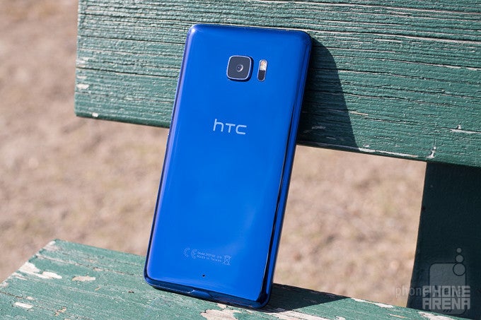
Introduction
Sometimes smartphone manufacturers keeptheir lineups simple: a clear flagship (maybe in a couple sizeoptions), then possibly a spread of mid-rangers, and maybe even asuper-budget model. And while all those phones can be veryinteresting for their own reasons – for as much as we love ableeding-edge hero phone, a really well-executed lower-end modelthat's still a stunning value can be even more important – it's notuncommon for us to build our expectations of a company's yearlystable of phones around such a product.
That's what makes 2017 so unusual forHTC. Not only are we on track to see the launch of fewer totalsmartphone models than we saw arrive last year, but HTC is switchingthings up in the flagship department, as a company exec confirmedthat we shouldn't be expecting an HTC 11: a direct follow-up to lastyear's HTC 10.
There will be a high-profile flagshipat some point, sure, but likely with some new branding – and maybeeven filling a slightly different role in the manufacturer's lineup.
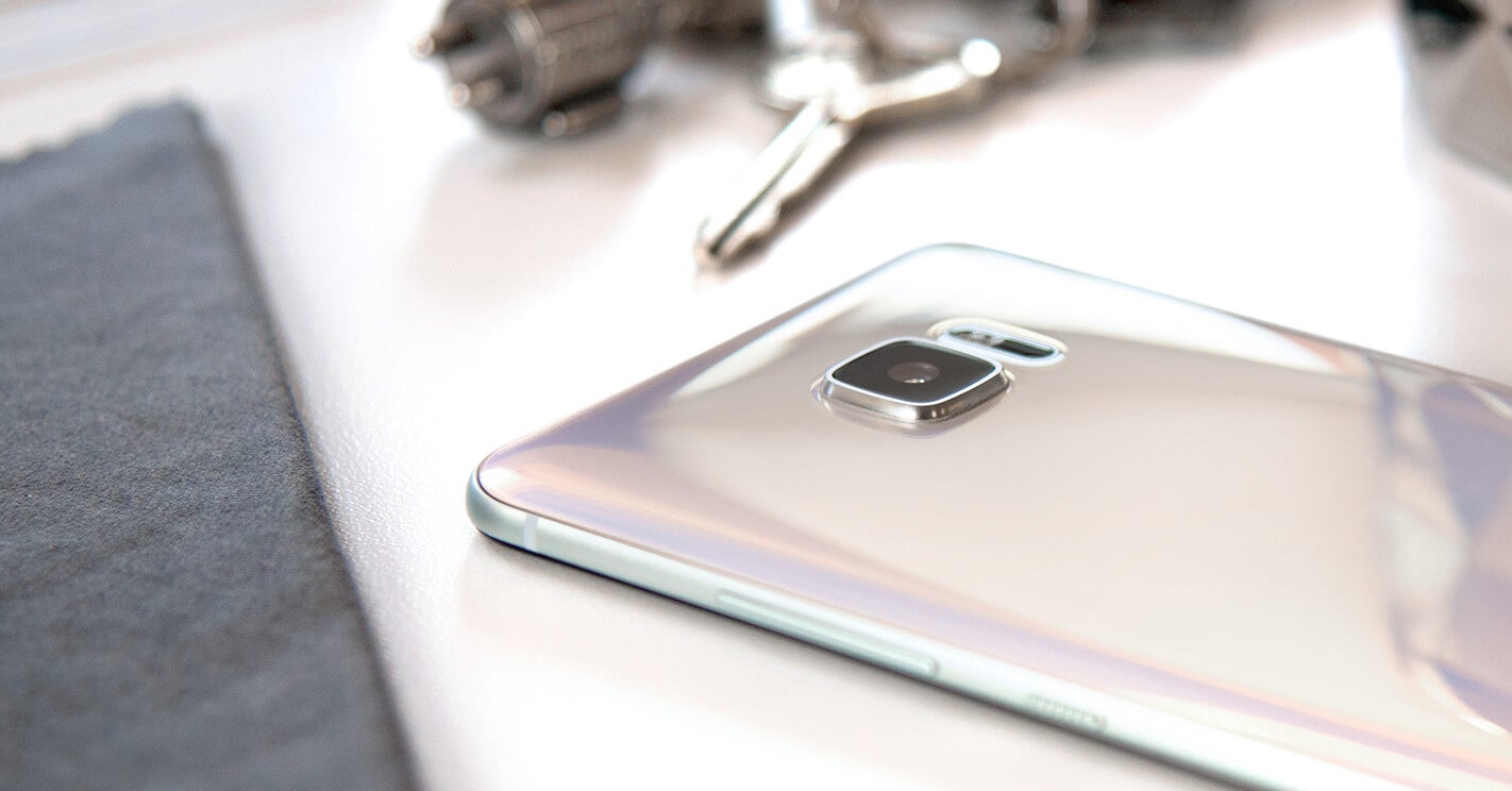
While we wait to get the full story onthe rest of HTC's plans for the year, we've already seen the companyget off to a quick start, launching a pair of HTC U models back inJanuary. While the smaller HTC U Play will stick to internationalmarkets, the US is getting the larger HTC U Ultra phablet. Withhigh-end specs, a big 5.7-inch screen, and a seriously flagship-levelprice tag, is the U Ultra a fitting replacement for the HTC 10, orwill HTC fans want to keep waiting for a possibly more petitehandset? Here's what you can expect from the company's first majorsmartphone of 2017.
In the box:
- HTC U Ultra
- USB type-C to standard-A cable
- Fast charger
- Cleaning cloth
- HTC USonic USB Type-C earbuds
- Protective case
- Warranty booklets
Design
How Big, How Blue, How Beautiful –with an emphasis on “big”
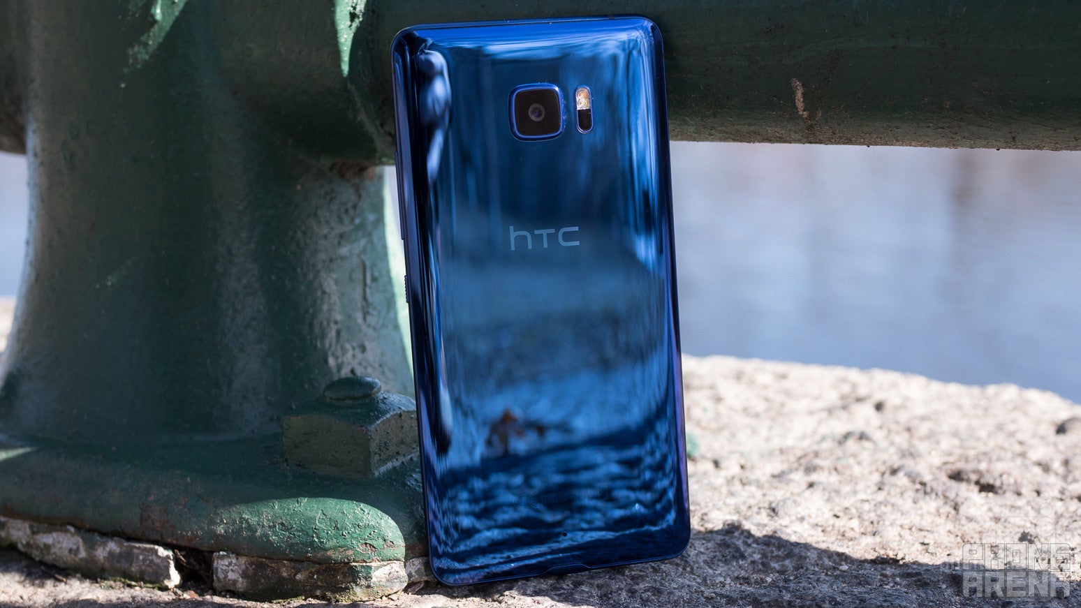
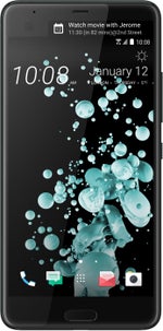
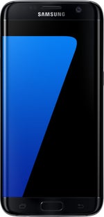
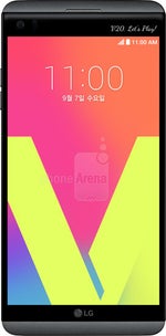
Sometimes it's easy to reduce a phone'sdesign to a single thought, and with the HTC U Ultra, the most aptwords that come to mind are “big and shiny.” With a 5.7-inchscreen, that “big” aspect is largely to be expected, but even inthe world of similarly equipped phablets, the U Ultra is on thechunkier end of the spectrum. Its 162.4 x 79.8 mm face makes itbigger than the ill-fated Galaxy Note 7 (and even bigger than theNote 5), and we'll spare the U Ultra the embarrassment of comparingit directly to the LG G6. Now, it's not like HTC is just wasting thatspace, and the U Ultra does deliver extras those phones lack, like anLG V20-style secondary display. But again, even the V20 is a smaller,more pocket-friendly phone than the hulking U Ultra.
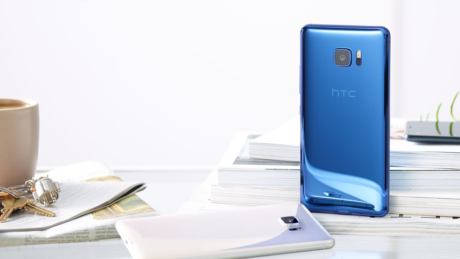
As for “shiny,” the U Ultra offersan attractive glass-topped, polished-metal back panel in your choiceof three colors; in addition to the stunningly bold blue you seehere, the phone is also available in black and white. That high-glossfinish is nothing short of eye-catching, but the near-featurelessexpanse of reflective material also turns the U Ultra into one of themore fingerprint-sensitive handsets out there. We're not talkingabout how you unlock your phone, either: every single little touchyou impart on the U Ultra's body shows up, clear as day. It's abeautiful phone, until you start actually using it; let's just saythat it didn't take long to understand why HTC saw fit to include acleaning cloth in the box.
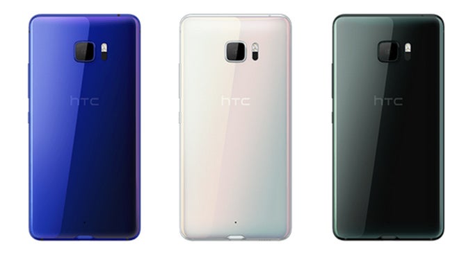
Continuing our tour of the U Ultra'shardware, we've got our volume rocker and pleasantly-textured powerbutton on the right edge, the hybrid SIM/microSD tray up top, and themain speaker and USB Type-C port on the bottom. As you've probablynoticed by now, that means no analog headphone jack, just like onlast year's HTC Bolt. Instead, you'll use the included USBheadphones.
It's worth mentioning, while we'retalking about design, that the USB port here looks like it doesn'tfit very well. It's not exactly centered along the phone's profile,and introduces a bump that interferes with the bottom edge of thehandset's back panel. We've heard of camera bumps before (and the HTCU Ultra very much has one of those), but a USB bump? That might betaking things a little too aggressively with the drive forcurved-edge construction.
Just like on the HTC 10, we're lookingat a front-mounted fingerprint scanner in the phone's home button,flanked by a pair of capacitive Android buttons. HTC's shiftedfront-facer placement since the 10 to accommodate for the U Ultra'ssecondary ticker display, and we also find a much smaller earpiecegrille here – which also doubles as a secondary speaker for stereooutput.
Display
Secondary ticker displays are just nota good match with LCD screen tech
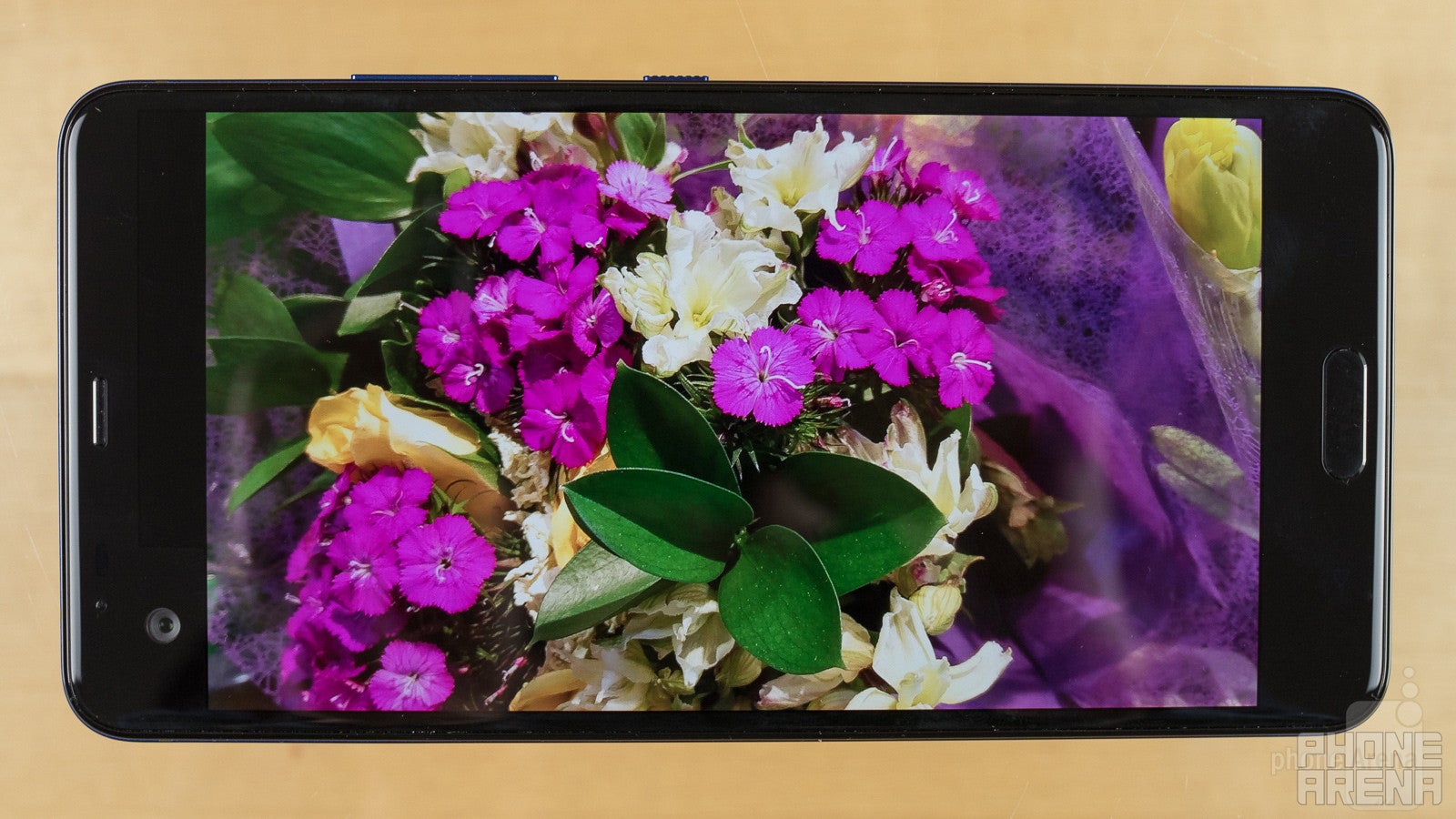
HTC is stepping out of its comfort zonea little with the screen on the U Ultra, introducing a phone with thesort of secondary auxiliary display we most often associate with LG'sV series. The implementation is a near perfect copy of what LG was upto with those phones, with a little extra strip of screen that sticksout above the main display, and extends about two-thirds of the wayacross.
That sort of setup creates some newopportunities for HTC, but also introduces fresh problems. We'll takea closer look at those in a second, but first let's check out themain screen.
Like the HTC 10, we're looking at aSuper LCD 5 panel with a Quad-HD 1440 x 2560 resolution. But bystretching things out from 5.2 to the U Ultra's 5.7 inches, we'redealing with a corresponding decrease in pixel density. The good newsis that at this kind of high resolution, the phone's got pixels tospare, and the image quality on the U Ultra doesn't suffer as aresult of its increased size.
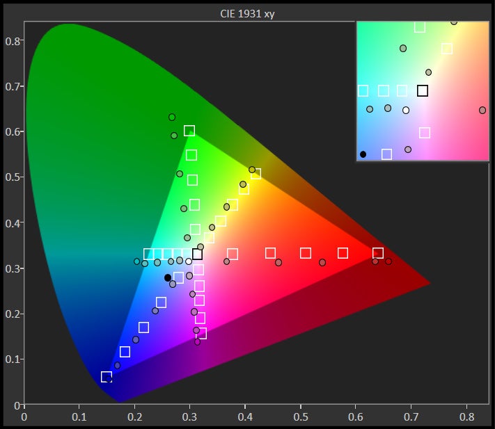
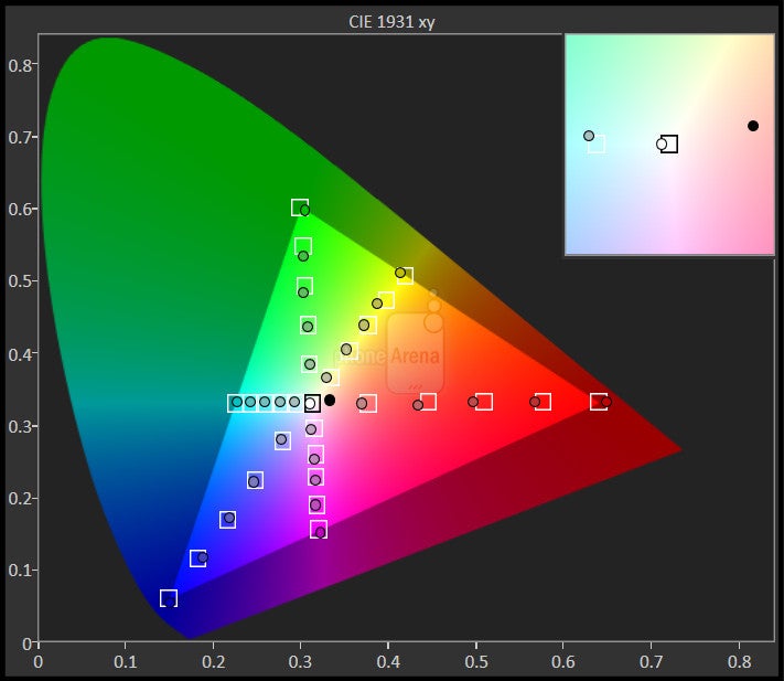
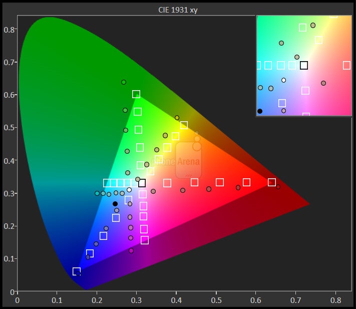
Color accuracy isn't bad, either,though it does tend to over-saturate at times. Screen brightness isalso decent, and there's a much-appreciated control panel setting toadjust color temperature – not that the screen on our unit neededany tweaking.
All this sounds good – and really,HTC doesn't make any huge missteps. At least, that's true about themain display.
Sadly, the secondary screen suffersfrom some of the same kind of issues we saw crop up with LG's phones– and the chief one there is some distracting backlight bleed. Sayyou're watching a full-screen video on the U Ultra. Since the displaydoesn't turn off the secondary screen's backlight independently ofthe main screen, and unlike an AMOLED panel, an LCD is going to stillbe partially illuminated even when it's trying to display pure black,you get this gray rectangle just sort of floating out there to theside of your video. It doesn't outright ruin the U Ultra experience,but it doesn't look great, either.
Interface and Functionality
HTC doesn't ruin Android with all its software extras, but nor does it add a ton of value, either
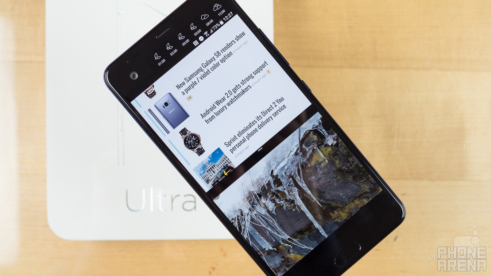
Let's continue talking about that secondary screen as we start dissecting the HTC U Ultra's interface. Like on LG's V phones, the screen here offers a variety of functionality, displaying notification icons and giving you readouts on phone status while the main display is off, and offering options like a quick-launch tray when the screen's on.
For HTC, new to this kind of thing, it's an admirable first effort. But there are also plenty of cases where we wish it operated just a bit differently. Take landscape orientation: now sure, for things like displaying a lot of text, it doesn't make sense to try and adapt this narrow band of screen for operation on its side, but things like the quick-launch app tray, or even the icon-based weather forecast, are frustrating to see locked into portrait-orientation only. Why not twist all those icons 90 degrees to correspond with the rest of the screen?
Admittedly, this is a minor quibble, but it's also something that would have gone a good distance towards making the U Ultra's secondary screen feel like a more intrinsic part of the phone.
The other real stand-out part of the U Ultra's interface is its support for the new HTC Sense Companion, an “always learning” personal assistant that's supposed to keep an eye on what you're doing (and doing next) and offer some helpful messages along the way, reminding you of meetings, or giving you a heads-up when your commute's traffic is looking heavier than usual. Sound familiar? We've seen this sort of general functionality before, so really our question is whether or not HTC's implementation outdoes the likes of Google's.
The problem is, though, that so far we really don't feel like the Sense Companion is doing very much at all. That's compounded by an unintuitive interface, and what seems to be an over-reliance on machine learning. Perhaps in an effort to prove just how smart its AI is, HTC give you precious little in the way of setup options; instead, the service is supposed to learn from you and offer its functionality organically. Maybe that really will work as time goes on, but it's frustrating how you can't just dive right in and start trying everything out manually.
Those hiccups aside, the rest of the HTC U Ultra's interface is a joy to use, and the core Nougat-based system software didn't leave us wanting for anything in the way of features nor polish. BlinkFeed makes a welcome return just to the left of your home screen, and HTC's Motion Launch gestures provide some handy shortcuts that ease accessing key functionality while your phone is sleeping.
Finally, the fingerprint scanner works like a charm, operating both swiftly and with quite good accuracy.
Processor and Memory
The U Ultra launched with a top-of-the-line chip, but those days won't last
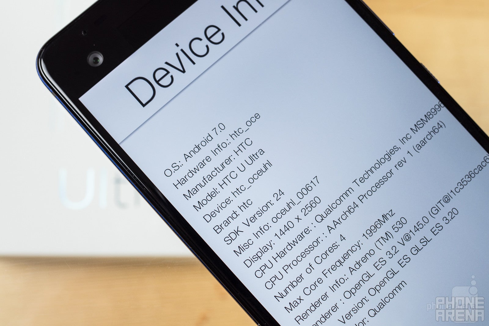
When talking about the G6, though, we had some reservations about this choice of processor, especially with the undeniably more advanced Snapdragon 835 just around the corner. Here, we're liable to give HTC a little more leeway, as it's in much less of an all-your-eggs-in-one-basket situation than LG is with the G6; with what we've heard about more flagships on the way from HTC this year, there's ample time for the manufacturer to put together an 835-based phone. But really, judging the performance of the U Ultra on its own accords, it's hard to find fault with HTC's choices.
We really love the company's decision to make 64GB of storage the phone's standard base level, and we hope this choice isn't just because the U Ultra is a phablet – come on, HTC, show everybody else how it's done. And if you somehow find yourself running up against that storage limit one day, microSD expansion is waiting in the wings, ready to lend a hand.
Connectivity
There's a price to be paid for unlocked flexibility
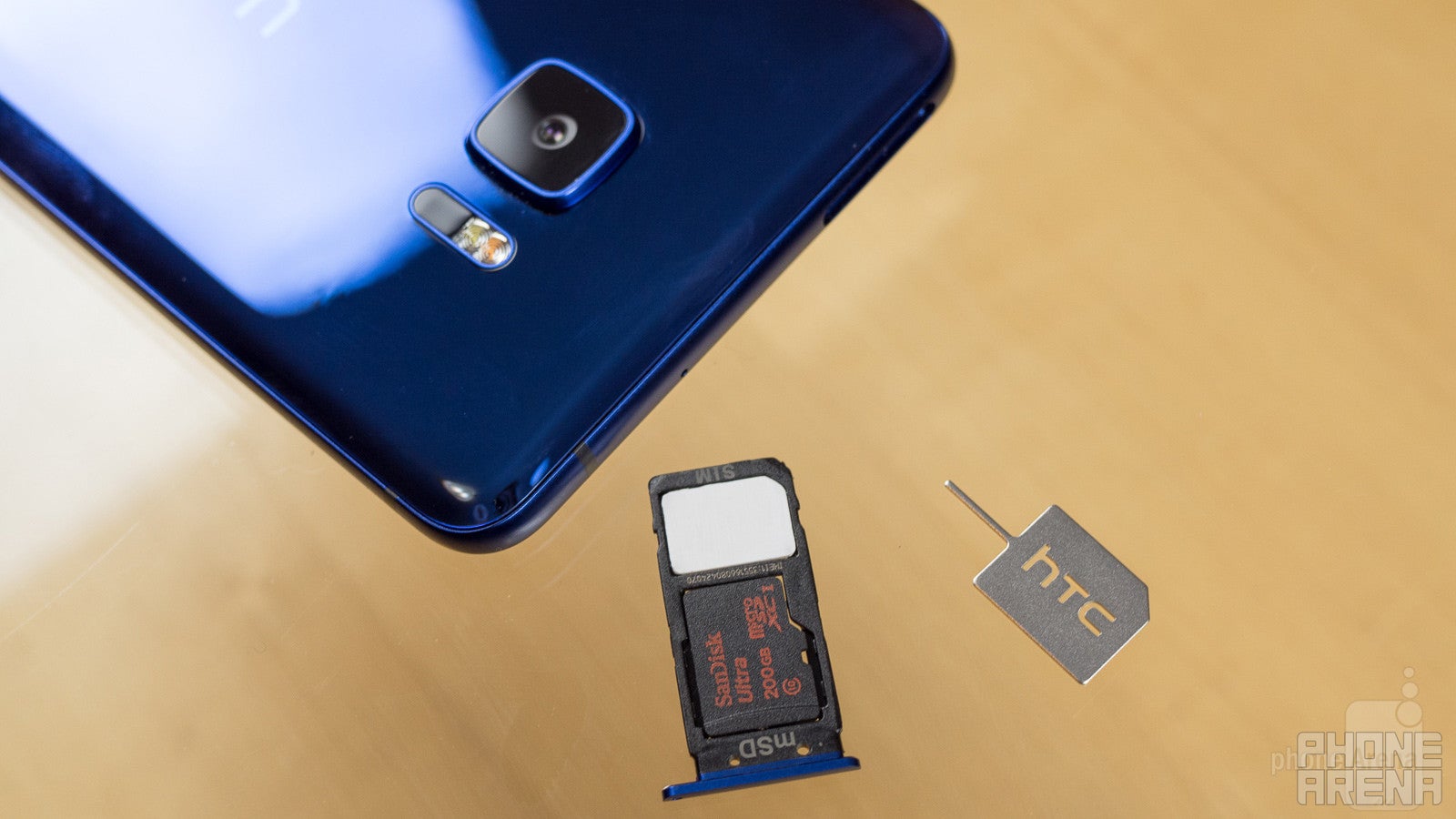
With the U Ultra, HTC has decided to go the direct-sales route, and while that means you can pick the phone up carrier-unlocked, it also means that you're going to be stuck with GSM-based networks like T-Mobile and AT&T. We don't love that situation, especially as the HTC 10 enjoyed far greater carrier support, but it's not going to doom the U Ultra, either.
Wired connectivity, meanwhile, is exclusively over USB Type-C, as you've probably picked up on by now.
Camera
By resisting the temptation to wow us with gimmicks, HTC delivers solid camera performance
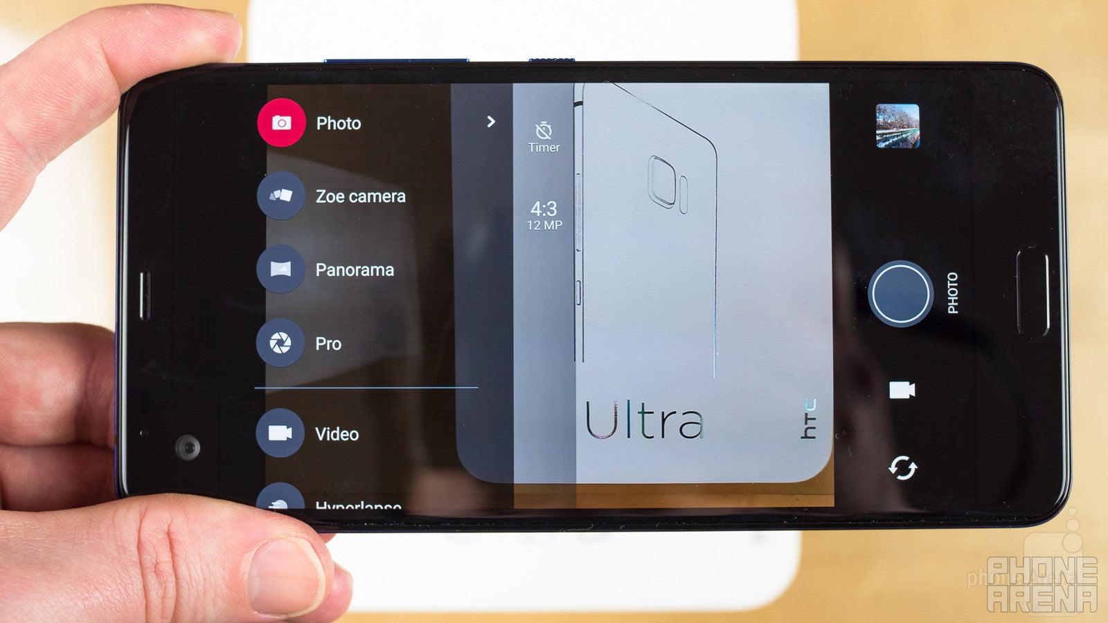
HTC's a company that loves to dream big with its cameras. Whether we're talking an early interest in dual-camera hardware, or choosing light sensitivity over raw pixel count, HTC's been among the first to the table with technologies that have later served to define modern smartphone image-taking. But for all these efforts, time and time again we've watched other manufacturers swoop in to steal the spotlight with better-performing alternatives.
With the HTC U Ultra, we see what can happen when HTC maybe stops trying so hard, and instead concentrates on giving some familiar camera hardware a gentle nudge or two in the direction of improvement. Rather than aiming for a moon shot, the U Ultra doesn't attempt any bold, ground-shaking steps forward, and instead returns with a main camera that's very similar to what we got on the HTC 10 – a 12MP UltraPixel 2 sensor with a big f/1.8 aperture and optical stabilization – while saving some of the fancier upgrades for the front-facer, which arrives as a 16MP camera that can pull a little software magic to effectively work as a 4MP UltraPixel camera in low-light environments.
Image quality
For the very large part, pictures captured with the HTC U Ultra look quite nice. With the camera's auto-HDR mode engaged, we snapped shots in all sorts of challenging environments, many of which had us thinking, “no way this pic is going to come out looking right.” But far more often than not, we found ourselves pleasantly surprised with a nicely balanced exposure.
Focus didn't give us any problems (aside from the interface occasionally reminding us not to accidentally cover up the laser range finder), and with OIS in tow, grabbing sharp pics was as easy as tapping the shutter.
As for complaints, we spotted a fair bit of noise in captured shots, but only as we started getting close to 100% zoom. And while a number of our pics looked a tad washed out and lacking really bold colors, when you shoot around Boston in late winter, you're mostly going to get neutral tones of various shades, no matter what you do. All things considered, we're pretty happy with how the U Ultra's main camera performed. Of particular note were images taken from within a small prop plane that still came out crisp and clear, as well as pic from a dimly-lit restaurant that looked even more appetizing than the real thing.
Even the front-facer really delivered, and while its 4MP UltraPixel mode wasn't quite as impressive as we were hoping for, it did let us snap pics (albeit of not the greatest quality) in utterly unlit nighttime environments where we felt fortunate just to be able to see anything at all. Under less stressful shooting conditions, both this and the regular 16MP mode looked good.
Video recording
Much like our experience with stills, video recording on the HTC U Ultra usually resulted in some really satisfying output. Our main issue is with the interface, which makes it a pain to choose your filming resolution: rather than selecting your choice from a list, you have to repeatedly tap an icon to cycle through all available options – miss your target, and you've got to go back through them all over again.
There's also some difficulty acquiring focus on close-up objects while filming. Mind you, we're talking about within a foot or two from the lens, and shooting at only a slightly more realistic distance sees the U Ultra refocusing without issue.
Video recording options extend up to 4K, but lack some of the fancier options found on other cameras – no 60FPS full-HD mode here.
Audio quality can be pretty decent, as the phone taps into its array of four on-board microphones. Perhaps as a consequence of all the processing the U Ultra's doing on that input, sometimes voices can sound a little hollow – like they've been overly processed – but everything was still quite intelligible.
Multimedia
HTC just doesn't have the market share to dictate “done with analog headphones”
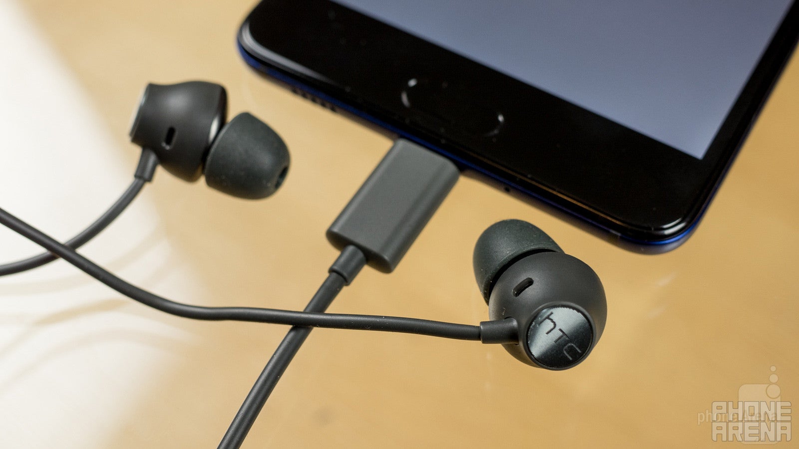
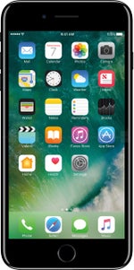
The days of the analog headphone jack may be numbered, but for the moment that plucky little connector still lives on, despite the efforts of phones like the iPhone 7 and HTC U Ultra to put it to rest. Like the HTC Bolt before it, the U Ultra ditches its headphone jack for a USB-only audio interface.
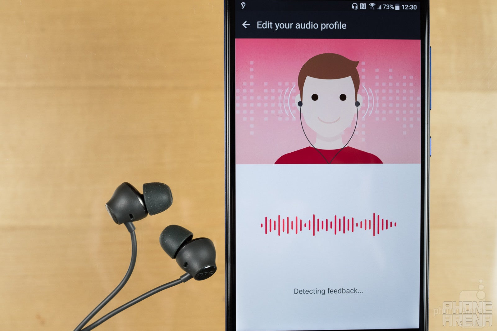
The good news there is that HTC's included earbuds sound really, really nice, come with an assortment of alternate tips to help insure a good fit, and offer an intriguing ear-canal-modeling feature that's supposed to tweak output for your particular physiology. Like we saw with the Bolt, we have the feeling that there's a combination of custom-scanning and just some more general-purpose EQ boosting going on here, but we can't deny that the results sound good.
Even if you're not using the headphones, the U Ultra sounds pretty solid thanks to the presence of stereo speakers. With the phone's earpiece pulling double-duty as one of those speakers, the output's a little unbalanced – and it's clear that the bottom-edge speakers is responsible for the vast majority of the phone's output – but it really does result in a pronounced improvement over a handset that forgoes front-facing speakers at all.
Call Quality
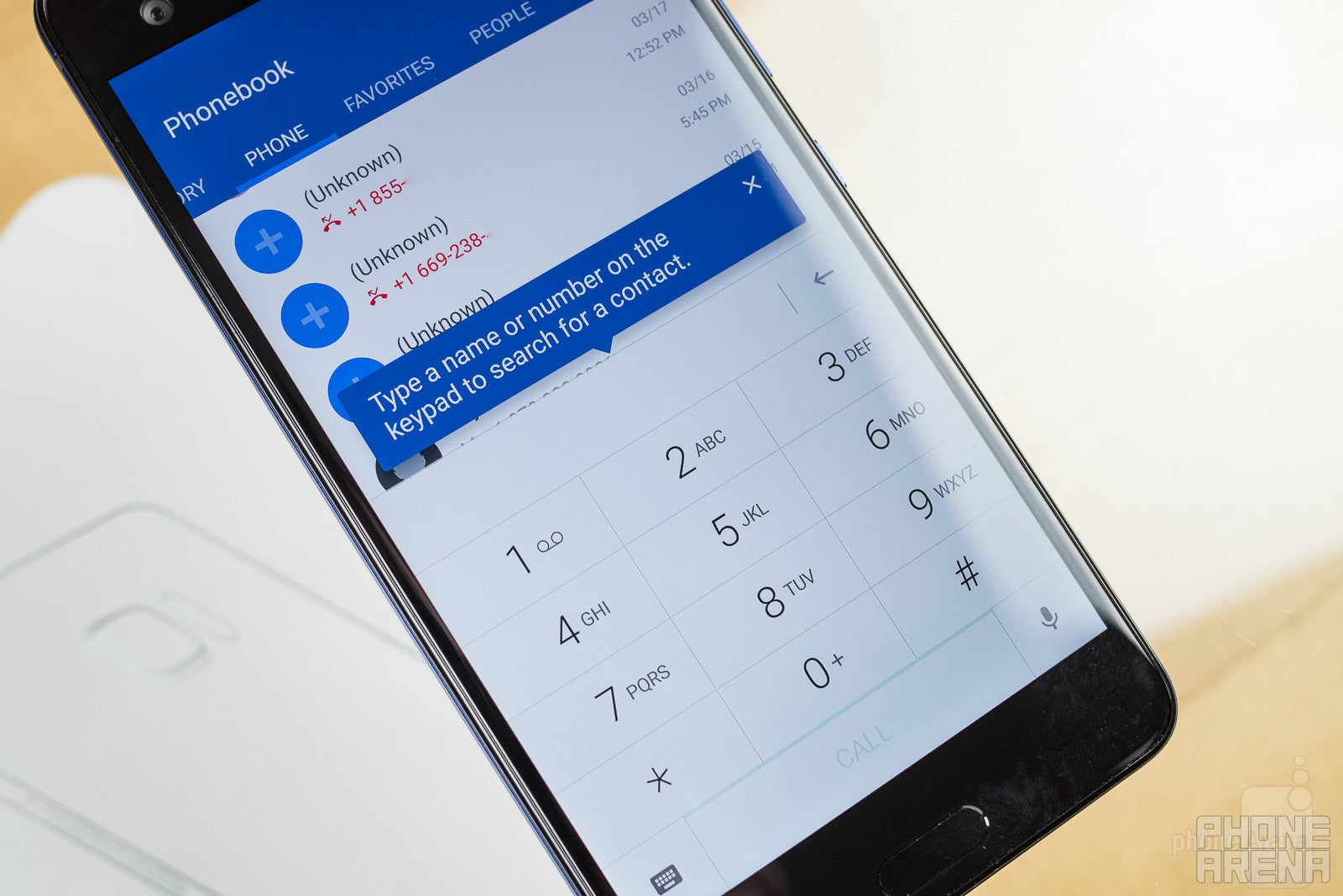
On the plus side, the phone's speakerphone works fantastically, and while we're not sure the phone's tapping into all four of its microphones on voice calls, things definitely sounded pretty good.
Battery Life
HTC does the U Ultra a huge disservice with a battery that's meager at best
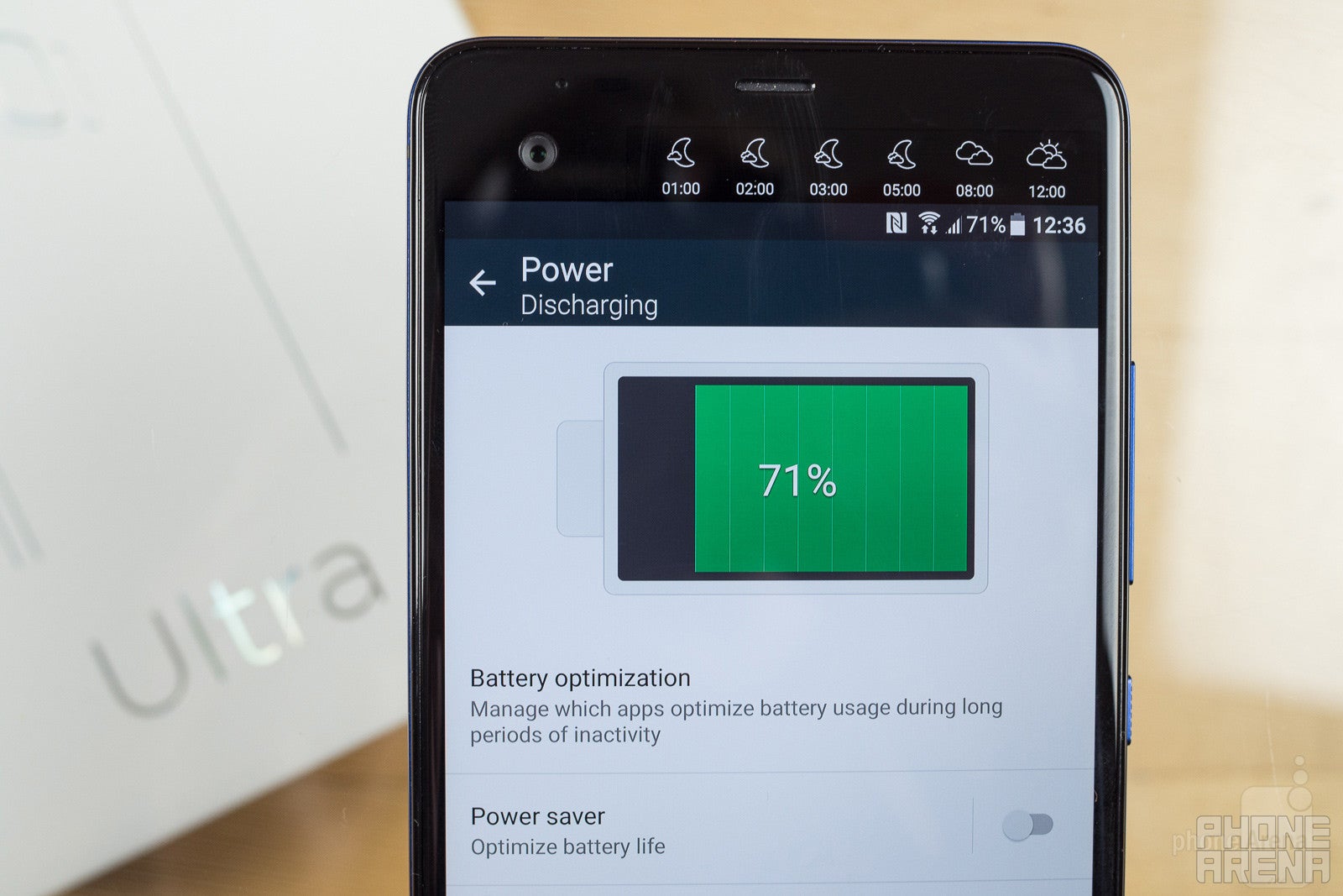
If HTC made one big oversight in the construction of the U Ultra, it was in not giving the phone a larger battery. This is a physically large phone, with a big power-hungry display – so why not pair that with a good 3,300, 3,500, or even 4,000mAh battery? Instead, HTC skimps on capacity with a 3,000mAh battery that matches what we got in the HTC 10.
That's nothing less than a big oversight, and one that threatens to move the U Ultra from the neighborhood of “decent smartphone with a few quirks here and there” to one where it's much more difficult to recommend the hardware. While we've seen plenty of phones with worse battery life – and in our tests, the U Ultra achieved a little under seven hours of screen-on time – it's just so frustrating to be dealing with a giant-sized handset that couldn't be bothered to pick up a battery that's as big as everything else here.
In the saving-grace department, recharge times are low, and with the included Quick Charge adapter we powered the U Ultra back up to full in well under two hours. But with no wireless charging, and such underwhelming battery capacity, it's hard not to be disappointed with HTC's decisions here.
Conclusion
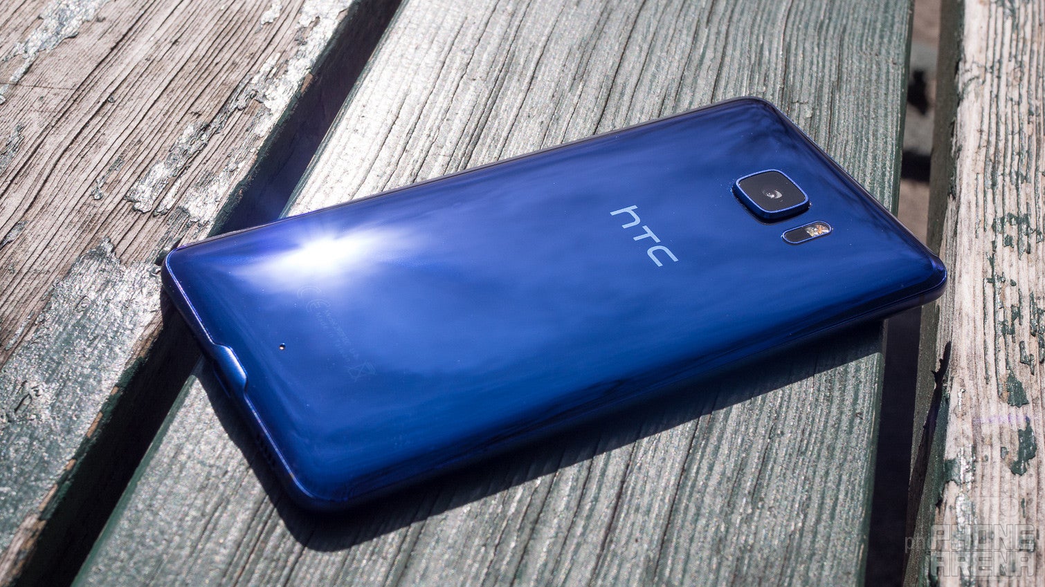
For as many steps as HTC takes in the right direction, it can't help but shoot itself in the foot with a few big goof-ups. The U Ultra is a relatively attractive handset that comes with a nice assortment of extras (like that case and the really good-sounding earbuds), has solid performance, a boatload of local storage, and offers a decently satisfying camera.
But it's still a phone that feels too large for its own hardware, one that seriously skimps on battery capacity, and comes up a little half-baked in the software department.
Maybe the biggest oversight HTC's making with the release of the U Ultra is its pricing, and how the phone's positioned in the company's lineup. After spending a week using the HTC U Ultra, the phone still feels like a hold-over until the manufacturer is ready to introduce a proper 2017 flagship: a phone with a more accessible size, with better battery life, and hopefully maybe even one with a more bleeding-edge choice of processor.
Despite all this, HTC is trying to sell the U Ultra like it's the end-all, be-all, can't-be-topped model in the company's stable, asking a preposterous $750 for the handset. While it's a good phone, that's a level reserved for the very best of the best, and we just can't see the U Ultra fitting in amongst such heavyweights.
If HTC only approached the U Ultra with a slightly, slightly different set of priorities, this handset could have been a real win, and help hold us over until the more obvious HTC 10 follow-up is ready to land. For now, though, this is just one phone that's really tricky to recommend. There are too many compromises, and too much other competition that's more worthy of your smartphone-buying dollar.






![Some T-Mobile users might be paying more starting in March [UPDATED]](https://m-cdn.phonearena.com/images/article/176781-wide-two_350/Some-T-Mobile-users-might-be-paying-more-starting-in-March-UPDATED.webp)




Things that are NOT allowed:
To help keep our community safe and free from spam, we apply temporary limits to newly created accounts: