HTC One M9 Review
Introduction
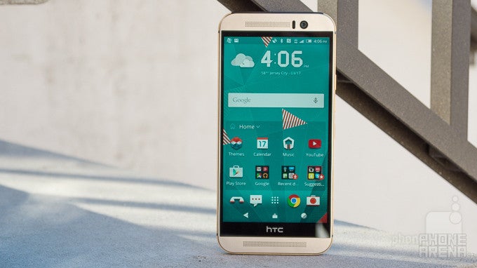
Nearing the arrival of spring, it’s that time of the year when we become all excited and giddy because it’s what we like to call the first flagship season. Now that Mobile World Congress 2015 is behind us, where several notable smartphones made their debut, it’s ripe for many companies to out their flagship devices for the first half of 2015 – and they sure didn’t disappoint us with their announcements! Acting swiftly, the HTC One M9 is one of the first out of the gate, hoping to get a slight head start against the anticipated horde of competition we know that’s lurking in the shadows, waiting and poised to make their move.
For HTC, it’s an interesting position for them, as 2014 ushered in a shift for the venerable company – one that brought them more notoriety in the mid-range segment, rather than the high-end. Don’t get us wrong, last year’s HTC One M8 delivered an acclaimed smartphone that proved yet again that the company knows how to design beautiful phones. In comparison to its esteemed rivals at the time, however, it didn’t quite make as much of a significant impact on consumers. All in all, it was a valiant effort, but it wasn’t the kind of thing to shake the ground beneath us.
And that, folks, is where its successor in the HTC One M9 aims to succeed. One year later, one year wiser, HTC is hoping that its latest effort is enough to do justice in the always-competitive high-end smartphone space. With more and more competition looming on the horizon, the M9 needs to succeed valiantly in order to contain its place amongst the elites.
The package contains:
- HTC One M9
- Wall charger
- microUSB cable
- Stereo headphones
- Replacement ear bud tips
Design
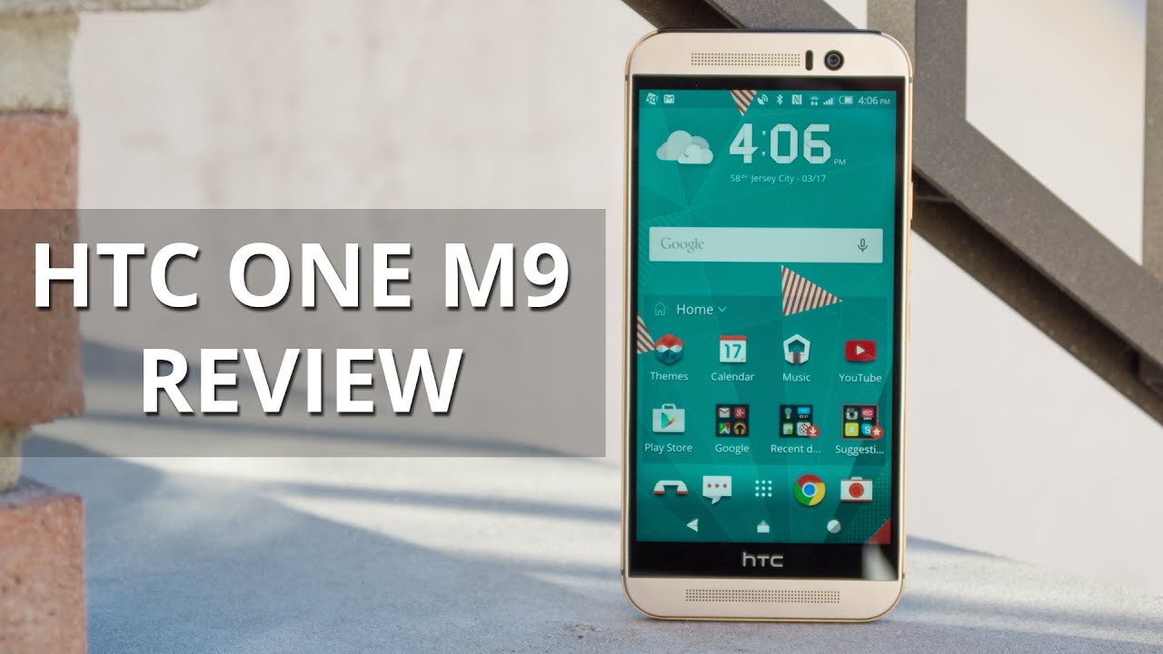
The HTC One M9 continues the tradition of yielding the design qualities of a premium smartphone.
Recycling a design isn’t a new process to tell you the truth, just look at what Apple does with its iPhones, or Samsung with... most of its line-up, or Sony with its Xperia Z phones. Looking at the HTC One M9, most people would be hard-pressed to realize any major differences in design from the onset – it almost looks identical to its predecessor! That’s not a bad thing, honestly, just because the HTC One M9 still embodies all of the qualities we’d want to find in a high-end, highly lusted smartphone.
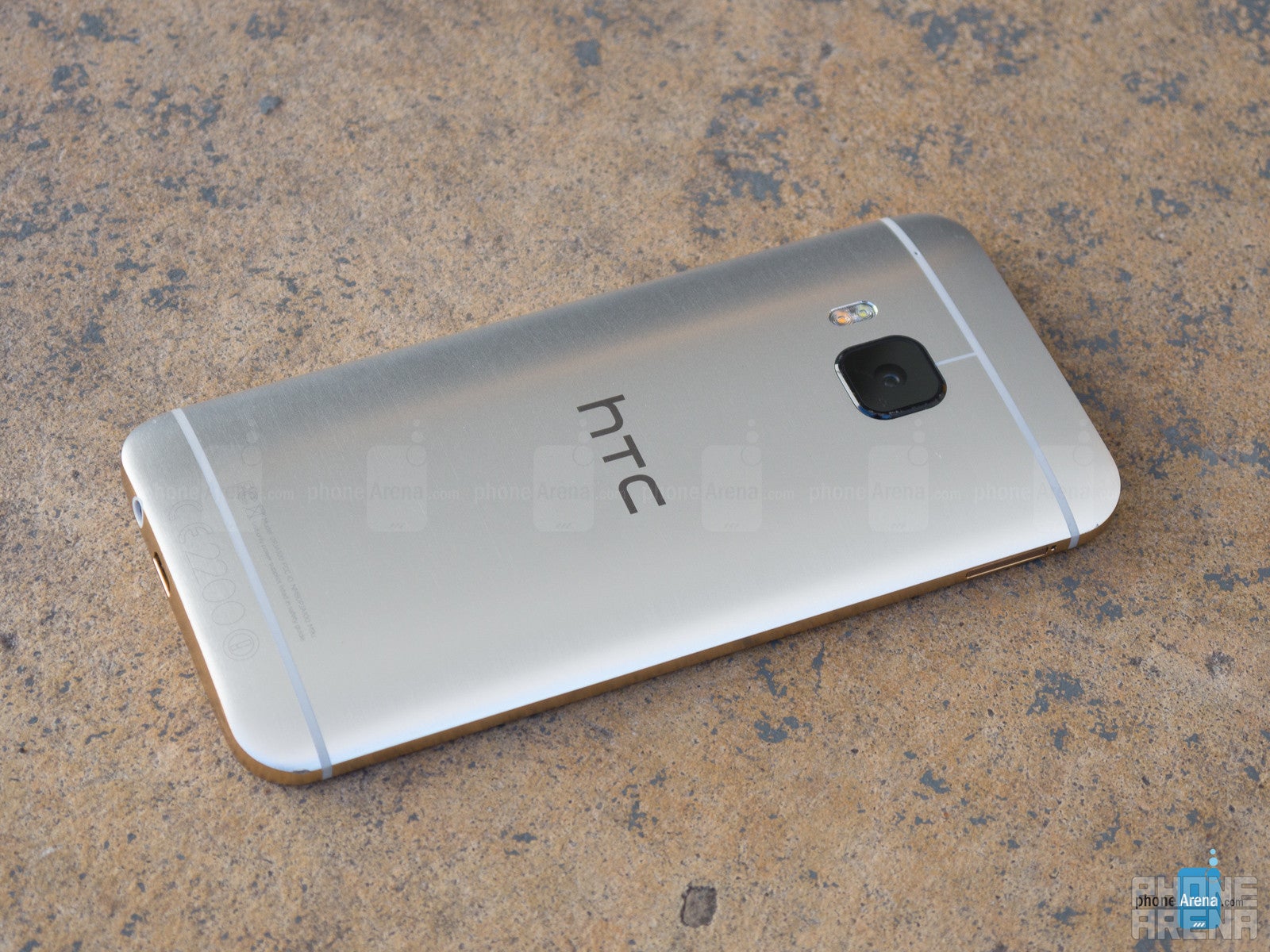
Quite frankly, the M9 retains the same DNA design language of the M8 before it – so what we have here is a solidly crafted thing that’s accentuated by its premium choice of materials. This time around, though, it employs a jewelry grade dual-tone finish that accents our all-metal silver colored review unit with a contrasting gold bezel. Honestly, it’s still incredibly beautiful looking and the scratch-resistant finish doesn’t feel as slippery as last year’s model.We really can have few complaints about the M9’s design, mainly because it’s just such a looker in the space, differentiating from the rest of the landscape with its all-metal body.. Meticulously designed, with attention to detail, and awe-inspiring from head-to-toe, it’s no surprise that the M9 continues the legacy that HTC is known for throughout its prestigious history.
Changes to the M9’s design are both subtle and direct. For example, they’re able to whittle away at the bezels surrounding the display – ensuring that the M9 is technically more compact than the M8, but it’s really tough to notice it in person. More apparent, thought, is the placement of the power button to the right side of the phone, which makes it more accessible.
Keeping its iconic design intact, the HTC One M9 is blessed with the same dual front-firing HTC BoomSound speakers from before, but they are now accompanied with Dolby Audio Surround. Rounding things out, it still features a nanoSIM slot, microSD card slot for expandable storage, and an IR blaster underneath the plastic cover lining the top edge of the phone. Right from the get-go, the HTC One M9 is available in three metallic colors – gunmetal grey, gold on silver, and gold on gold. Our particular review unit, the gold on silver one, definitely exudes a premium finish to the point that it can be mistaken for a solid silver bar.
As much as we would’ve been thrilled to see the M9 receive a higher degree of water resistance, that’s not the case here, since the M9 sports an IPX3 rating – giving it superficial protection against “light rain.” Interestingly enough, the optional HTC Active Case will increase its rating to IP68 for added submersion and drop protection.
Display
Sorry, there’s no plunge into quad-HD resolution just yet, but it’s hard to find fault with 1080p resolution in a 5-inch screen.
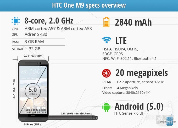
We’re not sure about how some of you folks feel about the HTC One M9’s display, a manageable 5-inch 1080 x 1920 S-LCD 3 display, especially when it seems as though more and more high-end phones are favoring quad-HD (1440 x 2560) resolution. On paper, HTC has done nothing new for the M9, as its display specifications matche its predecessor. Chiming in with a pixel density count of 441 ppi, we can’t find too much fault at HTC for choosing instead to stick with 1080p resolution, as details are undoubtedly preserved – so there’s great distinguishability from a normal viewing distance.
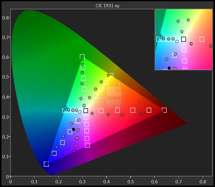
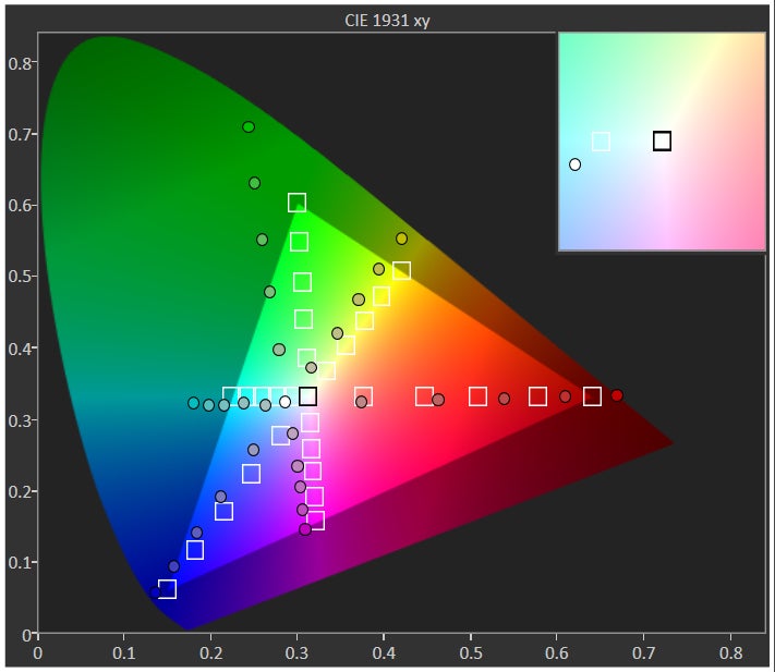
What’s more shocking, despite the obvious unchanged in specs, is that the display of the M9 exhibits a color temperature of 8100K – a stark departure from its predecessor’s mark of 7200K. Essentially, it gives off a distinctively colder tone, which makes it appear more bluish in hue. As a general rule of thumb, the ideal color temperature for a display is 6500K. Seeing that the M9 is well over that threshold, we’re a little baffled as to the decision to give the phone a colder toned display.LCD displays are capable of exhibiting very natural and accurate color reproduction, as well as good outdoor visibility, but the M9’s S-LCD 3 color reproduction seems a smidgen more skewed than last year’s display, besides being decidedly bluish, as we already mentioned. Well, it’s not the most color accurate thing, especially looking at where it hits the reference points in the color gamut chart, which you can find below. Also, the various gradients of magenta tend to favor the color blue. However, we’re glad to see that its brightness output has been increased to 508 nits – a marginal increase over the M8’s 490 nit brightness.
At the end of the day, we ask ourselves if what we’re given here is an effective display? Straight to the point, we’re inclined to say yes, mainly because it’s detailed, arguably at a perfect size, and it’s visible with the sun present. Sadly, it’s not particularly color accurate, which is kind of bothering, considering the premium status of the device on the whole.
Interface and Functionality
HTC Sense 7.0 is evolutionary, one that adds a whole new dimension to customization.
Fact, HTC’s Sense UI has always been at the cusp of meticulous design – similar to same level of dedication seen in the actual design of its phones. With the HTC One M9, we’re given the latest installment in the long standing customized Android experience; HTC Sense 7.0. This isn’t necessarily a revolutionary departure, but more evolutionary than anything else. Considering that HTC Sense has always been one of the more favorable customized Android experiences, we’re glad to see that they’ve continued on forward with the same mentality and approach for Sense 7.0.
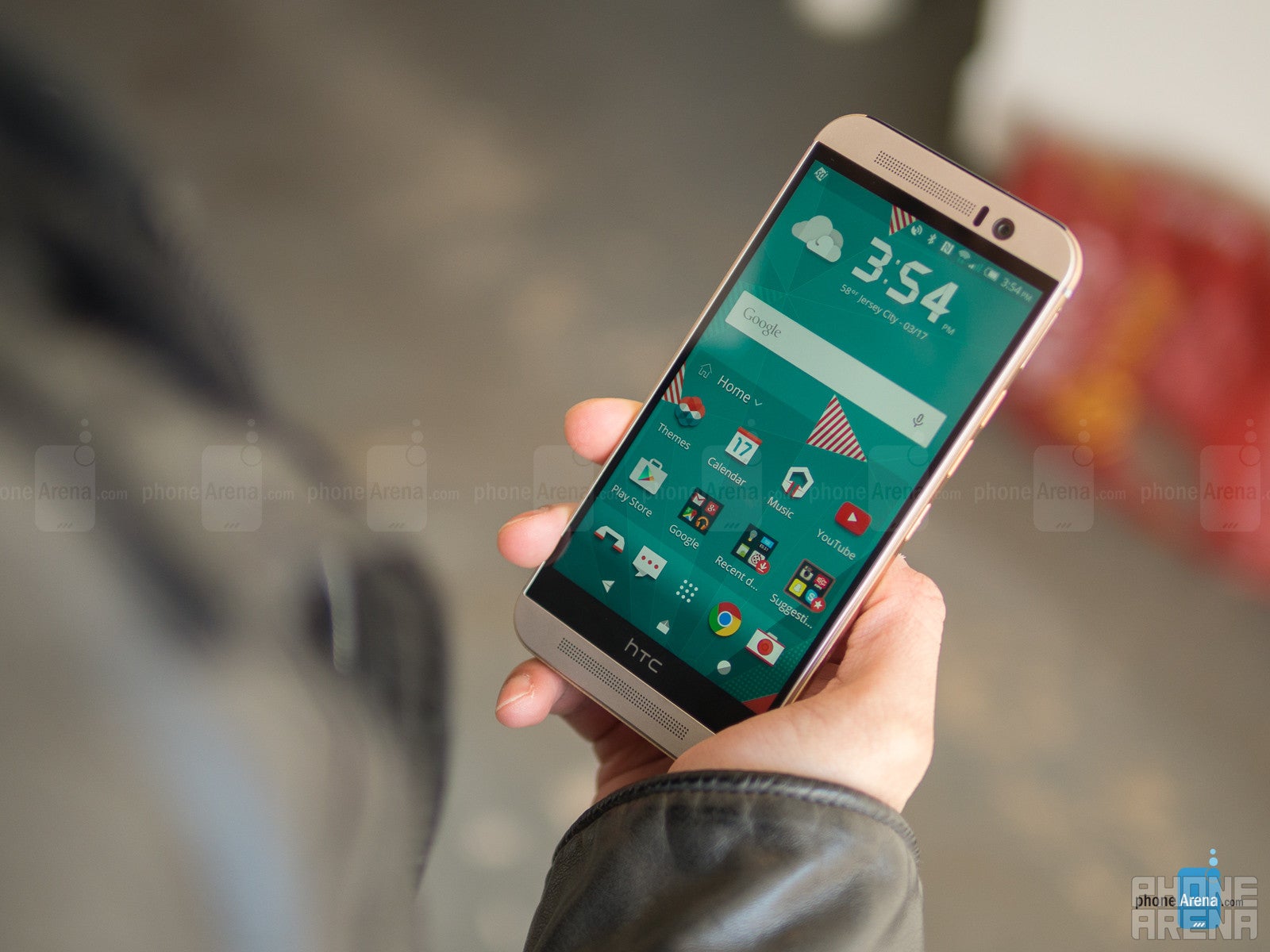
Superficially, there are subtle changes that differentiate Sense 7.0 visually from Sense 6.0 – albeit, they’re sometimes hard to realize until we look at them closer. Generally speaking, Sense 7.0’s approach is more streamlined than ever before, made evident for example by how the traditional clock/weather widget is now italicized. What’s most remarkable, however, is the unprecedented level of personalization that HTC Sense 7.0 brings to the table. In fact, nearly every aspect of the UI is customizable – from the theme colors, down to the look of the icons in the apps panel, and even the Android on-screen buttons.
There’s actually a centralized Themes Store where various themes can be downloaded to the phone, which naturally changes up the visuals of the interface. From simplistic to artistic, and plain out whacky ones, there’s a healthy selection to choose from the onset – plus, these downloadable themes will also modify notification tones as well. Now, if you’re not satisfied with the available selection, you can even go to the gallery, select a photo, and create a customized theme based on it. The M9 will actually analyze the image and generate a personalized theme, one that complements the color pattern of your desired image. It’s cool and different, but more importantly, it’s an expressive motion that we don’t tend to see too often.
Beyond that, this is the HTC Sense experience we all know and love – one that includes BlinkFeed in the left most homescreen pane. For the most part, it’s there to populate our social networking accounts, but it’s there more for the convenience factor, rather than having to open apps separately. And there’s also all the various Motion Launch gestures from before, which allow us do things such as turning on the screen by double tapping on it, unlock the phone by doing a swipe up when it’s off, and even launching the camera by picking up the phone, placing it into landscape, and pressing down on the volume key.
Of course, having Android 5.0.2 Lollipop right from the start is a treat, seeing that most of the new features are present here – like the ability to pin apps and okay Google initialization. Taking particular attention to the notifications panel, the connectivity options are accessible by a quick swipe, which presents us access to useful things like the flashlight. Sadly, though, Lollipop’s multi-user support has been omitted.
Another new entrant to the Sense experience is the HTC Sense Home widget, which by default, is placed on the homescreen after the initial setup process. It’s a valuable tool if you’re the kind of person that relishes on organization, since the widget intelligently arranges apps according to your usage and location. Broken down to three specific options, home, work, and out, we really like how it reacts to our usage. When at work, apps such as the calendar and mail are presented to us – while Google Maps is logically given when we’re “out.” There’s a “Suggestions” folder in there, but unlike the other icons in the widget, it’s not something we can unpin.
At the core of it all, HTC Sense 7.0 has the style, personalization, and straightforward operation we want in any smartphone experience. Redundant features are nowhere in sight, so it’s comforting to know that it’s an experience without complication. Throw in the higher level of customization thanks to the availability of themes, as well as a smart HTC Sense Home widget, Sense 7.0 is on the right path of being a worthy, evolutionary experience.
Phonebook
Very little has changed here, as Sense 7.0 doesn’t really do much to the phonebook’s operation and layout. Regardless of that, we have complete control in what contacts, and from what accounts, we want to be displayed in the phonebook. Naturally, it intelligently links contacts from multiple accounts, so there’s little disorganization that comes from multiple contacts for the same person.
Organizer
Likewise, Sense 7.0’s various organizer apps don’t a whole lot functionally and visually. In fact, the calculator, calendar, and clocks apps of Sense 7.0 are almost exact facsimiles to what we’ve seen in Sense 6.0 already – though, the color accents of each app will change accordingly to the theme we select for the UI. One particular change we notice is found with the calculator app, which now has an overlaid advanced functions section that can be accessed by merely swiping the pane to the left.
With the HTC Sense Home widget, it intelligently dishes up pertinent apps like Mail and Scribble, which are undoubtedly useful when we’re in work mode. On the productivity side, Polaris Office 5 is preloaded out of the box, giving us alternatives for word processing, spreadsheet, and slideshows.
Messaging
Lollipop’s arrival seemingly eliminated the need for a separate “email” app, especially now that Gmail can now be used for other email accounts. Nevertheless, HTC decided to give folks choice in what to use, as a separate “Mail” app is available with the M9. It’s functional, of course, but Gmail seems to present us with a more uniform experience – so it’s arguably best to stick with it.
Typing things up with the Sense keyboard is not bad of an experience, more so when the ample sized screen is enough for our fingers to happily type away. Actually, not much has changed with the keyboard’s operation and layout, but in supplementing Sense 7.0’s new approach of being customizable, we can opt to employ a trace-like operation – as well as the option to change the color. Overall, it’s an effective keyboard that gets the job done.
Processor and Memory
Slowdown? There’s no such thing with this phone!
A rarity for sure, Qualcomm’s latest silicon makes its appearance in HTC’s flagship phone. It’s logical, not surprisingly, which makes the M9 live up to its status of being a flagship thing. Ticking under the hood, the M9 is rocketed by an octa-core Qualcomm Snapdragon 810, accompanied with a roomy 3GB of RAM and the Adreno 430 GPU.
As you may know, this is a 64-bit octa-core monster with four Cortex-A57 cores operating at speeds of up to 2.1GHz, and four Cortex-53 tuned to 1.5GHz. Benchmark scores are off the charts, gaining high marks in several areas, which are quite expected for this piece of silicon. In our time using the M9, it performs effortlessly with an assortment of operations – both simple and complex. Apps open instantly, transition effects happen fluidly, and today’s most demanding 3D games run flawlessly. With the latter, however, we do notice at times that the phone tends to run hot during prolonged usage.
Initially, the M9 was announced to offer 32GB of internal storage, but since then, a 64GB variant has been announced – albeit, there’s still no confirmation if the 64GB model will be available globally. Nonetheless, the M9’s available microSD card slot is a sight for sore eyes, ensuring that we can complement its capacity.
Internet and Connectivity
Say adios to the “Internet” app featured in many HTC smartphones past, replaced solely by Google’s own Chrome browser. With Android 5.0 Lollipop, of course, we’re now able to have tabs opened in separate windows – so switching between tabs can be done by using the Recent Apps menu key. If that’s not your thing, it can be reverted to the usual mode by being all placed all within the Chrome app.
Surfing the web is enjoyable, thanks in part to the phone’s screen size, resolution, and speedy navigational performance. Pages load up in no time at all, while kinetic scrolling and pinch zooming are accompanied with good response. Seriously, we can’t complain about the experience here.
HTC’s latest effort has a wider band support for LTE than its predecessor; a total of 10 to be exact. All of the usual connectivity suspects are in tow with this one, so that includes things like aGPS with Glonass, Bluetooth 4.1, dual-band 802.11 a/b/g/n/ac Wi-Fi, NFC, and MHL.
Camera
Details are emphasized more with this new camera, but low lighting performance is just laughable.
Ever since the announcement of the original HTC One (the M7), HTC has gone on to praise the advantages of the “UltraPixel” camera. Rather than jumping the trend of going with higher megapixel count cameras, they’ve instead chosen to stick with the 4-megapixel UltraPixel camera. And with last year’s M8, they’ve brought in a second camera lens to complete its “Duo Camera” system – one that glorified the “bokeh,” or out of focus effect.
To its credit, the effect, when used properly, enabled the M8 to produce some slick looking shots. Although, it still lacked in one key area – detail. For those looking to crop photos, its inability to capture the same level of detail as some other formidable cameras makes it less versatile. Well, it seems as though HTC heard the complaints and acted accordingly for the M9. Armed with a number crunching 20-megapixel auto-focus camera, it’s a considerable jump over its predecessor. Interestingly enough, the UltraPixel camera lives on – though, it’s now been made as the front-facing camera.
Launching the camera app, it’s a familiar layout that doesn’t deviate from what we’ve seen in the M8. Adhering to both novice and enthusiasts, the camera interface is rich in shooting modes and manual controls to appease the latter – while also being simple in its automatic mode. Switching between the modes can be done by swiping down on the interface. Its more notable modes include photo booth, split capture, selfie, panorama, and bokeh.
Image Quality
Let’s start off with the good: detail has been drastically improved over its predecessor. Our arguments and qualms about the M8’s lack of detail are no longer a concern, as the M8’s 20-megapixel camera, without question, captures a ton more to enable us flexibility to crop images post shot without too much loss in quality. Colors, however, appear to be slightly subdued in comparison to the M8, almost to the point of being washed out at times. Despite that, we can assure you that the M9 is capable of taking some incredible looking photos outdoors – just as long as lighting is plentiful, naturally.
Additionally, we also can’t complain about its bokeh and HDR shots either. With the former, the process takes longer to accomplish than on the M8, but that soft out-of-focus look to the background is profound – giving focus to the subject in the foreground. Paying special attention to its HDR snapshots, however, the results seem to be more of a mixed bag. As a rule of thumb, HDR is meant to combine various exposures for a balanced look, but the M9’s HDR shots appear more artificial. Yes, under exposed sections are brightened up to compete against the more neutral exposure of the scenery. In doing this, images favor a hazier looking composition.
Still shot quality is pretty favorable under ideal shooting conditions, but using the M9 for low light photography is totally something else. Sadly, this is arguably the biggest disappointment to the phone. First and foremost, sharp detail is out the door, replaced instead by smudgy looking shots that have difficulty in handling dynamic range. Essentially, brighter areas appear over-exposed. Now, the HDR mode is supposed to tone things down for a more neutral appearance, but the unexpected consequence is that the M9 is more prone to blurring – due to the longer snapshot time for image processing. Yes, the flash is there for the occasion, but photos appear to be a bit more devoid of color.
If selfies are your forte, you’ll be especially pleased by the results from the new UltraPixel front-facing camera of the M9. In comparison to the M8, the M9’s front-facing snapper delivers sharper looking photos – allowing details to blossom more so than those of its predecessor.
Most phones don’t falter when it comes to taking outdoor shots where lighting is ample, that’s just the reality of things. However, as much as many of them excel in that area, a lot generally crumble under low light. The HTC One M9 falls into that category. Sure, we applaud HTC on finally bringing on a camera that solved the detail deficiency of the M8’s camera, but its performance isn’t well-rounded enough to compete against devices like the iPhone 6 Plus or Samsung Galaxy Note 4 in low light. In fact, it’s a smudgy mess that’ll make you think twice of trying to snag a shot. There’s always next year, right?
Video Quality
This year’s upgraded camera gives the M9 the ability to now record video in 4K resolution, in addition to the usual 1080p. Between the two modes, it’s a no-brainer decision to stick with 4K, just because the results are sharper looking. In comparison, its 1080p video quality is a nightmarish composition that’s light on the details, but heavy on the softer tones. In any event, audio recording is pretty clear and distinct for the most part, and its exposure adjustment is pretty good too, but the camera’s constant focus adjustment can sometimes be bothersome.
Matching its still image quality, the M9’s video recording performance is best reserved for situations when lighting is abundant. Other occasions, low lighting in particular, the M9 frustratingly can’t deliver anything tangible to the table. Noise, ungodly poor detail, and heavy artifacting demolish any hope in making it suitable.
Multimedia
Not only are there a ton of cool photo editing tools at our disposal, but the addition of Dolby Audio Surround helps to solidify its stature of being multimedia centric.
When it comes to the picture gallery, HTC offers a myriad of editing tools at our disposal to give images both a professional and artistic touch. Artistic elements are achieved by using the shapes, photo shapes, and prismatic effects – while things like the double exposure effect adds that professional grade touch by combining two photos together. There are some fun modes as well, like face fusion, which takes two portrait shots and mixes them together.
In true HTC fashion, Zoes are compiled automatically while viewing the gallery, but further enhancements and adjustments can be made later on. Grouping content is based on time and location, so that these Zoe clips are cleverly delightful in capturing the moment. Not everyone will have the time to invest in manually piecing a Zoe together, but it’s pleasant that the M9 can compile some fantastic ones on its own.
By now, it’s no surprise that the Google Play Music app is there for all of our music listening needs. As an alternative, the Sense music player continues to be present in the M9. Honestly, it’s a well thought-out, design conscious music player. HTC’s meticulous attention to presentation is apparent with its music player, as it continues to be one of the more visually attentive ones out there – evident by the visualizer option that’s available, which happens to also display lyrics simultaneously.
Back for another show, the M9 features the timeless classic of bearing dual-front firing speakers with HTC BoomSound. Technically, this year’s pair is slightly at a lower volume output of 72.8 dB, but it’s still rich in tone and deserving of our attention. Not only does it sound robust, but there’s a commanding presence when it emits audio. A new addition to the experience, Dolby Audio Surround, offers greater sound fidelity when it’s placed into music mode.
However, its usefulness and presence is felt most when watching videos, since theater mode adds a layer of depth to the audio experience. Hardly a shocker, the M9 is the perfect thing for the video watching experience – thanks in part to how audio is projected toward us, while all sorts of high-def videos come to life on its gorgeous screen.
Call Quality
Just like before, it’s spot-on with its performance.
Battery
Even with a larger capacity battery, the M9 can’t seem to outlast the M8.
Underwhelming is one choice word that describes its performance, seeing that it achieves an “average” mark of 6 hours and 25 minutes from a full charge. In our own real-world usage, the battery easily carries us through a solid one-day of normal use, but power users will have to monitor its level throughout the day. By comparison, the M8 managed to reach a tally of 7 hours and 12 minutes in our benchmark test – so it’s rather concerning to find the M9 trailing behind.
Conclusion
One year, that’s the typical cycle a company needs in order to make the necessary adjustments in making a new phone better than the previous one. As we take a look at the bigger picture, we certainly can agree that the HTC One M9, as a whole, has been tweaked and refined to correct the issues that were left outstanding with the M8. Visually, there are subtle changes to the design of the M9, but at the end of the day, it commands respect for continuing to be one of the best designed phones out there – more so when it embodies the qualities we want in a high-end product.
Naturally, most of the hardware has been upgraded with the M9, including the camera, which was one of the M8’s biggest opportunities. As we’ve seen so plainly, it corrects the issue of capturing detail, thanks in part to the new 20-megapixel snapper, but it’s still by and large trailing the overall performance of other phones in the market right now – namely the iPhone 6, Note 4, and Lumia 930. It’s just frustrating that it can’t handle low light.
Evolutionary is clearly the path taken by the M9, which is evident in how the HTC Sense 7.0 experience adds a new degree of personalization on top of an existing interface that’s modern looking in design already. Throw in the fact that it’s still relatively straightforward and simple, we can’t complain about the software experience – especially when other customized Android experiences overcomplicate things.
Arriving in the Americas starting on April 10th, the HTC One M9 will more than likely cost you the usual $200 on-contract price to snag. Looks alone, the $200 cost is more deserving than other phones, but we can’t help but to think about the looming competition on the horizon. A whole year has been invested in improving the M9 over the M8, and the results are there; however, it is yet to be seen if the improvement will prove to be big enough in order to guarantee the phone's leading spot for the remainder of the year.
Software version of the review unit:
Android Version: 5.0.2
Build Number: 1.32.401.6
Kernel Version: 3.10.49-g51f1ff1
HTC Sense Version: 7.0













Things that are NOT allowed: