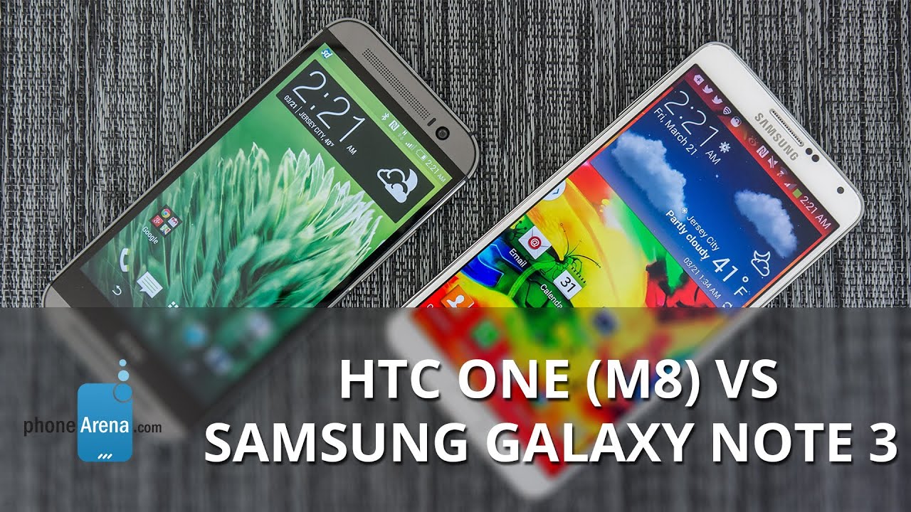
HTC One (M8) vs Samsung Galaxy Note 3
Introduction
When you’re atop the Android world, it means that everyone is looking at everything you’re doing – both the big and the small. Samsung, as we know, is the biggest fish in the pond at the moment, as they’ve proven to us that they can deliver the goods. Everything came together with last year’s Samsung Galaxy Note 3, a monstrous smartphone that’s argued by many as the company’s second flagship smartphone of 2013.
HTC tried its darnest to compete with Samsung’s aggressive efforts, but to no avail, they couldn’t keep up with the fanatical pace of its rival. This year, however, the HTC One M8 has already been acclaimed to be a formidable figure – one that intends on being relevant for quite some time. Consumers will no doubt have some homework to do, figuring out exactly what phone will deliver the goods that matter most to them. HTC’s offering is hot out of the gates, but we wonder if it has the steam power to overcome the features rich Samsung Galaxy Note 3.
Design
The key selling point of the HTC One (M8) is its meticulous, modern looking design. HTC has proven again that it’s a step ahead of Samsung in this department, as the One M8’s stylish appearance and premium finish puts it a solid leap ahead of the more conventional looking Samsung Galaxy Note 3. Sure, there’s a subtle sophisticated look to the Samsung Galaxy Note 3, with its stitched patterned design and faux-pas leather casing, but it lacks the quality ingredients seen in the HTC One M8’s package. Of course, the question between metal versus plastic has been visited numerous times – and from our perspective, the brushed aluminum chassis of the HTC One M8 screams out voraciously.
Size-wise, there’s an obvious disparity between them. Considering that the Note 3 is technically a phablet-sized device, its immense size over its rival is warranted – albeit, it’s something that proves to be more cumbersome to hold. In comparison, the HTC One M8 is still perceived as gargantuan, but it’s nevertheless the less unwieldy of the two. Furthermore, the arch frame of the HTC One M8 adheres better to our hand as we grasp it, making it feel more natural and comfortable to hold.
Samsung tried doing something different with the Galaxy Note 3, which is evidenced by the stitched pattern. When it boils down, though, it still lacks the charm, charisma, and oh-so attractive looks of the HTC One M8. Cheers to those designers over at HTC, seeing that it shows how committed they are in crafting a smartphone that’s instantly recognizable for its design.
Taking a look around their trims, there are several things they have in common – like their 3.5mm headset jacks, various microphones, IR blasters, and microUSB ports. With the latter, the Note 3 benefits by featuring a microUSB 3.0 port, in comparison to the HTC One M8’s older microUSB 2.0 port, which provides for faster data and charging connectivity. Paying attention to their respective power and volume controls, there’s not one particular set we like more than the other.
Finally, they have their own unique features. For the HTC One M8, it has dual front-firing speakers with HTC BoomSound that direct sound towards us – instead of against. Meanwhile, the Note 3 gains a productivity element with its S-Pen, which is special for accomplishing a handful of tasks.
Display
Much like their size difference, there’s also a huge disparity when we look at their displays. On the HTC One M8, it features a 5-inch 1080p Super LCD-3 display with Gorilla Glass 3. Technically, it sports the higher pixel density count of 441 ppi (in contrast to the Note 3’s tally of 386 ppi), but to tell you the truth, it’s not noticeable enough to the effect that we can recognize from a normal viewing distance. In fact, the Note 3’s larger sized 5.7-inch 1080p Super AMOLED display with Gorilla Glass 3 delivers a potent punch with its details as well.
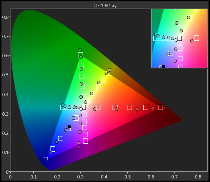
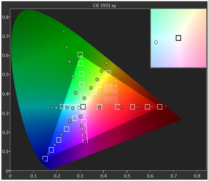
Utilizing different display technologies, they each have their strong attributes. Comparing the colors they produce, the Note 3’s oversaturated tones have an iridescent glow that instantly gets our attention, but the colors aren’t nearly as accurate as the colors produced by the HTC One M8’s LCD-based display. Viewing angles, though, go to the Note 3 mainly because it retains its vividness more. However, when it comes to outdoor visibility, the stronger 490 nits of brightness from the One M8’s panel is more visible than the weaker 360 nits of brightness pumped out by the Note 3.
We have to mention, too, that there’s some additional technology implemented into the Note 3’s display. Specifically, the display has the ability to recognize when our finger or S-Pen is hovering over it – providing us with numerous functions via its Air View features. Despite the added functionality of the Note 3’s display, some folks might not even use them a whole lot. At the end of the day, we like the two displays.
Interface and Functionality
The two opposing custom Android experience couldn’t be any farther apart from one another, seeing that one prides itself in simplicity and looks – while the other favors a heavy features set. At the core of it all, consumers will undoubtedly have a pickle in deciding which of the two are most agreeable to their needs. Although there’s not one that might encompass those specific requirements entirely, we’d bet that consumers will at least gobble up what they have to offer over time.
Like we said already, one of these experiences emphasizes simplicity with its operations, and good looks with the interface. That, folks, goes to the HTC Sense 6.0 UI, which is undeniably more visually pleasing to the eye with its modern and clean looks. Rarely does it fail to capture our attention with its stylish appearance, especially when the Note 3’s TouchWiz Nature UX experience seems more intent on donning a cartoonish overlay. Samsung really needs to take some pointers from the HTC One M8’s Sense 6.0 experience. Maybe one day they will?
Indeed, the TouchWiz experience lacks any pizazz or spark with its visual presentation, but what it lacks in that department, it makes up heavily with its features set. To be more precise, the TouchWiz experience is filled to the brim with a variety of functions – some proving more useful and practical than others, of course. For example, the multi-tasking experience is thrown up a notch thanks to its Multi-Windows feature, delivering us a true multi-tasking experience to mobile. In addition, the various Air Gestures and Air View functions permit us with another level of interaction with the phone that the HTC One M8 can’t match.
Rather than following the same path, Sense 6.0 chooses to favor a more simplistic route that’s light with features – though, the few it has to offer, like its new Motion Launch gestures, are inviting and quite practical. Some folks will argue that more features are better, while the others on the opposite side will vouch that simplicity and practicality are the utmost most pertinent qualities. Ultimately though, we can agree that Sense 6.0 is likely to cater to a wider audience with its stylish looks and easier operation – whereas TouchWiz will appeal to productivity centric individuals.
Processor and Memory
On paper, the HTC One M8’s quad-core 2.3GHz Qualcomm Snapdragon 801 SoC with 2GB of RAM is highly prize for its newness – in comparison to the Note 3’s last-gen quad-core 2.3GHz Qualcomm Snapdragon 800 processor with 3GB of RAM. Certainly there’s something to say about the HTC One M8’s newer piece of silicon, but the Note 3 can pull out nearly the same performance with its processor. From basic to complex things, it’s almost indistinguishable to say which of the two is the superior one. However, when navigating around their homescreen, there’s more snappiness with the performance of the HTC One M8.
Fortunately, there’s memory expansion with these two beauties thanks to their included microSD card slots. Between them, it’s easier to access the Note 3’s slot, which is hidden behind its removable rear casing. As for the HTC One M8, it’s positioned along the left side of the phone, but it requires that pinhole sized adapter pin to access.
Internet and Connectivity
As expected, surfing the web is effortless on these two devices, since they feature fast page loads courtesy of their 4G LTE connections, instant page rendering on the fly, and buttery smooth navigational controls. Due to the Note 3’s larger screen size and added functionality, like how we can perform a slight zoom with our finger/S-Pen while hovering over the display, we find it being the more ideal device for the occasion.
All the usual connectivity features are in tow here, like 4G LTE connectivity, so there’s no shortage of lightning fast speeds for all of our web surfing needs. Of course, all the other usual suspects are on board as well – such as aGPS with GLONASS, Bluetooth 4.0, dual-band 802.11 a/b/g/n/ac Wi-Fi, NFC, IR blasters, and video-out functionality with the help of optional adapters.
Camera
Attached with the flagship status, the expectation here is nothing short of superb looking photos from their cameras. Over on the HTC One (M8), it employs the same camera technology as its predecessor – a 4-megapixel ‘ultrapixel’ 1/3” sensor that features an f2.0 aperture lens, dual-LED flash, and a backside illuminated sensor. The fun doesn’t end there, as an unconventional secondary rear camera is also perched nearby, allowing it to measure depth information. Sticking firmly to the bigger is better mentality, the Note 3 packs a sizable 13-megapixel 1/3.06” sensor that’s complemented with an f2.2 aperture lens, BSI, and a single LED flash.
Similar to the look and feel of their customized experiences, the HTC One’s camera UI is cleaner looking. Underneath their layouts, shutterbugs will be pleased to know that they are rich with manual controls to give us complete control in taking our shots. Diving further in, it’s apparent that the Note 3 has a handful more “fun” shooting modes – whereas the HTC One M8, its “fun” is experienced post shot with its various ‘duo effects.’
Let’s be frank people, the HTC One M8 takes some good looking photos – more so with outdoor sunny shots. In fact, if we’re to compare its shots against the Note 3, most people would be hard pressed to realize the differences. Well, that’s unless we decide to crop or zoom our shots. Indeed, the photos produced by these two are more than agreeable to share via social networking, but the poor details capture of the HTC One M8’s camera limits it. Conversely, the Note 3 captures a ton of detail in its shots, which doesn’t lessen its quality if we’re to crop them.
Quite simply, details are arguably the differentiator with these two, seeing that they perform similarly in other areas like color accuracy. Interestingly enough, it’s the HTC One M8 that pulls slightly ahead when it comes to snapping nighttime photos, just because its shots tend to be brighter in overall tone. Whereas details are sometimes lost in the dark and murky samples of the Note 3, they’re more drawn out with the HTC One M8.
After comparing the samples of the two cameras, we’re inclined to lean towards the Note 3 for having the overall better quality. Still, we have to admit that the various ‘duo effects’ of the HTC One M8 has some appealing elements to it – such as being able to select the focus post shot. However, we have to remind everyone that the same effect can be achieved through the aid of other 3rd party apps.
Having a balance between details and nighttime capture, the Note 3 moves ahead of the HTC One M8 in the area of shooting 1080p high definition videos. Sadly for HTC’s new outed phone, its quality isn’t as flattering to the eye, especially when there’s a fair amount of motion blur and digital noise with its low lighting capture.
Recording high-definition 1080p videos on the other hand, the differentiator is mainly isolated to their night time production. Needless to say, we like the quality of the two phones with their daytime shots, but the LG G2 falters under low lighting situations with the absurd amount of motion blur evident throughout the video.
Multimedia
Very few phones emphasize on having an eye catching music player, but they do exist. Case in point the HTC One M8, which manages to have a livelier looking player than the Note 3, thanks in part to the dynamic look of its visualizer, and its ability to display lyrics while a song is played. Of course, we absolutely adore the dual front-firing speakers with HTC BoomSound of the HTC One M8, mainly because it projects sound towards us.
Not only that, but it churns out a whopping 75.2 dB of power. However, we can’t count out the Note 3’s single speaker either, which also has a commanding presence with its slightly better 76 dB punch. Despite the stronger output, the vibrancy and richer tones put out by the HTC One M8’s speaker make it the more ideal device.
More than equipped to handle playing back high definition 1080p videos, the two are nearly perfect for the video watching experience. Still, having a larger screen makes for an even more ideal experience – so that’s why we prefer the Note 3 for this. Additionally, the multi-tasking element in play with the Note 3 permits us to continue watching a video while doing something else entirely different on the phone.
Call Quality
By now, we’ve raved about how well the HTC One M8 is when it comes to the call quality performance. Perfect would closely sum up the experience, especially when voices through the earpiece and speakerphone are loud, clear, and noise-free. As for the Note 3, it’s nothing more than average with its quality. Even though voices through the earpiece sound natural, there’s some crackling heard at the loudest volume setting. On top of that, our callers on the other end of the line complain about our voice sounding robotic.
Battery
Looking back to last year, the Galaxy Note 3 managed to impress us with its better-than-average battery life. Using our battery benchmark test, it achieved a tally of 6 hours, 8 minutes from a full charge. However, the HTC One M8 topples that mark in a serious way. Even though the HTC One M8 is stuffed with a smaller capacity 2600 mAh battery, in comparison the Note 3’s larger 3200 mAh one, HTC’s beauty impresses us with its 7 hours, 12 minute figure with our battery benchmark test.
Conclusion
Traditionally, the older a smartphone gets, the cheaper its price becomes. Therefore, it should be expected for a 6-month product to be lower in price point than let’s say, a new smartphone that was just recently released. Bearing that in mind, we’d be inclined to think that the Samsung Galaxy Note 3 would be the affordable device, but that’s not the case here.
In fact, the HTC One M8 is actually the more affordable smartphone – bearing a contract and outright cost of $200 and $650 respectively. In contrast, the much older Note 3 is attached with a sticker tag of $300 on-contract, and an even more ridiculous $725 outright through many of the popular wireless carriers. It’s staggering, don’t you think?
We can argue endlessly and dissect each phone to determine the superior one, but again, they each have their unique features, attributes, and characteristics to reel in different individuals. In our opinion, the HTC One M8 has more of that balanced appeal to cater to a wider audience. From its stylish design, to its simple software experience, it has the key ingredients that are necessary for a solid foundation. Heck, the pricing is also easier to tolerate – an inviting incentive for those budget conscious buyers out there.
Oppositely, the Samsung Galaxy Note 3 can also attract the same folks, just as long as they can tolerate the diverse software features it offer, and its ordinary looking design. Nonetheless, productivity centric individuals will especially gravitate to what the Note 3 brings to the table. In fact, all of those software features, on top of the added functionality you get from its S-Pen, fit perfectly into the mold of productivity users.








Things that are NOT allowed: