HTC One (M8) Review
Introduction
Ah yes, it’s a brand spanking new year, a time to wipe the slate clean and start anew! The onset of 2014 is a refreshing one no doubt for the many smartphone companies vying for supremacy, where the atmosphere is brutally nothing less than a dog eat dog world. Certain companies rise to the occasion, while others simply fall into obscurity – due to the fierce nature of the business.
In particular, HTC is one of the companies that has been through the highest of highs, and the lowest of lows. Last year, they were one of the first major players in the Android sphere to announce a flagship smartphone – the metal cladded HTC One. Argued by many as the epitome of outstanding design, especially when it won our award for having the best product design, the fabled smartphone from the Taiwanese based company seemed destined for glory.
When many flagship smartphones dared not to dabble in metal with their designs, HTC’s pride and joy surely showed that it could be done – and done well in fact! Historically speaking, the HTC One became the company’s most famous and best-selling smartphone. For all of its triumphs, it didn’t do enough to keep HTC from bleeding out and being in the red by the year’s end.
There’s no denying that HTC is at a cross road at the moment. Rather than scaling back and rushing development, they’ve taken the time out to plan a strategy to emerge victorious this year with its newest flagship phone. The result of all of the work is now being seen in the all new HTC One, or as some of us know of it intimately by its codename, the M8 for short. Of course, the road ahead is unpredictable, but the new HTC One is one short step away in making people believe in the impossible.
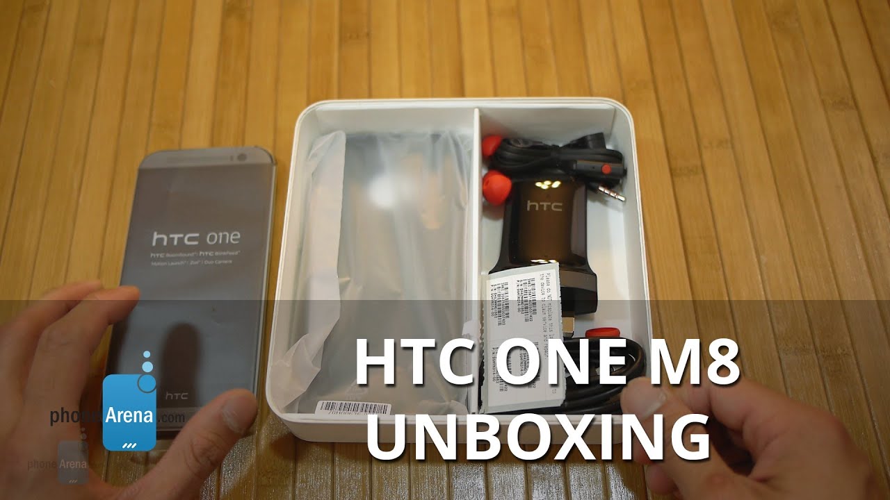
The package contains:
- microUSB cable
- Wall charger
- SIM Removal Tool
- Get Started Guides
- Case
- Wired headphones
Design
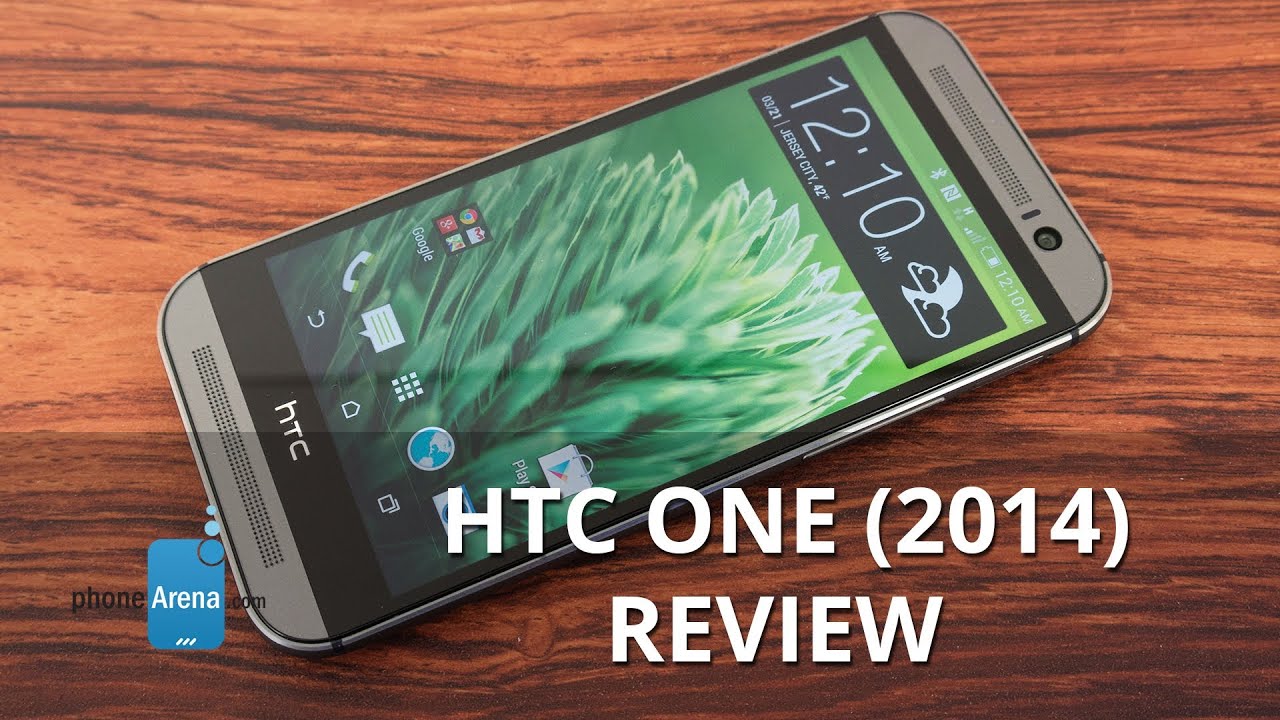
Design that pushes the boundary further than ever before! Sporting more metal in its construction, the HTC One is again the class leading head turner in the smartphone design space.
Last year’s HTC One blew us away with its outstanding design. Quite frankly, it was something refreshing and new. When you have an outstanding design already, it’s really tough to go outside the box and sprinkle something different with a new model. Fortunately for this new HTC One, it’s been given an evolutionary redesign that continues the task of telling everyone else that there’s a sensible amount of love given to the design process.
Briefly glazing over the appearance of this year’s model, we can instantly see some of the distinctive elements that have been established by the sweet industrial design of its predecessor. First and foremost, there’s the even more profound gunmetal colored brushed aluminum casing of the handset – the same unibody construction and design language from before. However, there’s more metal all around the body, giving it more of a uniform appearance. Upping the ante, this year’s model is now 90% metal – whereas its predecessor sported a 70% frame. Gone are those plasticy separators that hugged the trim of last year’s HTC One, and instead, the polished aluminum material extends to nearly all corners of the frame.
Partly thanks to its solid metallic frame, there’s a lot of sturdiness with its seamless construction – with smoother edges that gracefully hug from one side to the other. Impressively, HTC has done a bang up job in also minimizing the amount of seams throughout its body. In fact, there’s very little of them jutting out from the surface, so the end result is one smooth feeling phone in our hand. Nevertheless, the expected result from garnering premium choice materials is the amount of weight (5.04 oz) it’s carrying along. It’s not bad per se, seeing that it merely contributes in giving it that solid construction – and it helps too that there’s a subtle curve to the rear casing, giving it that ergonomic feel as well.
Barely relinquishing its grasp in the product design category, HTC once again impresses us with the fantastic, top-notch, and evolutionary design of the new HTC One. Few companies are as daring when it comes to product designs, so it’s extremely comforting to see that HTC doesn’t loosen up one bit. Instead, they have the forward momentum to eclipse what we’ve seen thus far from the field.
Gee, it’s pretty sweet when a company listens to complaints and corrects them. That’s what we find here with the new HTC One, seeing that it’s rocking a power button and volume controls that are more distinct to the touch and offer better feedback. The placement of the power button has changed, as it’s now positioned on the top right corner, which makes it more accommodating to right handed folks. Interestingly, there’s a dark plastic trim lining the top edge of the phone, which tucks away the unit’s IR blaster.
Elsewhere on the handset, there’s a microUSB port and 3.5mm headset jack lining the bottom edge – while a nanoSIM slot hugs the left side, and a microSD slot is discretely placed on the right edge. With the latter, it’s wonderful that there’s storage expansion with the handset, but accessing it is a slight inconvenience because it requires those pin-hole sized adapters to access.
Gone are the capacitive Android buttons from before, which are now incorporated into the UI. However, just like before, the new HTC One wields two signature front-firing speakers with HTC BoomSound to deliver an even more potent punch. And finally, the rear is home to probably the most peculiar thing on the handset – its Duo camera system. Oh no folks, the two cameras present here aren’t used to produce 3D content, but the tandem work together in achieving some cool focusing effects that we’ll expand upon later on.
Display
The size has been increased marginally to make it more flagship-like, but as a whole, there’s nothing particularly out of the ordinary with it.
Everyone is looking for the next big thing when it pertains to displays on mobile devices, but so far this year, it’s been nothing more than the usual flavor. As for the new HTC One, the only different thing about the display is its larger size – moving from the 4.7-inch panel of its predecessor, to a more flagship-like 5-incher. Yes, it’s still a Super LCD-3 panel. And yes, it’s also boasting the same 1080p resolution from before as well – so its pixel density is very similar, but ever so slightly lower - at 441 ppi. Despite that, it doesn’t really burst our bubble considering it’s still a high pixel density count, so details are tight, clear, and distinctive to the eye.
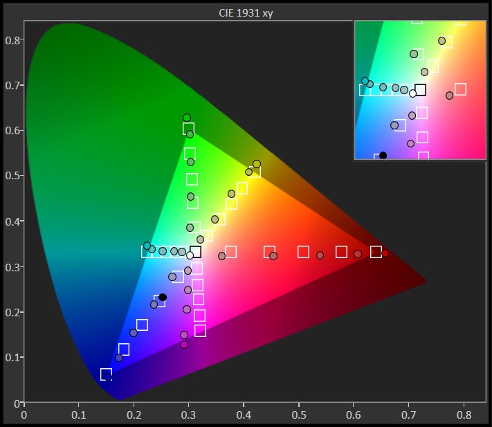
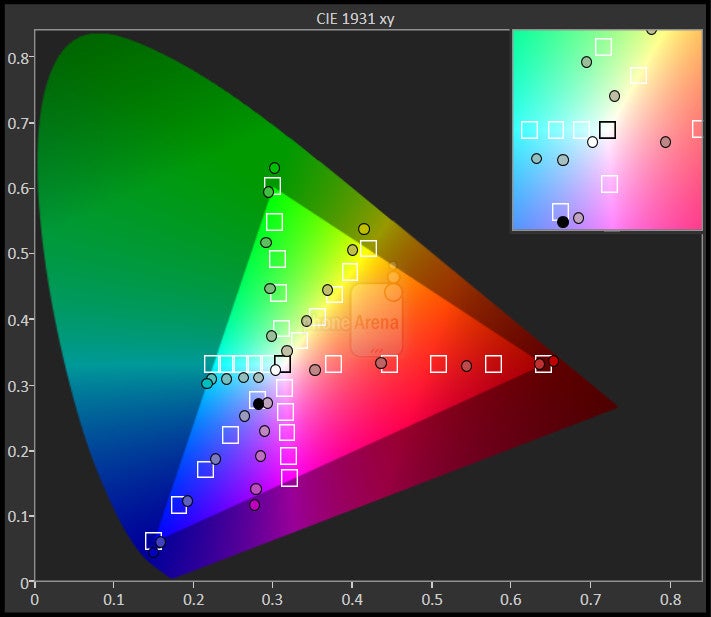
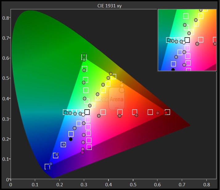
Image quality has improved slightly compared to the previous model - as before, it has a bit of a colder color temperature, so white appears slightly blueish. However, there's been some definite improvement in this area, as the new One comes with color temperature of ~7200K, compared to the 8000K of the old One (reference point is 6500K). The reproduced colors are vibrant and enticing to the eyes, with an overall lively look, instead of washed out, dull one. Screen purists will definitely like the fact that colors are slightly more accurate than before Thankfully, outdoor visibility isn’t an issue with this LCD-based panel, thanks in part to its brightness of 489 nits.
HTC One (M8) 360-Degrees View
Interface and Functionality
Sense 6.0 continues to be one of the more visually superior looking custom UIs. Unlike others, it doesn’t try to overcomplicate things with the new features in tow, but rather, they’ve kept it simple and to the point.
Drastically unique from what we’re accustomed to seeing from any Android smartphone, HTC Sense 5.0 on last year’s flagship product proved to be an inviting endeavor. Visually, the design of HTC’s customized Android interface was unequivocally a star in its own right – thanks primarily to its cleaner, modern looks. Best of all, it was an unobtrusive skin that provided users with a simple feeds list, the HTC BlinkFeed, that aggregated activities in one centralized and uniform area in the homescreen. Whereas other customizations threw everything at us, including the kitchen sink, Sense 5.0’s offering kept it uncomplicated, inviting, and most importantly, simple.
Enter HTC Sense 6.0 running on top pf Android 4.4.2 KitKat, the next step up to HTC’s Android skin. As a whole, the design language doesn’t make any dramatic departures that would diminish Sense’s already established looks. Instead, it retains mostly everything that we like about the UI – plus, a few minor tweaks here and there. Just like before, the homescreen is arranged in the same familiar layout where the left most panel is the HTC BlinkFeed, and everything else to the right is the traditional Android homescreen. This time though, we can designate which of the screens we want to make as our main homescreen.
Specifically targeting the social networking crowd, the HTC BlinkFeed is smarter in the way it delivers relevant information – as if it ‘sensed’ what you like most. Naturally, it aggregates the same content from before (Facebook, Twitter, etc), but they’ve added Fitbit to the mix. It’s a nice touch for those who use it, but unless you have some diehard Fitbit pals that are socially active with the service, you won’t see a whole lot of it pop up in the BlinkFeed. Beyond that, it’s more aware in what you ‘like’ in Facebook, so that it delivers the content that matters most to you.
There’s no questioning the absolute chic look of the UI, one that’s a cut above its competition with its ‘flat’ design language, but there’s a subtle change that some people might overlook. Depending on what core application you’re using, like the phone dialer, messenger, or calendar, each one will be marked differently with a particular color at the heading of each app. To be more precise, a blue highlight will be attached to communication apps like Mail and Messages, green for data-centric apps like HTC BlinkFeed and Weather, entertainment apps like the Gallery and Music will be attached with Orange, and black will be reserved for settings. It’s nothing major, but a small visual tweak that gives better organization – albeit, it’s tough to say if it monitors other third party apps, especially when they have similar color themes already in them.
At the end of the day, the same visual treat is present here with Sense 6.0 – complemented by some added new features and minor enhancements. In comparison to some other customized skins, it’s just inviting that it still combines a modern looking skin with software features that aren’t over the top or redundant. Like its clean and modern presentation, Sense 6.0’s operation is straightforward, simple, and sensible.
Motion Launch
The biggest new undertaking with the Sense 6.0 experience is seen most in how it employs various gestures to accomplish certain tasks when the phone’s screen is turned off. At the core of it all, these particular set of features provide us with quick-peek functionality. HTC’s interpretation is a pleasant addition and consists of using swipe gestures from all sides of the display.
Determining the time or date normally requires us to physically press the power button to turn on the screen, but a double tap from our finger brings the screen to life – and by that, we mean that the entire screen is powered on, as if we pressed the power button. Yeah, it’s great that it’s a convenient way to see the time or date, but it’s not entirely as great of an interpretation as the Moto X’s Active Display feature.
Swiping down from the top bezel gets us into voice dialing, something that will probably appeal most to phone chatters. To quickly unlock the phone, all we need to do is pick it up so that it’s in portrait orientation, and from here, just swipe up to unlock it. Again, it just eliminates the task of physically pressing the power button. If we want to jump straight to the widget panel (the usual Android homescreen panels), a swipe to the left does just that. Conversely, swiping right gets us into HTC BlinkFeed.
HTC has also sprinkled on another other motion-based gesture that automatically accepts an incoming call when the phone is picked up and placed next to the ear. We’ve seen this execution before on other handsets, so we’re not entirely wowed by this. In addition, we can launch the camera app by placing the phone into landscape and pressing on the volume button (any of them).
Processor and Memory
The latest piece of silicon from Qualcomm shows its veracity by providing the new HTC One with all the power and goodness to keep its performance in tip-top shape.
Befitting enough for today’s modern marvels, the HTC One M8, much like its other highly esteemed rivals, is powered by Qualcomm’s latest chip. It’s powered by a quad-core 2.3GHz Qualcomm Snapdragon 801 SoC coupled with 2GB of RAM and the Adreno 330 GPU. Outfitted with this behemoth of a chipset, it’s not all surprising to find its performance improved over its predecessor. Everything, and we mean everything, is accompanied with that snappy feel – something we’d expect to come from such a high-end piece of silicone. From playing intensive 3D games, to simple tasks, the new HTC One M8 barely loses any steam with its performance.
Interestingly enough, HTC will also have a particular variant of the handset for the Asian markets, which will be packing a slightly faster 2.5GHz Snapdragon 801.
Nowadays, it’s laughable to find a premier smartphone with only 16GB of internal storage. Unfortunate for this beauty of a smartphone, that’s the tally what we’re given with HTC’s prodigy. Nonetheless, the new addition of a microSD slot is a comforting gesture that gives us better expansion, but accessing it is a pain because we need that pinhole sized adapter to gain access to it.
Messaging
Donning a more spacious sized screen, the result here in the messaging experience is just the larger layout of the on-screen keyboards. Using either of them is a cinch, as it’s uber responsive to the touch and packs a decent auto-correct feature. On top of that, several numbers and symbols are accessible from the main layout – so there’s less need to get into some its secondary and third layouts.
Moving over the Mail app, there’s nothing out of the ordinary here that we haven’t experienced before. Aside from the particular theme color splashed along the top of the app to indicate it’s part of the messaging category of apps, everything else is pretty much in line to what we expect.
Organizer
Going through the various core organizer apps, it’s quite evident that there aren’t any dramatic differences between last year’s model. Functionally and visually, they all pretty much mimic what we’ve seen already – though, the color theme accent is the only noticeable difference.
Accessing Google Now is done in the same manner we’re accustomed already, which is accessed by doing a long press on the home button. From here, we can see all of the pertinent information that Google Now is known to precisely deliver.
Internet and Connectivity
HTC didn’t do a darn thing to really change up the web browsing experience. Out of the box, we can choose between HTC’s stock web browser or the always familiar Google Chrome. Both are more than equipped for the task at hand, as they perform flawlessly thanks in part to their quick page loads, buttery smooth navigation, and on-the-fly page rendering.
Seeing that our review unit is the international version bound for the European markets, it’s not able to receive 4G LTE using it with AT&T’s network stateside – so we’re left to using nothing more than HSPA+ connectivity. However, there will be different versions for major US carriers, and we can expect nothing but lightning fast speeds with LTE connectivity. Not surprisingly, the new One is outfitted with the latest connectivity gear, which consists of aGPS with GLONASS, Bluetooth 4.0 with aptX enabled, dual-band 802.11 a/b/g/n/ac Wi-Fi, NFC, and video out functionality with the aid of an optional MHL adapter.
Camera
A lot of emphasis has been put into its new duo camera, providing photos with some snazzy bokeh effects. However, the general quality of its shots doesn’t dramatically improve upon what we’ve previously seen with its ‘UltraPixel’ 4MP camera.
The facts point to the obvious, HTC is continuing to bet on its ‘UltraPixel’ camera. First introduced last year with the HTC One, we’ve seen it become a staple feature in HTC’s flagship portfolio of late. It features the same size 4-megapixel 1/3” sensor, resulting in larger-than-normal 2-micron pixels. However, this comes at the cost of having a relatively low image resolution of 4 megapixels, while rivals offer 8, 13 or even 20MP ones. As before, the camera comes with wide, f2.0 lens, but this time the flash is updated to feature two differently colored LEDs, called “Smart Flash”. Gone is the optical stabilization, replaced by “Smart Stabilization” that is said to rival the optical ones.
In this newest device, HTC is experimenting on something new by carrying along a secondary camera used specifically to measure depth information, so that the camera can cast specific focus onto different depths throughout the shot.
Placing our attention to the primary rear camera, It’s not to say that we’re a bit perturbed by the lack of any changes with the specs, but we were at least hoping to see something marginally better – to make up for the year long wait. The bigger question here is how the new ‘duo camera’ will be able to factor into enhancing the quality.
HTC has rearranged the camera UI with the new HTC One M8 by giving it a cleaner and more organized layout. Well, it’s wonderful that we can quickly launch the camera app while the phone is locked/turned off by utilizing the new motion launch gesture. Gone is the unified menu system that combined options for photos and videos, which are now separate from one another to reduce headaches in differentiating settings for either more. Of course, it’s blessed with a myriad of manual controls and shooting modes that really add some fun post photo.
Image Quality
Let’s first talk purely about its general image quality. From the looks of it, little has changed with the quality here. Outdoor shots turn out fairly sharp (but not oversharpened) with a good handling of dynamic range, where it balances out dark and light areas properly – and without under or over exposing certain elements. Despite the charming results, the ‘UltraPixel’ camera can’t capture fine details as good as higher resolution cameras. Sadly, purple fringing artifacts can often be noticed in high-dynamic areas. Meanwhile, macro shots tend to be delightful with that profound bokeh effect being cast to the area surrounding the object in the foreground.
However, photos taken indoors or in low lighting situations, produce underwhelming shots. Indeed, those large, 2-micron-sized pixels help to draw in more light into the camera, simultaneously giving our shots a brighter appearance and minimizing noise, but colors are washed out looking. In addition, details are once again soft and speckled looking.
Somewhat untraditional, the HTC One’s front-facing camera actually has more megapixels than the rear one – it's a 5-megapixel, wide-angle FF snapper. Not only does it play nicely when it comes to cramming in more people into the shot, but we’re pretty impressed by how good-looking the photos turn out.
1080p video recording quality in general is pleasing to the eye, as long as there’s sufficient lighting around. By default, the phone has its focus locked when recording, which means that adjusting it is done via touch focus. Turning it off, though, the camera is constantly adjusting the focus on the fly. Frankly, it’s a nice option, but it seems a bit too sensitive – causing certain situations to become out of focus. Under low light, we’re content by how bright the videos turn out, but yet again, we’re simply faced with softer details. Regardless of that, audio recording is impressive, since it’s fantastic in capturing depth in low tones.There's also the ability to capture panoramic and 360-degree images, which adds depth to the camera shooting experience. Even though the quality follows what we’ve talked about already in different lighting situation, the process in making them is a pretty simple one.
Along for the ride again are those memory making Zoe video highlights from before, complied and created automatically by the phone using a collection of captured images and videos. Choosing instead to do it manually, we can use the “Zoe Camera” mode to capture the collection of content by tapping the screen to take a photo, or holding down the camera button to start recording video. From here, Zoe highlights will capture a burst of 20 hi-res shots during the first 3 seconds. Again, not everyone will take advantage of this feature, but it’s something to bear in mind at least.
Duo Effects:
As we’ve detailed already, the secondary camera on the rear is strictly used for depth information. If you love bokeh effects (the blurred background behind the object in focus in shots taken with a DSLR camera) to the max, you’ll absolutely love how the second camera is able to attune the effect into the shots. When it comes down to it, the second camera allows us to select what areas of our pictures we want to be in focus – while the rest of the areas have that dreamy bokeh effect applied to them. Now it should be noted that this is only enabled with shots taken with the 16:9 aspect ratio.
Once a shot is captured, we can go back and apply the various ‘duo effects’ – they include ufocus, foregrounder, seasons, dimension plus, and touchup. Amongst them, the ufocus effect is what dishes up the most intriguing results, seeing that tapping anywhere on the photo adjusts the focus accordingly. Essentially, that riveting bokeh effect is composed to the area outside of the focus point – giving images that professional-like touch.
In addition, the foregrounder effect is carries along some amusing post effects too that replaces the usual bokeh with other enhancements. There are other effects too, like the copy and paste feature, that deliver Photoshop-like qualities by allowing us to ‘Photoshop’ ourselves into other photos with celebrities. However, the 'seasons' and 'dimension plus' effects seem rather tacky – just thrown in for the fun of it.
A warm, fuzzy feeling creeps in whenever we apply these various duo effects, primarily because of the sleek professional touch they splash onto our otherwise normal shots. Still, this isn’t a feature that’s necessarily new to a smartphone, since there are third-party apps that can achieve the post bokeh effect. Nevertheless, the seamless operation in bringing the effect to life is an inviting touch for the new HTC One.
Multimedia
Bigger screen, louder speakers, and a speedier performance makes the new HTC One more of a multimedia powerhouse.
The same categorized layout seen with the Gallery app with last year’s Sense 5.0 interface makes its presence yet again here with Sense 6.0. Compared to other stock or customized gallery apps, this one has a more dynamic look thanks to the Zoe highlights that prop up automatically under each categorized set of images. And of course, we have the wealth of editing and sharing functions to further share the joy of our content.
Although the bulk of the Sense 6.0 music player functions and appears similar to its predecessor, it’s undeniably one of the more stylish music players out there. In fact, it has a more discerning dynamic quality to it, evident by the cool 3D-filled visualizer player and its ability to display lyrics as a song is being played. If the Sense 6.0 music player isn’t your cup of tea, the Google Play Music app is preloaded as an alternative.
Audio fans have a lot to rejoice about with the new HTC One, just because the signature dual front-firing speakers with HTC BoomSound and built-in amplifiers are back for another ride. Showing us it’s serious, they deliver a pounding level of audio quality that’s unrivaled – while maintaining a pleasant audio level that’s accompanied by some subtle bass, making them sound fuller compared to the speakers of most rival phones. Meanwhile, its 3.5mm headset jack also proves to be a venerable thing in making the experience such a joy.
Keeping it simple, HTC didn’t tinker too much with the video player. Indeed, it’s a tantalizing thing to behold with its larger and sharp looking display, as high-definition 1080p videos fill every nook and cranny of the screen. However, it would’ve been nice for HTC to follow suit by adding some kind of multi-tasking element to the experience, but that’s not the case here. Nevertheless, those front-firing speakers make themselves known by enabling us to adequately hear everything even in noisy environments.
Supplementing the experience’s new Motion Launch gestures, there’s actually one particular gesture that applies to media integration. Referred to as HTC Connect, the three-finger swipe gesture allows us to send music or video via Bluetooth or Wi-Fi to a host of compatible multimedia devices – such as television sets, portable speakers, or other home theater devices. Quick and simple, it’s something that will gravitate towards media sharing individuals.
Back for round two, the HTC One M8’s HTC Sense TV app and built-in IR blaster allows the phone to double as a universal remote and media hub. Not only can we program it to work with an array of media players, but there’s a social element included with the app’s functionality. In true to Sense, the app ‘senses’ what content we enjoy watching and makes relevant recommendations based on that.
Call Quality
With its signature speakers, there’s no issue trying to make out voices in even the noisiest of environments.
As the earpiece is actually one of the stereo speakers, it really lends some help in the calling quality performance of the phone. Not only are voices exquisitely loud and commanding, but they’re for the most part clear and noise-free – making it very easy to hear our callers in extremely noisy environments. Lucky for us, that’s also the case switching it to speakerphone mode, where its dual front-firing speakers deliver a potent mixture of power and clarity. Lastly, our callers also benefit by being greeted to voices on their end of the line that are robust and lively.
Battery
It’s a pretty decent performer from the looks of it, though, its battery size is smaller than those of its main rivals.
As an indirect result of sporting a larger screen this time, the new HTC One also sees its battery size increased. Specifically, it went from a 2300 mAh one last year, to a slightly juicier, 2600 mAh battery. Compared to other recently announced flagship phones, the capacity still pales when you consider the Galaxy S5’s 2800 mAh battery and the even larger 3200 mAh one stuffed in the Xperia Z2.
Regardless of that, it’s more than enough to get us a solid one-day of normal usage – and that’s with the HSPA+ connectivity of our particular unit! Going through our synthetic battery life benchmark, the HTC One (2014) has lasted the impressive 7 hours, which puts it in the same league as some notable performers, such as the LG G2, or the gargantuan HTC One Max. In comparison, the old HTC One's result is just 5:45 hours, so the new flagship will be a definite improvement in this area.
HTC has yet another ace up its sleeve in the form of the unit’s ‘extreme power saving mode.’ Depending on what battery level you have the phone set to activate the mode, battery life will be extended tremendously. Under these extreme conditions, the handset only permits us access to the bare essential functions – like phone calls, text messages, and manually receiving email. For example, even with 10% battery capacity, the extreme power saving mode will provide roughly 30 hours of standby.
Conclusion
HTC isn’t wasting any time in getting its flagship out and into the hands of hungry consumers. In just a short time, we’ve witnessed the unveilings and announcements of several flagship smartphones, but it’s comforting to see that HTC is aggressive with the new HTC One’s rollout. To the amazement of many folks out there, it’s being made available right away for the usual $200 to $250 on-contract price point or $650 off-contract..In a field of other contending flagship smartphones, the new HTC One (M8) is blatantly outstanding for its impeccable industrial design – one that’s unparalleled thus far! Seriously, it’s one of the few smartphones that take pride in donning a stylish and solid metallic chassis - the elements needed in giving it that oh-so delicious, premium association.
Of course, the addition of a second camera in the rear helps to enhance the look of photos that are taken, but generally speaking, the pure quality of its camera is still lagging behind the forerunners in the space. Yeah, it takes some pleasant looking photos and videos, but it just can’t capture as much fine details as its esteemed rivals. Therefore, the overall feeling we have regarding the camera isn’t an enthusiastic one.
So what does it all mean for the new HTC One, the handset that the company is betting on to succeed in the face of stiff competition? Yet again, we can’t deny the obvious that it’s an amazingly gorgeous smartphone – one that we’re unlikely to see surpassed by any of the flagships being released within the first half of 2014, probably with the exception of the Sony Xperia Z2, which will be able to rival the new One's premium build. The new HTC One doesn't seem to have any particularly weak spots, save for the UltraPixel camera, which continues to lag behind rival offerings. Still, we have to make it clear that the camera is good enough for casual usage. So, it'll all come down to just how important the camera is to you. If you happen to demand top-notch camera quality with no compromises, then we think it'd be worth waiting a few weeks so that you can take a look at the upcoming Galaxy S5 and Xperia Z2, which are expected to perform noticeably better in this respect.
However, if you're ready to settle with just a decent camera, then we're sure you're going to appreciate the new HTC One's beautiful design and robust set of features and capabilities.
Software version of the review unit:
Android Version: 4.4.2
HTC Sense Version: 6.0
Software Number: 1.54.401.3
Kernel Version: 3.4.0-g56241fd
Build Number: 1.54.401.3 CL325617












Things that are NOT allowed: