HTC One E8 Review
Introduction
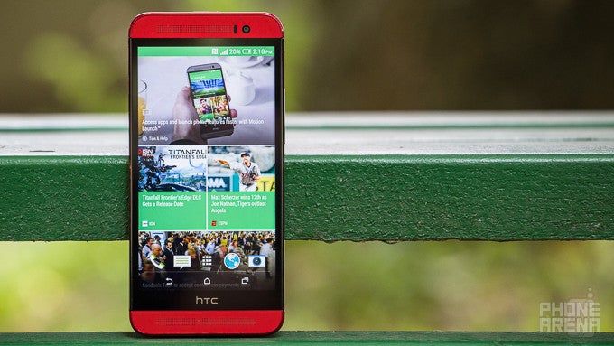
Not long after HTC made the aluminum-clad HTC One M8 public, we started hearing about a lookalike One device that would copy the M8's look and internals, but forgo metal altogether, and instead opt for a cheaper, polycarbonate shell. Subsequently released as the One E8, it seems to us that HTC's plastic flagship likely has one purpose: to allow the company to experiment with a different approach towards the flagship model, and perhaps even make a few new fans in the process.
But is that a recipe for success or disaster? Time to find out.
Design
It is what it is: the One E8 is simply the One M8 re-done in polycarbonate. That's a pro, not a con.
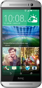
The One E8 is the One M8, and vice versa. Truly, with the exception of the E8's polycarbonate shell, little else stands out, as it's simply identical. This holds true for the E8's shape, with its curved and comfortable-to-hold rear, along with HTC's signature, front-blasting BoomSound stereo speakers. Save for thickness (the E8 is chubbier, at 0.39 in / 9.85 mm), even the dimensions of the two devices are nearly identical (5.76 x 2.78 in / 146.42 x 70.67 mm), though the E8 is relatively lighter, at 5.11 oz / 145 g.
Looking at the back, there are some more differences, and apart from the plastic shell. HTC has done away with the M8's UltraPixel Duo camera and the E8 instead houses just one camera with a single LED flash sidekick.
At the sides, the One E8 is, again, very similar to the One M8, but not entirely. For one, the power/lock key is perfectly centered on the top, while the volume rocker on the left is inconspicuous, and more flush with the surface. Thankfully, the two are clicky (especially the power key) and provide decent travel and feedback when pressed.
Display
No, this isn't a perfectly color-accurate panel, but it is acceptable, and its maximum brightness allows for a great outdoor viewing experience.
With a large, 5-inch, 1080 x 1920 pixel resolution IPS display, the One E8 is well-positioned to deliver a great user experience, as image reproduction is crisp thanks to those excellent 441 pixels per inch. But is it true to life?
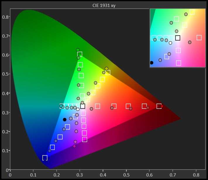
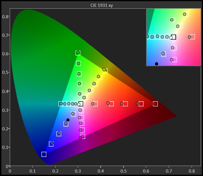
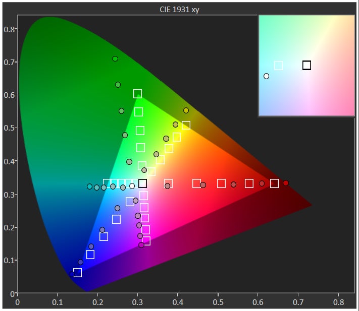
In one word: no. At least not completely. For example, at nearly 8000 K (with the reference value being 6500 K), the One E8's display is overly cold, and this issue is especially noticeable when looking at whites and greys, which exhibit a visible bluish tinge. Gamma, at 1.98, is also noticeably off the reference value of 2.2. As for color reproduction, we again have a mixed bag. On average, color inaccuracy is acceptable, though it should be noted that lower intensities of red are severely under saturated, while blues are consistently over saturated throughout. Lastly, magenta is messed up, with each intensity level having an entirely incorrect hue. With all that said, do keep in mind that this is still a comparatively color-correct panel, especially if you use the Galaxy S5 as a benchmark.
Interface and functionality
The Sense 6 UI is just beautiful. It could win more people over with a few extra features, though.
We've come to appreciate HTC's touch when it comes to skinning Android, and we rarely have complaints when it comes to the company's custom UI, especially the latest version in Sense 6. The interface is flatter and far more colorful than previous iterations, but it moves around like the wind, refusing to ever slow your experience down.
On a slightly different, more holistic note, Sense 6 allows you to change your current theme to one that you like better, though we're talking a change of color more than anything else. You also get perks like the ability to simply swipe up on your sleeping device's screen to power it on, though, for whatever reason, you'll have to rely on the awkwardly-placed power button to shut it down.
Processor and memory
Zero complaints.
You won't find the One E8 wanting for power, for its 2.5GHz, quad-core Qualcomm Snapdragon 801 chipset is more than capable of providing a frills-free user experience, whether we're talking interface navigation, or running some of the heaviest 3D apps on the market. Like the One M8, the One E8 also sticks with 2GB of RAM, which do the job just fine.
Internet and connectivity
All bases: covered.
Browser
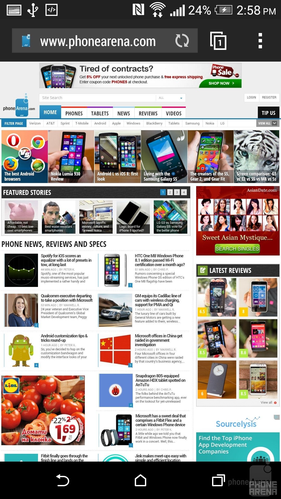
On the connectivity front, the E8 does not disappoint at all. This is an LTE-enabled device with support for FDD LTE bands 1, 3, 7, and 8, and also boasts extras such as Bluetooth 4.0, NFC, DLNA, and A-GPS.
Camera
The camera has the makings of a better-than-average unit, but snaps are often exposed incorrectly, so you end up with overly-dark shots.The LED flash is also a bit impotent.
Instead of using the “UltraPixel” camera found on the metal One M8, HTC has instead opted for a 13-megapixel shooter with the One E8. The unit has a single LED flash sidekick, and the lens' aperture sits at f/2.2, which is pretty much on par with most modern high-end smartphones. At the front, we've got a very decent, 5-megapixel snapper for selfies and video calls.
HTC One E8 sample images
As for video capture, the E8 fails to differentiate itself from the M8, and similarly doesn't offer any of the fancier shooting modes, like 4K UHD capture, or slow-moes at 120 frames per second, so you're basically limited to 1080p video. As you can see, resulting footage is decent on the whole, but it's not without its drawbacks. For example, clips are fluid and detailed, but murkier than they should be, and blown-out highlights are typical. As for night footage, don't expect to make out much unless there's at least some lightning.
Sample Videos
Multimedia
Boom go the BoomSound speakers! Excellent stuff.
Speaking of the latter, video files with a variety of encodings (MKV, H.264, etc) are played back problem-free, but DivX files won't run with the built-in player. In terms of audio playback, your investment into the front-facing BoomSound speakers is well-rewarded, as it outputs rich sound, devoid of any major distortions even at maximum loudness. And loud they are!
Call quality
Meh.
Call quality is definitely a chink in the One E8's armor, as we definitely found it to be lacking in certain regards. For one, the earpiece is only medium-loud, though sound fidelity is decent. The microphone, however, is problematic as voices have a growl-y quality to them, and there's definite distortion at higher levels of volume. Speaking of volume, the microphone is, again, medium-loud. Overall, we concluded that the E8's performs just slightly under the average, at least when we consider flagship devices.
Battery life
HTC has fitted the One E8 with an identical to the One M8 battery in terms of capacity – 2600 mAh. Interestingly enough, however, the company is listing a much better figure for talk time on a 3G network with the E8 – nearly 27 hours (versus 20 hours for the M8). To make matters even more mysterious, standby time (again on a 3G network) is pretty much identical, at 21 days. These are actually pretty decent figures when compared with the average.
Conclusion
Love the HTC One M8's style, but can't quite afford its price tag? The One E8 is probably what you're looking for. With the exception of its polycarbonate shell, the One E8 is every bit the device we've all come to appreciate and respect.
The One E8 is being readied for release in select Asian and Eastern European markets, including China, India, Malaysia, the Philippines, Singapore, and Russia. Exact pricing is, for the most part, unknown, though we're not entirely clueless. Judging by a few Asian stores, it's probably fairly safe to say that it's going to be at least 20% cheaper than the metal M8. This gives the One E8 a lot of breathing room, meaning that one can overlook some of its downsides and get a pretty decent bang for his buck.
Follow us on Google News








Things that are NOT allowed:
To help keep our community safe and free from spam, we apply temporary limits to newly created accounts: