Google Nexus 9 Review
Introduction
Google’s line of Nexus tablets have always been a delightful bunch, not only for the affordable cost attached to them, but also for the fact that they’re normally the first to offer the most up-to-date version of Android. It all started with the original Nexus 7 back in the summer of 2012, followed subsequently by the release of the Nexus 10, and then the refreshed version of the 2013 Nexus 7. Each tablet, of course, proved that it didn’t require consumers to fork over huge sums of money to pick up and own a high-performing unit. Instead, Google’s line of Nexus tablets ushered in a new era for the segment – one that continues to highly competitive and budding.
Interestingly, Google has commissioned HTC to manufacture its latest tablet model in the Google Nexus 9. This revelation, naturally, is a surprising one considering that HTC hasn’t been active in the tablet space for quite some time. In fact, the last time they released a tablet was back in 2011 – the ill received HTC Jetstream. After the lukewarm response HTC received from its tablets, including the HTC Flyer, the company seemingly hit all the brakes when it came to anything tablet related.
Thankfully, though, the Google Nexus 9 is the company’s chance to become a relevant player in the market once again. Featuring Google’s latest Android update, Lollipop, in conjunction with some spiffy specs and a low price point, the Nexus 9 is already shaping to become something grand for the upcoming holiday season.
The package contains:
- Quick Reference Guide
- Product Safety & Warranty Brochure
- Wall charger
- microUSB cable
Design
In keeping with the tradition, the Nexus 9 exudes a humble design that doesn’t try to be too flashy.
Historically speaking, we know that HTC takes great pride when it comes to designing its products – evident by recent memorable devices like the HTC One M8. There’s no kidding that they’re meticulous when it comes to that, even when it comes to inexpensive priced devices. Well, seeing that the Nexus 9 follows in the same tradition of other Nexus tablets, its design favors a more humble quality.
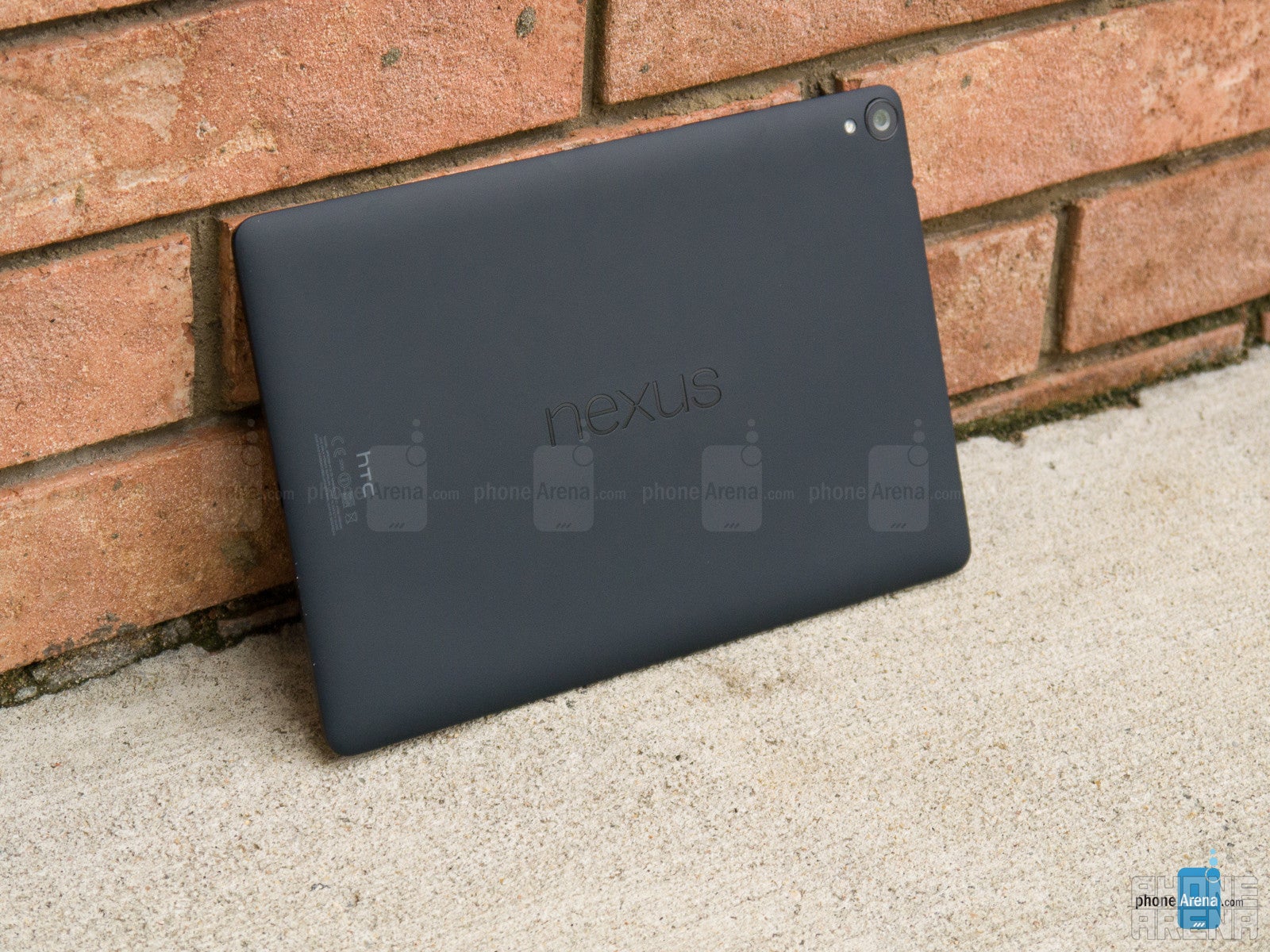
Looking at it for the first time, it’s really tough to distinguish that it’s an HTC design – mainly because its design language treads on a different path from what we see from its smartphones. Going with an all-plastic body, one that has a soft touch matte finish to it, the design is no doubt clean and minimalist. Its design doesn’t break any records in terms of being the skinniest or lightest, but it proves to be relatively easy to hold with one and two hands.
However, there are a couple of distracting things we feel that stands out with its design. First of all, there’s a bit of hollowness to its design, which is made especially known when we tap on the back of the tablet – it just doesn’t have the solid feel of something like the iPad Air 2 or Xperia Z2 Tablet. In addition, the camera lens protrudes out from the rear casing, which causes it to come in contact with whatever surface it’s placed on. To be fair, though, this implementation allows the tablet to rest evenly on a flat surface – so that it doesn’t wobble while typing in landscape.
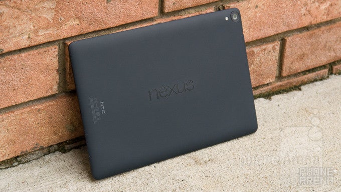
Along the back, the Nexus name is emblazoned squarely in the middle – while HTC’s logo is ever so discretely positioned towards the bottom (when held in portrait). Taking a peek around the tablet’s trim, it features the assortment of ports and buttons. These include its power button and volume button along the right, microUSB port and microphone on the bottom, and 3.5mm headset jack on the top.
A familiar set up used by many of HTC’s smartphones, the Nexus 9 is outfitted with two front-firing speakers with HTC BoomSound – so it’s safe to presume that it’ll carry on HTC’s reputation of offering quality sound. Although it’s tough to make out, especially when it blends in with the black color of the screen’s bezel, there’s actually an LED light placed in the middle-bottom area of the tablet.
Being a budget-conscious tablet has its perks, like in being easy on the pockets, but at the same time, it doesn’t have the same high flying set of arsenal that accompanies some of its rivals. In particular, it doesn’t have a water-resistant construction, there’s no expandable storage, and you can’t use it as a universal remote to change the channel on your TV. Just saying!
Display
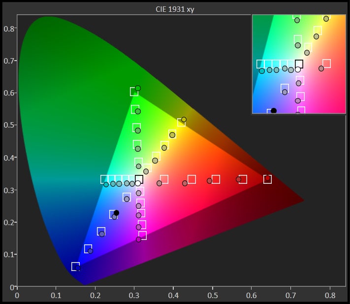
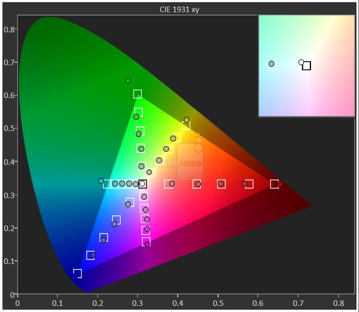
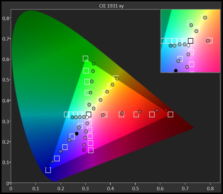
Details are nice, but it’s pretty amazing that it’s almost spot-on with its color reproduction. All the qualities are impressive!The Nexus 9 features 8.9-inch 1536 x 2048 IPS LCD display. Visually, its size and resolution gives it a respectable pixel density count of 288 ppi, which is an effective thing to make out miniscule text in the web browser without much squinting. That’s certainly isn’t as striking as the Samsung Galaxy Tab S 8.4’s display per se, with its class-leading tally of 359 ppi, but it’s nonetheless pleasant for everyday things.
What’s most surprising, however, is how the screen bears so many high-quality characteristics. Case in point, its potent brightness of 453 nits, excellent 2.17 gamma, great 6942 K color temperature, and its ability to accurately reproduce colors. With the latter, it impressively hits all of the target marks for each color gradient – easily besting its contemporaries in the iPad Air 2 and Galaxy Tab S 8.4! At the same time, it’s still easy to view outdoors with the sun out.
Benchmarks aside, the screen looks good! From its great detail, to its visibility, and its precise color reproduction, the screen of the Nexus 9 might appear ordinary from a cursory look, but beyond that, it packs all of the rich essentials in giving it some strong visual qualities that we appreciate.
Interface and Functionality
Android 5.0 Lollipop is an evolutionary leap forward and redefines what it takes to be a versatile and proper tablet experience.
Trying something new can sometimes be a scary venture, even more when users are sometimes content in being complacent with the current experience of their device. We’ll admit, we were feeling that overwhelmed sensation when turning on the Nexus 9 for the first time, which we might add, is the FIRST tablet to ship with Google’s brand new Android 5.0 Lollipop experience. Above all, the platform’s new direction is something you’ll be astounded by – not only for the visual changes, but in the way that its features continue to enhance how we intimately interact with it.
There’s a lot to cover here with Android 5.0 Lollipop, but rather than going into each and every minute detail, we’re simply going to mention how it directly affects our experience with the Nexus 9. For a detailed report about the updated experience, however, you can read more about it in our review of the platform.
First, let’s talk about the introduction of what Google calls Material Design with Android 5.0 Lollipop. From a visual design standpoint, the interface has been painstakingly refined to follow the principles of flatness and minimalism – you can see it in how notifications are discretely overlaid. From the app icons in the app panel, to the arrangement of connectivity icons in its Quick Settings, Google’s intention of bringing this lively appeal to its platform is soundly evident. Yes, we like this new look indeed!
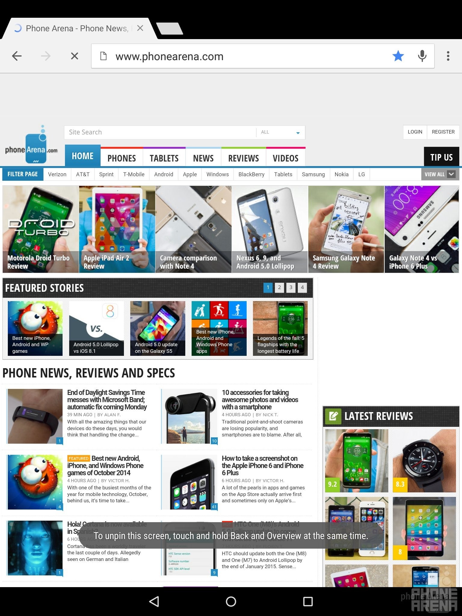
Functionally, it’s a leap ahead of iOS, and in some instances, better than how Microsoft attacks things with Windows 8.1. The new features are in abundance with Lollipop! First and foremost, we can now classify notifications according to priority – so we’re not inundated by irrelevant ones. Furthermore, we’re especially ecstatic about Lollipop’s new pinning feature, which allows us to lock the interface to one specific app. So if that friend asks to borrow the tablet to search for something on the web, but has some other nefarious ulterior motive, such as posting something funny about you on your own Facebook page through the app that’s installed, they won’t be able to do so – just because you can pin (lock) the tablet to using one particular app.
We can go endlessly about every single new detail about the platform, but we still have to place judgment on some of its misses. Android as a whole has great depth and customization, but for some reason, in comparison to what other manufacturers do with their customized experiences, Lollipop is still trailing behind when it comes to multi-tasking – it simply continues to offer us task switching, as opposed to true multi-tasking.
Nevertheless, the goods outweigh the bad with this overhaul, so we’ll leave at that. Google has undoubtedly presented us with an immersive experience, one that’s unparalleled by the competition – and continues to evolve dramatically with each iterative update.
Messaging
With the arrival of Lollipop, the Android keyboard receives a visual change that eliminates the borders that normally outline each individual key. At first, it’s an uncanny sight to behold, as we’re sometimes left wondering how it’s able to distinguish between keys, but we’re able to adapt and type away with normal ease. Thankfully, we can change the keyboard’s theme in the settings menu – to revert back to the traditional layout with borders we’re accustomed to using.
For the most part, the overall typing experience doesn’t differ, as it’s very responsive and offers a decent auto-correct function, but as an alternative, there’s also Gesture Typing, which relies on those swiping gestures to input text. On the Nexus 9, we prefer to use the portrait option more, seeing that our finger is doing less swiping across the keyboard’s layout. In contrast, we’re more likely to individually press each button with the landscape option, as opposed to Gesture Typing, just because it’s offers us with a more comfortable, natural experience.
Gmail for Android has been a versatile email client, one that delivers the same rich experience we get from the desktop client. Naturally, Lollipop’s arrival brings forth an even more refined and unified experience. Not surprisingly, Google’s Material Design is profoundly evident with Gmail, as the flat layered design language principle is heavily reinforced – as tabs movie in-and-out when we select a folder or message.
Yes, there’s an “email” app icon in the app panel, but Lollipop now diverts us to using the Gmail app for all our accounts – hence, its unified experience. The setup process is no different from before, but what’s odd is that there’s no unified inbox. What’s even tougher to distinguish is the way the platform differentiates the email notification icons in the menu bar area, since they all use the Gmail icon.
Processor and Memory
NVIDIA’s Tegra K1 processor is an delicious treat that packs a punch in giving the Nexus 9 some serious firepower.
Gamers rejoice, the Google Nexus 9, even with its affordable cost, isn’t an underpowered tablet. Oh no! Rather, it’s formidable thing that’s powered by NVIDIA’s Tegra K1 processor. In fact, the foundation is based on a dual-core 64-bit Denver CPU core architecture, which is an impressively large core with a desktop-class, wide, 7-issue superscalar design, with clock speeds of up to 2.3GHz. It also comes with a large amount of L1 cache: 128K+64K (I$/D$). The tablet comes with 2GB of RAM, and it also features the Kepler with 192 shader cores that has shown it performs at the top of the charts, which will make the device a delight for gamers.
Running off numbers and geeky terminology is one thing, but what about its actual performance on the tablet? Without question, the Nexus 9 screams with its operations – one that rarely exhibits any sort of delayed response or choppiness. Normal, baseline tasks are all handled with tight responses, but the Nexus 9 delivers great handling with mobile gaming as well. Obviously, the benchmark scores give us a telling tale that it’s a beast.
The Nexus 9 is available in two memory configurations; 16GB and 32GB. Needless to say, the options are typical for anything nowadays, but it would’ve been more poignant for it to carry along a microSD card slot – considering that this is a tablet that’s meant to offer light productivity work on the road.
Internet and Connectivity
Internet browsing
Initially, the Nexus 9 will be sold as a dual-band 802.11 a/b/g/n/ac Wi-Fi only model, but a model with LTE connectivity will become available later in the year. As usual, it’s brandished with all of the typical connectivity options – like aGPS, Bluetooth 4.0, and NFC.
Camera
It wouldn’t be our first choice, but its 8-megapixel camera can deal some average looking photos and videos.
Many of the core apps we know and love with Android have been phased out in favor of Google’s own branded ones. No longer do we have the Camera app, which has been replaced by the Google Camera app – one that’s been available for quite some time as a downloadable app in the Play Store. Yet again, we can see Lollipop’s favor of offering a cleaner and simpler UI, since the Google Camera app’s interface is predominantly reserved for the viewfinder. In terms of shooting modes, we’re given photo sphere, panorama, and lens blur. Sorry folks, there’s not an option for HDR with this one. Additionally, there are no manual controls – so expect to use touch focus constantly to achieve the proper exposure.
We obviously know HTC’s positioning when it comes to cameras, as they continue experiment with all sorts of technology with its line of smartphones. Here with the Nexus 9, however, it’s actually accompanied with a standard 8-megapixel rear camera – one that features an f/2.4 aperture lens, LED flash, and up to 1080p video recording. Comparing it to other prized tablets in the space, the camera gear in tow here is pretty much similar in specs to what’s offered by the competition as well.
The outcome is for the most part a favorable one that produces average looking photos that won’t disappoint, just as long as lighting is sufficient. Its strength lies in outdoor shots, much like anything else, just because it dishes up nicely defined details – though, if you’re not too steady, it sometimes falls victim to blurring. Colors, too, are pleasant in tone, despite the subtle amount of saturation it casts in our shots.
A common expectance with all cameras is that tangible level of reduction in quality with low lighting shots, which unsurprisingly is present here with the Nexus 9. Sure, images come out dark, which in turn, masks details in the shot, but noise is shockingly kept to a minimum. Still, fine details are lost in the process. All told, the Nexus 9 is an average performer in this category – better with the outdoor stuff than low lighting, of course.
Turning our attention to its 1080p video recording quality, we have the same reservations with its quality. It’s okay enough to use, but it isn’t particularly our first choice when the occasion to record something comes around. Specifically, it’s a bit light on the details – plus, its focus can sometimes be delayed.

Multimedia
An HTC signature feature, its dual-front firing speakers offer depth – though, a bit echoey.
Again, the Google branded apps have a larger presence here with Android 5.0 Lollipop, as the Gallery app of the past is now gone – replaced instead by Google Photos. Therefore, it’s the hub for all photos and videos, where we’re given a vast set of tools to edit and fine tune photos. People with a lot of time will especially take fancy in all of the options and settings, but the best part is how simple and fun it is for us to edit them – albeit, there are no editing functions whatsoever with videos.
The music player, unsurprisingly enough, is the Google Play Music app – something we know dearly all too well, since it’s what’s loaded on all Android phones. Knowing that this is vanilla Android we’re dealing here with the Nexus 9, it makes sense that it’s the default music player. The latest version of the app, which has been available to download for a good while now, bears the same updated visual cues that match the new and polished looks of Lollipop.
A signature staple of HTC’s products, the Nexus 9 boasts dual front-firing speakers with HTC BoomSound, which produces 70.1 dB of audio power – a tally that might seems weak on paper, but trust us, it still reverberates with a deep punch. Listening intently to the quality, it doesn’t crackle or strain at the loudest volume, but it sounds echoey at times. It’s not bad or diminishes its quality, but it’s something that’s apparent.
Nowadays, almost every tablet is more than capable of playing all sorts of high definition videos – the Nexus 9 included. However, it doesn’t offer as wide of a support for various codecs out of the box (think Xvid and DivX). Of course, supported videos play flawlessly on the Nexus 9 – where the experience is strengthened by its sharp and accurately colored display. If there’s one thing lacking with stock Android, it’s that it fails to provide the same multi-tasking depth that some customized experiences offer.
Battery
By far, it’s one of the better performing tablets with battery life.
In our real word experience, it’s able to propel us through 1.5 days of power usage – a mark that we feel is commendable on many levels. Even better, though, is how it performs in our very own standardized battery benchmark test. Producing a mark of 9 hours and 24 minutes, that nearly matches Google’s claim of 9.5 hours of juice with Wi-Fi browsing. Worthy of being noted, too, is that the mark eclipses its rivals in the iPad Air 2, Xperia Z2 Tablet, and Galaxy Tab S 8.4!
Conclusion
Modesty, that’s what makes the Google Nexus 9 an unsuspecting threat in the tablet space. The specs and design aren’t insanely out there, to drastically separate it from the existing crop of competition, but rather, it’s what it delivers with its overall package that gives it such an inviting presence – one that undoubtedly embodies all the qualities we want in that near-perfect tablet.
We’ve explored its humbling design, dived deep into the new Android 5.0 Lollipop experience, and even put it through one intensive battery testing, to come to the conclusion that it’s arguably one of the most delightful tablets to launch this year. Best of all, its starting price of $399 undercuts many of its rivals in the process, since the pricing alone goes a long way in giving it some serious value. For the money and all, the Nexus 9 doesn’t disappoint with its specs sheet, performance, and software experience.
HTC has been out of the tablet game for a considerable amount of time, failing to earn its presence in the space, but with the arrival of the Google Nexus 9, they’ve undeniably brought together something that follows in tradition to the Nexus line. Conversely, it’s Google that takes a lot of credit, seeing that Android 5.0 Lollipop shows why it’s the most advanced tablet platform around!
Everything about the Android experience has been refined and enhanced with not only some features that are “in-your-face,” but they’ve meticulously ensured to us that it has far more depth than its rivals. From being a fun tablet for playing games, to a productivity focused one that’s handy for pulling out work while on the road, the Google Nexus 9 has a presence that resonates deeply in the space. And we can’t neglect to mention that it’s super affordable in the process! What more can we ask, seriously?
Software version of the review unit:
Android Version: 5.0
Build Number: LRX21L
Kernel Version: 3.10.40-g07fc5e6







Things that are NOT allowed: