Google Nexus 6P Review
Introduction
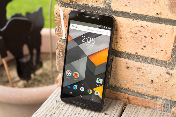
Choice. It’s a good thing. For this year’s lineup of Nexus devices, Google adds not one, but two brand new smartphones that better cover a wider gamut of the demographics. We’ve already taken an in-depth look at the smaller model of the two, the Google Nexus 5X. Purists and enthusiasts are no doubt stoked about the prospect of pure Android, but not everyone will like the duller styling of the Nexus 5X.
Enter the Nexus 6P, a rock solid phone that screams Premium – it makes more sense why they named it the 6P. First timer in the Nexus world, Google commissioned Chinese company Huawei to design one its latest Nexus phones. For Huawei, it’s undeniably a ripe opportunity for them to build brand reputation not only in the US, but all around the world as well, seeing that they’ve struggled in gaining notoriety in other markets besides Asia.
When last year’s Nexus 6 was announced, many Nexus faithfuls were given a little bit of a surprise in the form of a higher-priced smartphone – whereas with the previous two Nexus smartphones, they were much easier on the pockets. Normally, high-level, metal phones, especially ones accompanied with killer specs, tend to cost a premium as well, but for the Huawei-made Nexus 6P, it’s ensuring that it’s undercutting the competition with its $499.99 starting cost. And best of all, it’s a pure Android device.
We’ve certainly seen our fair share of killer smartphones that are on the affordable side, so how does this Nexus compare?
The package contains:
- Google Nexus 6P
- Wall charger
- USB Type-C to USB Type-C cable
- USB Type-C to USB Type-A cable
- Quick start guide
- Safety & warranty information
- SIM removal tool
Design
Sleek. Sexy. Super. It exudes an intense premium feel, arguably the most premium Nexus to date.
Looking back at what was done, the original grand-daddy of them all, the one and only Nexus One, arguably claimed the reputation of being the most premium-made Nexus ever. Yes, the Nexus 4 came pretty close with its glass surfaces, but the original is still highly acclaimed. That’s all changing, though, mainly because the Nexus 6P is one gorgeous looking phone from head-to-toe.
Huawei has crafted a fine handset with the Nexus 6P, boasting a contoured aluminum body that never feels brittle – even with its slim 7.3mm frame. Its aluminum chassis is incredibly sturdy, exhibiting a design that’s meticulously crafted. You can see that attention to detail in things like its subtle beveled edges adorning its sides, the minimal plastic spacers used to comprise its cellular radio, and the shiny trim around the camera lens.
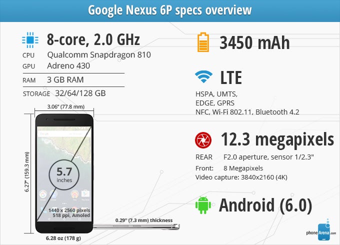
Speaking of the camera, some might point out the protruding hump that’s there, but it’s not as pervasive as you’d think. In fact, it looks like it doesn’t stick out that much at all when viewing it at certain angles. Its size, instead, is arguably what’s going to either attract or detract people from it. Comparing it to some other phones packing 5.7-inch screens, the Nexus 6P is a bit taller and wider – while sporting a 71.6% screen-to-body ratio, which is lower than say, the Note5 or Moto X Pure Edition. Its weight, too, at 178 grams is a bit heavier than the Note5, but it’s warranted considering it’s nearly all metal here.
Above all, it’s satisfying that it’s sporting an original design with that premium quality intact. Not only is it a different looking thing, but it’s undeniably the best-designed Nexus device put together to date. That’s not an understatement at all, however, it certainly will help Huawei gain some notoriety on a wider basis. Although they’re no strangers to premium designs, this one is just to die for.
When it comes to button placement, both the power button and volume controls are situated in ideal locations, next to one another on the right side of the phone. It helps that they’re raised and offer spring responses when pressed, but we do like how the power button bears a rigid texture to tell it apart by just feeling it with our finger. The only other things found around its edges are the 3.5mm headphone jack on the top side, and a new USB Type-C port on the bottom.
Unlike its sibling in the Nexus 5X, the 6P comes with both a USB Type-C to USB Type-C cable to enable us to charge it with the included wall charger (one that rocks a USB Type-C port), as well as a USB Type-C to USB Type-A cable used to connect to a traditional USB port. At the moment, we find the latter cable to be the more useful of the two because it means we can connect it to our computer to transfer over files, and also charge it through any other USB chargers we have around. The argument for this newer connection is that the cable is reversible, so no more wondering if it’s being inserted the correct way.
Oh yeah, the Nexus 6P also rocks dual-front firing speakers, which could’ve mitigated its screen-to-body ratio, but it’s nice to have for watching videos because it ideally projects audio towards us. And lastly, there’s a recessed fingerprint sensor in the back that functions flawlessly to unlock the phone – even when it’s in standby. That’s useful because it eliminates the need to press the power button first to wake it up, then proceed to unlock using the fingerprint sensor.
Display
It’s not perfect, especially with its weaker brightness output and overblown colors, but it's quite vibrant for sure.
The Nexus 6P isn't fashioned with a 6-inch display, but rather, a 5.7-inch 1440 x 2560 AMOLED one. Details are no problem with this Quad-HD beast, as its 518 ppi pixel density matches that of the Note5 – so it’s incredibly sharp and detailed, providing our eyes with some visual treats. Well, it should come as no surprise that the Nexus 6P wouldn’t settle for anything less than Quad-HD resolution.
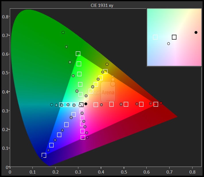
Without going into the synthetic benchmarks of the display, we will say that the screen here bears all of the staple qualities of AMOLED – like its wide viewing angles, high contrast, perfect black color tone, and those over-saturated colors that you may love or hate. Seriously, we won’t deny that the package here has all the ingredients to make it attractive, but if we’re to look more critically at its characteristics, it still has room for improvement.
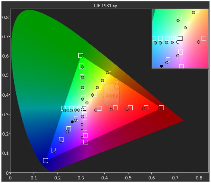
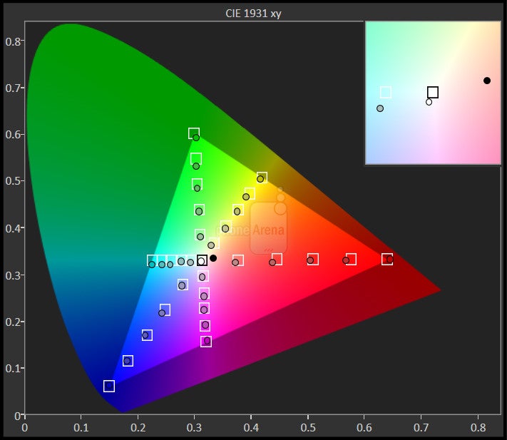
First and foremost, we have to talk about its color accuracy in the sRGB color gamut chart. Taking a cursory look at the chart indicates that we’re dealing with overblown colors here. It clearly shows that it’s far from being very accurate. Reds appear blood red, yellows have a slightly orange tone to them, and blues tend to be deeper in tone than they should. The screen appears vibrant, but in reality, those colors are far from true-to-life.
Another thing we have to point out is its poor visibility outdoors when the sun is present – it washes out tremendously to the point that it’s unusable unless we shield it. Achieving a maximum luminance of 356 nits, it’s not as potent as the Nexus 5X mark of 487 nits, and nowhere close to the blinding 593 nits reached by the iPhone 6s Plus.
All is not bad with the Nexus 6P display, though, especially with its 2.26 gamma value and 6737K color temperature. Those figures aren’t too off from the ideal values, so to that the degree, the screen manages to do a good job.
Interface and Functionality
There’s more to love with Android 6.0.
If you haven’t done so already, go and check out our full in-depth review about the sweetest and smartest Android version to date – Android 6.0 Marshmallow. You’ll be put up to speed regarding what’s new, different, and exciting about this latest release. In this review, however, we’ll focus on a few things that directly relate to the Nexus 6P’s experience, which is identical to its Nexus 5X sibling.
The Material Design vibe that debuted with Lollipop is here to stay, and it hasn't been changed a bit. This is not a bad thing or an issue in our book, mind you - we still think that this refreshing design language is one of the best things that could have happened to Android. This means that you still get a host of card-based UI elements, paired with colorful icons, and predominantly white menus.
One of the more notable additions to the OS is the revamped app drawer. Gone are the horizontally-scrollable cards that were present in Lollipop! Marshmallow comes with a stock launcher that displays the installed apps in a neat vertical window, which is not comprising separate cards (the same applies to the widgets pane as well). As usual, it sorts the apps in an alphabetical order, yet some of the apps you use the most will appear at the top of the drawer page, providing you with easy access. There's also a nifty search bar at the very top of the app drawer that allows you to manually search for an app.
Another area in which Android 6.0 Marshmallow has received a visual update of sorts is the lock screen. In Lollipop, you had a dialer and camera shortcuts, but the new variation of the OS has ditched the former for a Google Now voice search shortcut. That's pretty understandable considering that Marshmallow puts emphasis on the improved pro-active and contextually-aware Google Now. Still, we miss the dialer shortcut a bit.
This is not everything that's changed within Marshmallow, of course – we have a surplus of minor other changes that aim to make the user experience more coherent. Some of the more notable ones that we will highlight are the revamped Apps menu, a new Do Not Disturb toggle in the quick settings pane (which allows you to easily configure it straight from the notifications panel), as well as a revamped stock Phone app.
Ambient Display
Taking a bite out of Motorola’s playbook, the Nexus 5X, along with Nexus 6 and 6P, provides us with useful information upon picking up the phone – or whenever notifications arrived. The time, date, and any relevant notifications are briefly displayed on the screen, offering us quick access to them without having the need to turn on the phone completely. Not only that, but it’s meant to reduce power consumption as well.
Now on Tap
The changes that Google Now has scored are rather significant. The star of the show is Now on Tap, a proactive and contextually-aware functionality for Google Now. You enable it by holding the home button of your device and once you do so, the feature will "scan" the screen for places, people, movies, song names, others, and provide you with relevant actions. Sounds a bit dull on paper, but it's actually pretty exciting in real life, we promise!
Quick camera access
Indeed, the camera can be accessed through the lock screen, but now there’s an even faster way of launching it. From a standby state (with the screen off), we can simply double press on the power button to launch the camera – ensuring that we’re never too late to capture a moment. While this isn’t a particularly new feature, as many other phones offer something similar, we’re nevertheless grateful to have it on board.
A case for stock Android
Universally acclaimed, there are several reasons why so many enthusiasts prefer stock Android over the handful of custom experiences out there. It’s simple, direct, and offers the latest and greatest core features of the platform – like having support for multiple users, screen pinning, always-on Google Now activation, and much more. And it’s not preloaded with the unbearable set of bloatware that generally accompanies some customized experiences, compounded by carrier models with even more junk added on.
We certainly can see the attraction of stock Android, giving us the control of how we want to use the phone. Redundancy can mitigate an experience’s worth to a user, which is a problem with some of these custom Android skins that throw nearly everything but the kitchen sink at us. Hence why stock Android is so direct, and purposeful with its content. What’s really great about this Nexus phone is that, just like its Nexus brethren, it’s going to get those wonderful and important software updates faster.
Phonebook
The Phone app has seen some small tweaks with the tab indicators — instead of text, those have been reverted to icons. Moving over to the call log section, it looks different as well, coughing up individual borders for each call interaction. And finally, the settings menu of the Phone app has also been re-organized, with more options available at a first glance instead of buried within submenus.
Organizer
Functionally, the core basics are well intact with the Google Calendar app, as it integrates with Google’s ecosystem seamlessly. Visually, there are some subtle changes, but for the most part, it retains the principles of Material Design. In addition, we can choose what view that suits our liking – whether it be a daily, weekly, or monthly one. Enhancing the experience comes from leveraging Marshmallow’s new ‘Now on tap’ feature, whereby it scans an appointment and populates relevant information back to us. For example, it’ll offer useful actions to appointments that are attached with specific destinations or addresses.
As for the rest of the core set of organizer apps, such as the Calculator and Clock, there’s honestly not much that’s different from what we’ve exposed to previously. At the core of it all, they function in the same manor – while sporting very subtle changes to their appearances. The Calculator’s functionality, for example, has been slightly expanded.
Messaging
Gone is the email app that in previous years populated our other accounts, while Google’s own Gmail app handled, well, our Gmail account all by itself. There’s not even a placeholder for an icon as well, where it notified us in the past that the Gmail app is now the only option for checking email.
We have no complaints with that decision, since it’s logically arranged so that accounts can be viewing separately – or in just one universal inbox. Beyond that, it leverages the same set of functionality we get from using Gmail on a traditional desktop PC, so it’s well-endowed to handle even the most demanding of email users.
Jotting down messages using the stock Android 6.0 Marshmallow keyboard is just as effortless as it was before, mainly because it’s responsive, logically arranged, and offers us access to many of the numbers and punctuations from within the main layout by performing long presses on specific buttons. Now, if individual tapping isn’t your forte, then you can always resort to using its gesture typing for a more seamless process. And if you prefer going all voice, there’s the option too by just pressing on the corresponding icon just above the keyboard.
Processor and Memory
Speed and finesse, that’s the way of the Snapdragon 810.
Being the better spec’d between the two new Nexus phones, the Nexus 6P is graced with Qualcomm’s best at the moment – a 2.0 GHz octa-core Snapdragon 810 SoC based on 64-bit architecture. Essentially, this configuration is comprised out of four Cortex-A53 and four Cortex-A57 cores, all of which are clocked in at 2.0 GHz. Accompanying it, we have 3GB of LPDD4 RAM and the Adreno 430 GPU, a total package that delivers incredible speed and finesse in everything we do. From the trivial, to the complex, the Nexus 6P is in the same category of high-powered phones we’ve come to absorb so much.
The Adreno 430, specifically, is designed to deliver up to 30% faster graphics performance and 100% faster GPU compute performance, while reducing power consumption by up to 20%, as compared to its predecessor, the Adreno 420 GPU. Its benchmark scores solidify its position as being a formidable smartphone for all sorts of operations – including graphics processing, where its Quad-HD resolution doesn’t seem to be too much of a setback for its performance.
Starting off with a base storage capacity of 32GB, it’s a good position considering how 4K video capture can eat up things relatively quickly. However, Google seems cognizant in anticipating the kind of space that power users demand by offering 64GB and 128GB models as well. These two options definitely help considering that there’s no expansion here. Pricing starts at $499 for the 32 GB variant, goes past $549 for 64 GB, and then ends up at $649 for the 128 GB one.
Internet and Connectivity
Even with the introduction of Android 6.0 Marshmallow, there’s no significant changes to the way we experience surfing the web using Google’s Chrome browser – so it works in the same capacity we’re used to on other phones. Generally speaking, there’s not much separating its experience form the Nexus 5X. On the surface, it undoubtedly gets the job accomplished, but it’s only different in the way that we have more real-estate to enjoy web sites in their entirety.
The Nexus 6P supports the following LTE bands: B1/2/3/4/5/7/12/13/17/20/25/26/29. With its Qualcomm modem, the smartphone is compatible with carrier networks worldwide, providing for a hassle-free transition if you’re the global trotter type. Those customers who call Sprint or Verizon home, they’ll be pleased to know that the Nexus 6P has support for CDMA bands 0, 1, and 10 – so they’re not left in the dust with this latest Nexus.
And finally, it’s accompanied with the usual array of connectivity features we’d expect to find in a modern, well-respected smartphone. They consist of aGPS with GLONASS, Bluetooth 4.2, dual-band 802.11 a/b/g/n Wi-Fi, and NFC.
Camera
It’s spot on with its quality, but shots under low light captured with the flash appear more subdued than those of the Nexus 5X. Besides that, it’s pretty impressive.
The Nexus 6P features an "unprecedented" f/2.0 12.3MP Sony camera sensor on its rear panel. The component in question is, most likely, the Sony IMX377EQH5, which is a sensor originally made for camcorders. It comes with improved optics and super-sized 1.55 micron pixels — not as large as HTC's UltraPixel sensor (2 microns), but certainly larger than the 1.2 micron pixels in some current camera sensors. This should help it capture more light in dark shots, making pictures better exposed and less noisy.
In addition to 12MP (4:3) or 9MP (17:9) still images, the sensor is capable of producing 4K videos, along with impressive 240FPS slow-motion clips. The sensor can actually handle 4K and 2K video resolution recording at 60 frames per second, but Qualcomm's current chipsets, including the Snapdragon 810 used in the Nexus 5X, only go up to 30FPS.
The camera sensor is kept company by a laser autofocus system and dual-LED flash. The former will most certainly make for impressive auto-focus speed, while the latter will help the camera make the most out of situations where light is of insufficient quantity. On the front side, there's an 8MP camera with f/2.2 lens.
Turning our attention to the camera interface, powered by the Google Camera app, its appeal will mainly hinge on whether or not you like Google’s interpretation of what the shooting experience should be like. On a foundational level, it’s a simple and hassle-free experience that centers its focus on quickly snapping a shot on a moment’s notice – without being too distracted by other features. Speaking of features, it’s rather light with its package over what we get in other phones. It comes with Photo sphere, Panorama, Lens Blur, and HDR+, which is nice for casual shooters, but for serious ones, it’s just missing additional modes to adhere to their needs.
In particular, many of today’s high profiled phones offer a diversified manual mode – where shooting parameters such as shutter speed, focus, ISO, and much more, can all be modified to our liking. Like we said, this isn’t everyone’s cup of tea, but for the obvious point of capturing a moment you’d like to remember, we suppose it gets the job done effectively – and without distraction too.
Image Quality
We’ll cut right to the chase, the Nexus 6P’s camera performance is nearly identical to that of the Nexus 5X, which should be no surprise considering they both have the same rear camera. The only thing different in our observations, though, relates to its dual-LED flash performance. In particular, it tends to cast a significantly warmer tone, giving colors more of an overblown appearance. At the same time, however, there’s noticeably more noise in the shot when the flash is used – whereas it’s minimized with the Nexus 5X. And that, folks, is basically the only thing different from its quality.
Some people will have reservations regarding its 12.3-megapixel sized snapshots, but in all fairness, there’s nothing to be concerned about – it takes some pretty good looking photos. If the iPhone 6s is an indication already, the Nexus 6P reaffirms the notion that a camera’s quality can’t be individually based on its megapixel count. Time after time, from outdoor scenes to indoor ones, the Nexus 6P establishes several, favorable results that make its camera so versatile to use.
The shots from Times Square in New York, in particular, show us that it’s quite capable at snapping sharp photos. While the overall shots look especially pleasing to the eye, where it’s accompanied with good details and bold colors, meticulously looking into the shots show us that there’s a hint of over-sharpening – causing finer details to become duller, while edges tend to be accentuated more. Under sunny conditions, the camera has a little bit of a tough time handling dynamic range. It’s not bad per se, but the blue sky contrasting the landscape scene tends to come out over-exposed.
Fortunately, the HDR+ mode fixes things quite a bit by adjusting the exposure throughout the scene to offer consistency. Therefore, shadows and highlights receive the proper amount of treatment to paint a picture that’s evenly exposed – without applying too much color saturation in the process, which sometimes gives photos that unworldly, artificial composition.
We’re also quite pleased by its performance indoors under artificial lighting, where conflicting light sources generally pose an issue for some phones. With the Nexus 6P, however, that’s hardly the case, proving that it’s very much adaptable. In the shots inside of a liquor and pet store, the camera does nicely to correct its white balance for the particular lighting condition – so that it casts colors that are on the warmer side. Again, we do see that there’s a challenge when it comes to dynamic range, as some of the labels on the bottles in the background are lost due to the over-exposure.
What’s pretty impressive, though, is how it manages to deliver acceptable results under low light as well! Yes, its favorable results can be attributed to its 1.55 micron pixels, where it’s able to catch in more light – producing images that are exposed properly, and with minimal detection of noise. Generally speaking, we’re very pleased with the outcome, even though fine details are dulled down tremendously. Obviously, it’s mostly noticeable if we’re to either crop an image or just zoom in, but the overall capture is pretty likable. The only area where the camera seems to be lacking is night time photography, where most shots tend to come out blurry.
Another improved thing about the Nexus 6P over the 5X, is that it offers a better front-facing 8-megapixel snapper – one that shines for its detail capture. The Nexus 5X is good in this regard too, but it’s only better here with the 6P. Every nook and cranny on our face is finely detailed, including wrinkles and individual strands of hair.
Video Quality
Likewise, its video capture quality is identical to the Nexus 5X, whereby it takes some better-than-average videos too – aided primarily by its 4K video capture. First and foremost, there’s plenty of detail going with its 4K capture. Secondly, it manages to produce bold colors that favor a slightly warmer tone. Thirdly, audio recording is spot on, resulting in voices that are bold and filled with fidelity.
Being the premium of the two Nexus phones, you’d think they’d fashion OIS into its arsenal, but they don’t. Therefore, it suffers from the same shaky movements that are evident with the Nexus 5X capture (made more profound with digital zooming). Adding to that, its focus adjustment with the 4K recording option is a bit sluggish at times. There are also some jello and rolling shutter effects going on at times, which might prove to be a bit distracting.
Multimedia
The sharp looking AMOLED screen combined with dual front-firing speakers make it suitable for watching videos.
Since we’re dealing with pure Android here, photos and videos are handled by the Google Photos app. If you use this on other Android phones, you’ll fit in quite easily here with the Nexus 6P, considering that it’s the same exact experience. Not only is the Google Photo app the vessel for viewing our stored content, but there are additional features and tools, such as cloud syncing and various editing tools, which extend the app’s usefulness beyond just being a generic hub.
The music player, not surprisingly at all, is handled by the Google Play Music app. By now, anyone using Android should be familiar with this player, seeing that it’s commonly pre-loaded on most Android devices. Knowing that, its layout and operation isn’t a surprise. Superficially, it’s tasked to play locally stored content, but if you happen to be an All-Access subscriber, you can stream songs that are included in Google’s catalog.
Speaking of audio quality out of its speaker, we’re happy to report that it’s better than the Nexus 5X’s output. Those dual front-firing speakers help to propel it to achieve a maximum output of 78.4 dB, besting the paltry 69.2 dB mark of the Nexus 5X, which makes it a substantial improvement. While volume is more than ample to echo in confined spaces, the actual quality is a bit on the lighter side – lacking serious bite when it comes to bass, favoring treble more so than anything. Even though we’re content by the quality of its speaker, it’s sadly lacking with its headphone jack, which achieves a disappointing power output of 0.34 V.
When it comes to watching videos, however, the experience is amplified by the combination of its dual front-firing speakers and generous sized display. The end result, of course, is one that’s ideal to capture our attention, especially when its performance is smooth and skip-free. Still, there’s no multi-tasking element that would enable us to do other things. Essentially, the focus here is just to watch the video, and to that degree, it gets the job done. We just wish it offered more.
Call Quality
It handles phone calls better than the Nexus 5X, but it’s certainly not class-leading.
Fortunately, the Nexus 6P doesn’t suffer from the same scratchy voices that plagued the Nexus 5X’s call performance. While it’s still not perfect, the mostly audible voices through the speaker sound better here – albeit, it’s still a smidgen artificial sounding. It gets only a little bit better on the other end of the line, but we’re at the very least happy to find its speakerphone is significantly more useful, since it’s louder in tone to make it usable in noisy conditions.
Battery
Average, that pretty much sums up its battery performance.
One of the other main attractions about the Nexus 6P over choosing to go with the 5X, is its larger 3450 mAh battery cell – a figure that makes the 2700 mAh one in the Nexus 5X quaint by comparison. As much as we’re to believe that it’s going to be able to achieve better longevity, that’s sadly not the reality after spending time with it. Rather, it shows no improvement whatsoever, reaching the same performance of its sibling.
Specifically, we’re able to get through a whole one-day of normal usage with no issues at all. In fact, by the end of the night, we’re still at a good enough capacity. However, it’s no doubt beneficial to give it nightly charges in order for it to be in an ample capacity come the following day. Power users, too, will be satisfied by its performance, which is sufficient in getting through a demanding 8-hour work shift.
Moving to our custom battery benchmark test, it validates our claim of delivering average-life performances – on par to that of the Nexus 5X. Checking it out, it’s able to achieve a time of 6 hours and 24 minutes from a full charge, which is nearly identical to the Nexus 5X’s tally. That’s a bit of a shame to tell you the truth, since it means that the battery here isn’t as efficient despite the larger sized capacity of the cell.
Where it manages to impress, however, is in its speedy recharge time. Getting it back fully charged only requires the Nexus 6P 89 minutes to achieve, which is better than the 100 minutes it takes for the Nexus 5X to accomplish the same task. This rapid-charging is attributed to the newer USB Type-C connection it’s sporting.
Conclusion
Huawei, in the end, stands to greatly benefit from the Nexus 6P. Its name on the back of the phone might be overshadowed by the humungous Nexus moniker that’s splashed on there as well, but it very well has deeper implications to its reputation. The Nexus 6P is without question, the single best designed Nexus device since the series’ genesis. Not only is it one meticulously crafted smartphone constructed from premium materials, but it manages to notch out an original design that doesn’t look like anything we’ve seen before – so it’s undeniably refreshing.
Now, the design is just one part of the equation, since the other relates to its stock Android 6.0 Marshmallow experience and overall performance. Android purists that want the best of the best when it comes to the platform should no doubt keep the Nexus 6P in contention, since like many other Nexus devices, it’ll be granted access to those special Android software updates faster, plus it benefits from an unsurpassed level of software excellence within the Android universe.
And speaking of its performance, there’s enough to propel the phone into the mainstream. From the buttery smooth performance out of its Snapdragon 810 chip, to its highly versatile camera, there’s absolutely plenty of reasons why it’s so good. You know what’s even better? Its pricing, which surprisingly enough, carries a lower starting cost than last year’s Nexus 6. Frankly, its $499 cost undercuts the competition, namely the titans in the space – like the iPhone 6s Plus and Samsung Galaxy Note5. With a cost like that, it makes for an attractive offering that doesn’t skimp out with the design.
Still, we’ve been spoiled by other highly acclaimed and affordable smartphones that paint very similar pictures. For example, the Moto X Pure Edition stands out profoundly with its 399.99 starting cost. Sure, you can save a cool $100 going with Motorola’s pride and joy, which by itself has a lot of value to offer, but don’t think for a second that the $100 premium of the 6P isn’t justified. You’re getting a useful fingerprint sensor, a more premium design, and that true stock Android experience with the Nexus 6P.
Needless to say, it still has its own set of shortcomings, but when we factor in everything, it can’t get any better than this for a Nexus device. Killer looks, outstanding performance, and stock Android go a long way – made even better by the fact that it’s priced aggressively.
Software version of the review unit:
Android Version: 6.0
Build Number: MDB08H








Things that are NOT allowed: