Who designs the best looking smartphones?
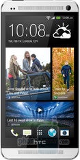
The HTC One is a gorgeous device.
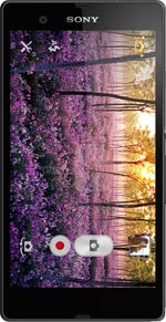
Then we have the gorgeous glass Sony Xperia Z that is not just beautiful but also practical, dust and water resistant.
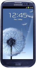
On the other side of the fence are Samsung’s devices, a uniform bunch with a soft, glazed polycarbonate plastic that feels great to hold, but does not necessarily have the same solid feeling.
We have also added LG and BlackBerry with their less consistent designs, but we’d rely on you to justify your choice in the comments, if you pick them.
Enough with the introduction, though. It’s time to vote - who has the best smartphone designs? Why? Would you vote for a phone maker for just one phone, or do you value consistency? Does copying and stealing count, and what is good design? Let's kick off this discussion with your thoughts in the comments right below.
Follow us on Google News




Things that are NOT allowed:
To help keep our community safe and free from spam, we apply temporary limits to newly created accounts: