Sony's Xperia Lollipop skin vs the older KitKat layout: UI comparison
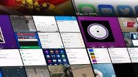
If yours is on the list of Sony devices due an upgrade to Android 5.0 Lollipop, it's probably safe to assume that you're running out of patience. Indeed, whenever the company starts seeding the new firmware, it'll likely be too late for it to not rank last in terms of speedines of software updates. Thankfully, the Sony Xperia M4 Aqua displayed at Sony's booth at MWC 2015 in Barcelona had Lollipop loaded on it, and it of course featured Sony's proprietary Xperia theme on top of it. In order to give you a taste of what's coming, we took a number of screenshots of its new interface and put them side-by-side next to the older KitKat layout.
In general, you shouldn't expect a massive update. The changes we spotted are mostly visual, as Sony obviously had to adhere to the new Material design language. That may sound a bit disheartening, but the reality is that Sony's skin is in a dire need of a bit more eye candy, and the new build focuses on exactly that.
Check it out:





Things that are NOT allowed: