The
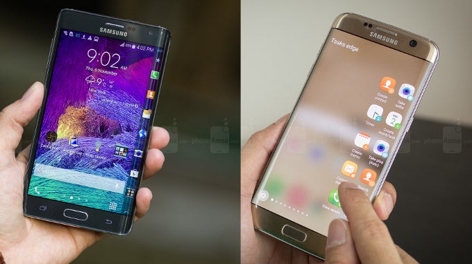
Galaxy Note Edge, released back in 2014, was quite a different beast from what we're used to seeing nowadays. Its display was curved on the right side only and its arch was much more dramatic, reaching almost to the back of the phone. The phone barely had a frame on its right but had some extra display space to work with on the actual curve. As a result, the Edge Panels looked (and still do, for those of you that rock the good-old Note Edge) very different to the ones found on post-
Galaxy S6 edge smartphones.
Nowadays, the Edge phones are curved on both sides, but have shallower curves, which can't house a full secondary panel on their own. The panels are pulled out when the user swipes in from a specific "handle" point either on the left or the right of the screen. From then on, a small drawer comes out, blurring the main screen content, and we get access to widget-like controls for Favorite Apps, Favorite Contacts, Weather, Tools (ruler, flashlight, etc.). So we do have the on-demand panels, but to use them, we need to sacrifice our view of whatever we are doing with the phone right now.
On the original Note Edge, the panels were thin slits of actionable widgets, which resided on the very arc of the display. Due to their size, they were capable of showing limited amounts of data, but on the flip side, they were always visible. If you were to enter an app that runs in fullscreen, the Edge Panel would automatically retract, but swiping in from any point of the right side of the display would call it back out. No blurring, no obstruction, you could have both the main display content and Edge Panels displayed on-screen, and use both.
There are still some power users out there that miss the old Edge style, but how many? We decided to ask you which method you prefer, and here's how the votes tallied up. It seems the old panels won't be missed too much, but still – 28% is no small amount of users.
Read the latest from Preslav Kateliev





Things that are NOT allowed: