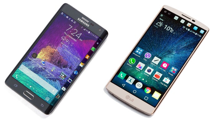
Ah, the
Samsung Galaxy Note Edge — Samsung's first "Edge" design that wowed the world with a display that is curved on one side, creating room for a secondary display used for app shortcuts, notifications, and different app controls. Unfortunately, Samsung chose to simplify the concept in favor of creating a more symmetric and ergonomic design with the
Galaxy S6 edge and
Galaxy S6 edge+. Gone are the Edge panels, as the two new models make use of a shallower curve and offer a more "core" set of functions, such as calling up favorite apps, favorite contacts, night clock, and a news ticker.
Near the end of 2015, LG introduced the
V10. A large smartphone, which had a 2.1" secondary screen accompanying its 5.7" display, projecting notifications even when the phone is sleeping, and offering home to a few separate panels of its own – favorite apps, recent apps, tools, and a customizable owner name or message. Seeing as these features are very similar to the ones the Galaxy Note Edge had, it's hard not to draw comparisons between both concepts. So, let's see how the old battles the new – here are 4 ways in which we think the Note Edge's Edge Panel is more useful than the LG V10's ticker.
Read the latest from Preslav Kateliev


Things that are NOT allowed:
To help keep our community safe and free from spam, we apply temporary limits to newly created accounts: