New Samsung infographic shows how intuitive TouchWiz UI is on the Galaxy S6 and S6 edge

Available in select markets since April 10, Samsung's Galaxy S6 and Galaxy S6 edge represent a new beginning for the company not just when it comes to hardware design, but also when it comes to software. Samsung enhanced its often-criticized TouchWiz UI, trying to eliminate unnecessary features and keep just the essential ones.
To show the world just how intuitive and streamlined the revamped interface is, Samsung today posted an infographic that presents the highlights of TouchWiz UI, plus some of the exclusive features that Galaxy S6 edge users get to enjoy.
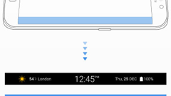
The infographic mentions the "bright and simple colors" of TouchWiz UI, the Smart Manager, the easy camera controls, and Samsung's very own Themes (which enable users to personalize the look of the S6, software-wise). At the end, Samsung shows the People Edge and Information Ticker of the Galaxy S6 edge, which - as you probably already know - sports a dual-curve display.
source: Samsung Tomorrow
The infographic mentions the "bright and simple colors" of TouchWiz UI, the Smart Manager, the easy camera controls, and Samsung's very own Themes (which enable users to personalize the look of the S6, software-wise). At the end, Samsung shows the People Edge and Information Ticker of the Galaxy S6 edge, which - as you probably already know - sports a dual-curve display.
Of course, both the Galaxy S6 and Galaxy S6 edge come with much more than what the new TouchWiz UI has to offer. To check out the two handsets in detail, feel free to read our Galaxy S6 review and our Galaxy S6 edge review.
source: Samsung Tomorrow


Things that are NOT allowed: