Motorola's smartwatch could have featured a rectangular screen
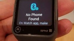
While the Motorola Moto 360 was the first round smartwatch (ok, almost round smartwatch) that immediately looked different than the square-faced models that came out of LG and Samsung's camps at the time, Motorola almost went with the same square-faced design as the others. The square display was as close to a smartphone screen as possible, and text didn't get cut off at the top and bottom of the dial. Manufacturers felt that buyers would want the screen to resemble the display on their smartphone as closely as possible.
But Motorola decided to differentiate its timepiece by going with the flat tire design, which we will call round. Thanks to some old photos of a rectangular Motorola smartwatch prototype, we can look back at what might have been. The shape of the screen is not the only thing different compared to the Moto 360. The prototype features a microUSB charging port instead of the magnetic induction charging that was eventually used on the Android Wear powered watch.
Check out images of the Motorola smartwatch prototype that pre-dated the Moto 360, by clicking on the slideshow below.
source: GizmoChina
There is a certain elegance to a round smartwatch like the Motorola Moto 360, that you don't get from some square or rectangular screened smartwatches. This is even true when other manufacturers, like Huawei, go round with their smartwatch design.While we will never know, Huawei and others might have opted for the rectangle instead of the circle had Motorola not tried it first.
Check out images of the Motorola smartwatch prototype that pre-dated the Moto 360, by clicking on the slideshow below.
source: GizmoChina







Things that are NOT allowed: