More new screenshots showcase Sony's beta stock Android UI concept
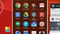
Swedish website Swedroid has given us an early peek at Sony's new "Concept for Android", which is currently making trial rounds among beta testers in Sweden. We've already understood that Sony is reimagining its Android user interface along Motorola's lines, simplifying the experience not by reducing graphics and features, but rather by sticking to the stock "Google" feel while sprinkling some branded apps, icons, and functionality on top of its already great looks.
While we've seen bits and pieces of the experience in the past few weeks, we hadn't really been treated to the big ol' gallery of screenshots that our hearts desired... up until now, that is! The screenshots, published by Swedroid, portray a Nexus-like experience, with the ROM based on Android 5.1.1 Lollipop and a minimal addition of third-party apps. Sony's Album, Music, What's New, and Xperia Lounge apps are still present, and the camera app is unquestionably Sony's. Future updates could see more apps and features added to the experience.
source: Swedroid via Xperia Blog
Sony's plans for the concept aren't exactly clear at this point, but we won't be surprised if the "near-stock" feel graces its mobile devices in the near future. According to the poll we did, most of you unquestionably prefer the feel of stock Android over most manufacturer skins, which means you ought to be happy with such a turn of events.
source: Swedroid via Xperia Blog







Things that are NOT allowed: