It has been quite a long wait for Google's new chat apps -- Allo and Duo. We first heard about the apps during Google I/O back in May, but since then the apps have been in a quiet and private testing phase so we haven't heard anything new. However, there has been a small, but interesting, change to the Allo and Duo listings in the Play Store.
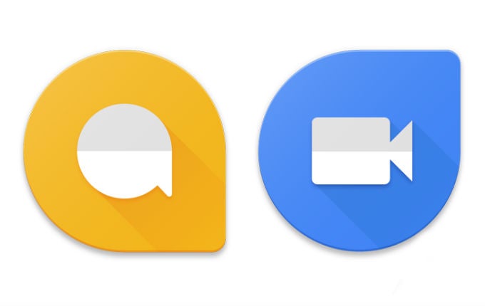
Google has quietly updated the icons for
Allo and Duo, which was frankly well overdue. The original icons for Allo and Duo looked like they had been slapped together at the last minute and didn't really fit with the general look of other Google app icons. Originally, the icons were simply the names of the apps in a chat bubble for Allo and a video camera for Duo. The new icons are much more Material, symbolic (no more words!), and even match a bit. You still get the chat bubble for Allo and the video camera for Duo, but now those icons are inside matching (almost) pin-shapes in yellow and blue.
These feel much more like proper, final version icons for the apps and that's probably a good thing because the expectation is that we'll see the new apps released when Android 7.0 Nougat is pushed out and that is expected to happen in the next couple weeks.
What do you think of the new icons?









Things that are NOT allowed: