Google Play Store to soon reorganize the main navigation options
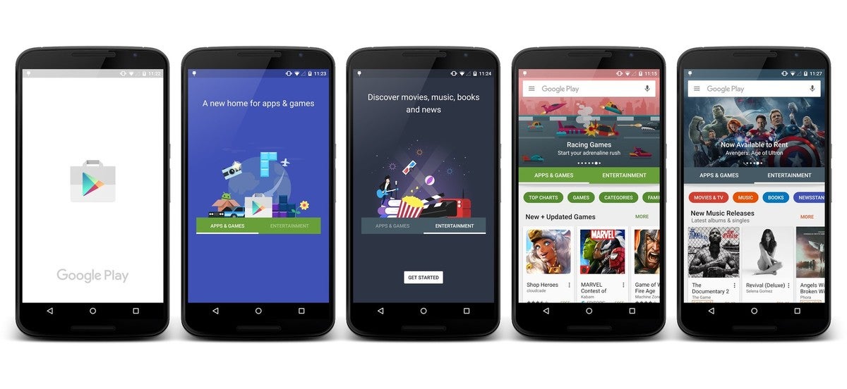
It looks like there are changes coming to the Google Play Store to change the way you navigate content. The big change is to switch from having six category tabs at the top of the Play Store home page - apps, games, movies & TV, music, books, and newsstand - there will now be just two options - apps & games, and entertainment.
As you can see in the image above, the change will create two main tabs on the Play Store home page, one for apps & games and one for entertainment. The end result does create a cleaner look and an spot for the big image at the top of the home page, but it will also mean that instead of having all of the categories right there up front, it will take an extra tap to get to the category you want to browse.
Google UI engineer Kirill Grouchnikov posted the image on Google+, but didn't give any indication on when the change might be coming, he only said it would be "soon".
It definitely has some visual appeal but it will mean navigation takes a slight hit. The change may be worth it for those who search more than they browse though. What do you all think? Let us know in the comments.
source: +Kirill Grouchnikov via Android Central





Things that are NOT allowed: