Google Drive hops onto the Material Design bandwagon
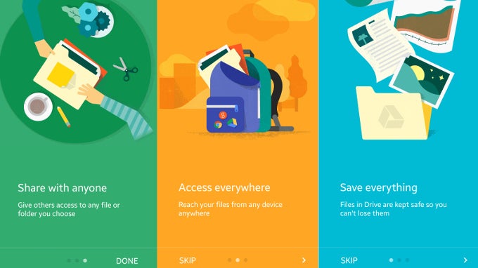
Material Design is gradually becoming the predominant trend in the design language of most of the more popular Android apps, with Google's ones in the vanguard. Among the latest of these to receive's Matias Duarte's freshest design language were Google Maps, Gmail, Google Chrome, Google Play Newsstand, Google Wallet, Google Calendar, and the Play Store itself. Today, another rather popular and handy Google app, Drive, has received its fair share of the very same Material Design that's rolling alongside Android 5.0 Lollipop.
Frankly said, the updated app is not substantially different from the pre-Material Design one - apart from a few menu consolidations, the fly-over button at the bottom right of the screen, and a few animations, the app has generally kept its looks and its fans will probably have little to no issues with the slightly-improved cosmetics (which stacks high in our book). Of course, it might take some time before the updated Google Drive hits your device.
Download: Google Drive (Android)





Things that are NOT allowed: