First look at the new iOS 11 App Store
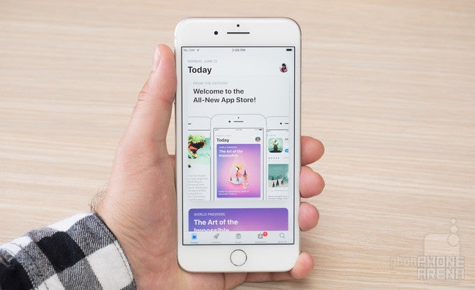
Nine years ago, this great thing happened, and no, we're not talking about the discovery of the cute Barbados threadsnake – the tiniest snake known to man. Back in 2008, Apple introduced the App Store to Apple OS (that's what iOS was known as back then). For the first time, third-party developers were officially invited to bring native apps to the iPhone, and boy did they deliver! Apple's App Store is currently home to over 2 million apps. To date, over 180 billion app downloads have been registered, not counting app re-downloads and updates, while app makers have raked in over 70 billion dollars in revenue.
Obviously, the App Store isn't going anywhere. In fact, it is only going to get better in the coming months, with the release of iOS 11 this fall. At WWDC 2017, Apple announced that it is bringing both visual and functional changes to its marketplace as part of a complete App Store redesign. We are now going to walk you through them, but first, here's the mandatory disclaimer: we're running an early version of iOS 11 on our iPhone 7 Plus, the accent being on "early". Therefore, the redesigned App Store may end up looking slightly differently when it is opened to the public later this year. With that out of the way...
What's new at the new App Store?
Quite a lot has changed, as expected. For starters, you're greeted by a simpler, cleaner interface that looks like this next to the current version:
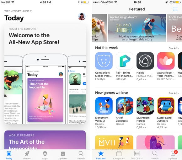
The iOS 11 App Store on the left vs the App Store in iOS 10 on the right
See that on the left? That's the new "Today" screen. It is here to replace the "Featured" tab, even though it essentially follows the same concept: to present you with apps that you might want to check out. The new panel does that differently, however.
For starters, there are now "Game of the day" and "App of the day" picks, selected by Apple's curators. Also presented daily is a list of hand-picked apps all revolving around the same theme – meditation, photography, home improvement, or shopping, for instance. And to help you make the most of your apps, Apple is going to publish quick articles with tips and tricks about popular apps. In case you're wondering, scrolling down the list will let you browse previous daily app recommendations.
Games have their own tab now
For quite some time, games have been the most popular app category, which is why it makes sense for Apple to dedicate a whole tab to them. Here's how that looks like next to the existing Games category:
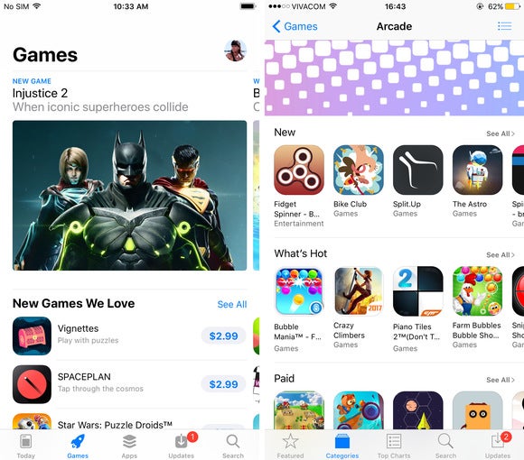
The Games tab in App Store for iOS 11 (left) vs the Games category in iOS 10 (right)
Having a dedicated Games panel doesn't only save us a few taps. The new section is built with better visual presentation in mind, giving us a richer at-a-glance preview of top titles – with large images and gameplay videos. Games' product pages have also been overhauled to look better, as well as to give easier access to comments and similar titles.
Charts rating games by popularity are still present, of course, and so are the numerous game categories. We also have the familiar selections based on certain game qualities or themes, such as the "Most beautiful games" and "Prep for zombies" selections that we're given. What's new, however, is this "Games you might like" category, which appears to be for app recommendations based on previous downloads.
What does the Apps tab look like?
The Top Charts tab has been replaced by one that's simply called Apps. It follows the principles we outlined below, serving as a simple, visually pleasing guide for all the newest and most popular apps. The panel is rich in visuals, with plenty of videos to watch. It also includes the top-app charts and app categories you'd expect, as well as app recommendations revolving around a topic of interest – cooking, sports, or travel, for example.
And when am I getting all this?
The redesigned App Store redefines the way iPhone and iPad users find apps, and that above was just a teaser hinting at what the experience will be like. But as we said in the beginning, the update is coming along in the fall, along with the grand launch of iOS 11. That is likely to happen in September, around the announcement of the next batch of iPhones. But for those who don't like to wait, a public beta of iOS 11, expected to launch in the coming weeks, might give a more in-depth look at the new App Store. Until then, here's a handful of screenshots to explore.







Things that are NOT allowed: