Do you like Samsung's new Android Nougat UX for the S7 and S7 edge?
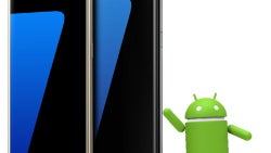
Oh, TouchWiz, where art thou? Samsung just unleashed the Android 7.0 Nougat beta on our unsuspecting Galaxy flagships like the S7 or S7 edge, and the TouchWiz of yesterday seems gone for good - not in the most visible part like home screen iconography, but in the settings, submenus and notifications shade.
The brand new SamsungOne font makes the fresh UX look very different and more minimalistic, the clean and simplified settings list brings back fond memories of the Note 7's Grace UX, and the extra Always-On screen options from the deceased phablet are also brought in to sooth the mourning a little bit. Samsung also brought over the new battery saver modes from the Note 7, but provided the screen resolution changes they contain as a standalone feature, too, and added different performance modes you can choose from, depending on what you want to do with your device.
This is a pretty intriguing overhaul, and, given that a lot of ex-Note 7 owners are downsizing to a Galaxy S7 or S7 edge, it is important that Samsung does the Nougat update right. That is why we wanted to ask you whether you are satisfied with the changes you see so far with the Android 7.0 Nougat beta for the S7 or S7 edge, both visually and under-the-hood. Tell us in the poll below, and elaborate what you like best or dislike most in the comments.





Things that are NOT allowed: