Clear: a to-do list app worth its salt arrives for iOS with buttonless interface
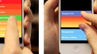
Have you ever searched in vain for a to-do list app that doesn't swamp you with options, or that promises simplicity but between entering something and having to checkbox or scratch it afterwards it just becomes too much work?
Clear for iOS has been generating a fair amount of buzz in its beta stages, and now it is available in the App Store in all of its touch-optimized glory. And we tell you, this thing is meant for touch - navigation is simply swiping in the four directions or pinching. To-do entries are limited to 30 characters, and every part of the app is developed with ease of use and swiftness in mind, but not a single button in sight.

As Clear's co-creator Phill Ryu puts it eloquently:
There’s so much crap trying to get your attention in other to-do apps, you don’t even bother typing things in on the iPhone app version, [but] with Clear it’s so fast it’s sometimes even fun... Have you seen babies play with an iPad? They love swiping and manipulating things directly one-to-one on the screen. There’s nothing more natural than that on a touchscreen device.
Granted, utilities apps are a dime a dozen, but when you try to find something that is designed from the ground-up with touchscreen gestures in mind and bets on simplicity of the user experience, you quickly find out that either there is a steep learning curve, or something's missing. Clear is available at the App Store from today for an introductory $0.99 price.
source: Clear (iTunes)

Follow us on Google News






Things that are NOT allowed:
To help keep our community safe and free from spam, we apply temporary limits to newly created accounts: