Android 5.0 Lollipop totally crushes iOS 8 in terms of interface design, according to you
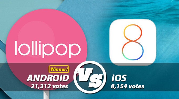
Last week, we asked you to rate both Android 5.0 Lollipop and iOS 8 in several different categories and determine which one has a better interface. We were more than sure that this battle was going to be bloody and fierce, as both the fans of Google's OS and Apple's mobile platform are quite devoted to their beloved operating system of choice.
Broken down, these results show us that the only aspect in which our readers find iOS better is the interface of the latter's camera app - 2,398 voters found it better than the stock camera app of Google's OS, which amassed 2,138 fans. As per your opinion, Google's OS wins a crushing victory over iOS in the widget implementation section - backed by 80.92% of the voters, Android simply leaves no chance to iOS 8, which accumulated only 19.08% of the votes.
You can check out a complete breakdown of the final results in the gallery right below. Are you surprised by the outcome?
As a quick refresher, you can check out some of the screenshot compositions that represented their respective camps.









Things that are NOT allowed: