Alleged LG G3 screenshot hints at more “flat” design to Optimus UI
The LG G2 is such an excellent device, it goes without saying that its successor has some very big shoes to fill. We fully expect LG to bring its “A” game to the stage whenever the new LG G3 gets introduced.
Under the hood things are even more hazy. We have seen rumors pointing at a quad-core Qualcomm Snapdragon 805 CPU, or perhaps an octa-core MediaTek processor, maybe even a processor of LG’s own design. With rumors like that, it really is anyone’s guess.
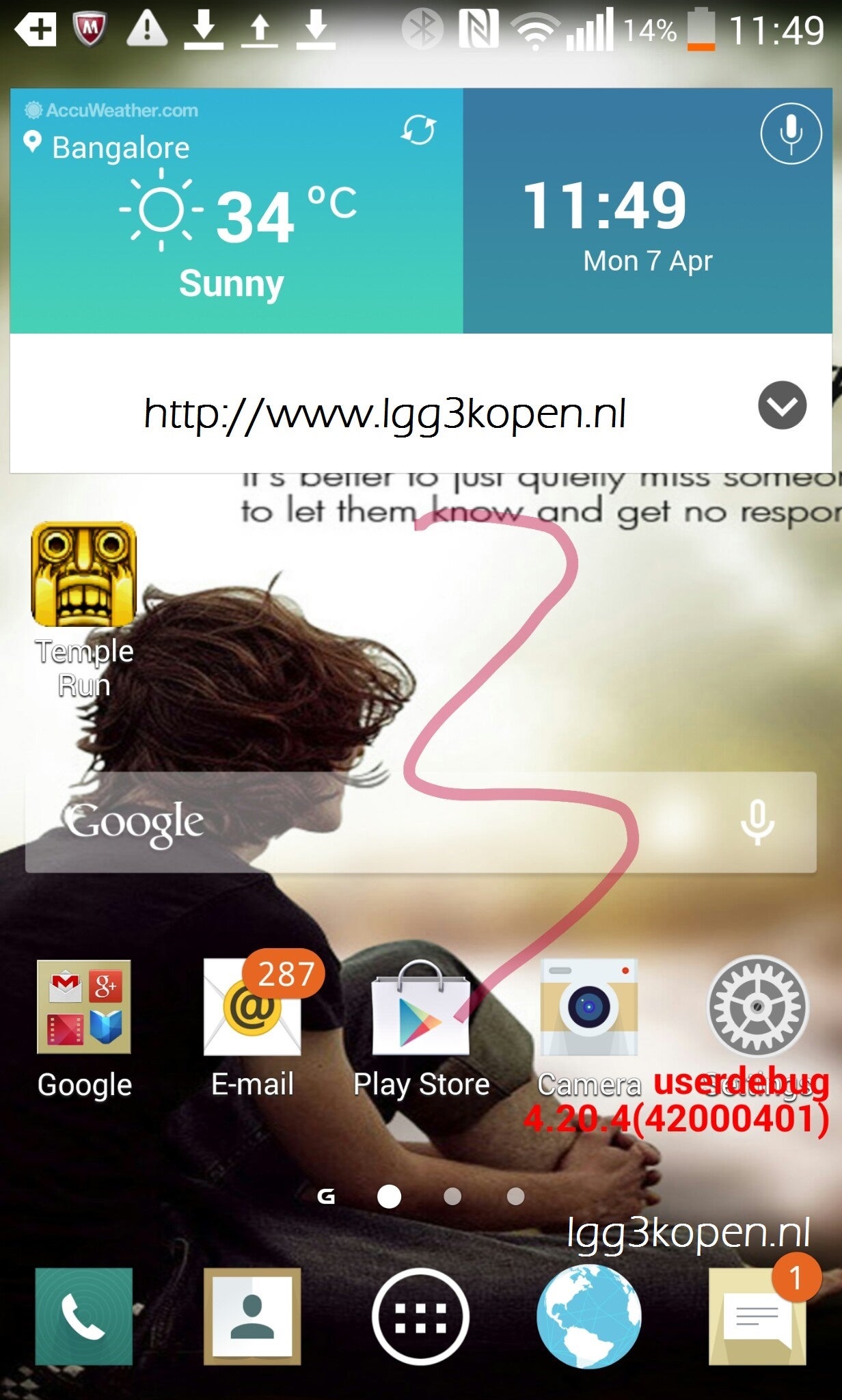
From a user perspective, the LG G3 would be a good device to introduce an enhanced UI for the skin LG puts on its Android powered devices. Since we are also expecting to see advanced personalization features the user experience is going to be different anyway, so why not give it a new look? The Optimus UI in its current form on the G2 is very similar to the TouchWiz interface found on Samsung devices. If the screen shot here is the real deal, then it looks as though LG has subtle changes in mind for the UI elements.
The app icons look a little more flat, which would follow a trend set by Apple and Samsung. What will be more interesting to see is if there are deeper changes made to the UI underneath the home screens, further along the lines of what Samsung did to TouchWiz. Either way, it is going to be exciting to see if the LG G3 proves to be the Galaxy S5 “killer” it has been billed to be in the Korean media.
source: Niels Summer (LGG3kopen.nl)





Things that are NOT allowed: